/lu:talika/
Falling in Every Direction is the artistic practice of Francesca Hyde, a circus artist. Her work is deeply rooted in Academic topics such as Feminist New Materialism, as shown in her latest show/relation with Tank. Francesca is also part of the circus collective ‘Collectif and then…’.
Credits
UX/UI Design: Cecilia Righini
Development: Mykhailo Bakalo
Homepage Animation: Patrícia Beja
Website
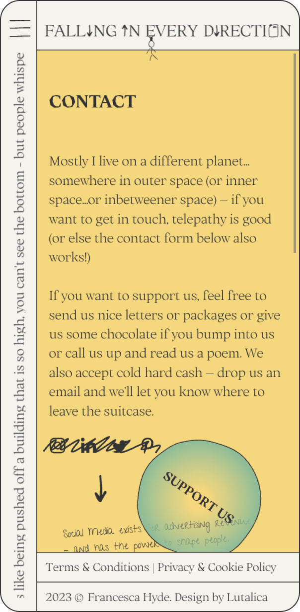
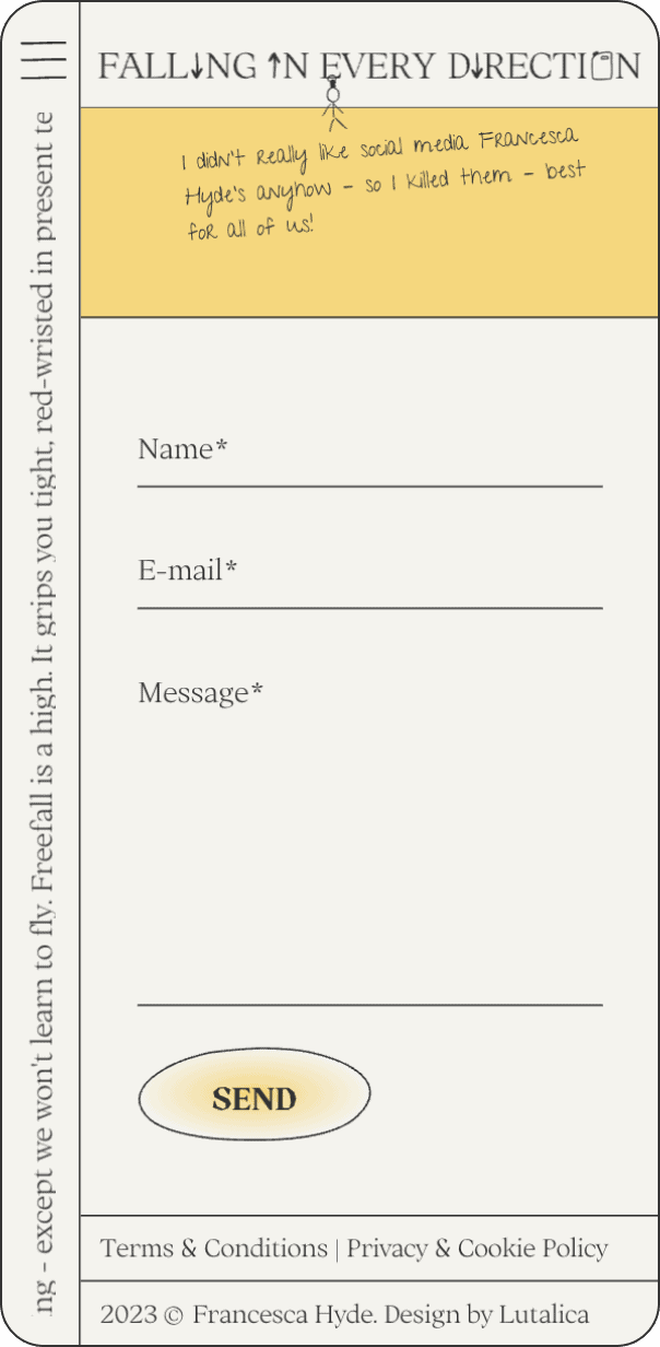
Francesca Hyde was looking for a website that could reflect/participate in her experience as a circus artist. Her immediate needs were for the site to be accessible and to use open source fonts designed by women. During the research process, we started to imagine an interactive experience with hand-drawn elements, to mirror Francesca’s dynamic yet reflective practice. The final result was an eccentric layout with the look and feel of a personal diary or journal, complemented with various animations.
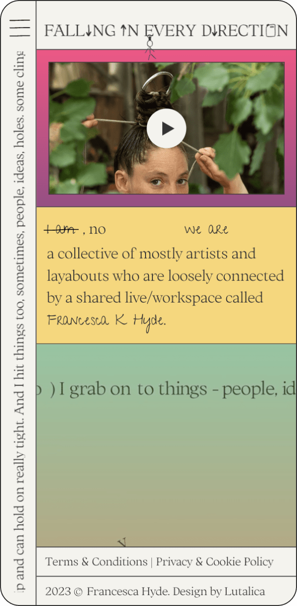
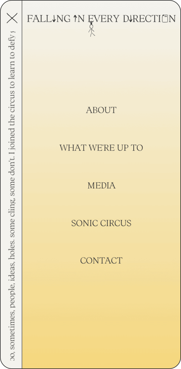
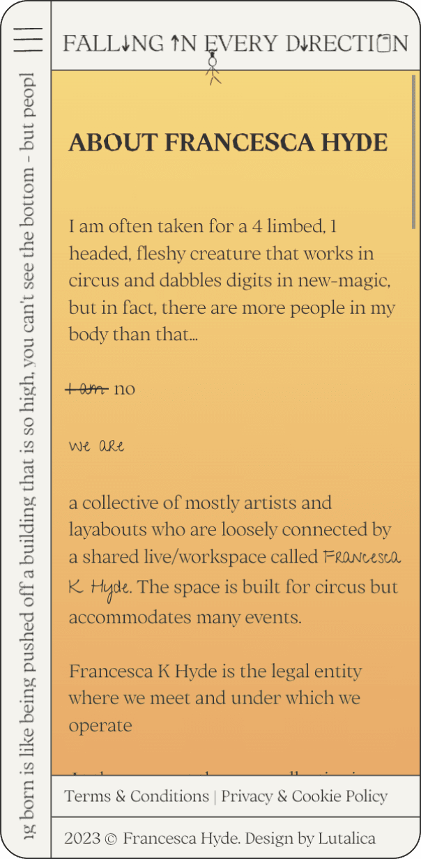
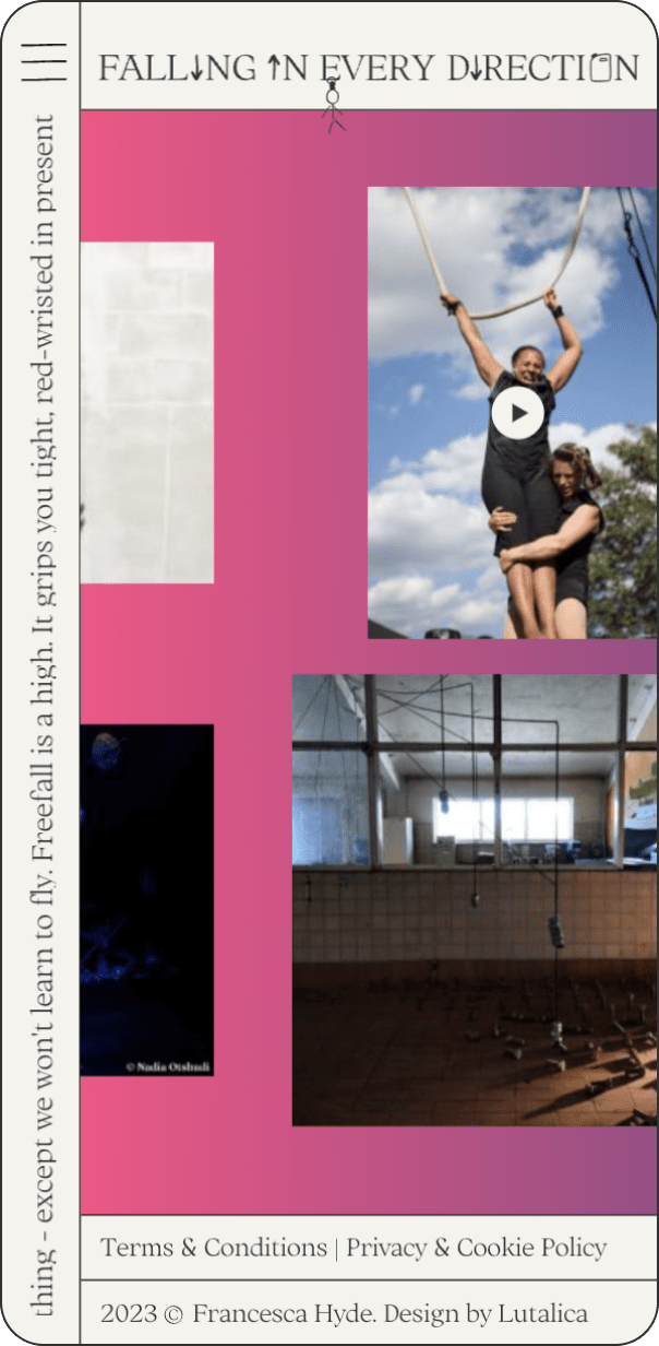
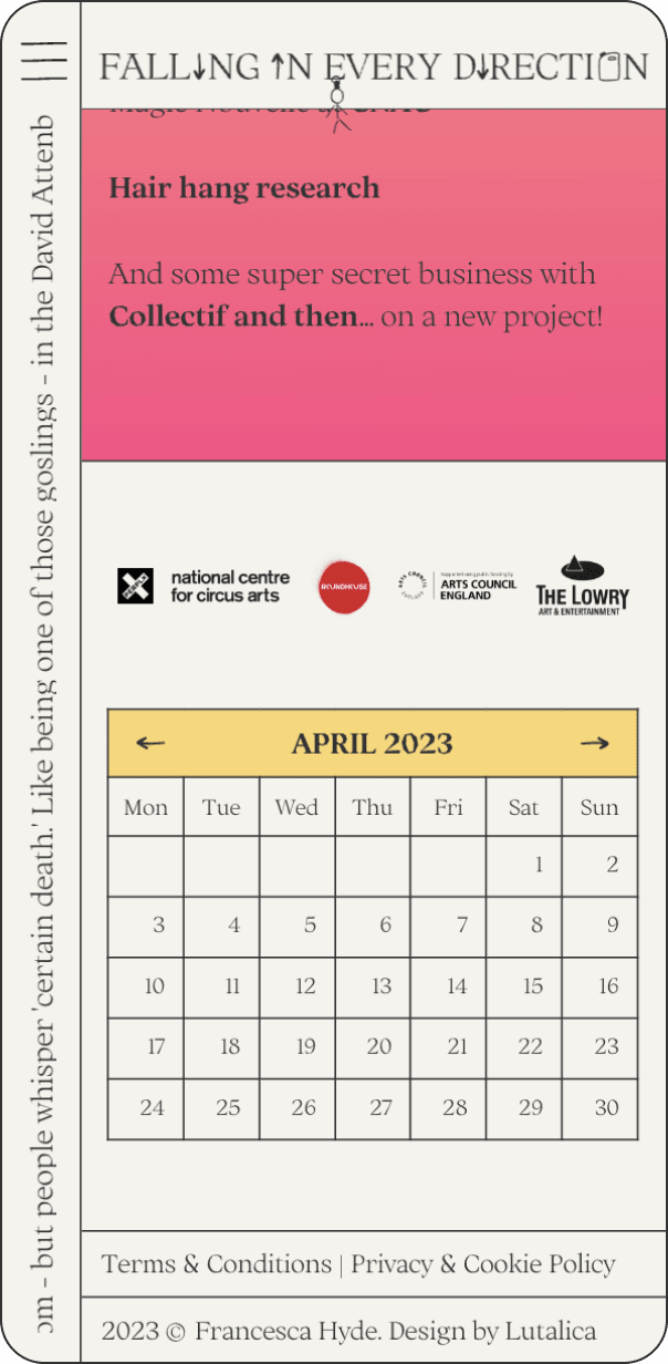
We transferred the contrasting geometric sections that are present in the desktop version of Francesca’s site to a smaller mobile screen by changing the orientation and making use of rotating banners to display larger amounts of text in a smaller space. Here the drop-down menu fills the screen, making the site easy to navigate, whilst retaining the vibrancy of the desktop site.
Digital Assets
The assets were a mix between the open-source font Ortica, a calligraphic serif designed by Benedetta Bovani, and hand-drawn graphics. The animations were mostly created in the development phase, while the scrolling poem featured on the homepage was animated by Patrícia Beja.