/lu:talika/
Share
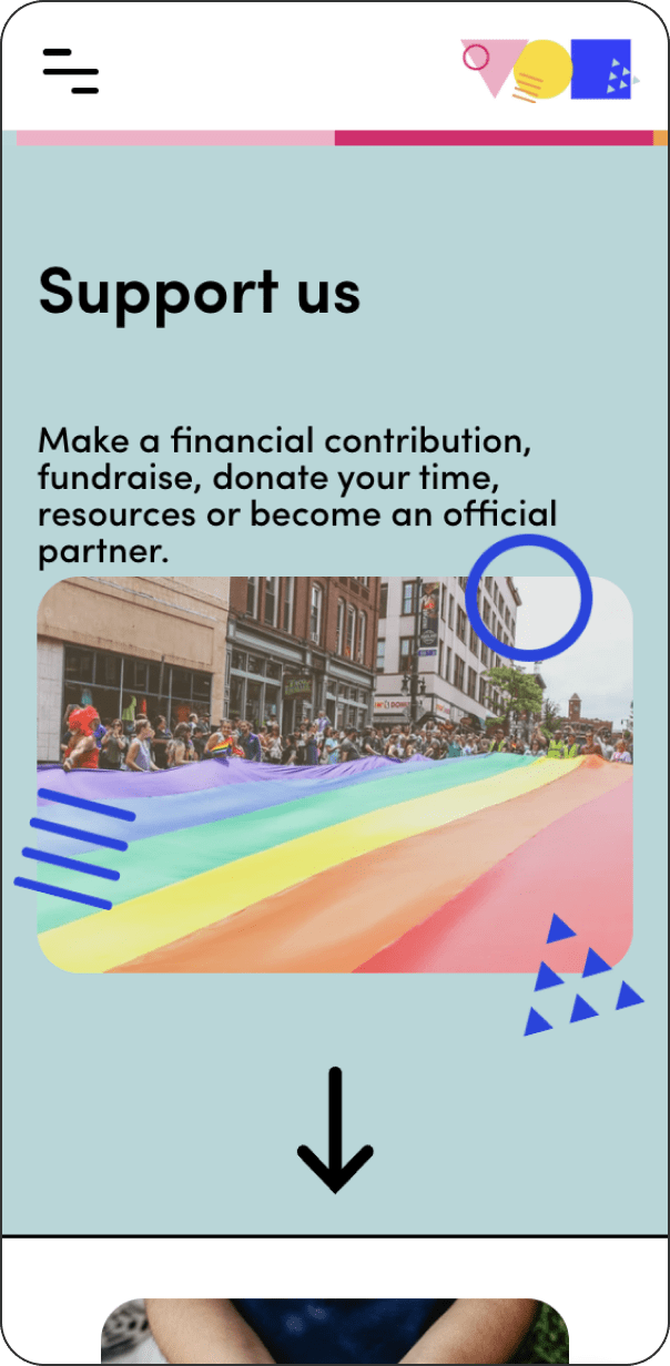
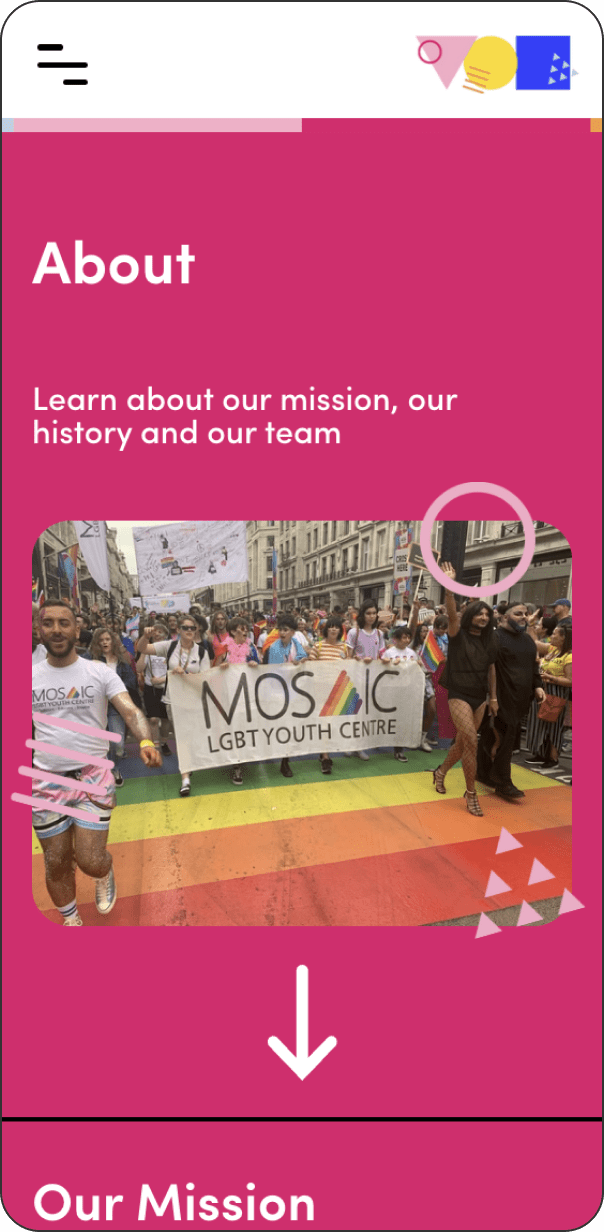
Mosaic Trust, previously known as Mosaic LGBT+ Youth Centre, is a not-for-profit organisation that aims to support, educate and inspire young LGBT+ persons from 13 to 19, and those around them. To help them lead their mission and showcase their engagement, we provide them with both visual and strategic tools to make them grow and raise a larger audience.
Credits
Design and Development: Cecilia Righini
Rebranding
To develop the new branding for Mosaic Trust, we organised surveys, workshops and focus groups with the young persons involved in the organisation. The keywords that stood out were ‘kind’, ‘friendly’, ‘young’, ‘dynamic’, ‘optimistic’, ‘joy’, ‘fun’.
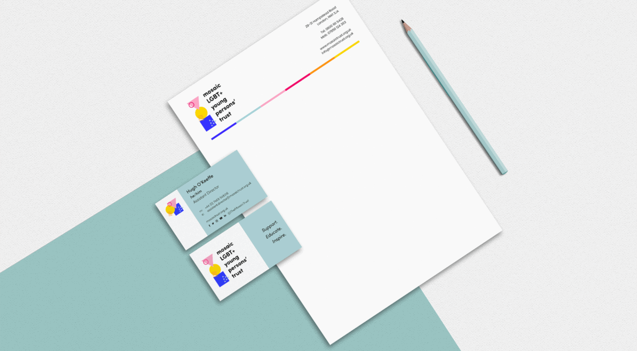
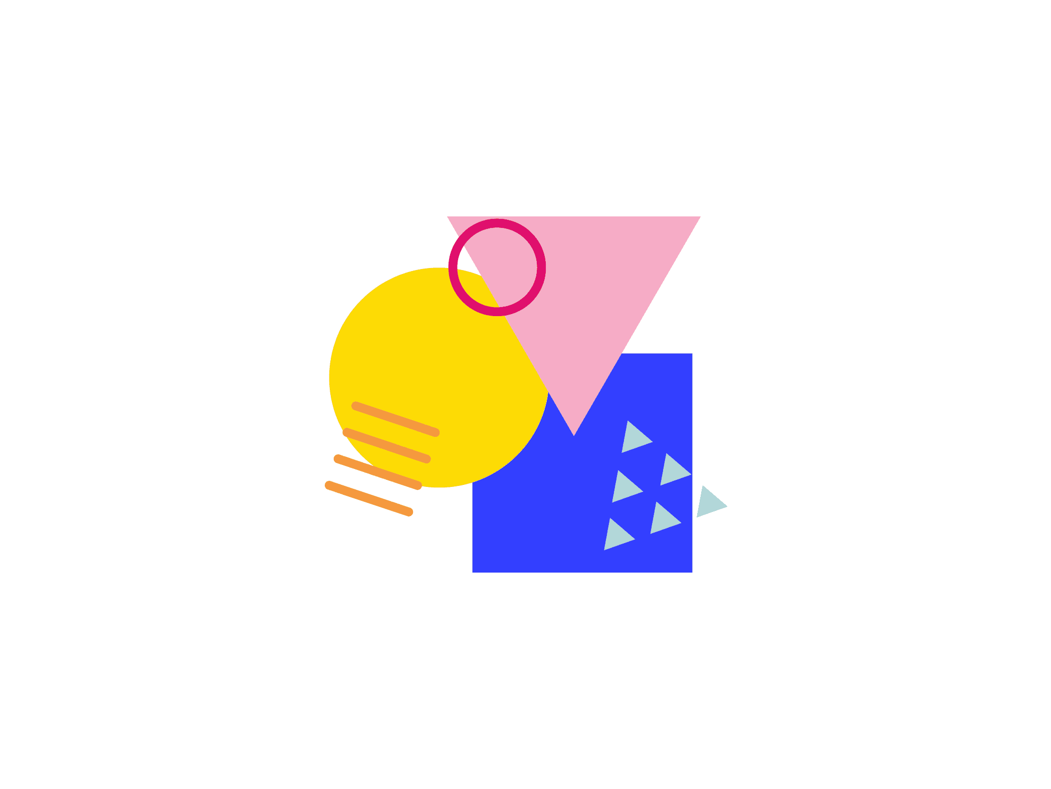
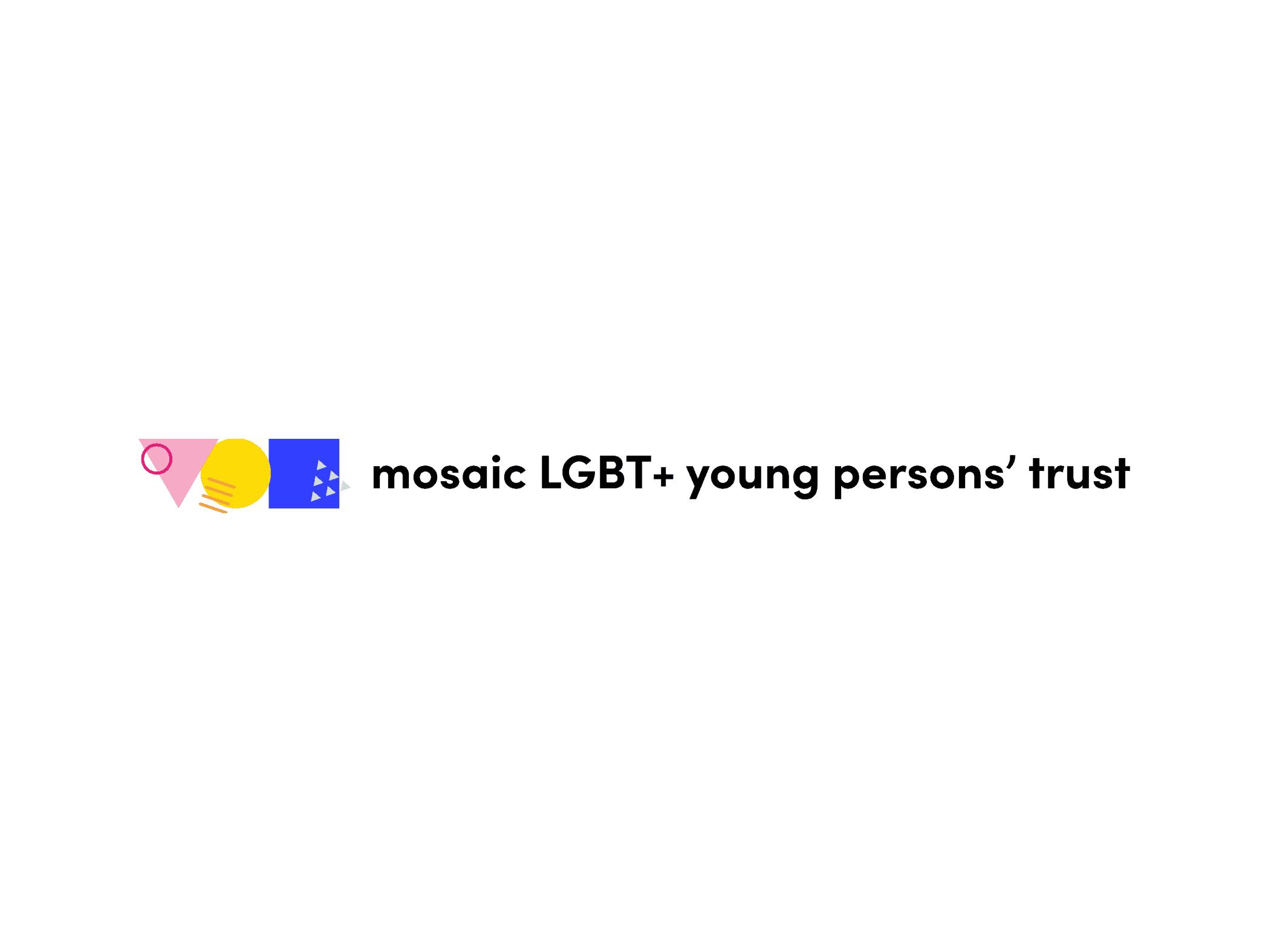
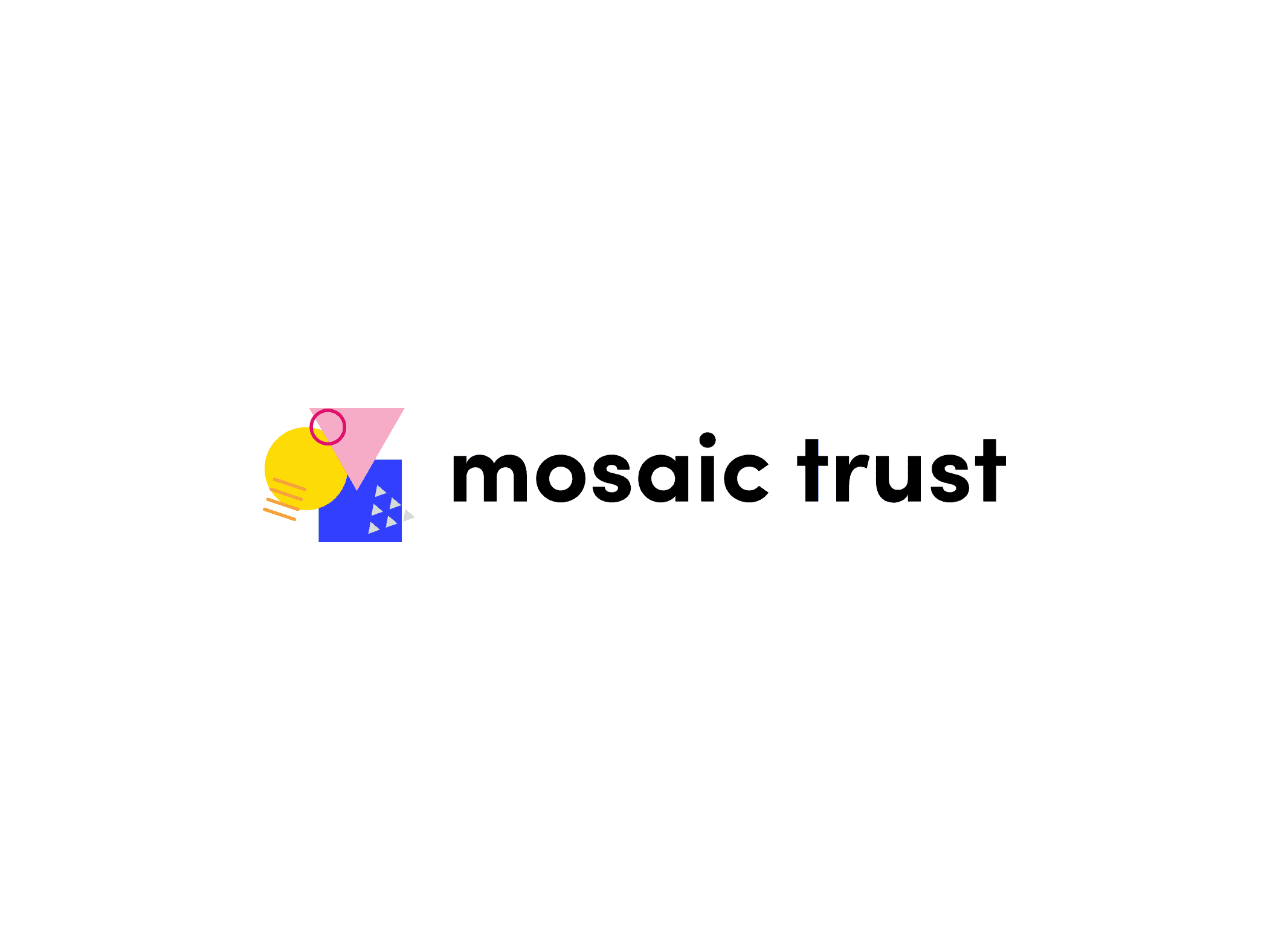
After multiple iterations, the winning concept used three shapes, a square, a triangle and a circle, which respectively reflects Mosaic Trust’s keywords ‘support’, ‘educate’, ‘inspire’. In this responsive logo design, the shapes are always connected to express the interconnection between these concepts.
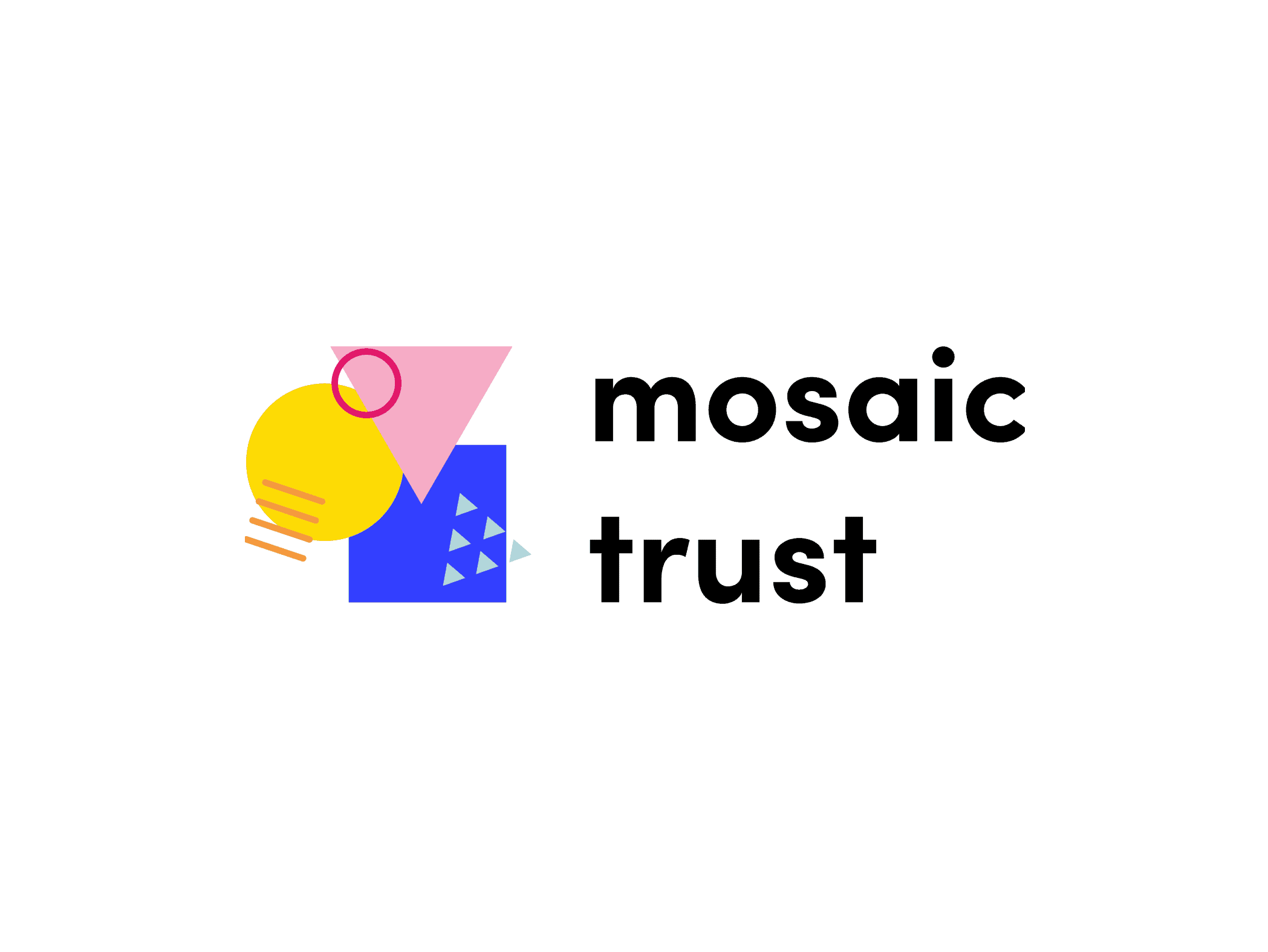
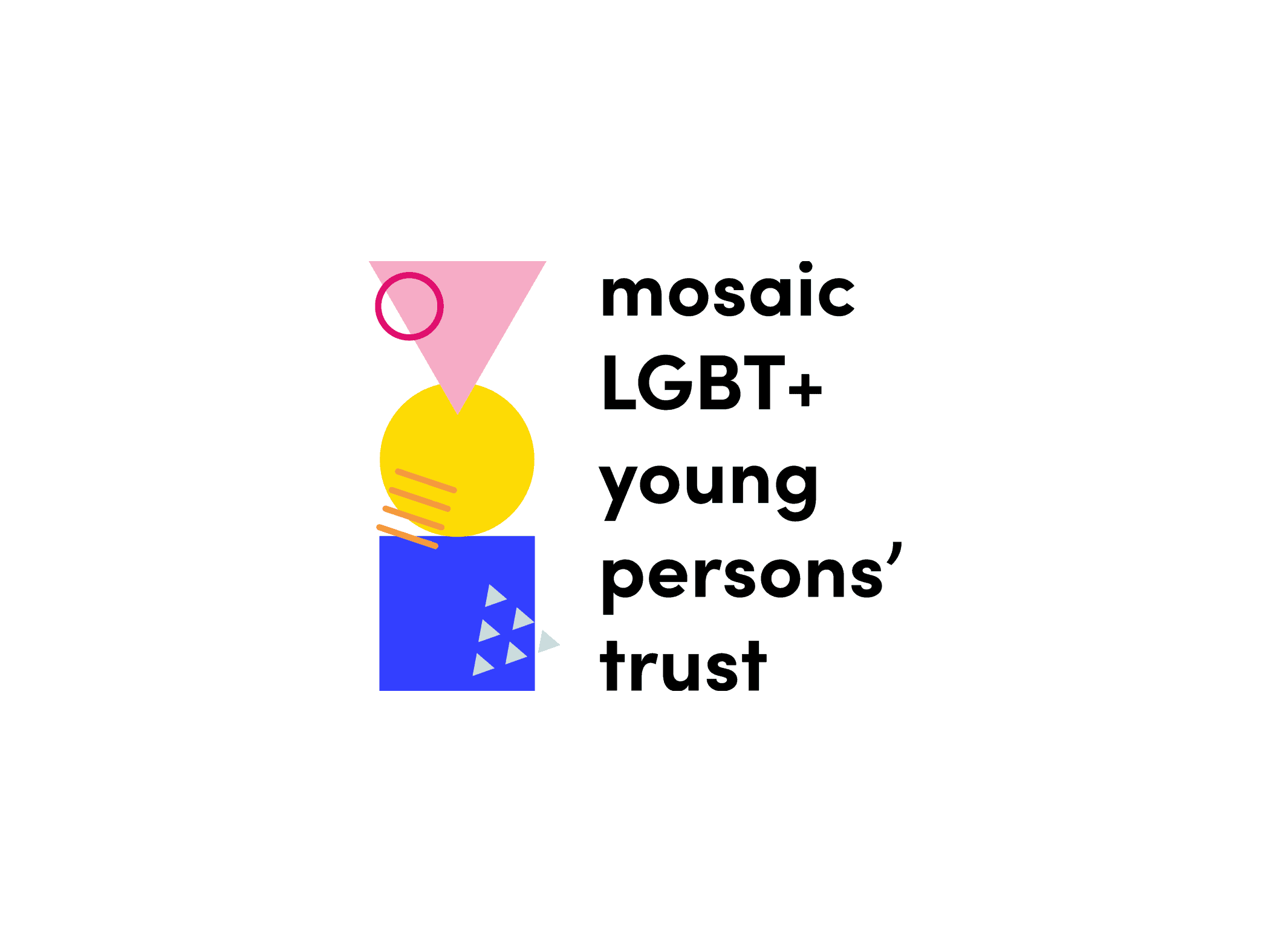
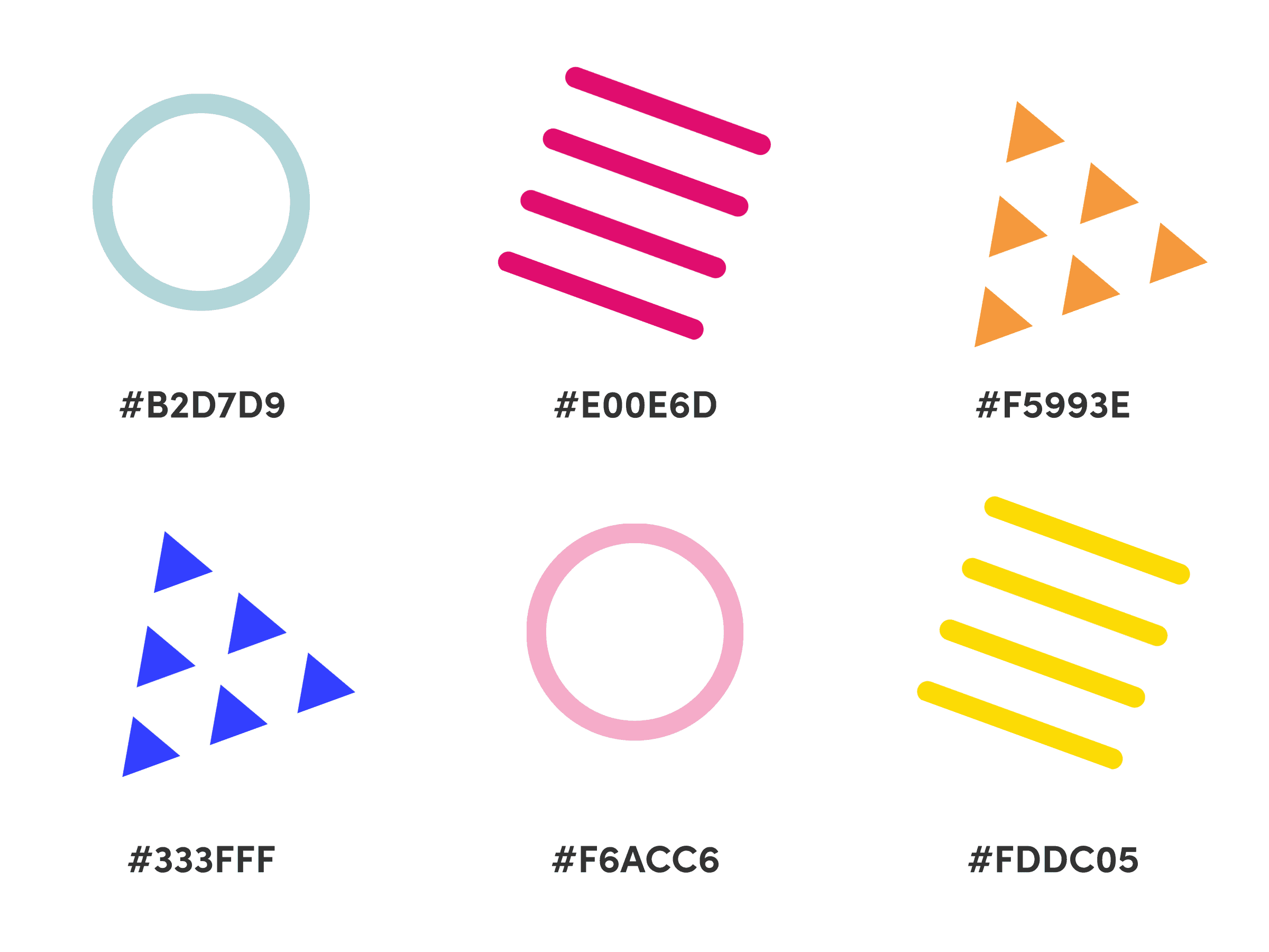
We picked two shades of colour for each shape, taking into consideration colour psychology:
- Support: electric blue and baby blue. Blue is usually associated with trustworthy and dependable brands.
- Educate: magenta and baby pink. Pink is the colour of sensitivity and sexuality.
- Inspire: yellow and orange. These two joyful colours express friendliness and positivity.
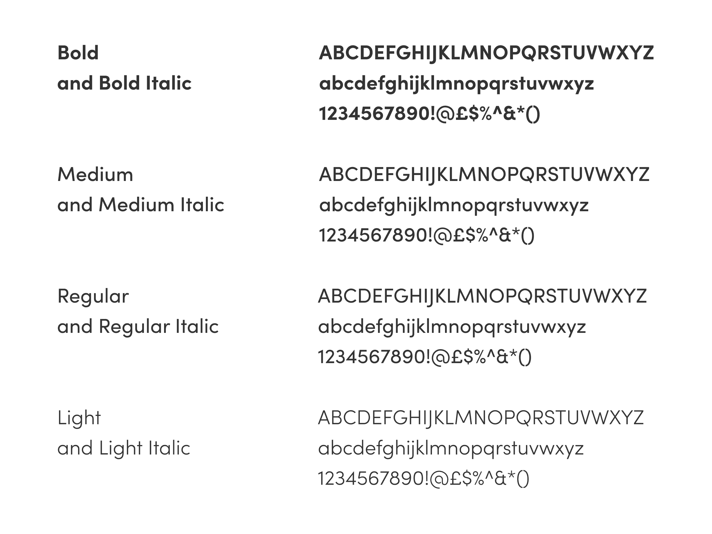
The chosen type, Sofia Pro, is a clean, modern and harmonious geometric sans serif font family.
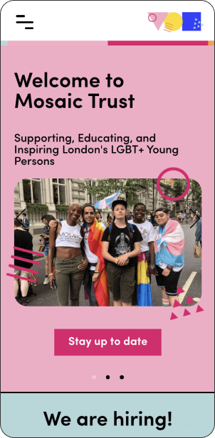
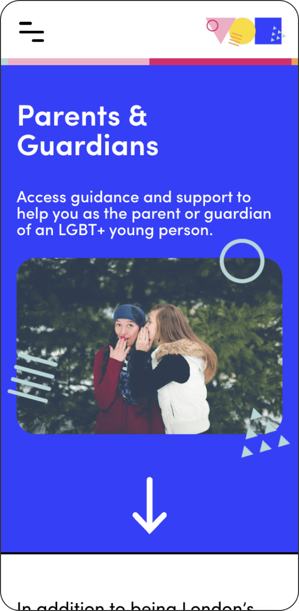
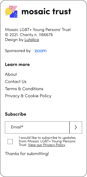
Website
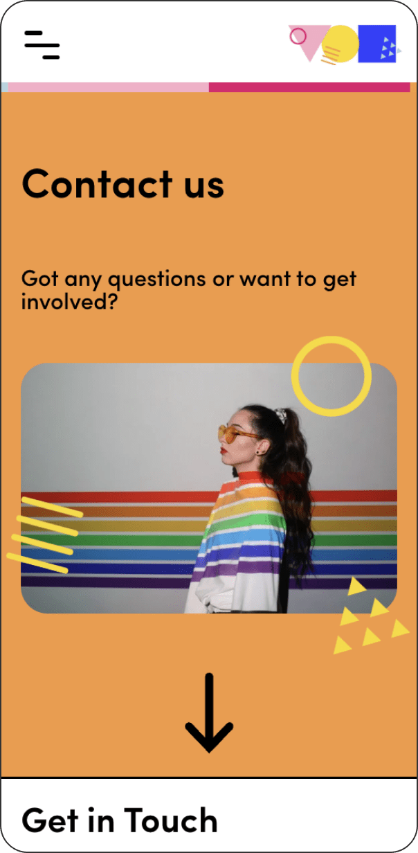
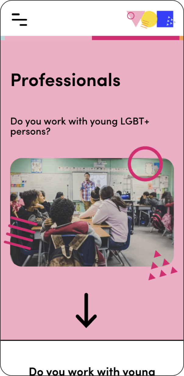
The new website for Mosaic did not only involve a simple application of the new branding but complex and ongoing research on user experience and accessibility. The target audiences include queer young persons aged from 13 to 19, their parents or guarantors, volunteers and industry professionals – e.g. press, schools, etc. Therefore, we created a clear and structured site map which made it easy for users to navigate the site and find the information they need.
The website was built on WIX, which allowed the complete restructure of the site in a short period of time. Easy to use, it also permitted the non-technical Mosaic team to be included in the site management and to edit quickly different information, events and other updates.
Digital Content
The templates for Mosaic Instagram were created on Canva, which is completely free for not-for-profits, to allow for total flexibility without the need for design software.
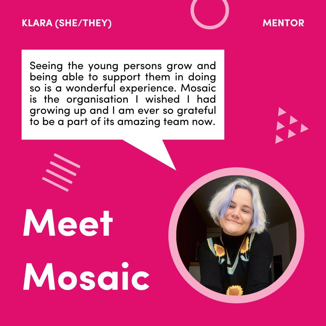
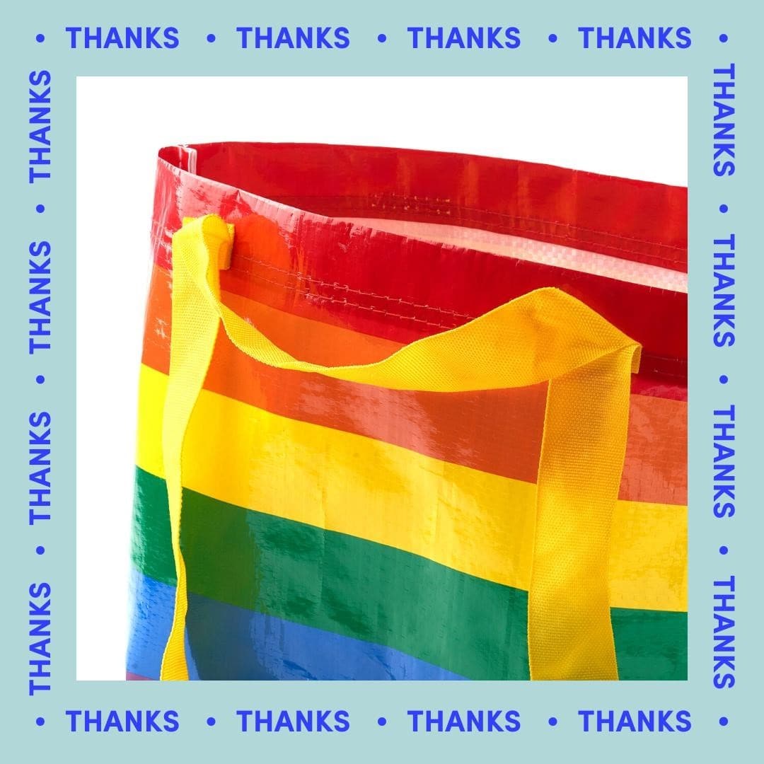
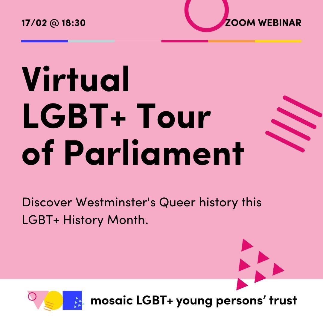
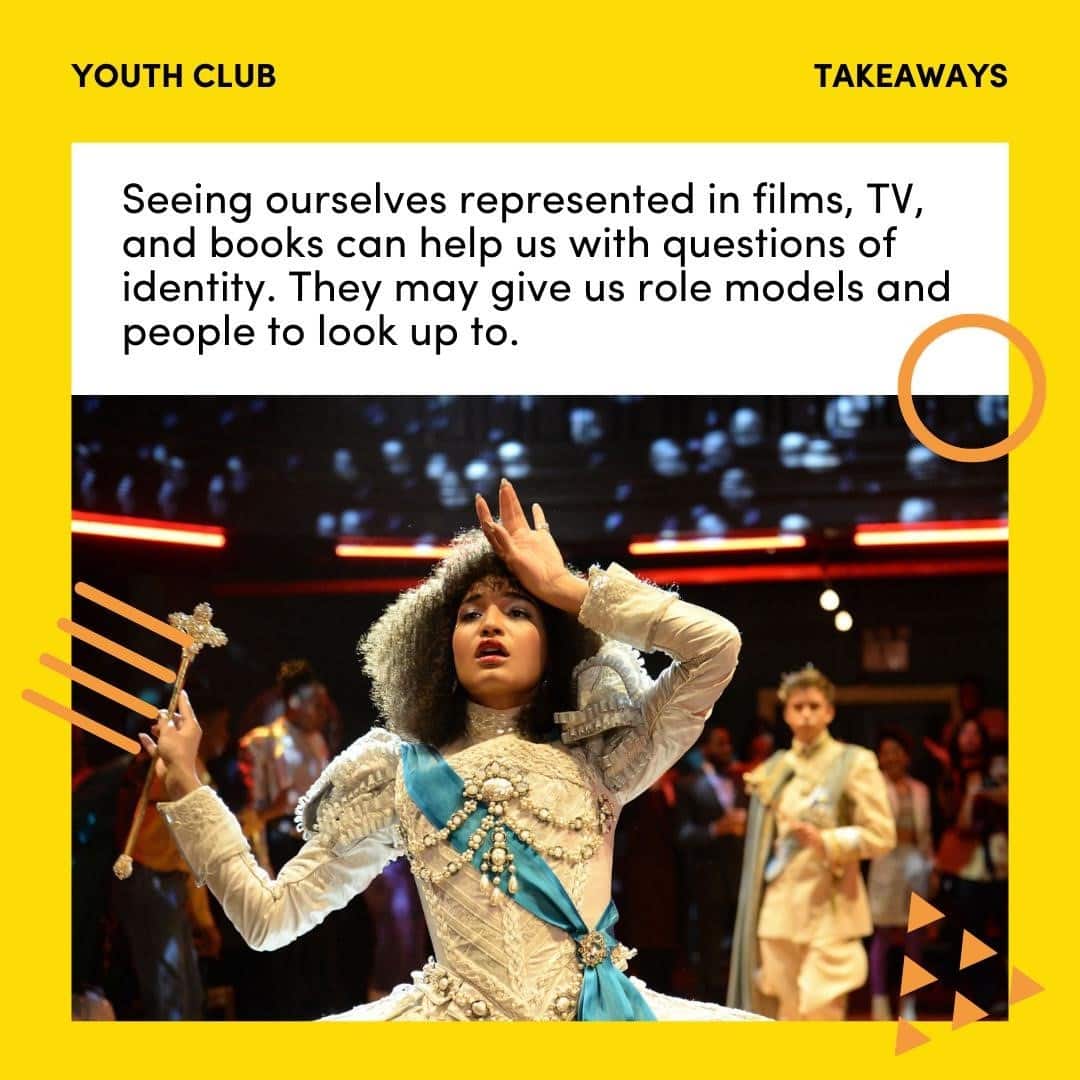
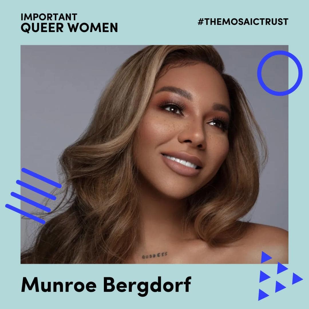
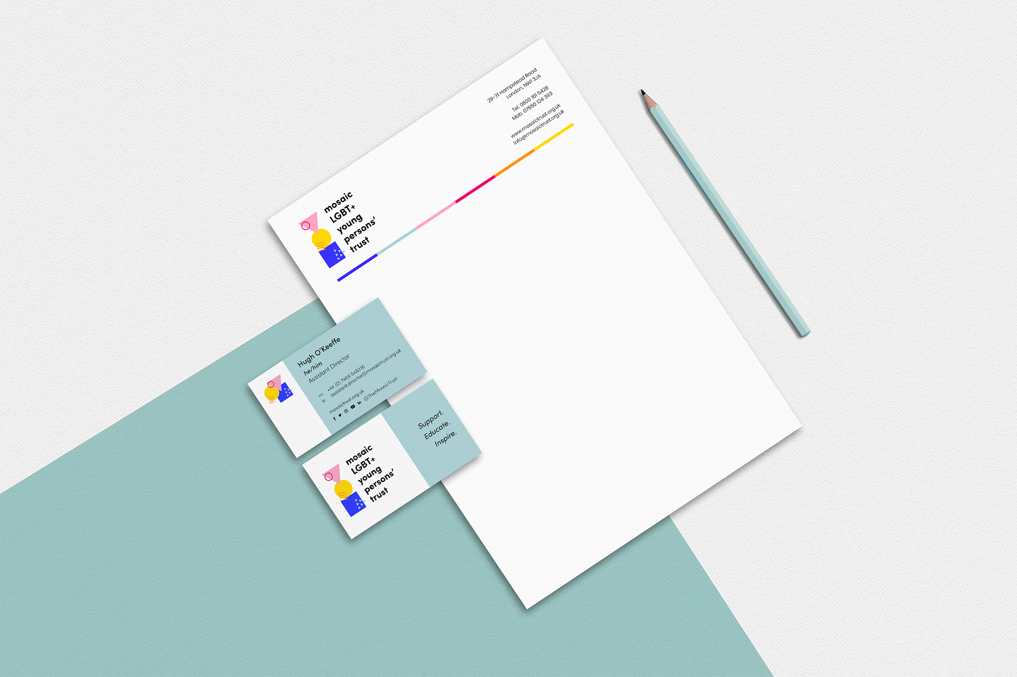
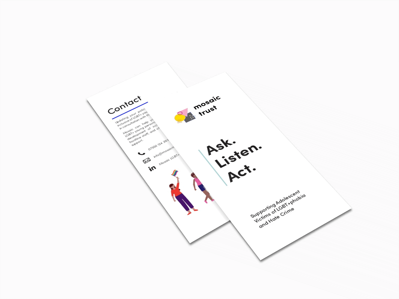
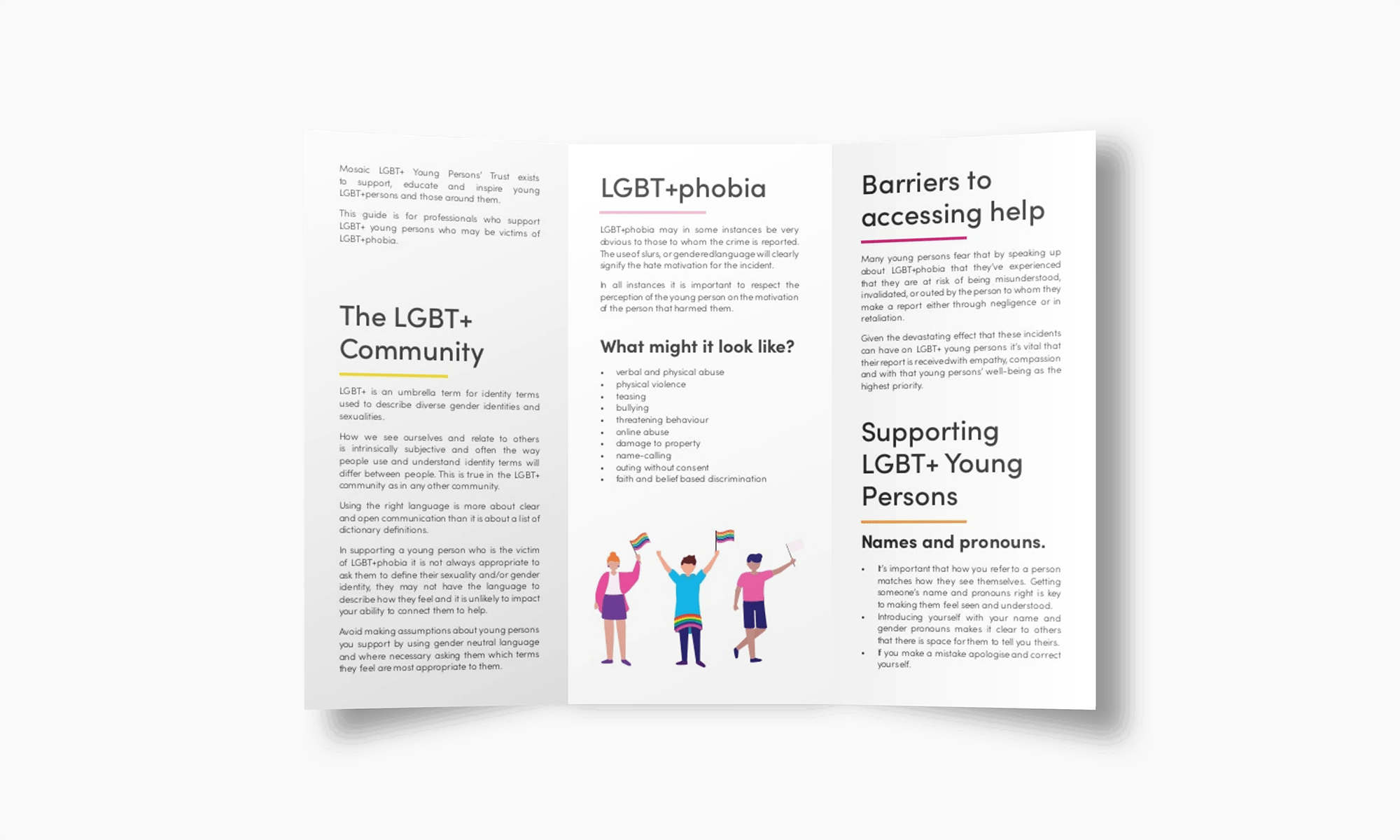
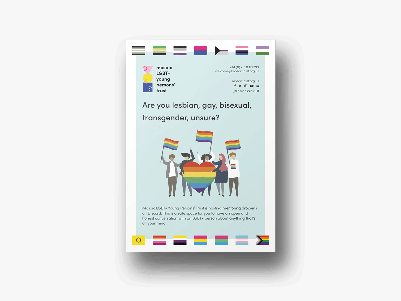
Mosaic Trust activities are both online and offline, with face-to-face workshops and campaigns to raise awareness about their services. Printed assets, from flyers to posters to simple letterhead and business cards, were created and developed in the same line as the digital design, providing a professional look and solid tools for volunteers and members of the Mosaic team.
Testimonial
– Lukasz Konieczka, Director at Mosaic LGBT+ Young Persons’ Trust