/lu:talika/
Share
House of Halsan connects queer individuals, organisations and brands, and consults with LGBTQ+ leaders to guide their organisational and comms strategies. As a seasoned, Queer fundraising and comms specialist with a rich history of collaboration with some of the world’s largest global brands and corporations, Cat Halsan brings a wealth of experience to her clients. We were glad to design and develop the original website for House of Halsan.
Credits
UX/UI Design: Cecilia Righini
Development: Lisa Komoltseva
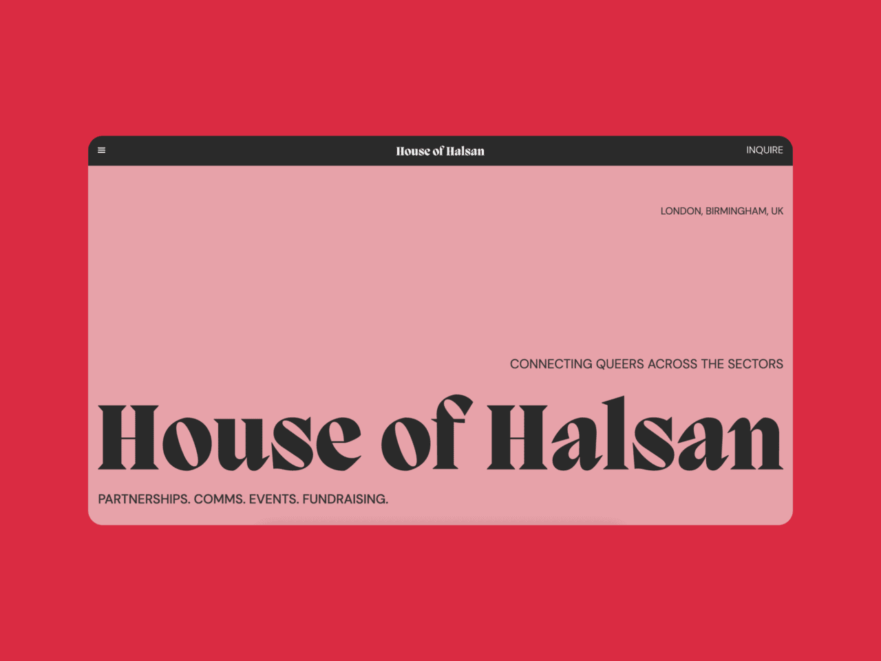
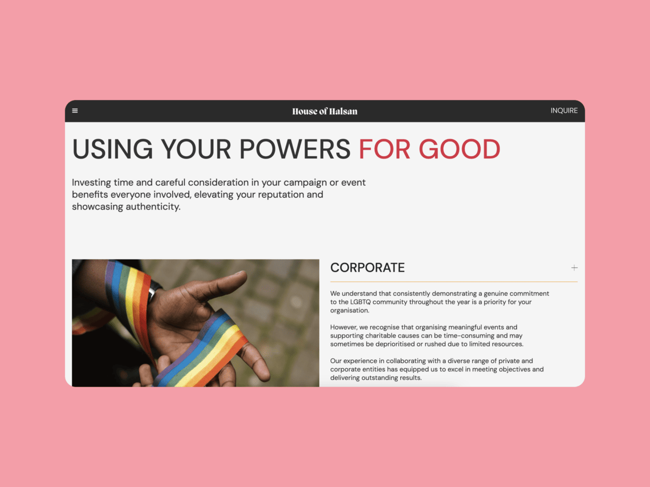
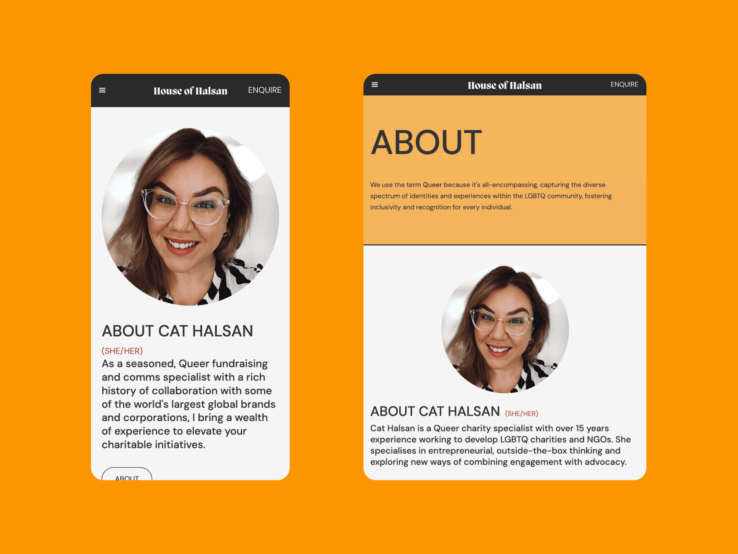
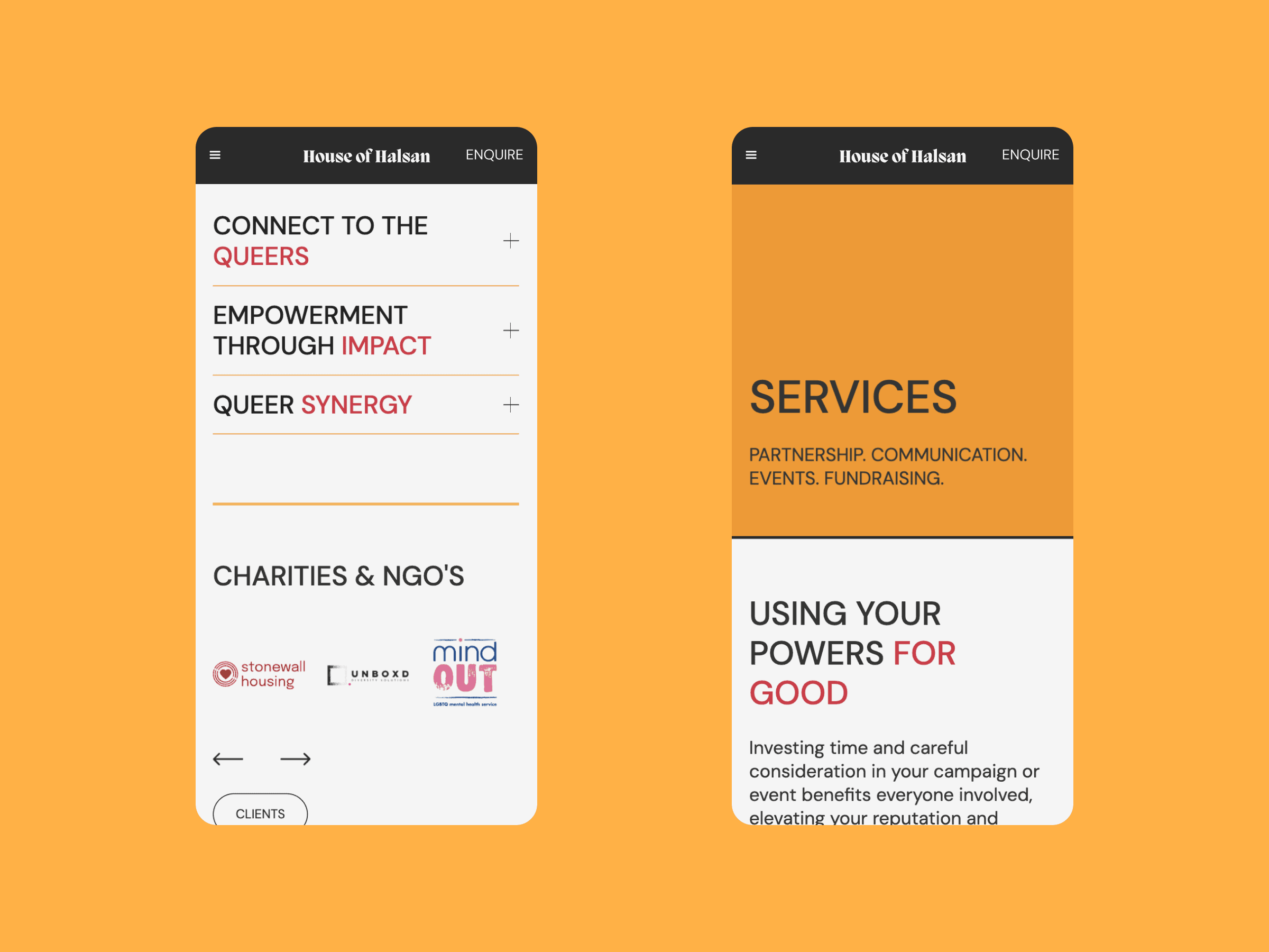
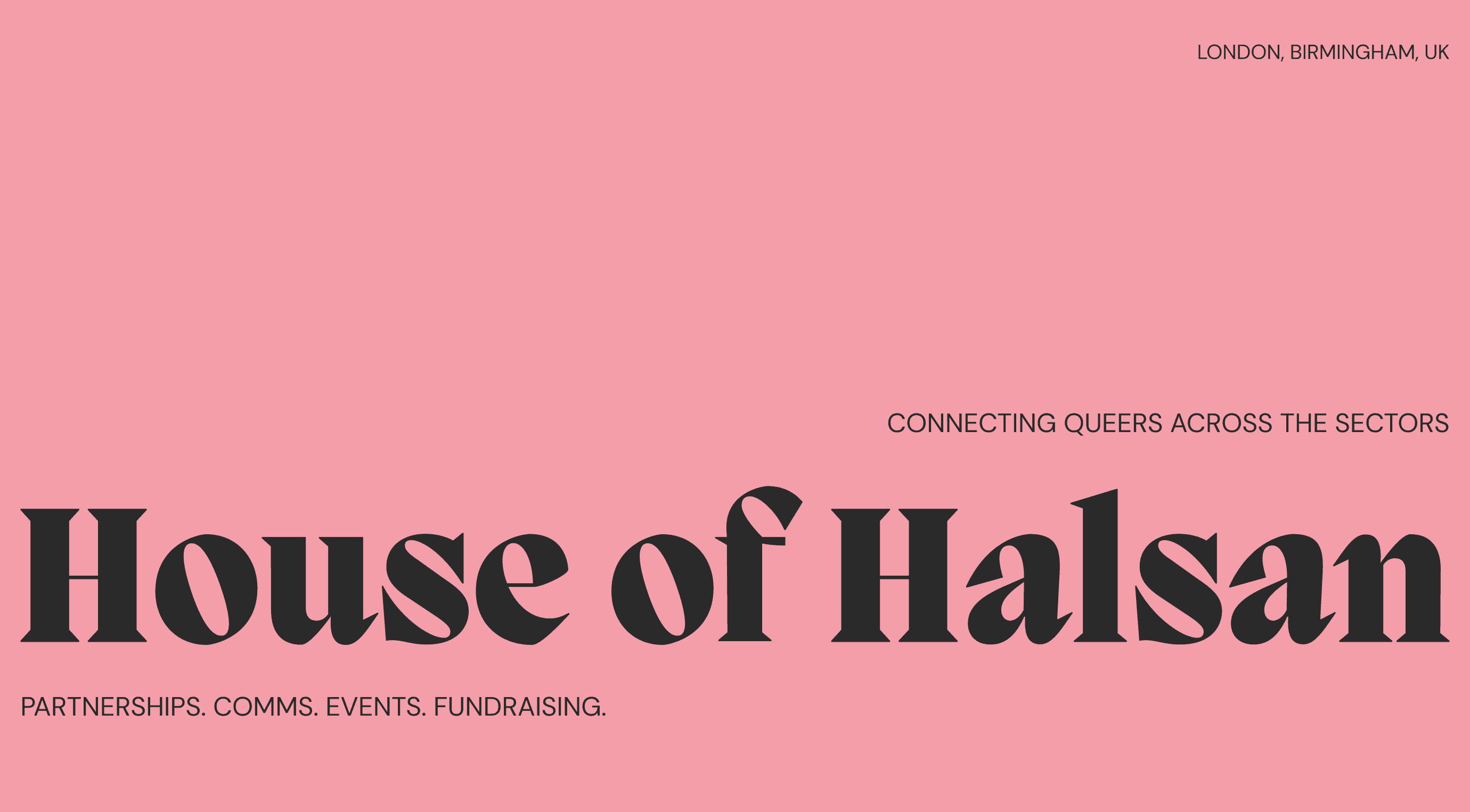
The website’s colour scheme features warm coral and peach hues, creating a welcoming and vibrant atmosphere. In designing the website, accessibility was a key consideration for both our team and the client. We ensured the site was equipped with clear calls-to-action (CTAs), buttons, and carousels to facilitate easy navigation and present information in a digestible way.
The logo typography and layout of the website subtly recall classic print media, adding a layer of sophistication and reflecting Cat’s communications expertise. The main title font, PP Migra, is reminiscent of the bold display fonts used in magazine headings, drawing inspiration from 19th-century advertising posters. These design choices additionally reference drag ball culture, which the name ‘House of Halsan’ also refers.
