/lu:talika/
Share
Weirdo is an advertising agency with a difference. They actively look for ways of including and appealing to diverse audiences, challenging themselves to create unique and powerful work. We have much in common with Weirdo, a fellow social-justice-orientated creative agency and we had a great time re-designing their website on Webflow.
Credits
UX Design: Katie Gee
UI Design: Zoe Tang
Development: Elizaveta Komoltseva
Awards
Awwwards: Honorable Mention
Website
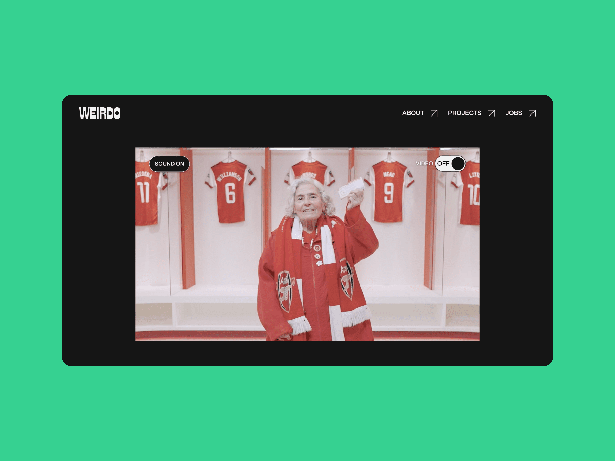
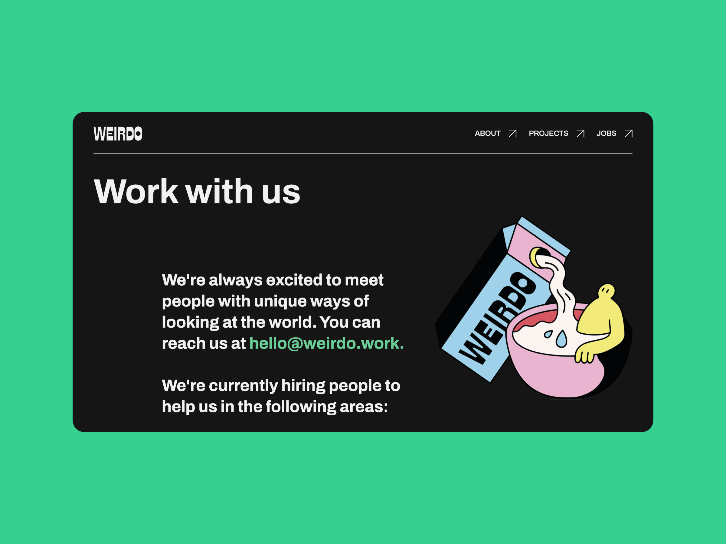
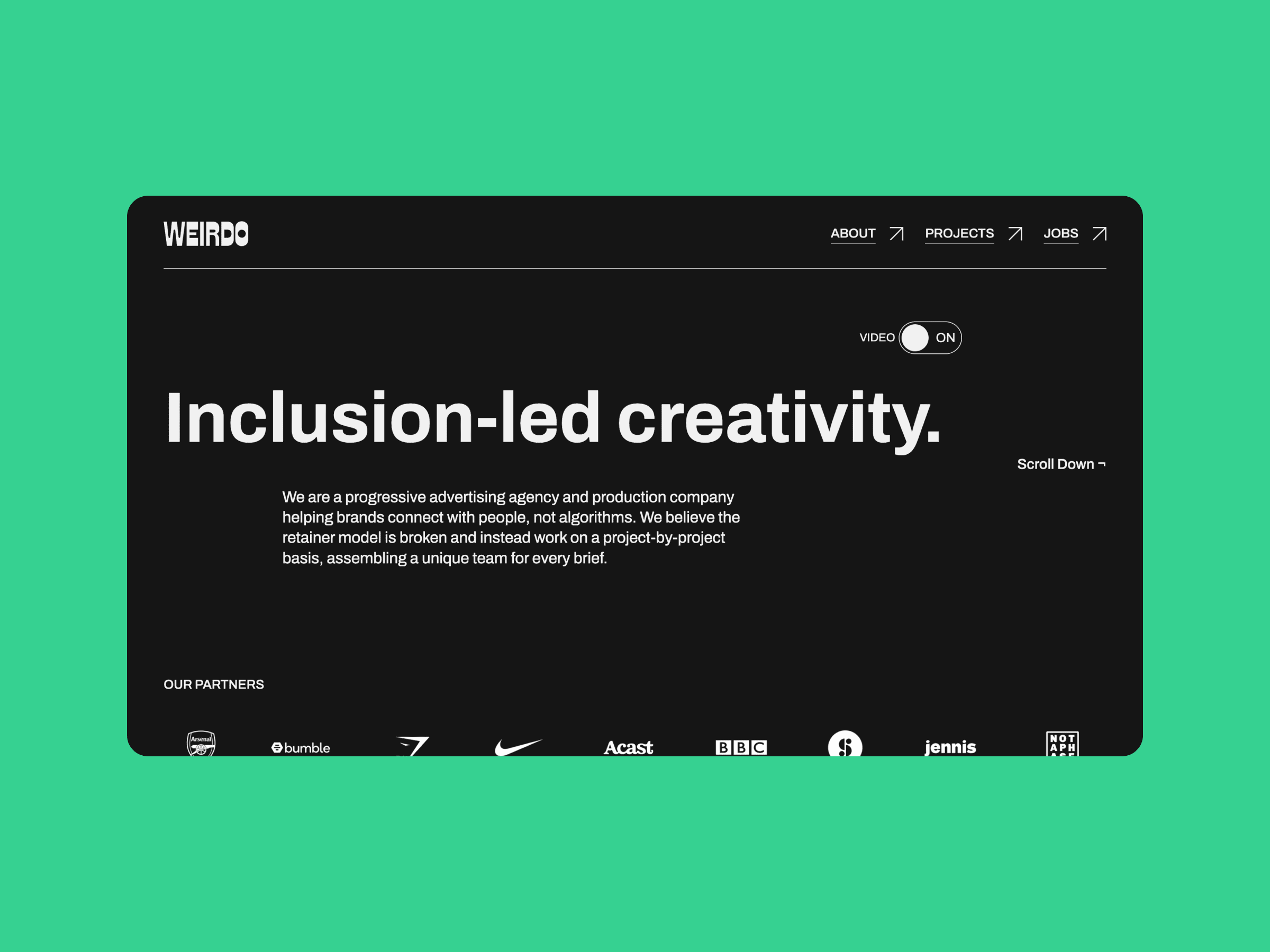
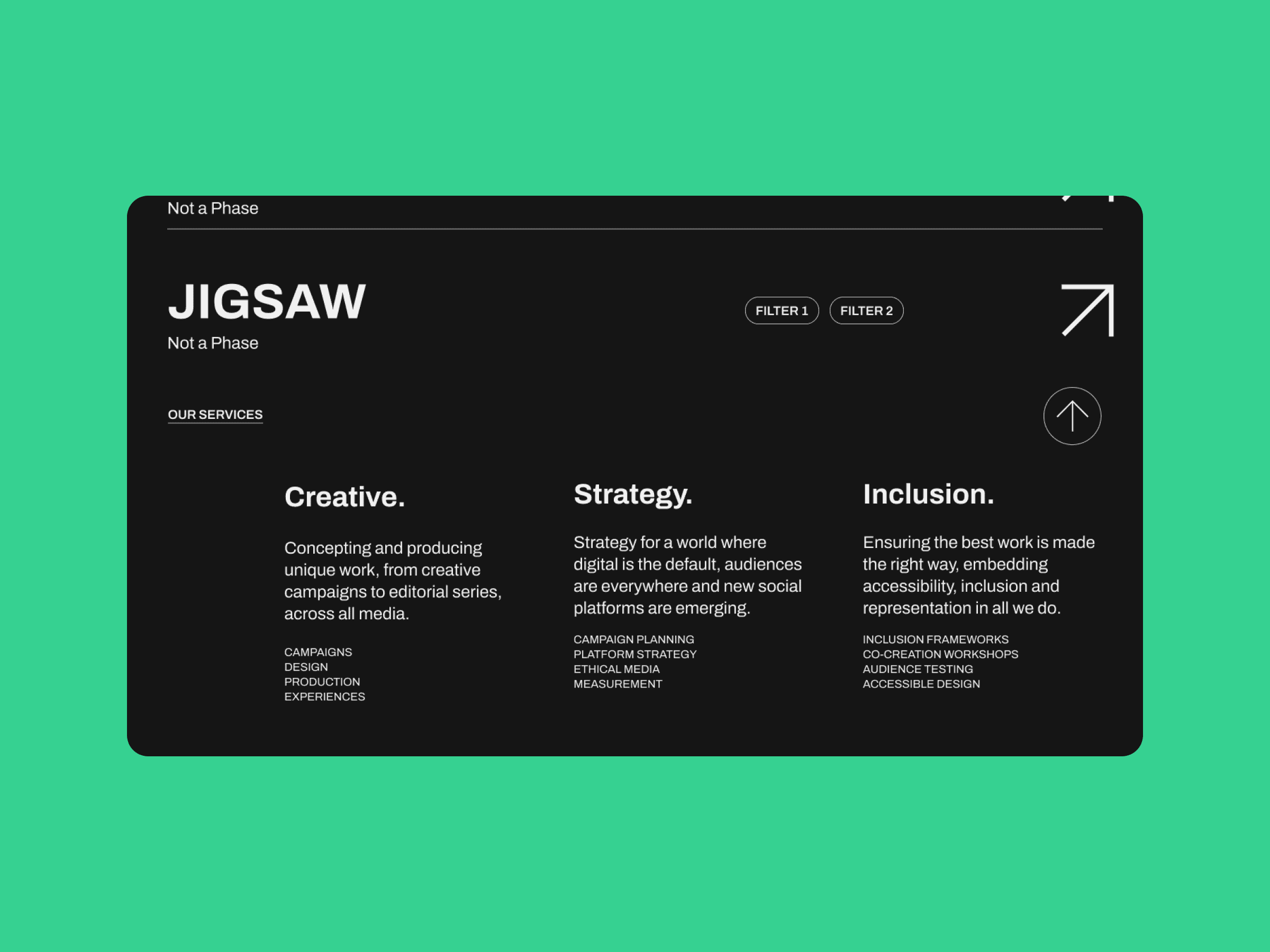
Weirdo came to us with brand guidelines that they were happy with, so our job was to extend this visual identity to a fully operational website. Accessibility was of paramount importance to this client, as Weirdo prides itself on the inclusion of people with varying abilities and access needs. Digitally savvy, they also valued simplicity and high-speed loading times for a satisfying user experience.
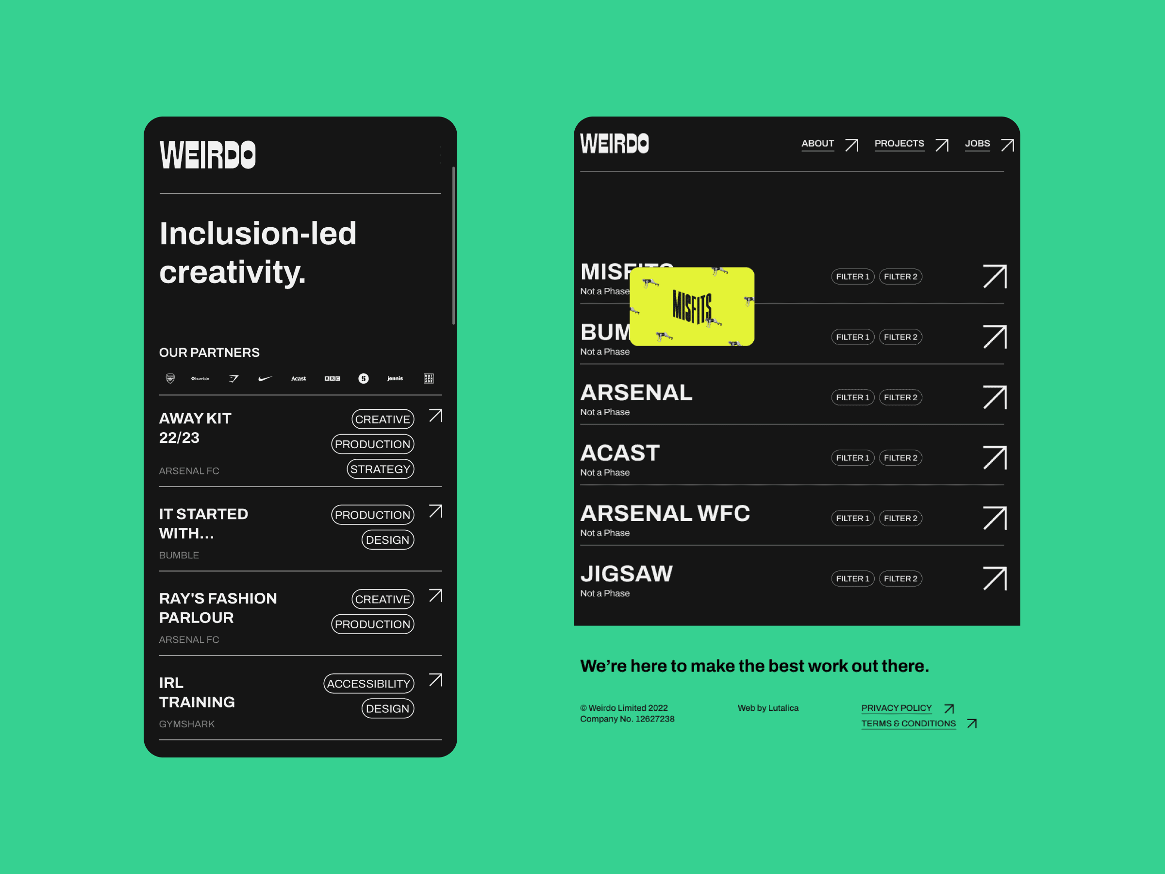
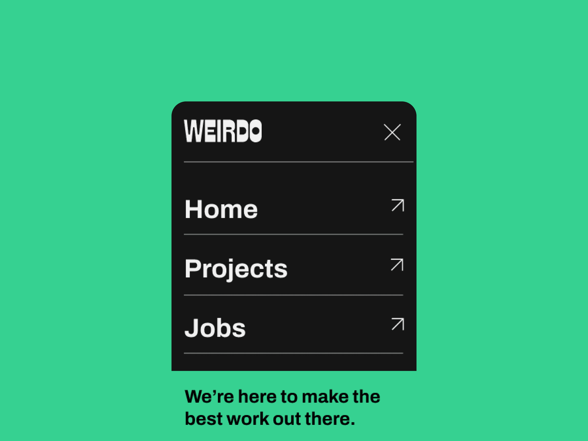
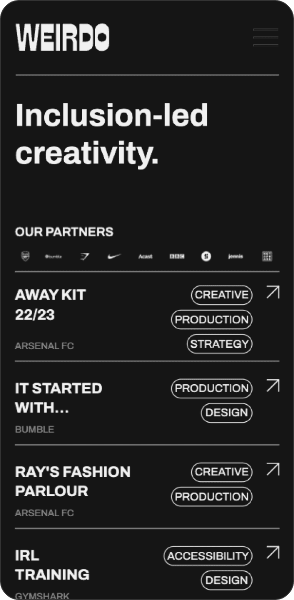
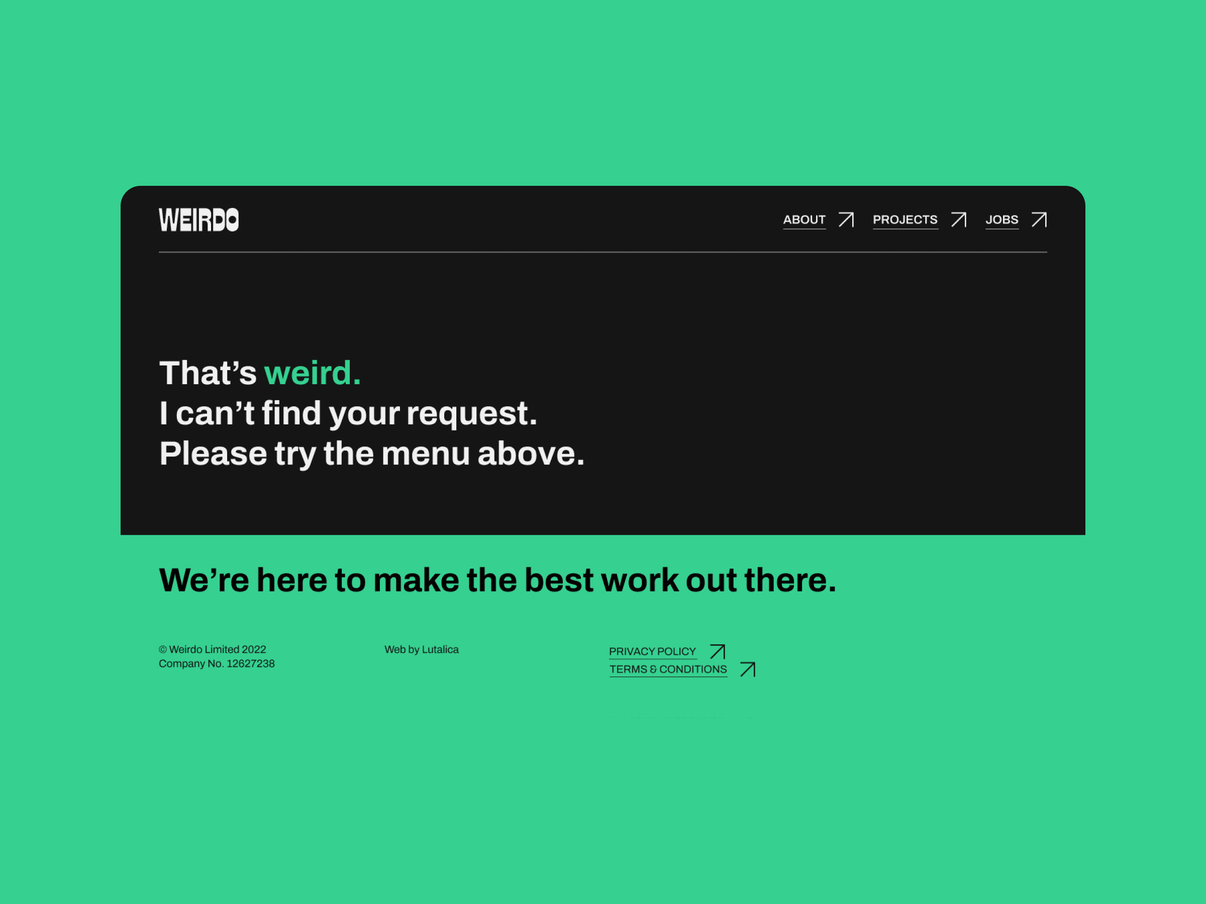
The client wanted the navigation bar to always be clear and accessible. On desktop, the nav bar sits permanently at the top of the screen, and menu options are limited to just three. For mobile, the user taps on the oversized nav bar symbol in the top right corner to see the same options in full-screen.
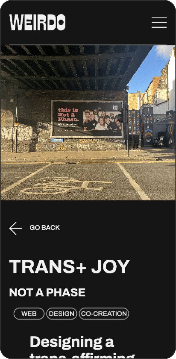
The way the text and images re-size on the mobile version of the site aids accessibility and readability because the focus is narrowed for the user. This means they’re only presented with a quantity of information they can digest within seconds on each screen.