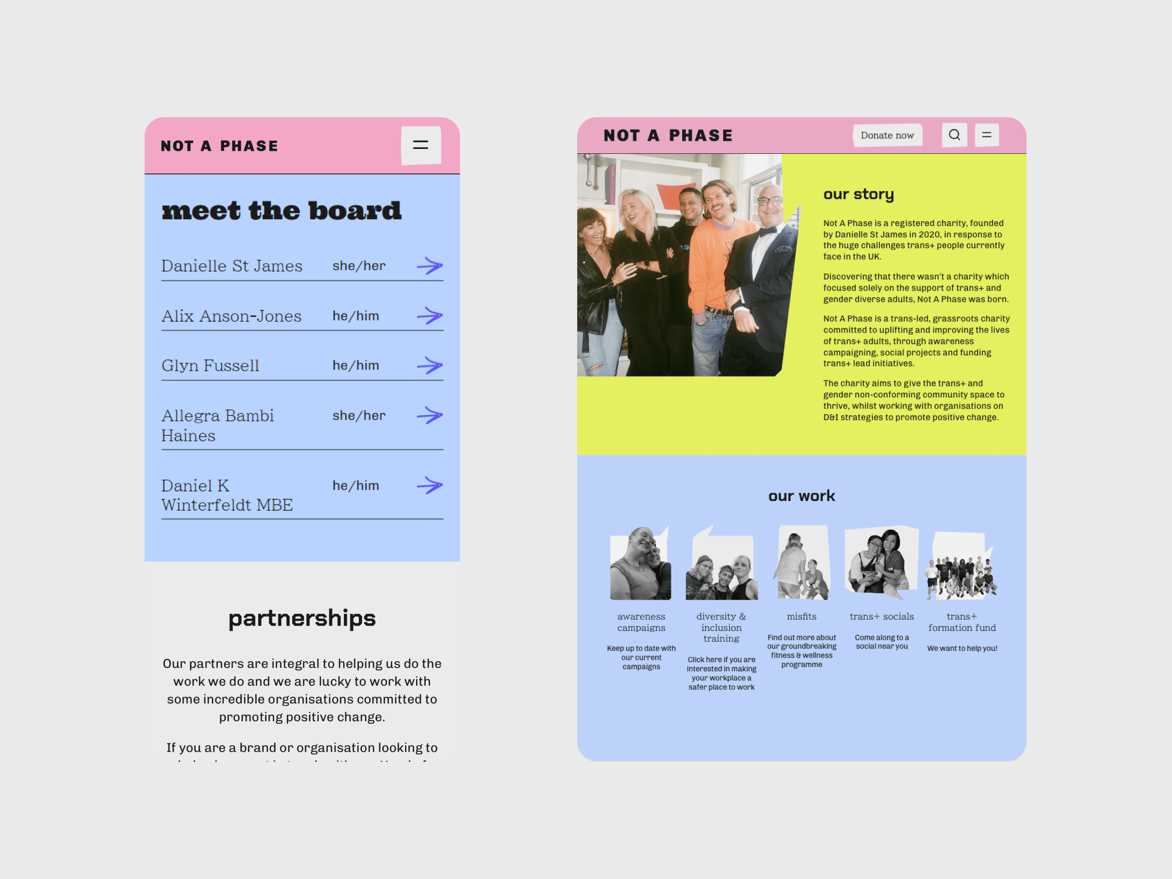
Not A Phase
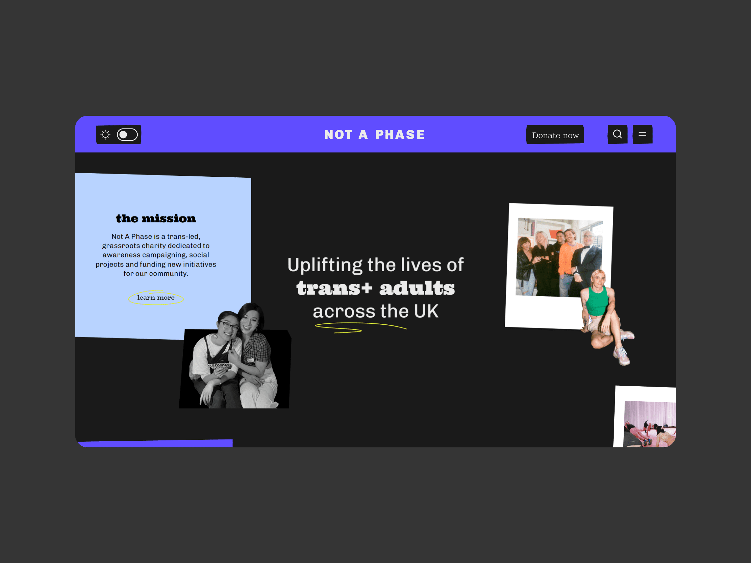
Not A Phase is a registered charity which supports trans and gender-diverse adults. The charity is trans-led and committed to uplifting and improving the lives of trans people through campaigning, social projects and funding trans-led initiatives. In collaboration with Weirdo, we redesigned and developed the charity’s website on WordPress.
Credits
UX Design: Pietro Righini
UI Design: Zoe Tang
Development: Nata Sheketa & Sofiia Bondarenko
Website
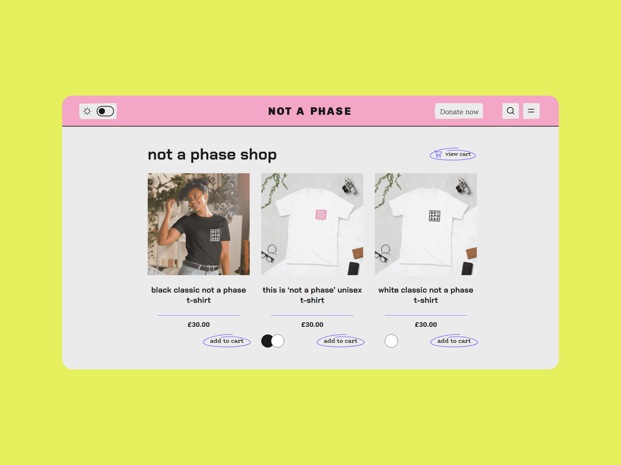
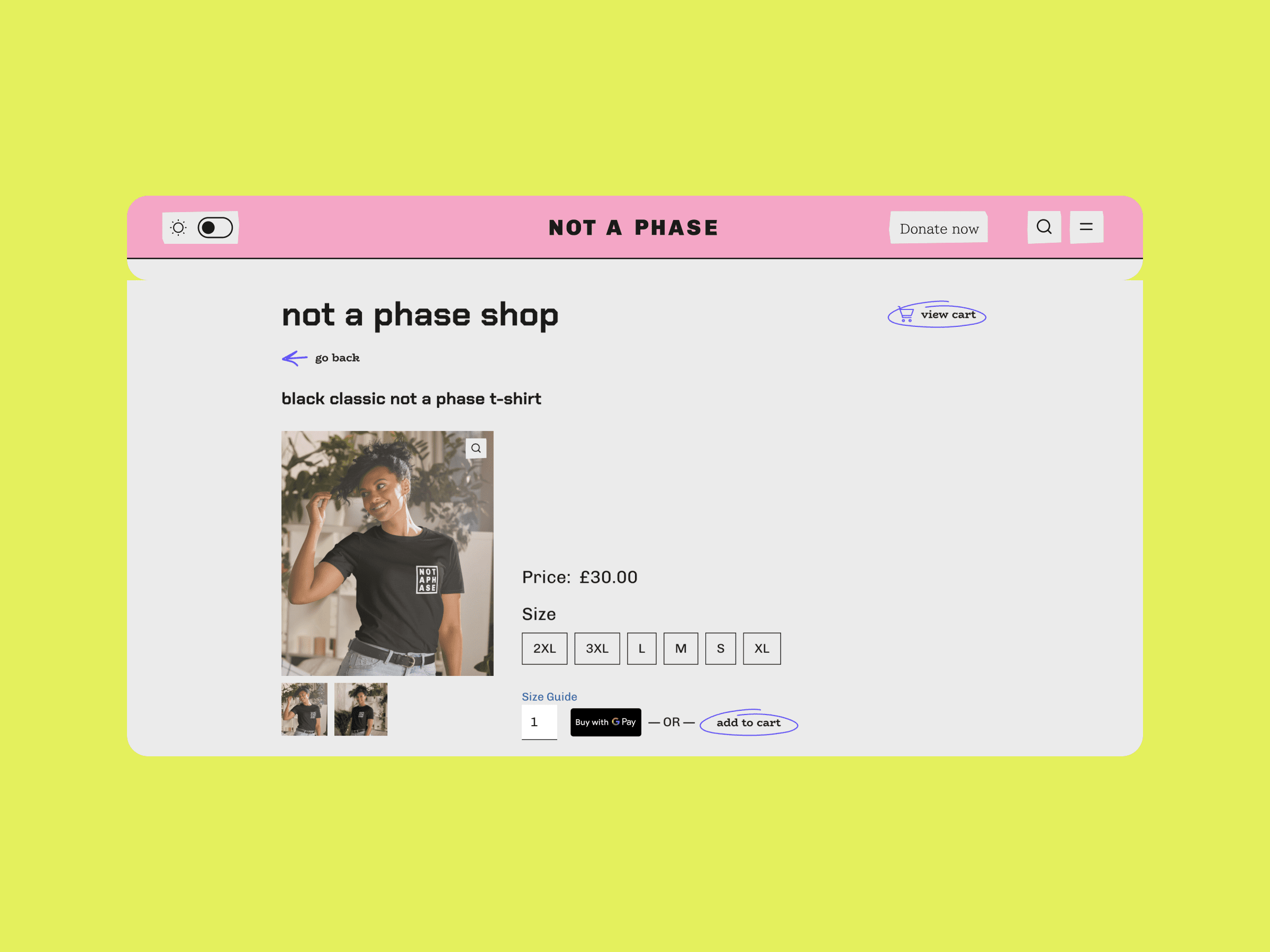
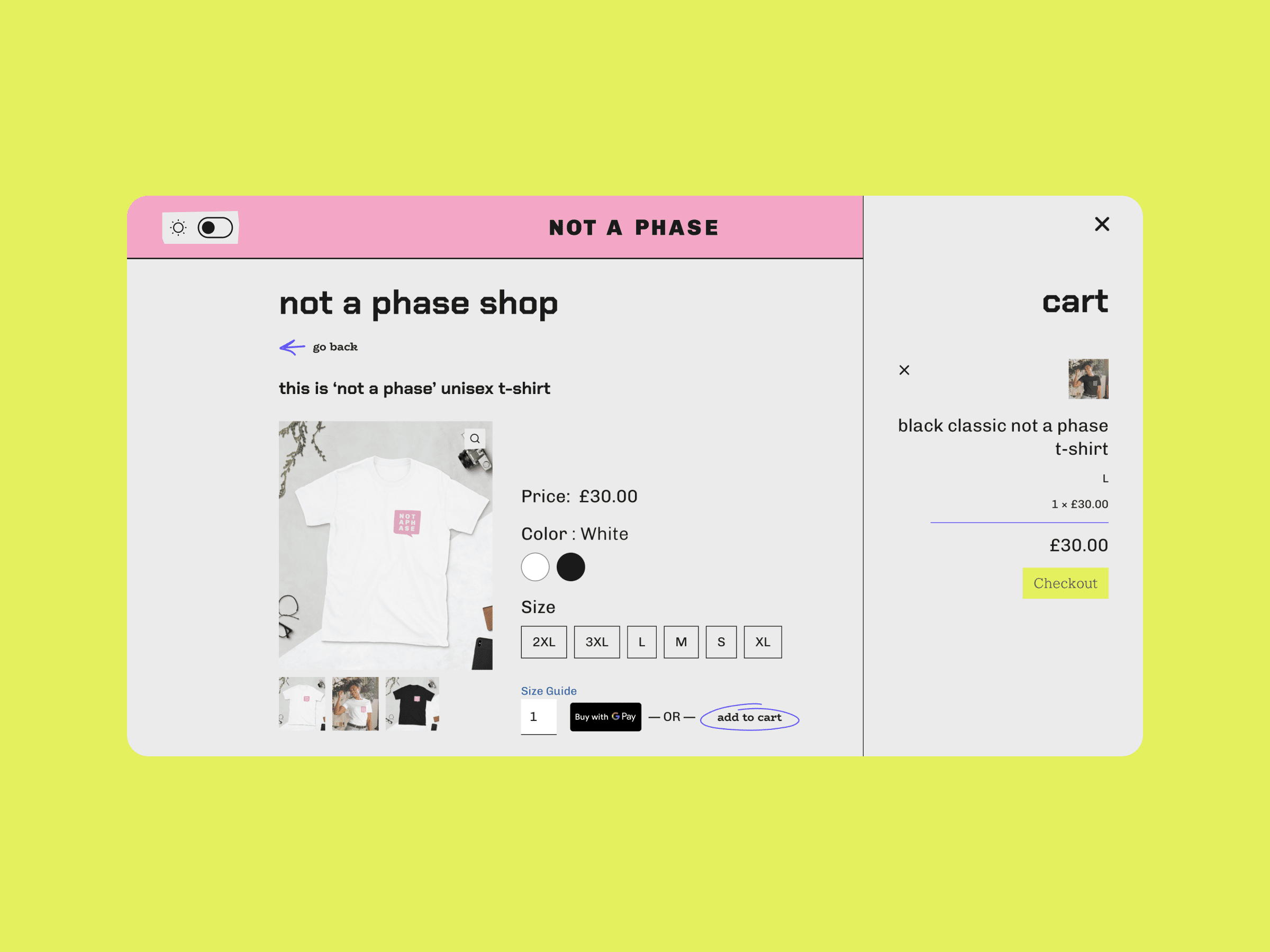
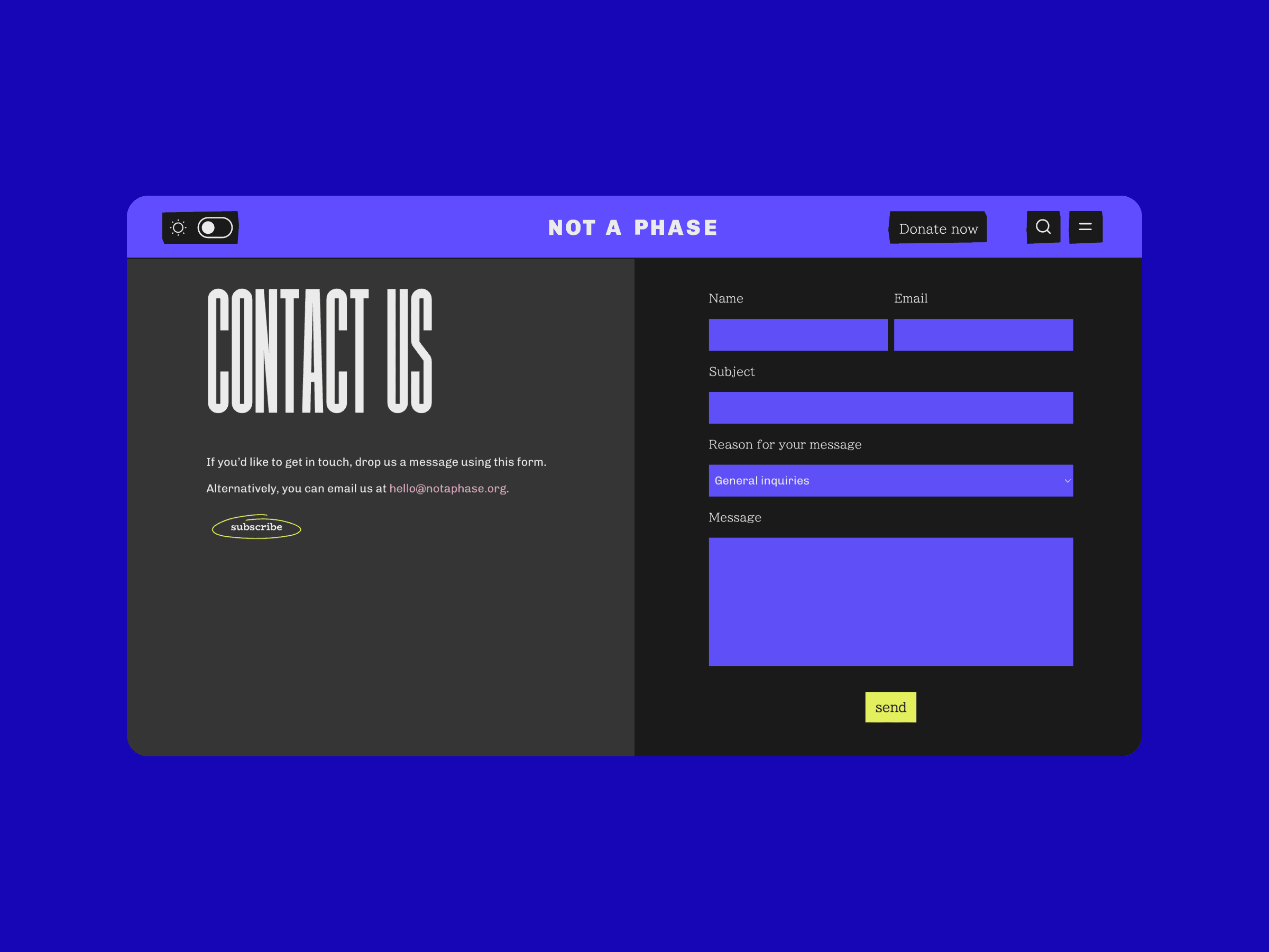
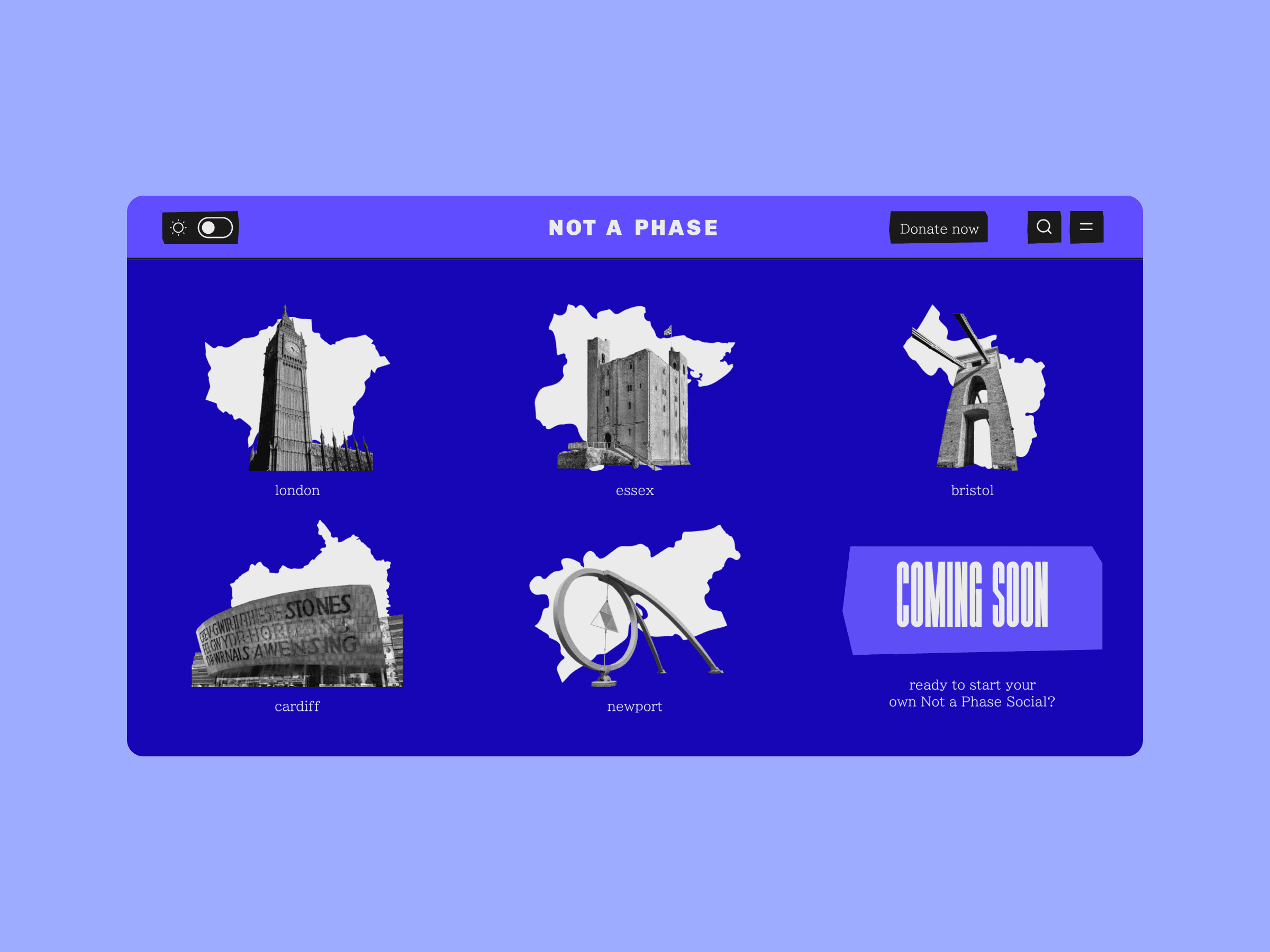
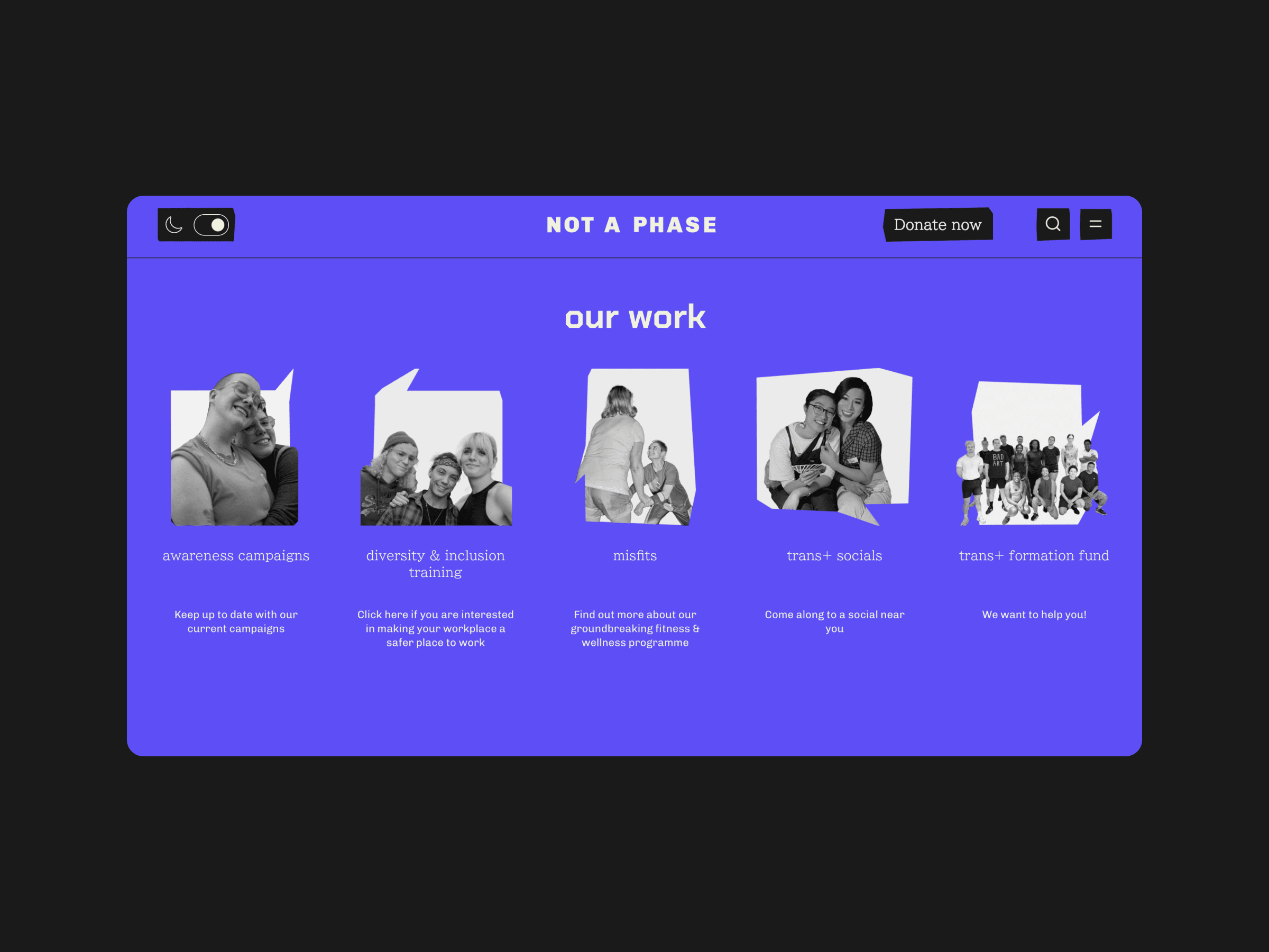
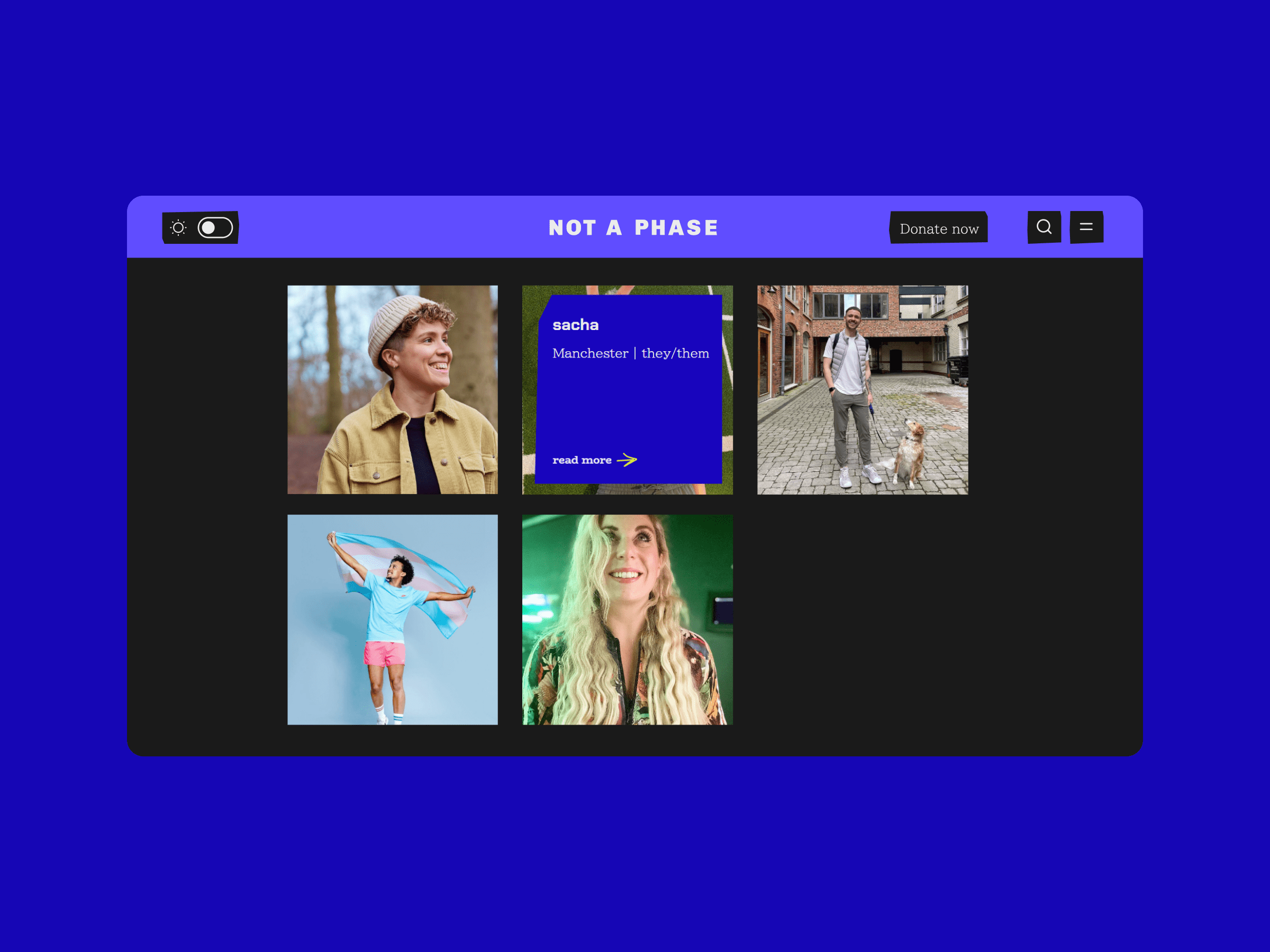
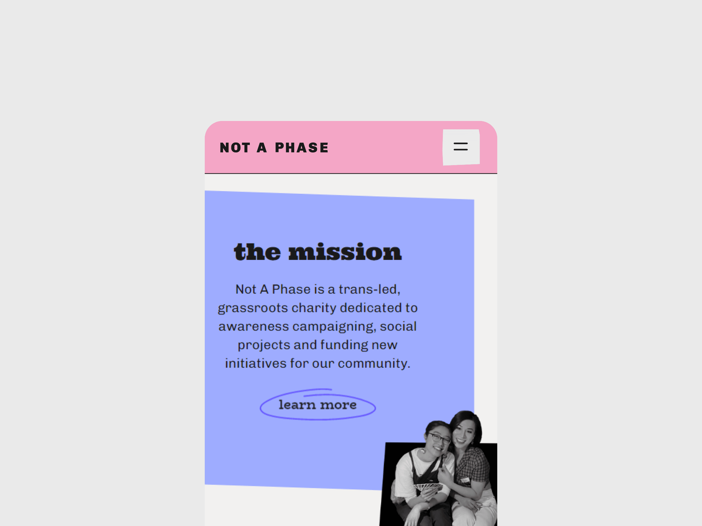
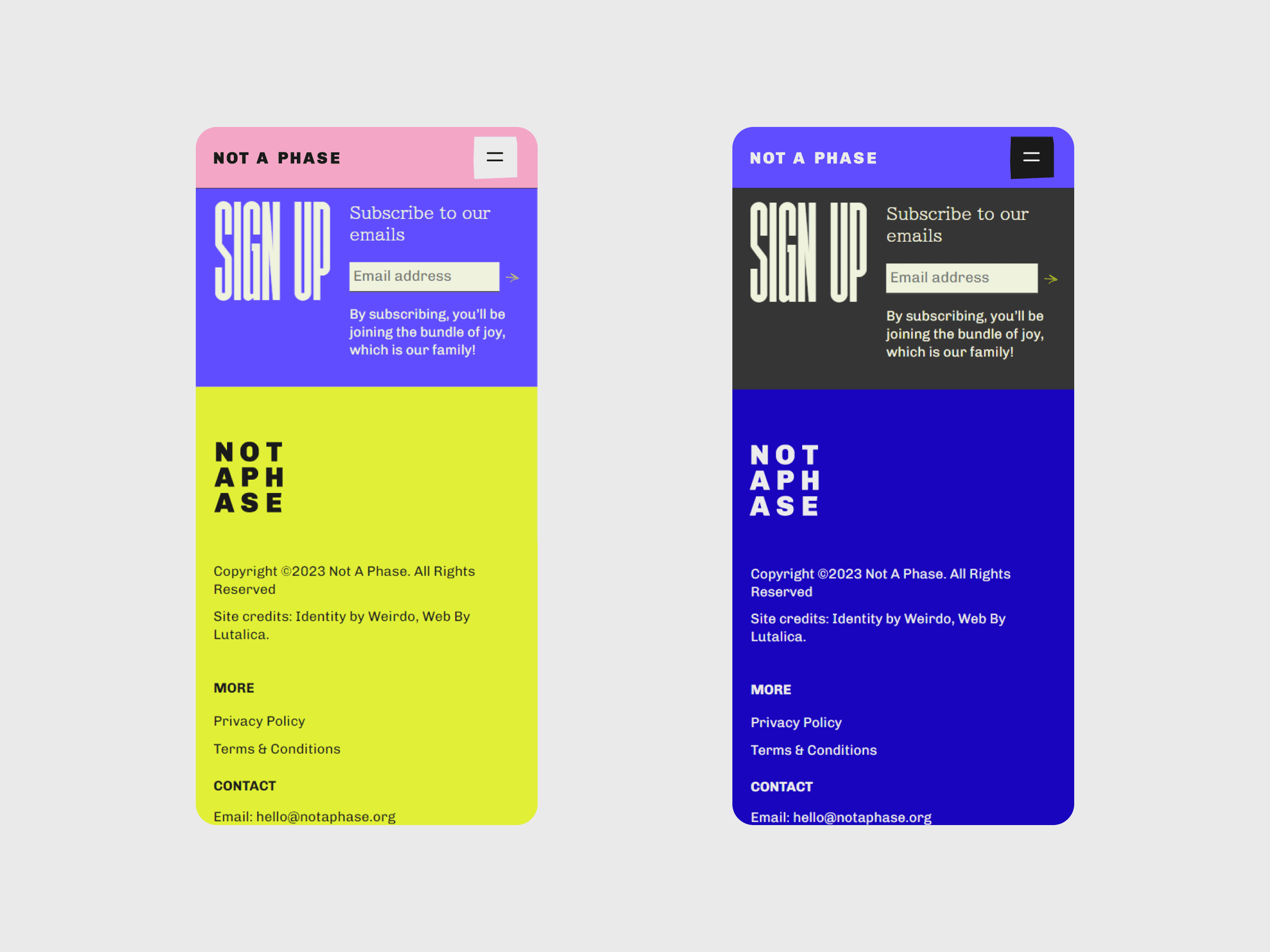
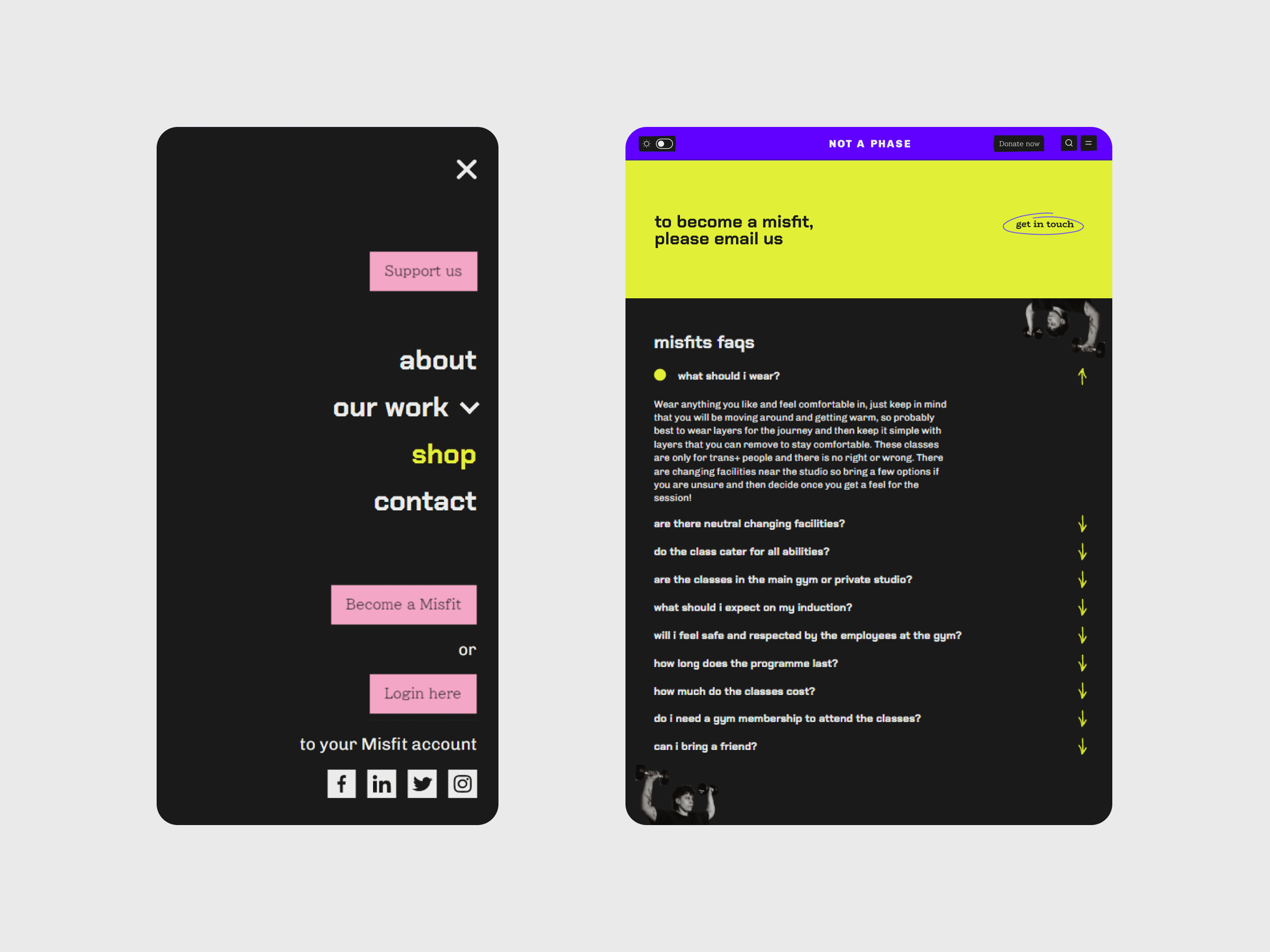
Following the brand guidelines our friends at Weirdo created for Not A Phase, we gave the charity a bright, playful new website full of colour, animation and interactive elements. One of the motifs running through the site is that of a low-fi community notice board, featuring animated post-its and polaroid frames.
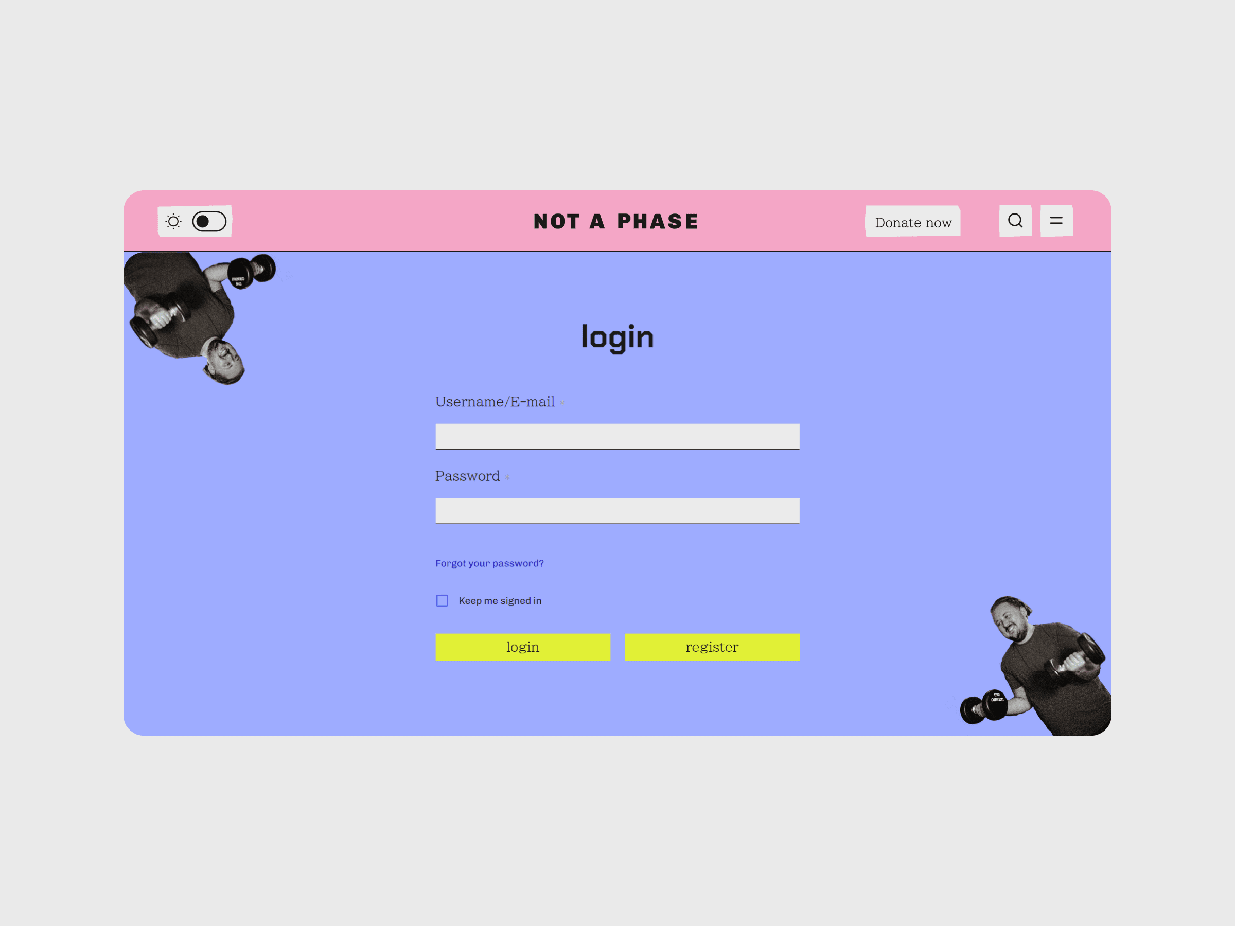
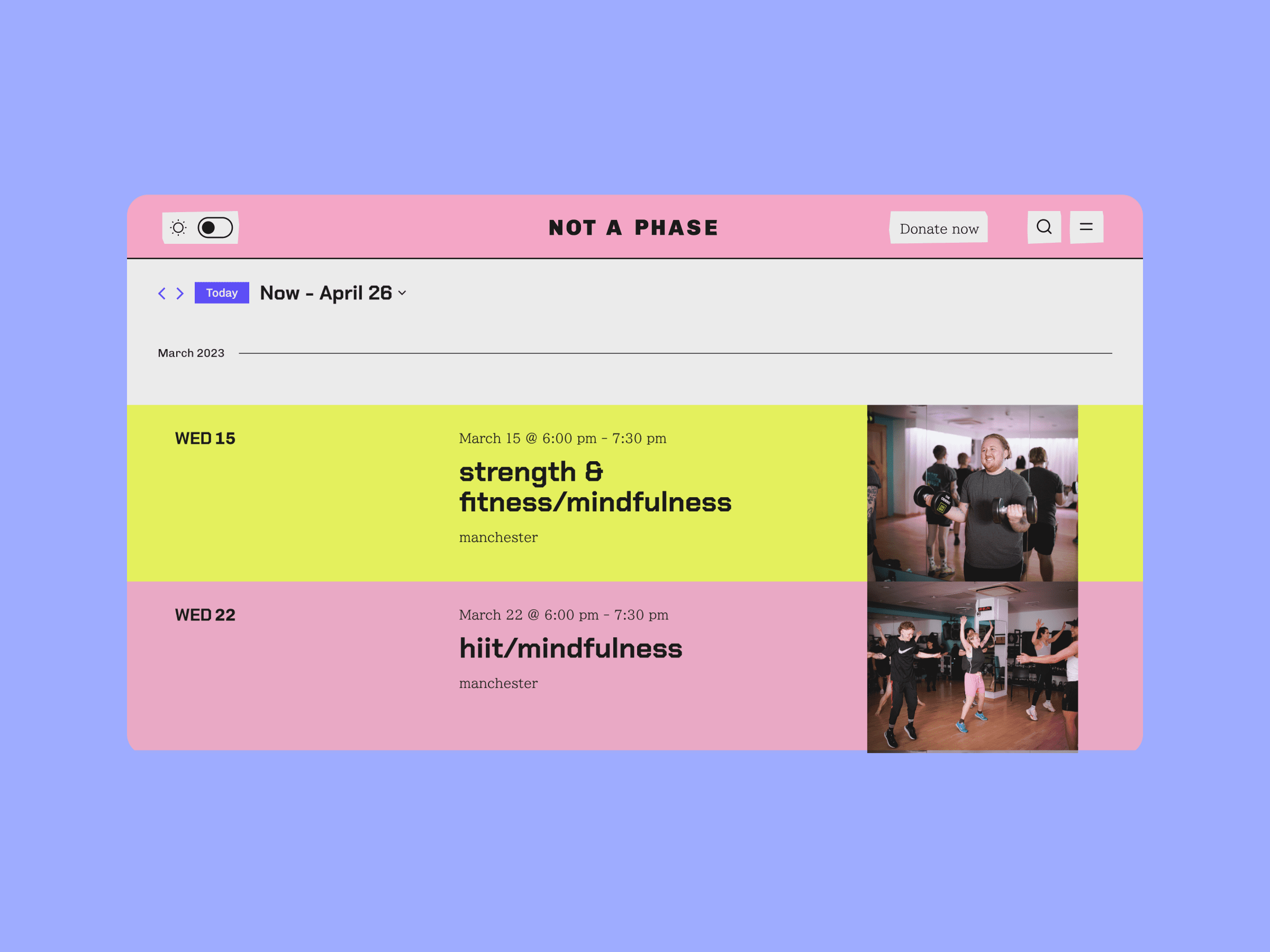
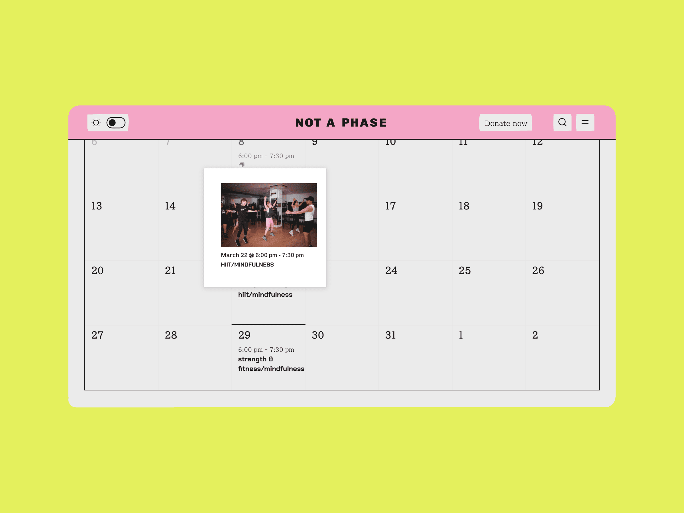
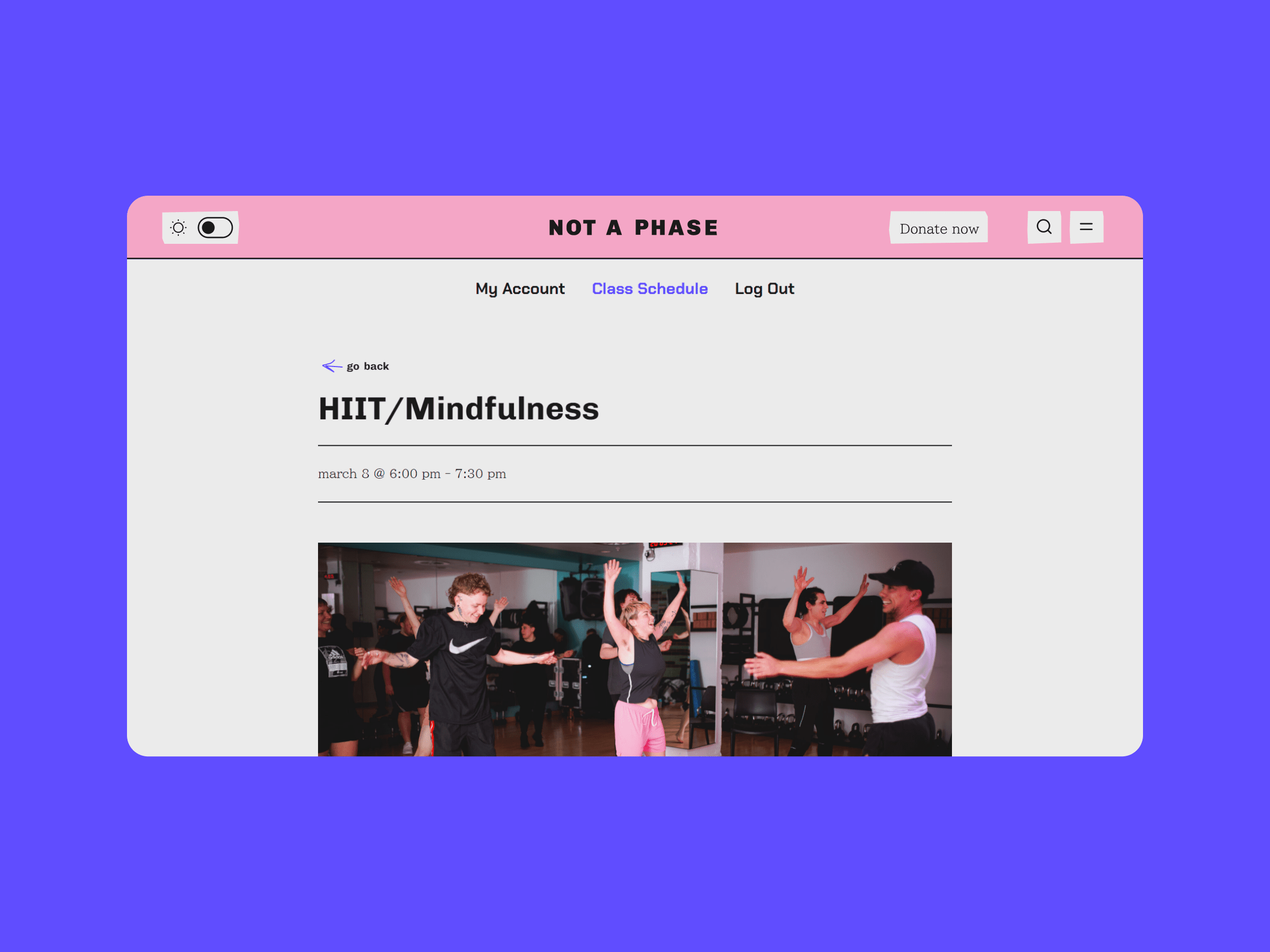
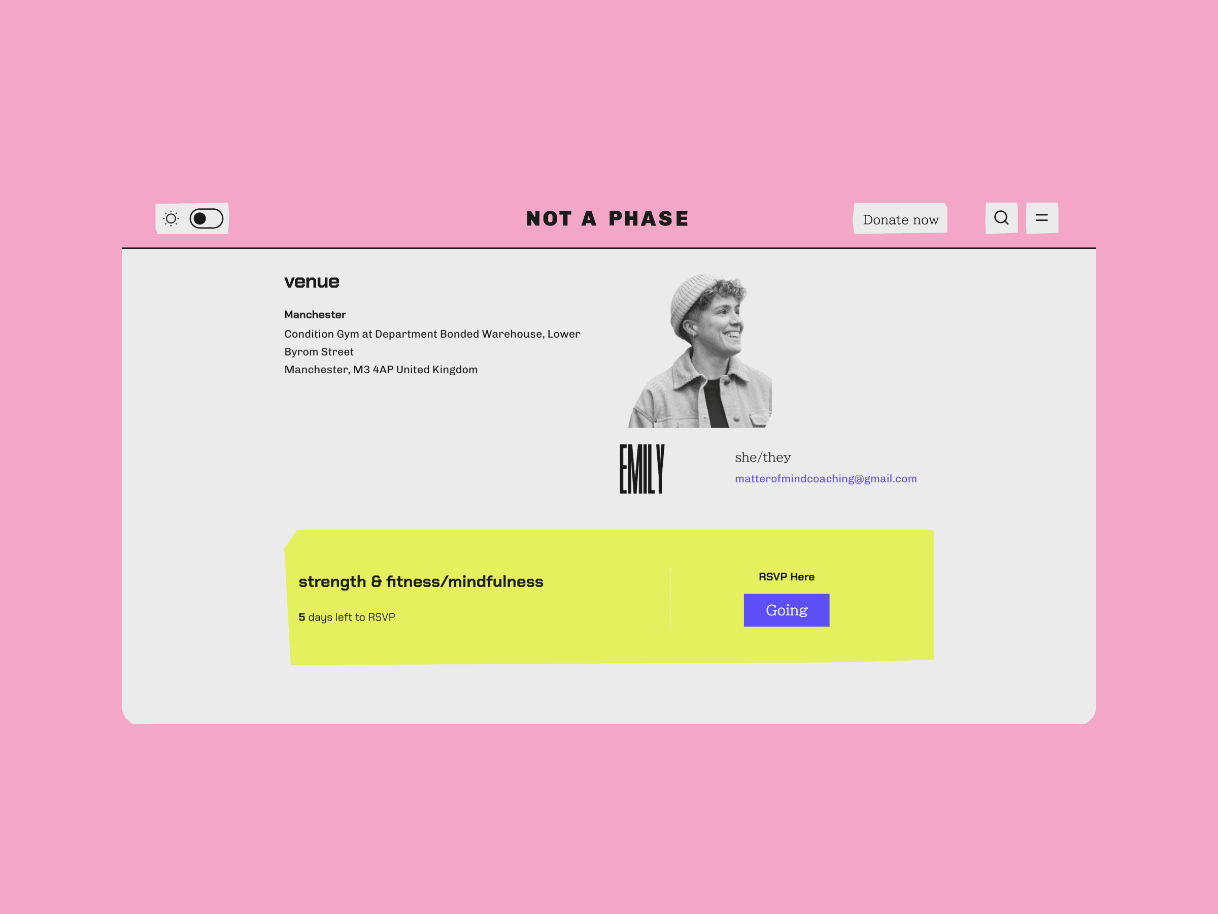
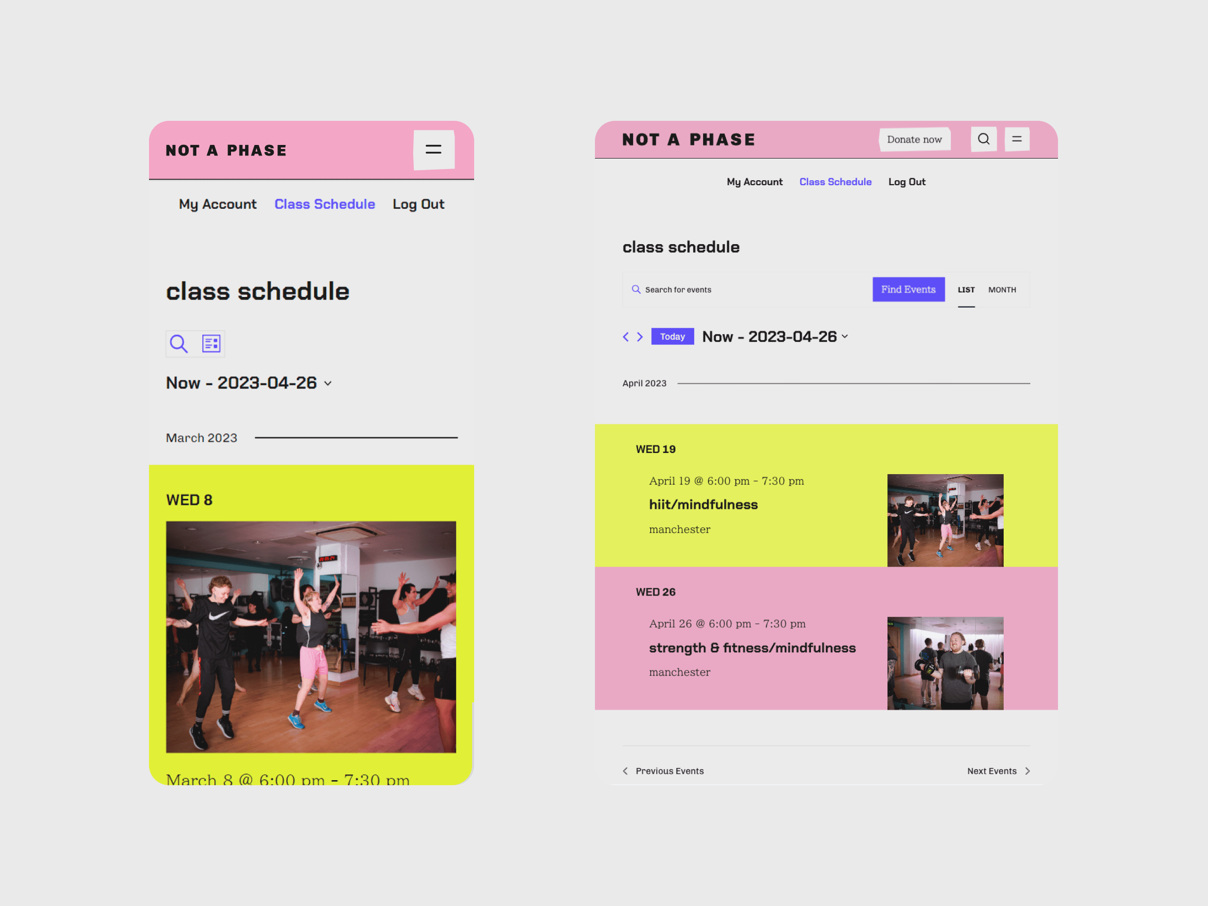
Members' Area
The members’ area was made to be simple, accessible and user-friendly. When a member logs in, they are directed straight to a calendar, which gives them a clear overview of the exercise classes that are on in their city. Members can toggle between a calendar and a full list view of classes, depending on what they find easier to use.