I'm From Driftwood
I’m From Driftwood collect oral histories from people in the LGBTQIA+ community, and share them via their website, YouTube channel and podcast series. IFD’s mission is to tell LGBTQIA+ people around the world that ‘you exist, you matter, you belong.’ We re-designed and developed IDF’s website, and created a new visual identity for the organisation.

Credits
UX Design: Katie Gee
Branding and UI Design: Cecilia Righini
Development: Sofiia Bondarenko
Brand Refresh
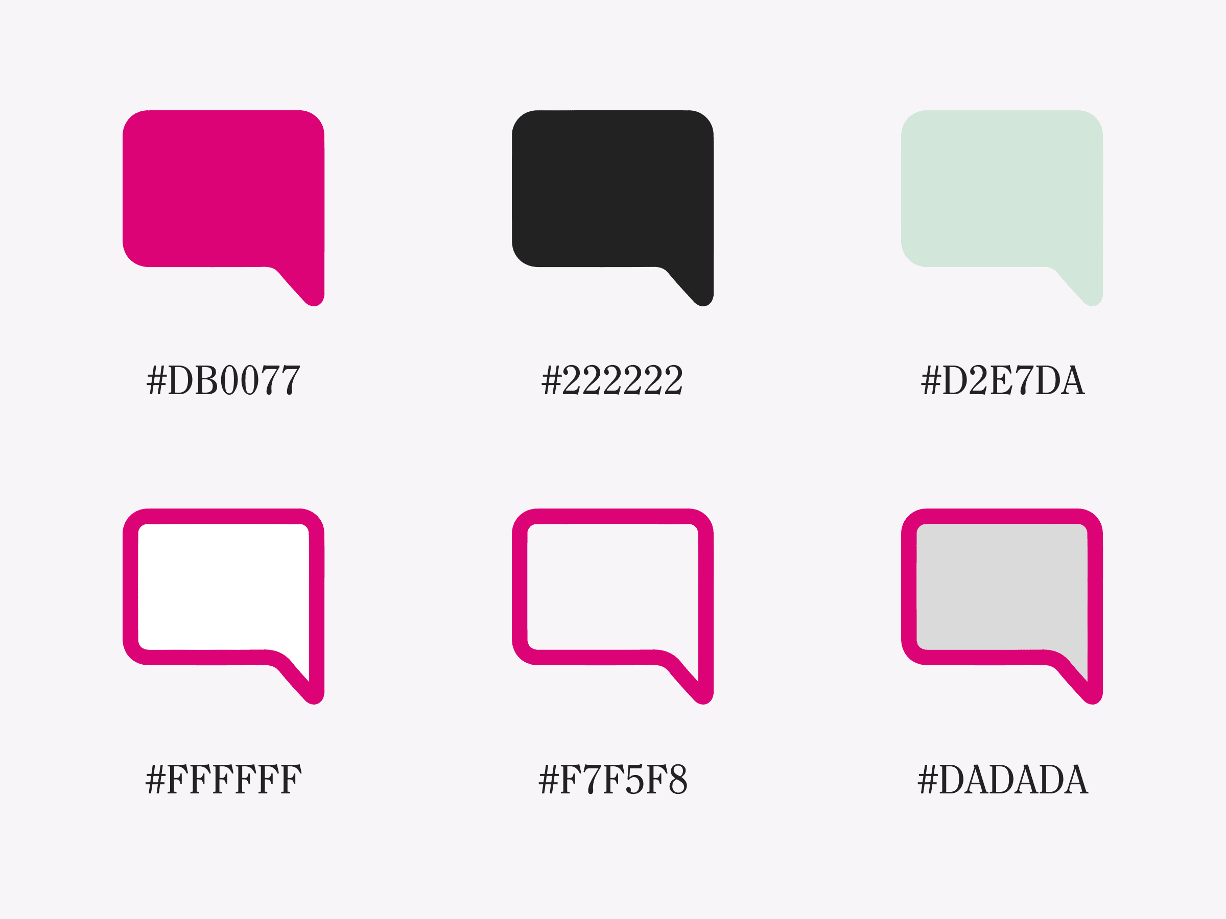
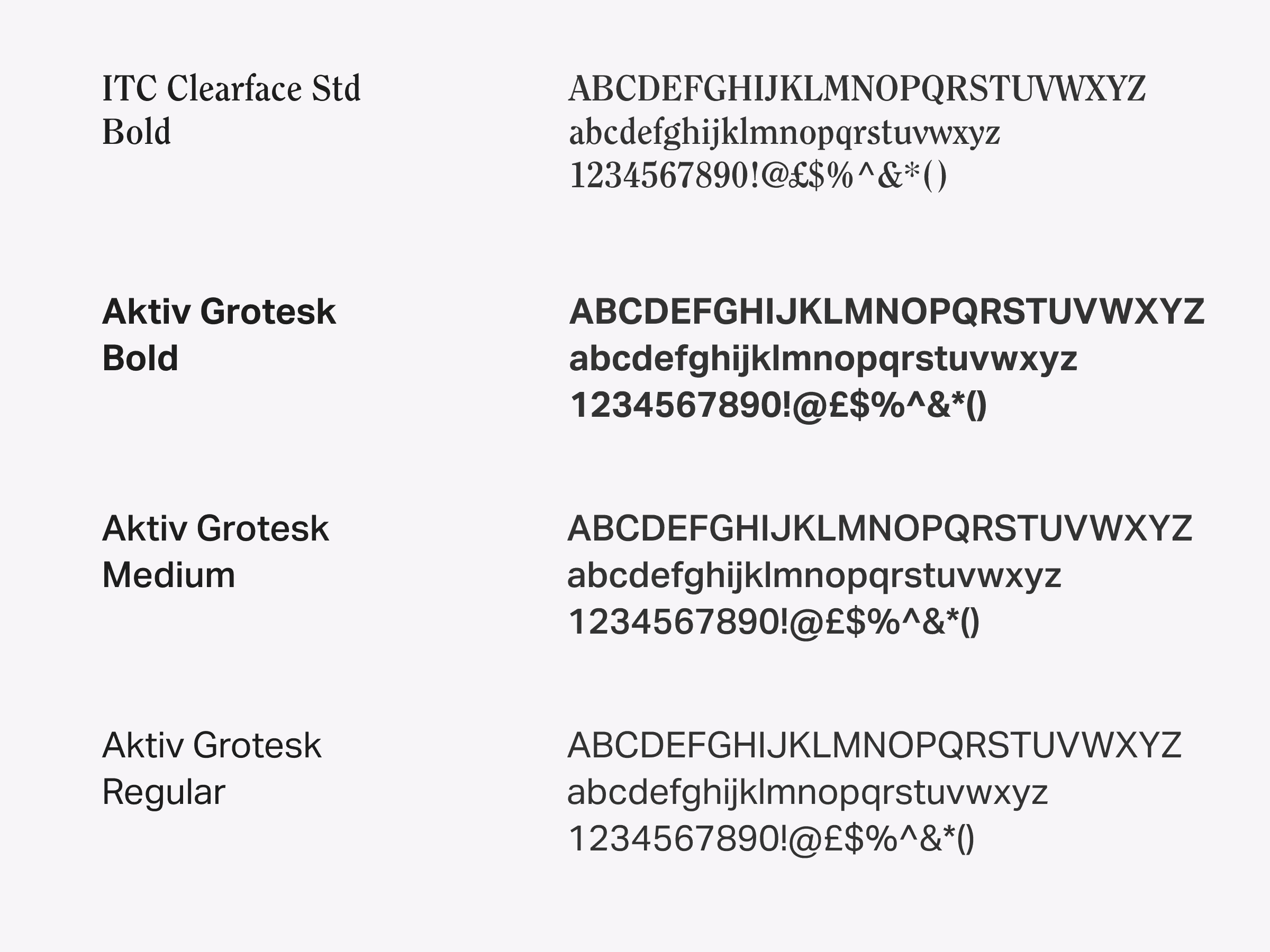
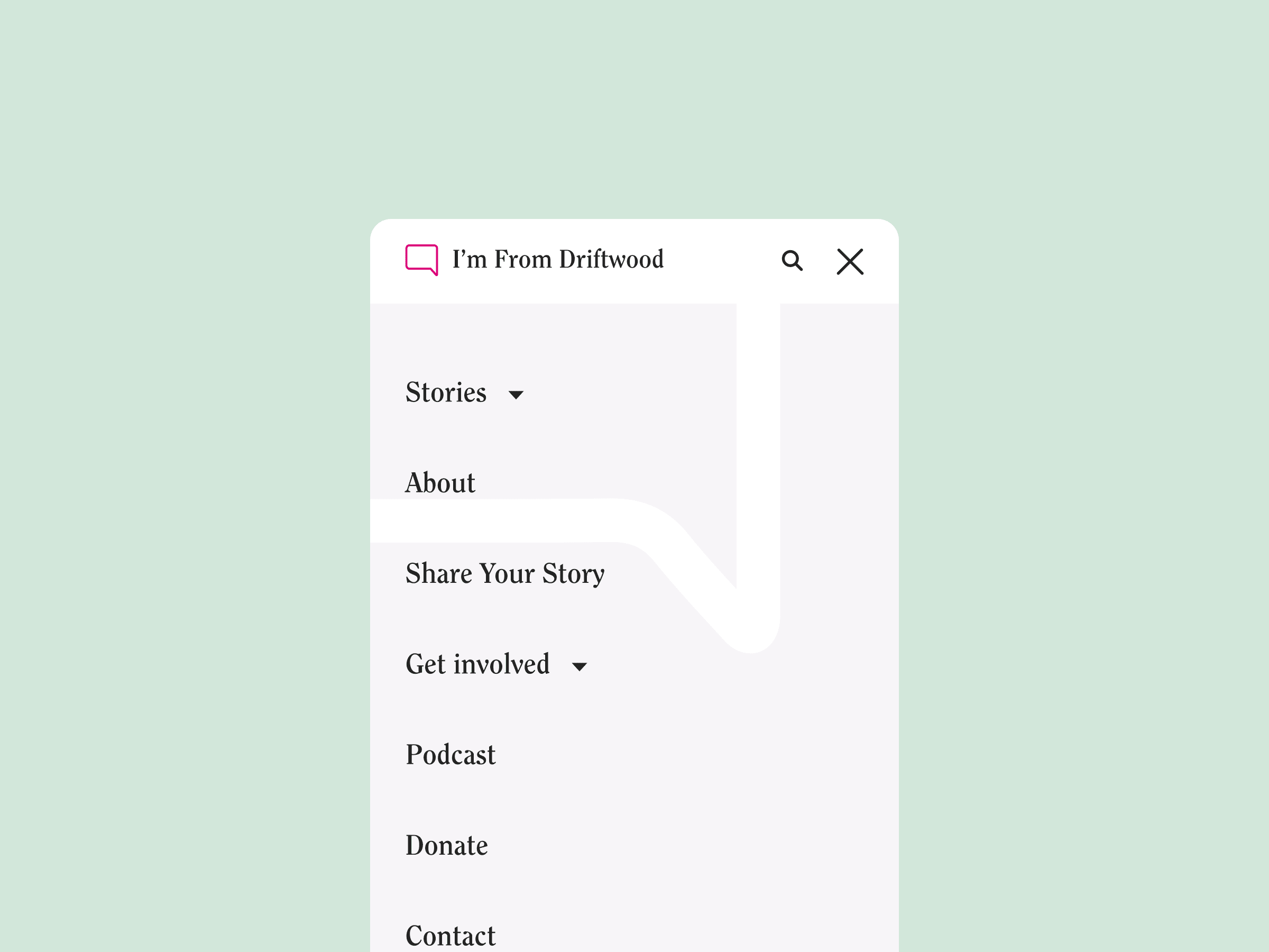
We created a responsive logo for I’m From Driftwood, incorporating elements from the previous logo design. The full logo consists of a geometric speech bubble, outlined in hot pink, and the two brand fonts: ITC Clearface, a serif type with marked stroke and italic weights, and Aktiv Grotesk, a clear, accessible sans-serif typeface. We updated the logo with more contemporary shapes, new fonts, and a new layout, but kept the white space in the square, which represents the space left for people to tell their stories.