
Branding
Branding is about creating an identity for you as an individual, organisation, or business. It’s your route to connecting with your audience and staying in their minds. More than skin deep, good branding is about expressing who you are and what makes you unique. Studio Lutalica has a proven track record of delivering impactful branding and rebranding projects.
Our team includes experts in communications, design, and community engagement. We ensure your brand not only looks good but also resonates with your audience. We’ve worked on projects across four continents, bringing a global perspective to our work. Our brand designers live in Edinburgh, London, France, and beyond, ready to help you transform your brand.
Crafting Your Unique Identity
Your logo is the core of your branding. It should be strong and unique enough to represent your entire enterprise.
Fun Fact: The word “logo” comes from the Greek ‘logotype,’ which translates as ‘word speech.’ In practice, logos are more like ‘pictorial word speech.’ They’re most successful when the name of the brand springs immediately to mind, like Nike’s tick or McDonald’s golden-arched M.
At Studio Lutalica, we create responsive logos. This means we’ll design variations of your logo for different use cases.
Our process starts with the main canonical logo for your brand. From there, we create a series of logos for different specifications – variations featuring your brand name, simplified versions for icons, black and white versions, and alternative colour formations.
During the logo design process, we consider where your logo might be used. Will it be your Instagram profile picture? Your App logo? Will it feature on products you create? Your logo, typography, and colour palette are closely intertwined, so we recommend developing each in tandem for the best results.
Typography is a field of design in its own right, and we are huge typography geeks. Fonts give an immediate sense of your brand identity. There are also important accessibility and practical considerations when choosing your brand fonts.
If you need a bold and unique font for brand recognition, we may source a custom font for you. Custom fonts can help you stand out in a crowded market. However, they also come with licensing rules that you’ll need to factor into your budget.
To determine if a custom font is right for you, we’ll ask about the platforms you use and the number of people applying your branding. For example, if you create a lot of Google Slides presentations, we might recommend a compatible Google font. If your branding is primarily used by a limited number of people on custom designs, such as your website and in print, a custom font could be the way to go.
We won’t just pick your fonts and send you on your way. We’ll create a document with rulesets defining your typographic style.
The tone, selection, and number of colours in your brand palette help create a mood and a defined aesthetic. For example, a vintage furniture company might use muted tones to suggest age or bright neons to upend convention.
Books have been written about colour psychology and the significance of colour in art and culture. Colours can convey meaning and build connections between people and things.
We consider accessibility as much as colour psychology and aesthetics. For your website, social channels, and other communications to function, they need to be legible. If your audience can’t easily understand what you’re putting out there, you’re limiting yourself to gimmicks.
The degree of contrast between colours impacts readability. Colour contrast is crucial on digital platforms, where the eye is already strained, but it’s also key for print and editorial design. We check our designs against the official WCAG (Web Content Accessibility Guidelines).
Current guidance recommends a 4.5:1 level of contrast between background and small text, and a 3:1 level of contrast between background and big, bold headlines. Research suggests that particular colours and colour palettes affect people with different access needs in different ways. For example, some dementia sufferers find solid black off-putting as it can be perceived as a recess (Alzheimer’s Society, 2023). Some people with autism find stark contrasts and jarring palettes overstimulating and anxiety-inducing (National Autism Society, 2023). We consider your end user and their needs at every stage of the design process.
How do you speak to your audience? This says a lot about who you are as a brand. Some clients come to us with a vague idea of their tone of voice, but specifics may differ between team members, resulting in a mismatch.
Discovering how you want to be perceived by your audience and how you want to make them feel is the first step in creating your tone of voice guidelines. Our copywriters then lay out practical steps to help you and your team convey this in your communications.
The way you speak on a mass communication level, particularly on your website and social media platforms, is key to connecting with your audience. Every email and tweet is a chance to show who you are and what you stand for.
The way you communicate one-on-one impacts the relationships you have with customers, clients, readers, and anyone you contact. That’s why we need to understand who will be using your tone of voice guidelines before we generate them. Is this just for you or a small number of external communicators? Do you have a customer service team for whom tone of voice guidelines will be part of their training? Whatever your needs, we’ll create usable documents for you to create a strong tone of voice across platforms.
Consistency is key to a strong brand. With this service, we’ll deliver a Brand Book – a document with easy-to-follow specifications so anyone creating assets can carry out your brand personality effectively and consistently. The Brand Book includes:
- Responsive Logo: Guidelines on how to best apply your new logo in various formats.
- Colour Palette: A flexible colour palette and usage guidelines.
- Typography: Selection of typefaces and how to use them.
- Brand Assets: A set of visual/graphic elements for digital and print use.
- Tone of Voice: A guideline that defines a clear tone of voice for your brand.
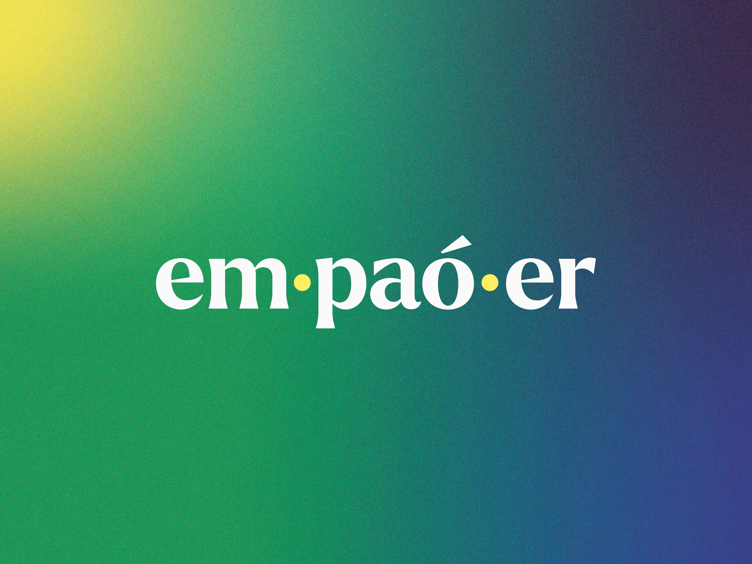
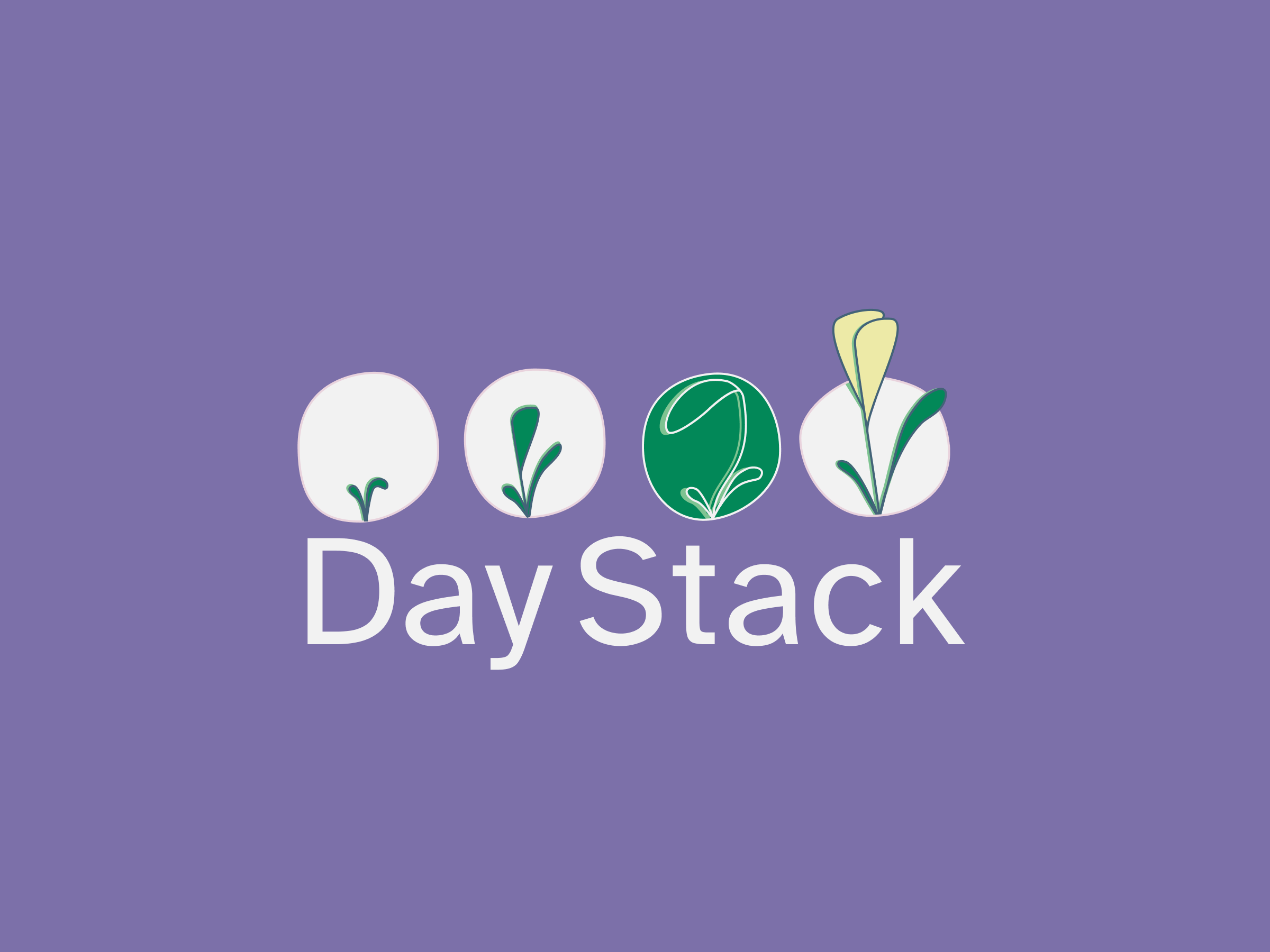
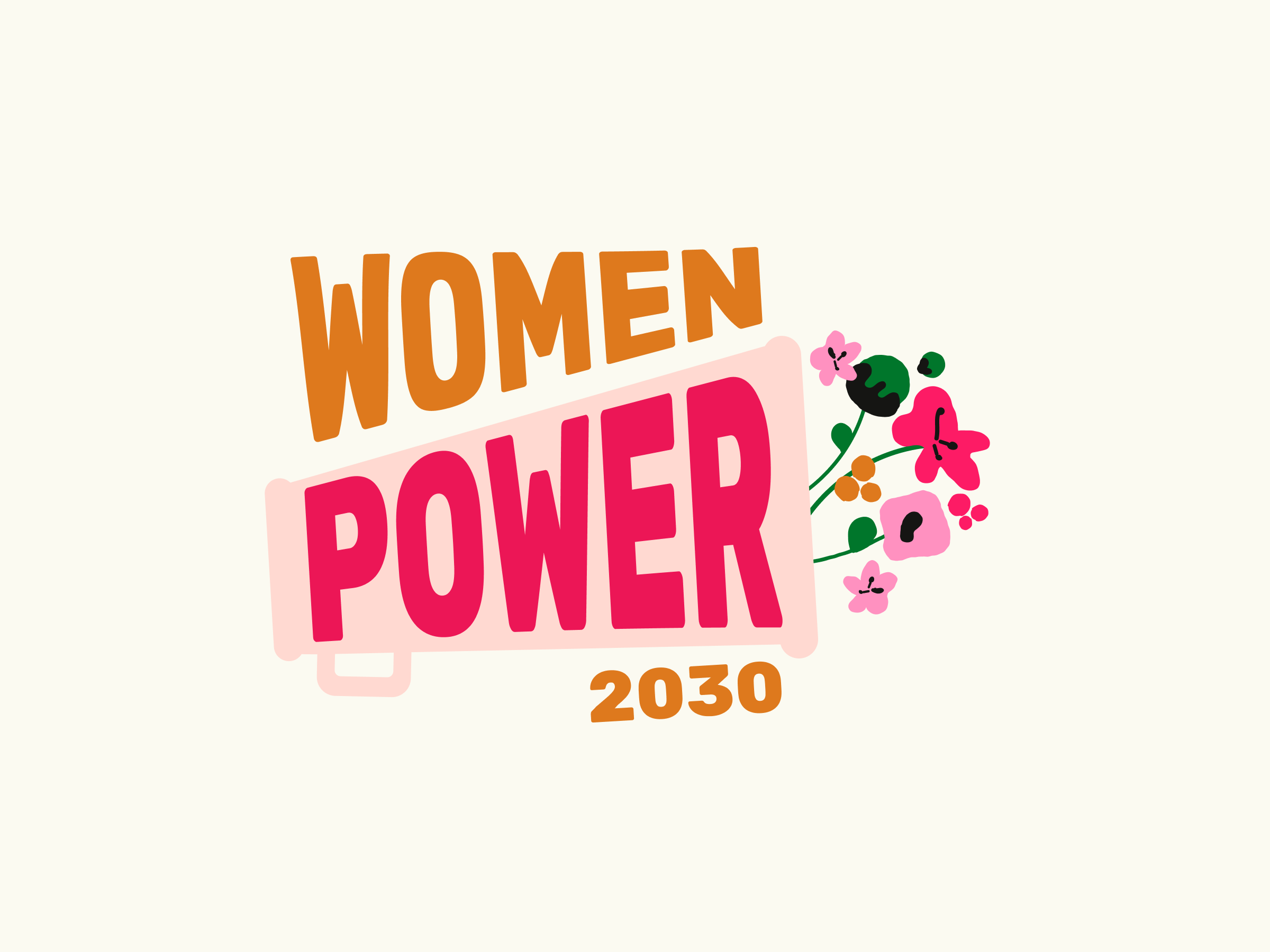
Selected Branding Work
We need to understand exactly who you are and what makes your brand unique, so we can develop a visual identity that will convey that in a competitive market. We’ll send over some discovery questions to get your creative choices flowing and then invite you to an interactive workshop, where we’ll tease things out further. Following the workshop, our branding team will send over a series of moodboards to give you a flavour of the different directions that the project could go. Take your time to look over these and don’t be shy about giving us feedback.
Our team will use everything we’ve learnt to create initial concepts for your re-brand. Usually, we begin with iterations of a logo, colour palette and typography, and move on to graphic elements, photography, frames, etc. as appropriate. At every stage of the branding process, we’ll ensure that the visuals properly communicate who your organisation is and what you stand for.
We’ll touch base with you as we develop and refine the branding deliverables, factoring in your comments, concerns and suggestions, to ensure you’re as happy with the final product as we are.
Our branding process concludes with the delivery of a comprehensive Brand Guidelines Document. Here, we’ll clearly lay out all of the information you need to apply your branding across your website, print and digital assets, presentations, social media, and so on. Depending on the project scope, the final document will include:
- Responsive Logo: A guide on how to best apply your new logo, which will have a few variations, so you can select the best format, depending on size and context.
- Colour Palette: A flexible colour palette and guidelines on how to use it.
- Typography: Selection of typefaces and how to use them.
- Brand Assets: A set of visual/graphic elements to use across digital and print.
- Tone of Voice: A guideline that defines a clear tone of voice for your brand.

READY TO chat?