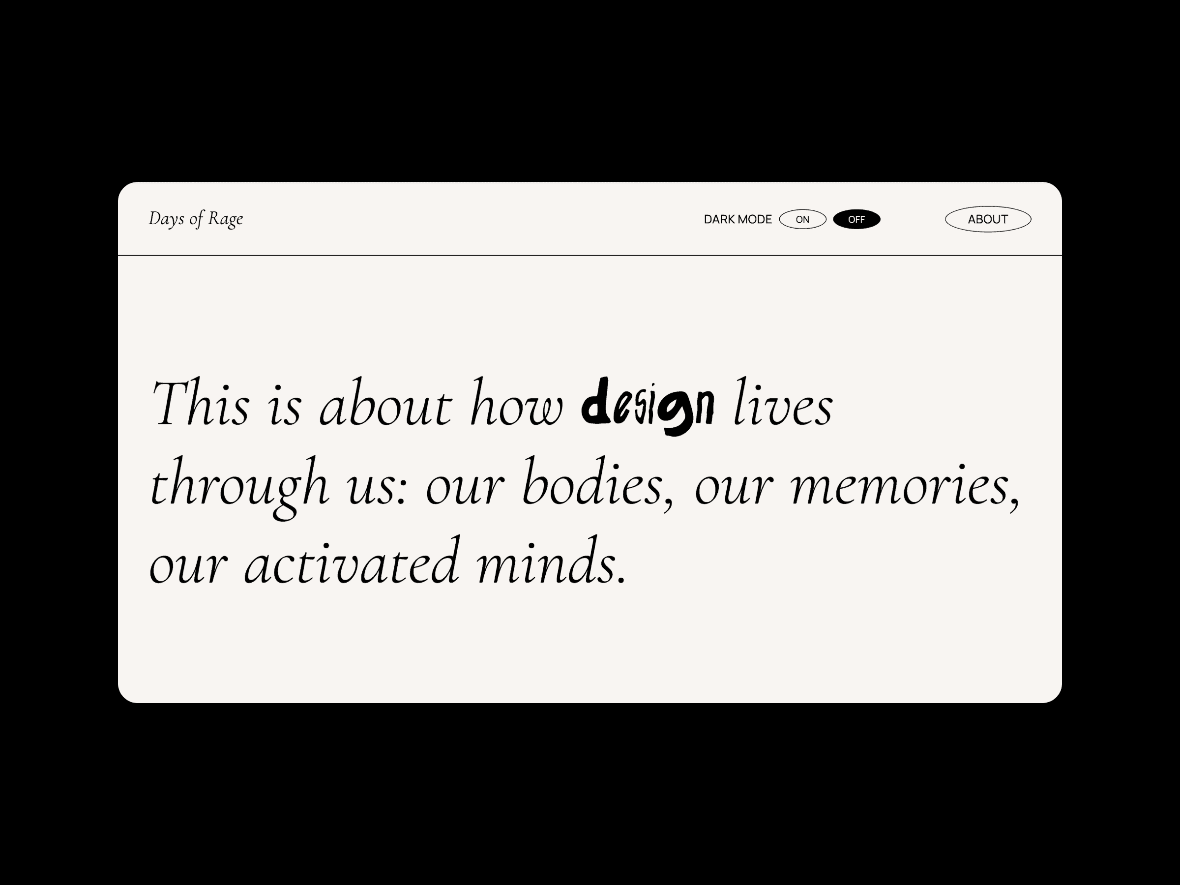
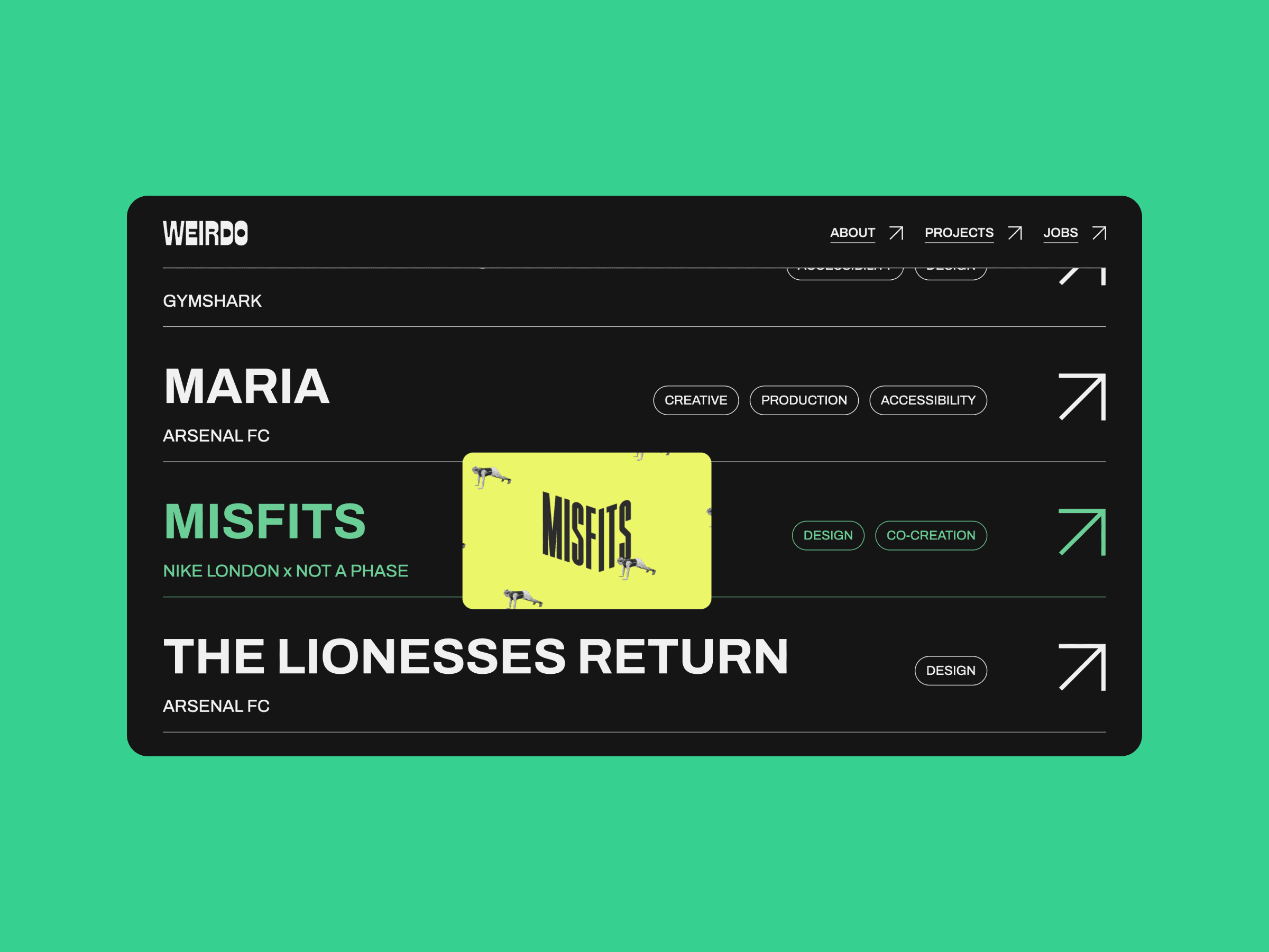
Work
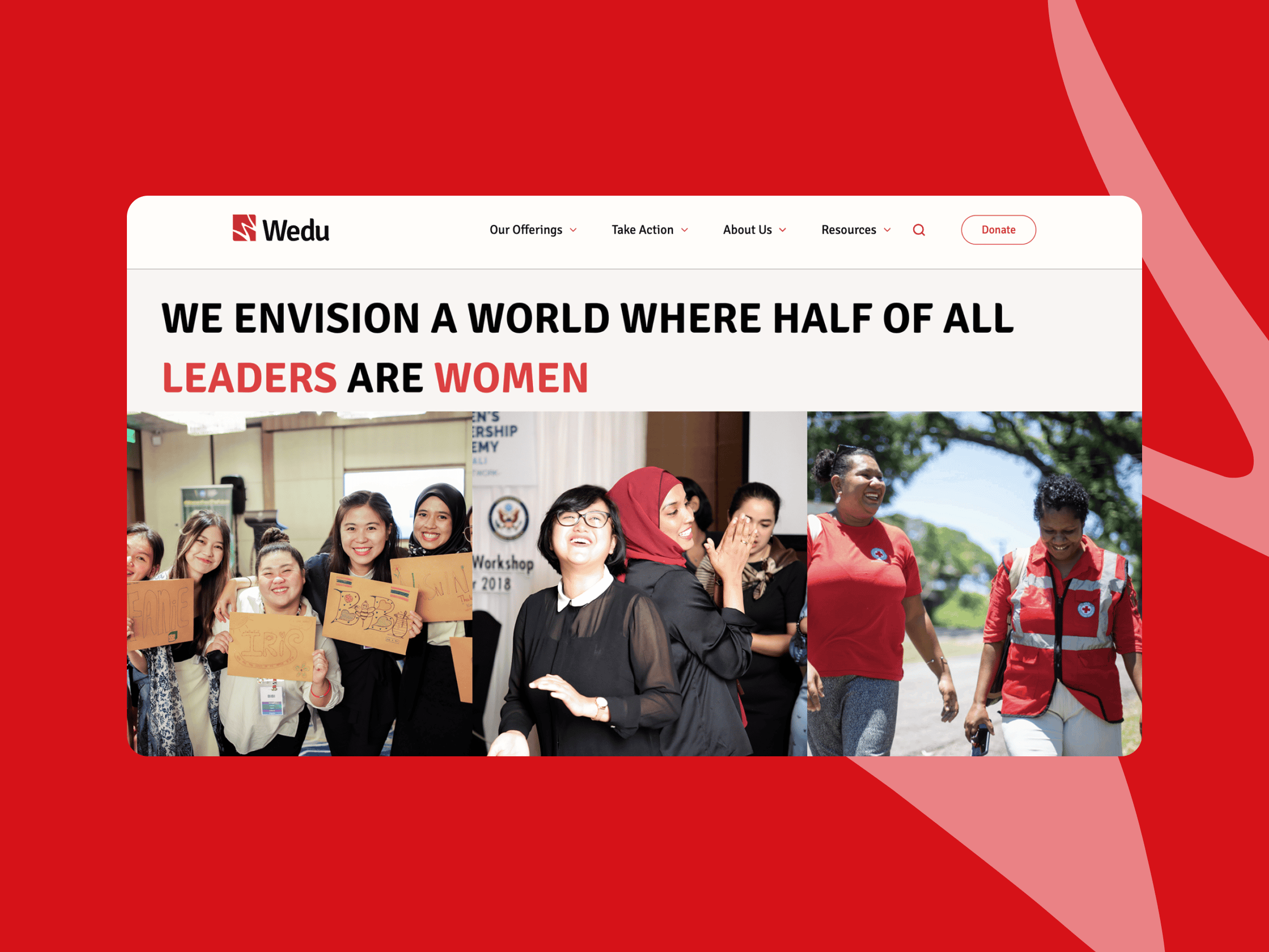
Empowering women leaders in South and Southeast Asia through mentorship, leadership programmes and grants.
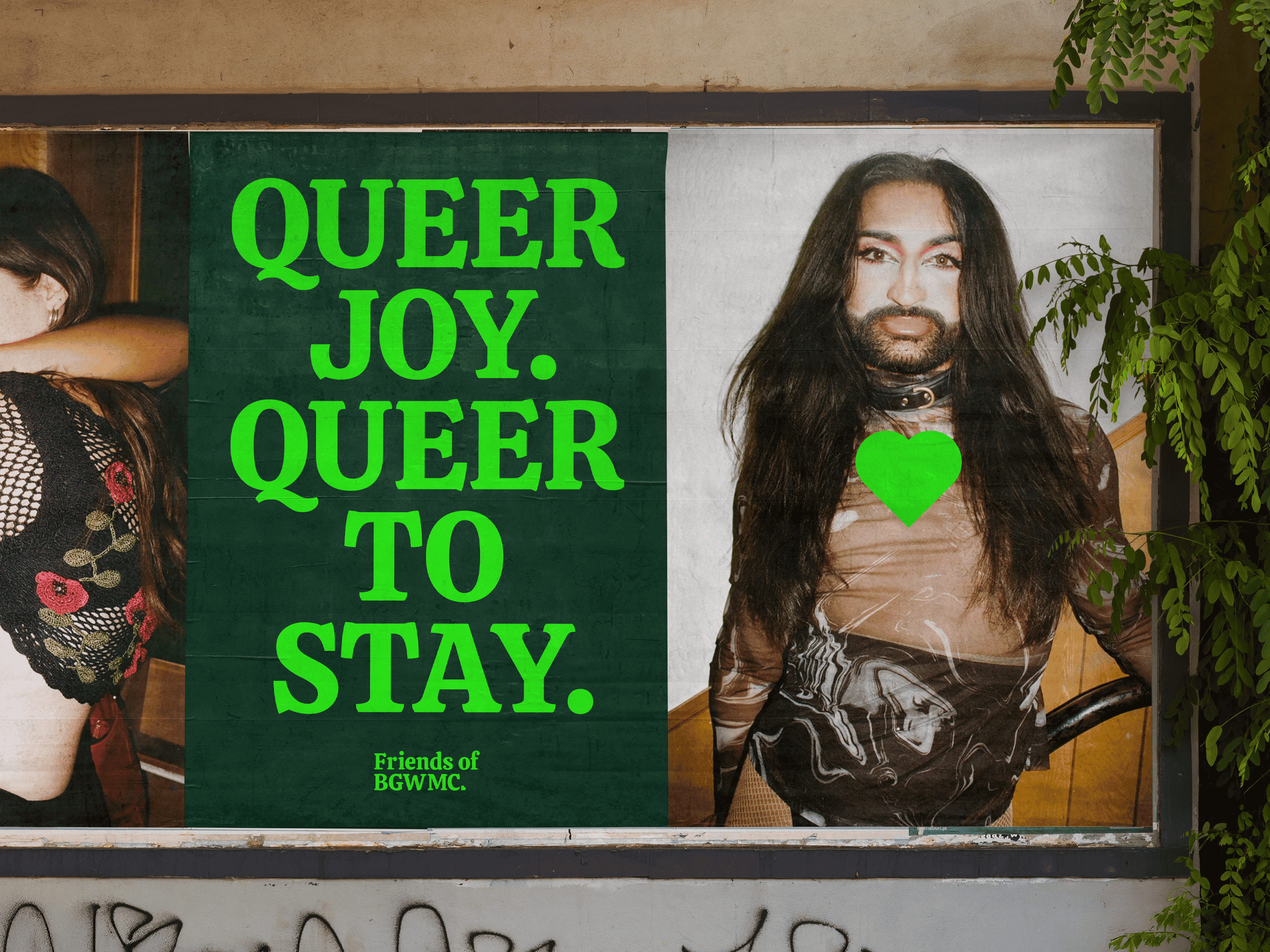
A grassroots campaign group set up to save the iconic East London queer venue.
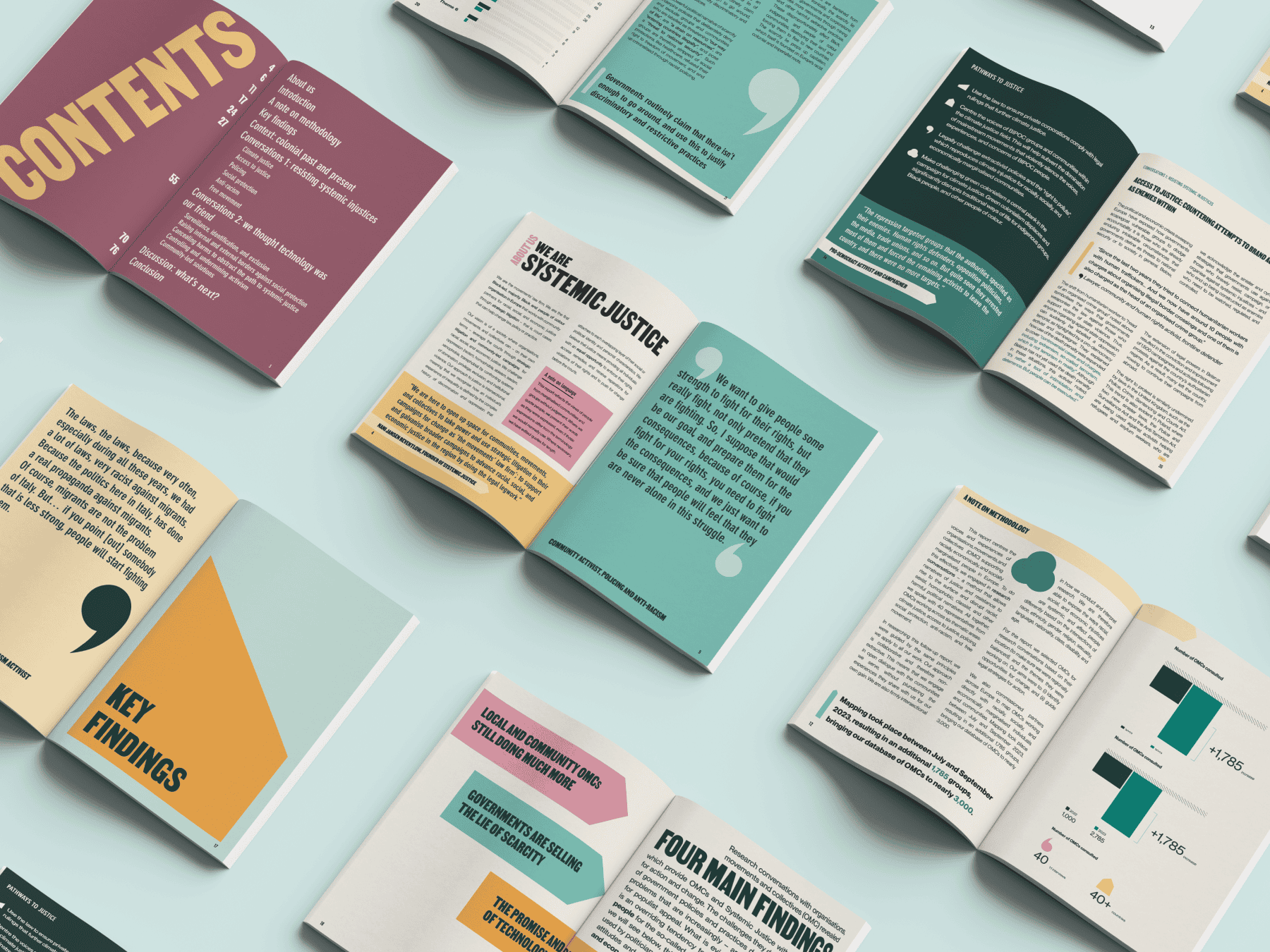
Dedicated to transforming the law to better serve communities fighting for racial, social, and economic justice.
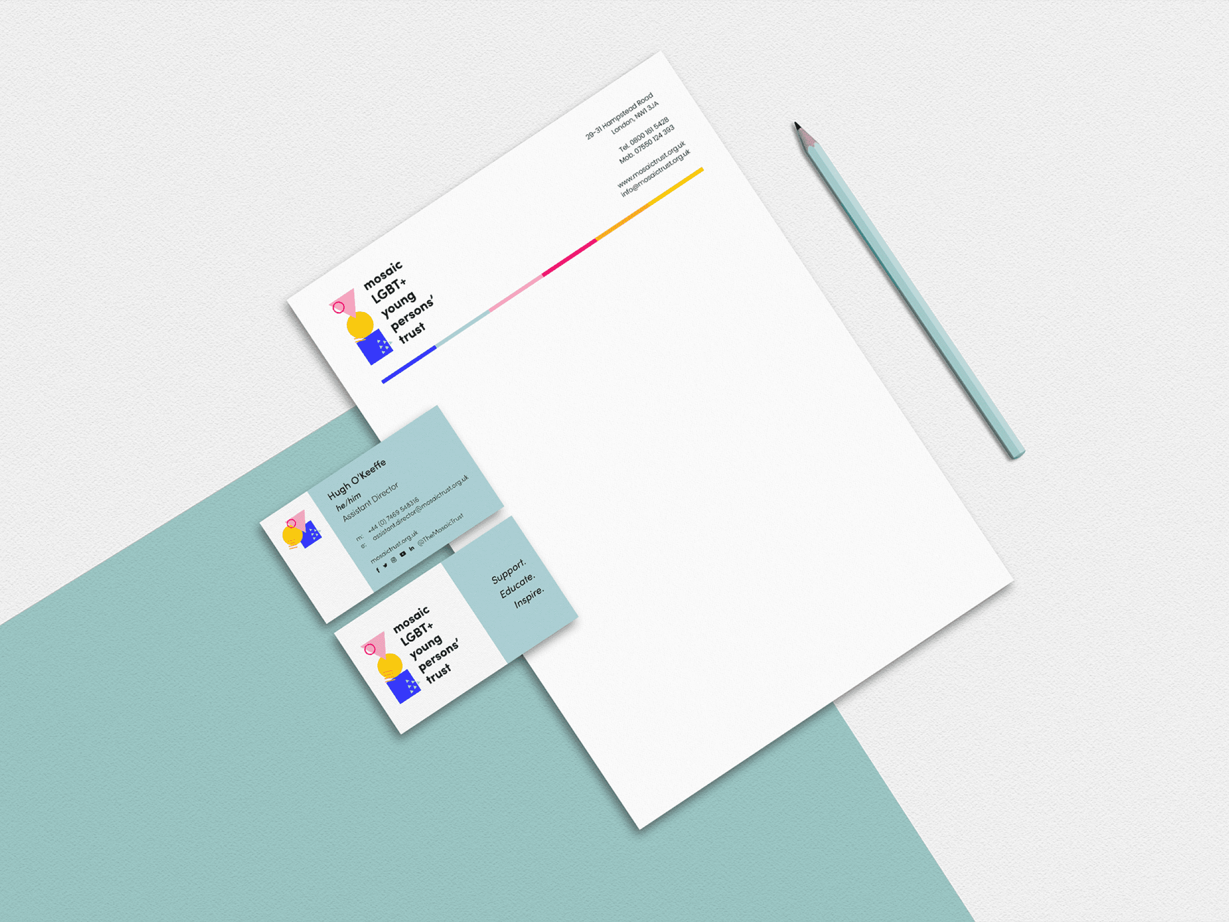
Advocating for LGBTQ+ rights and social justice through strategic partnerships and community empowerment.
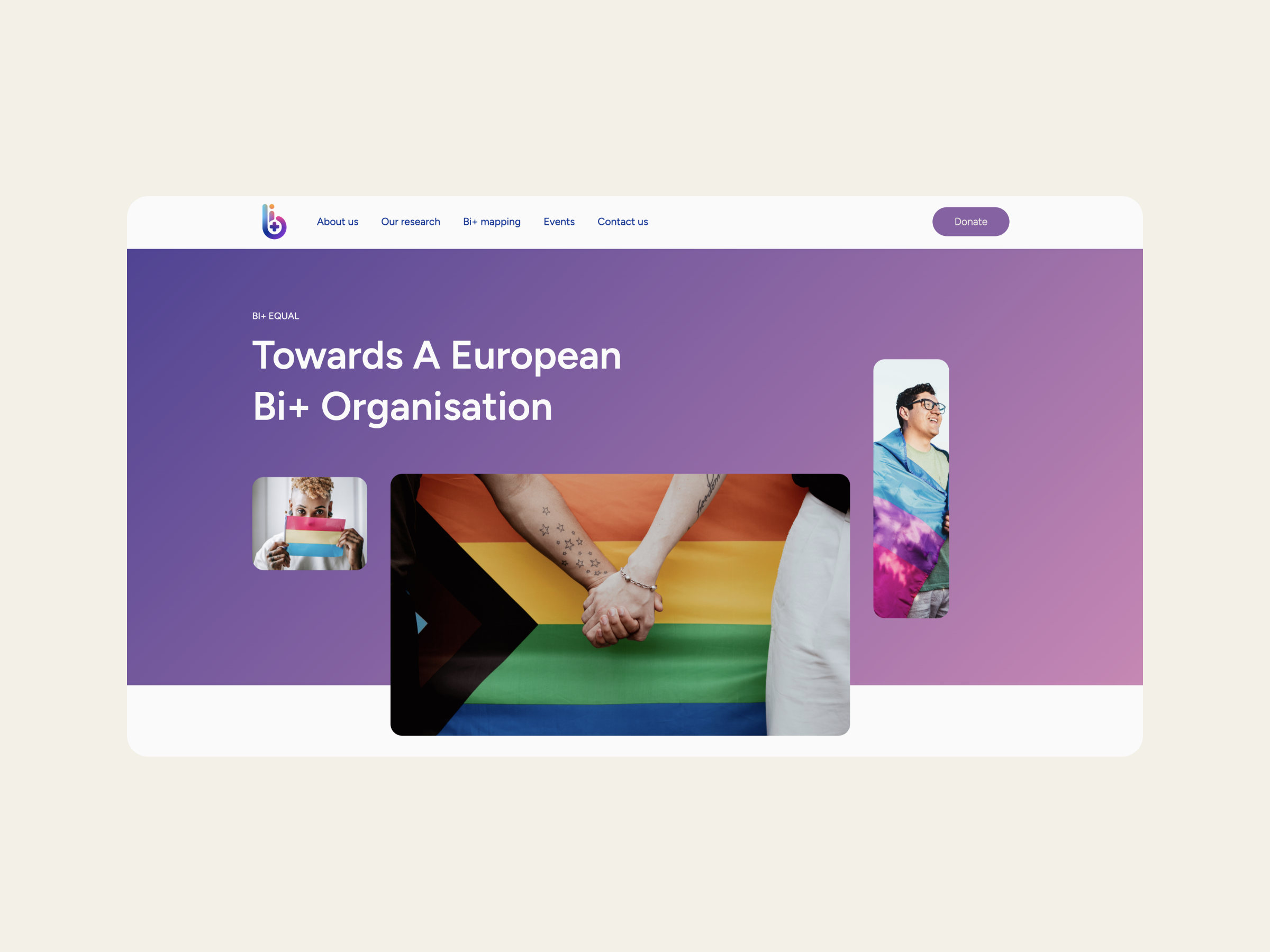
A pan-European initiative focused on promoting gender equality and sustainable development.
At the forefront of sexual health innovation, enhancing spontaneity with cutting-edge anorectal health solutions.
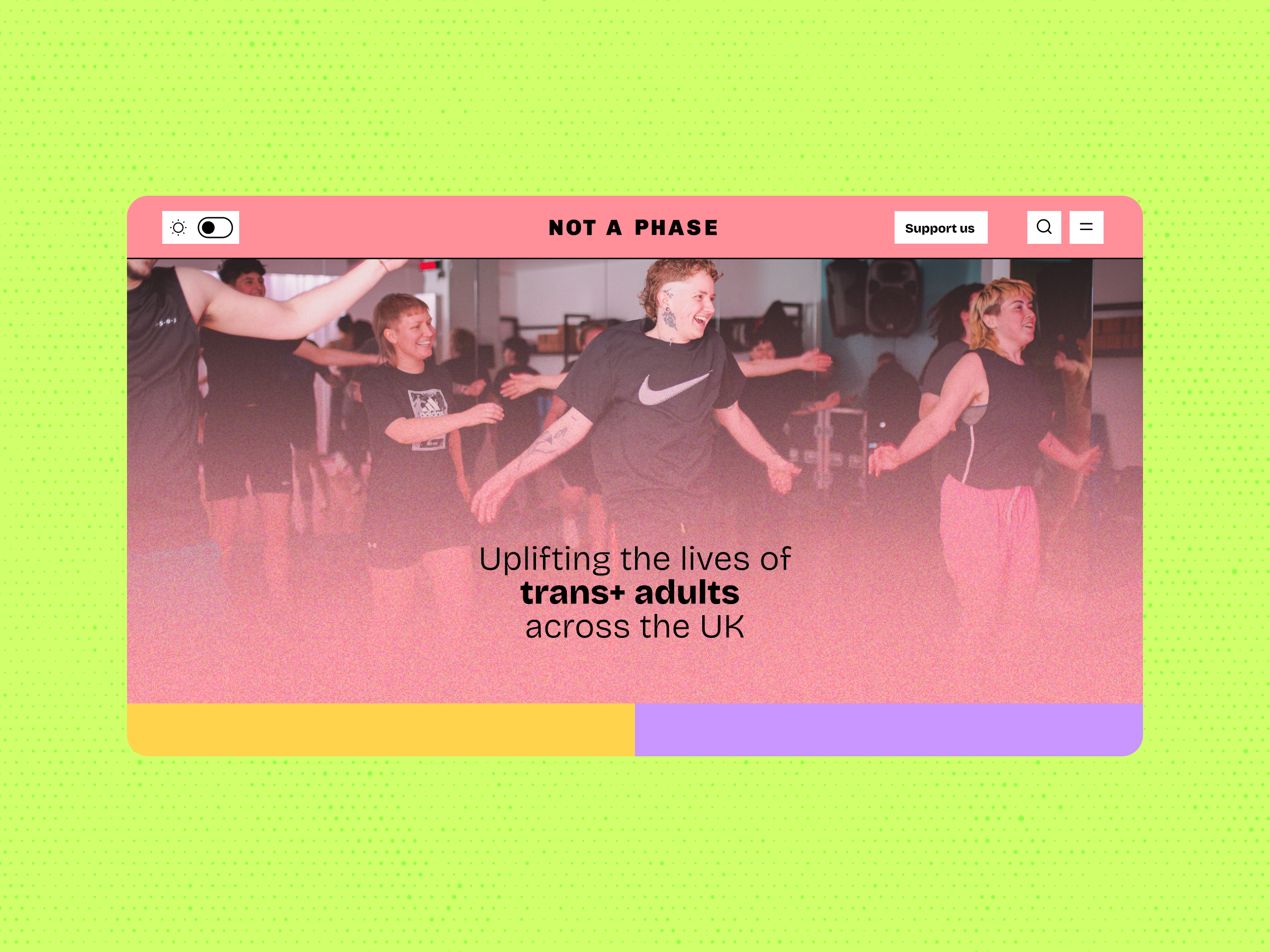
Uplifting the lives of trans+ adults in the UK through advocacy and support services.
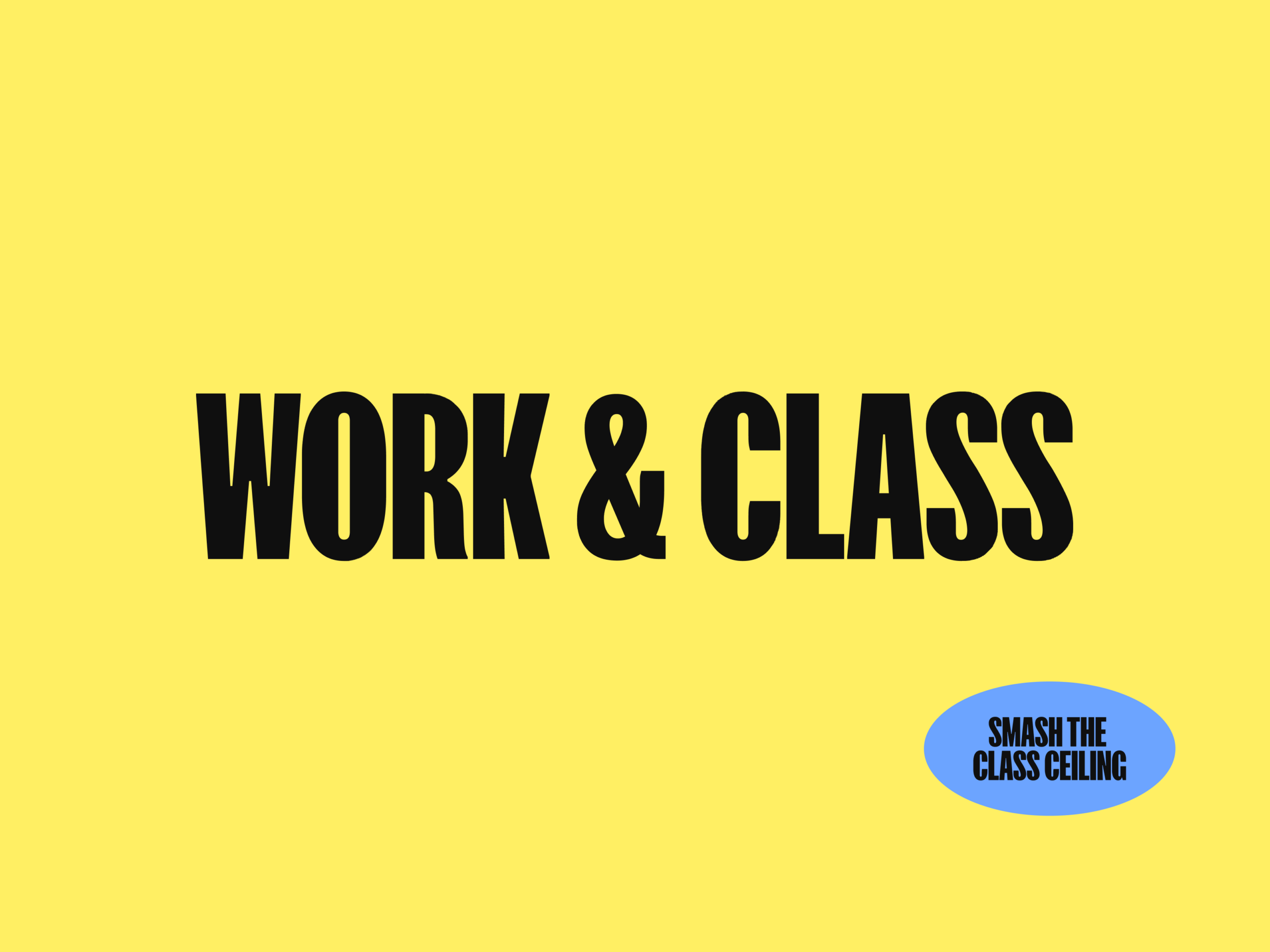
Bridging the gap between brands and working-class communities through authentic representation.
Advocating for LGBTQ+ rights globally through research, advocacy, and support networks.
Simplifying list-making for neurodiverse individuals with a welcoming and accessible app.
Australia's first LGBTIQA+ refugee-led organisation, advocating for the rights and dignity of displaced persons.

Preserving queer Bangladeshi history and culture through a community-based archive, safeguarding vital narratives.
Providing rapid response grants to support women and LGBTQ+ activists in urgent situations.
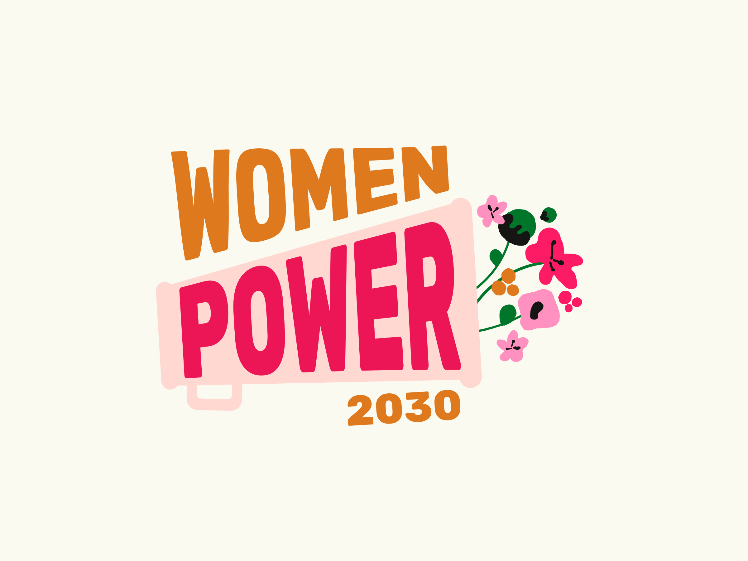
Strengthening women’s rights and feminist organisations globally for gender equality and sustainable development.
Renowned social justice expert focusing on LGBTQI rights and gender justice through participatory philanthropy.
Dedicated to fostering a sustainable, diverse, and equitable UK economy through strategic funding and initiatives.
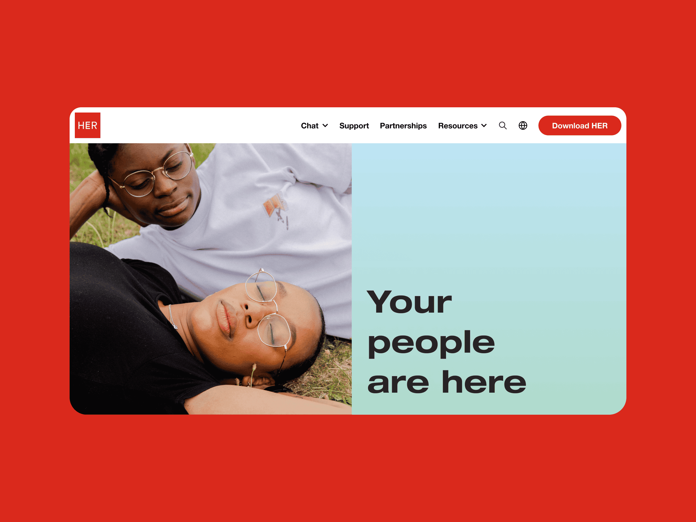
The leading sapphic dating app for queer women, non-binary, and trans individuals, fostering authentic connections.
LGBTQ-owned company creating authentic Pride products, supporting diverse suppliers, and donating to LGBTQ+ causes.
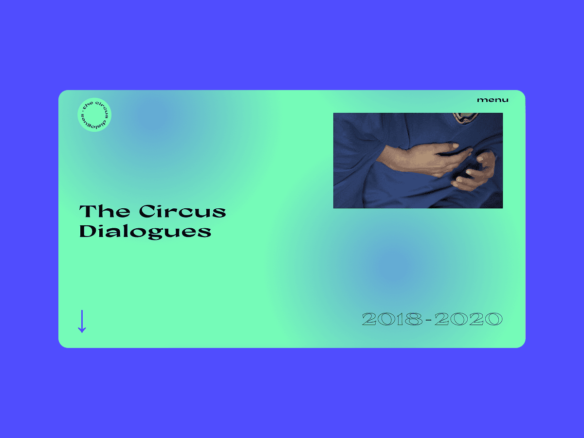
Amplifying the voices of circus artists, fostering intersectional feminist conversations within the circus industry.
Enhancing organisational structures with DEI consultancy for agile and effective operations.
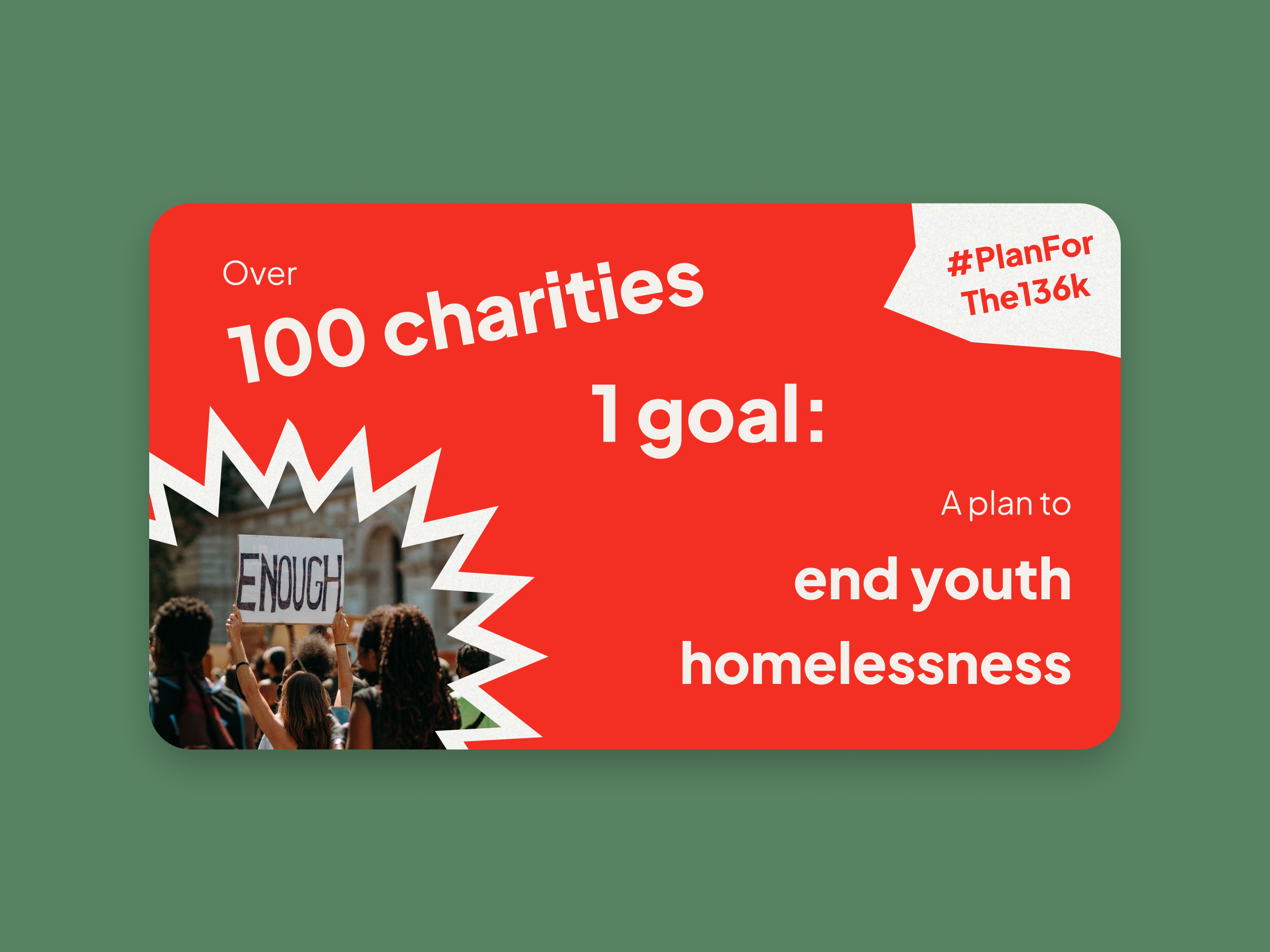
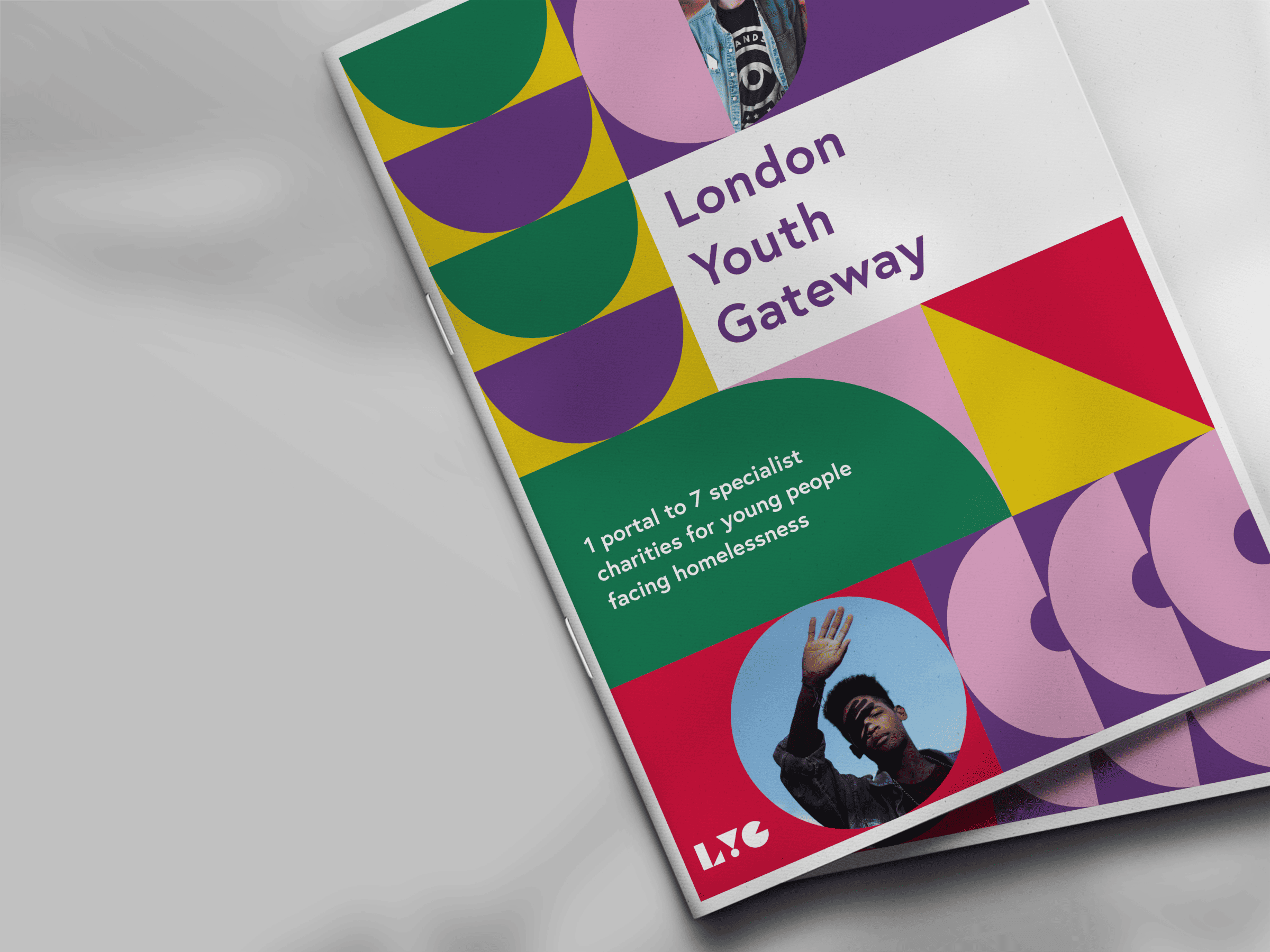
Tackling youth homelessness through UK-wide charity collaboration and strategic planning.
Empowering creative entrepreneurs with tailored operations and change management for diverse communities.
Communications strategies to connect with LGBTQ+ audiences.
Gathering insights influencing key policy decisions through public opinion surveys.
Driving gender equity in tech by building inclusive ecosystems and opportunities for women.
Exploring mind-body interactions in functional disorders through research and co-participatory design.
Supporting LGBTQ+ youth facing homelessness with safe housing and support services.
A digital archive collecting oral histories of LGBTIQ+ displacement.
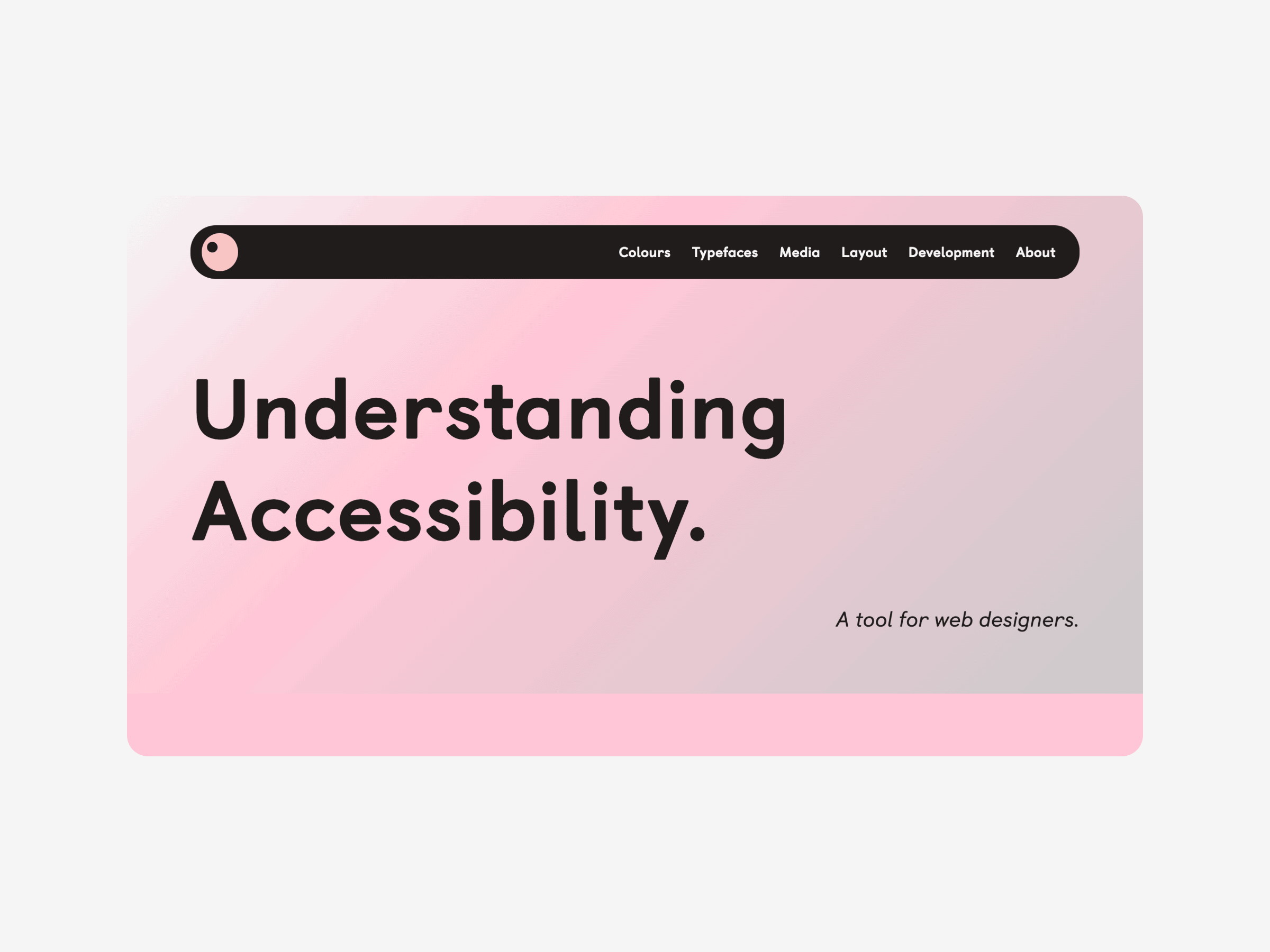
A tool for web designers to easily learn about and implement digital accessibility.
Closing the gender pain gap by revolutionising pelvic pain care.
Empowering LGBTQ+ youth with support, advocacy, and inclusive opportunities across Scotland.
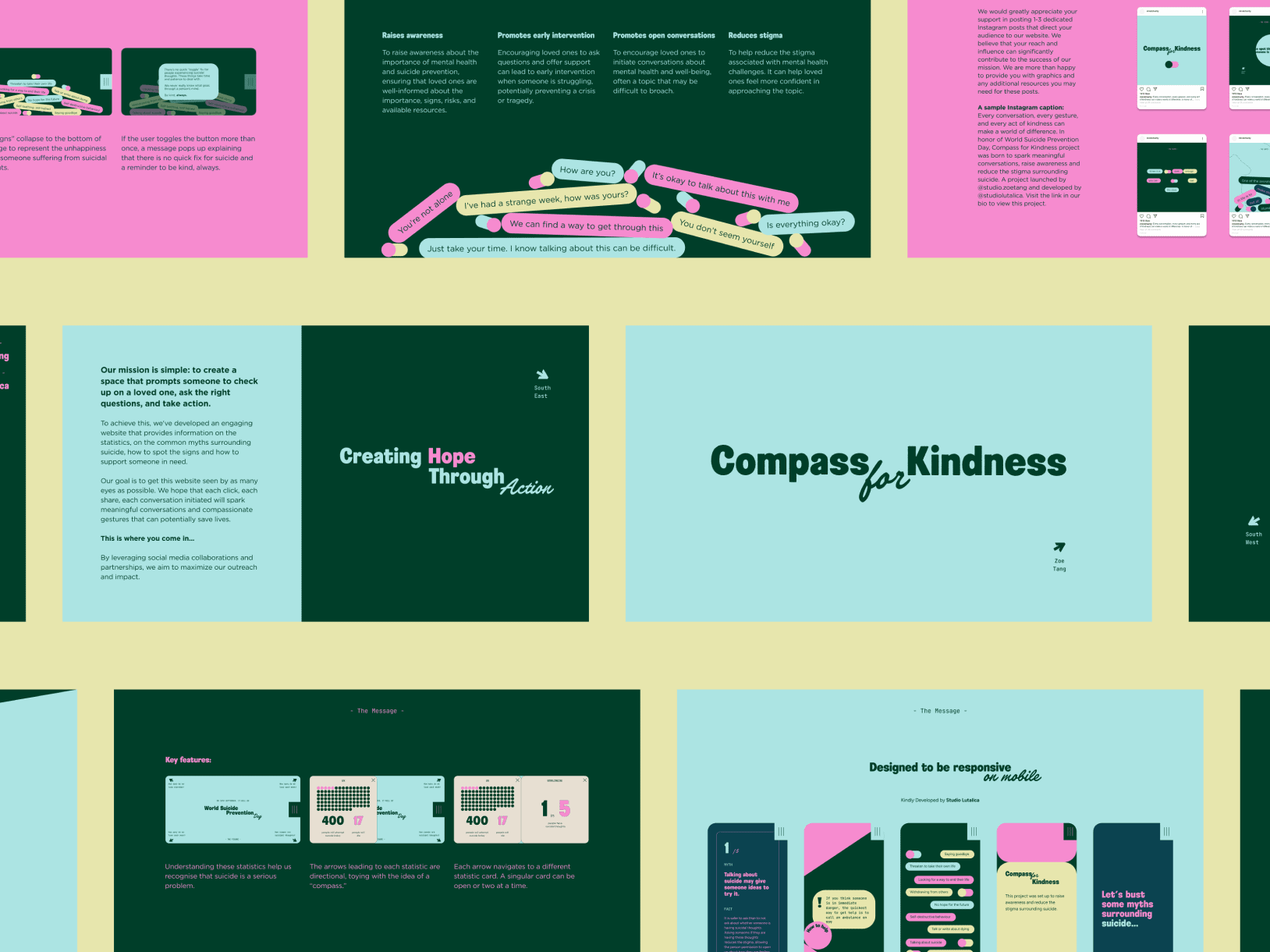
A tool to destigmatise suicide through interactive design.
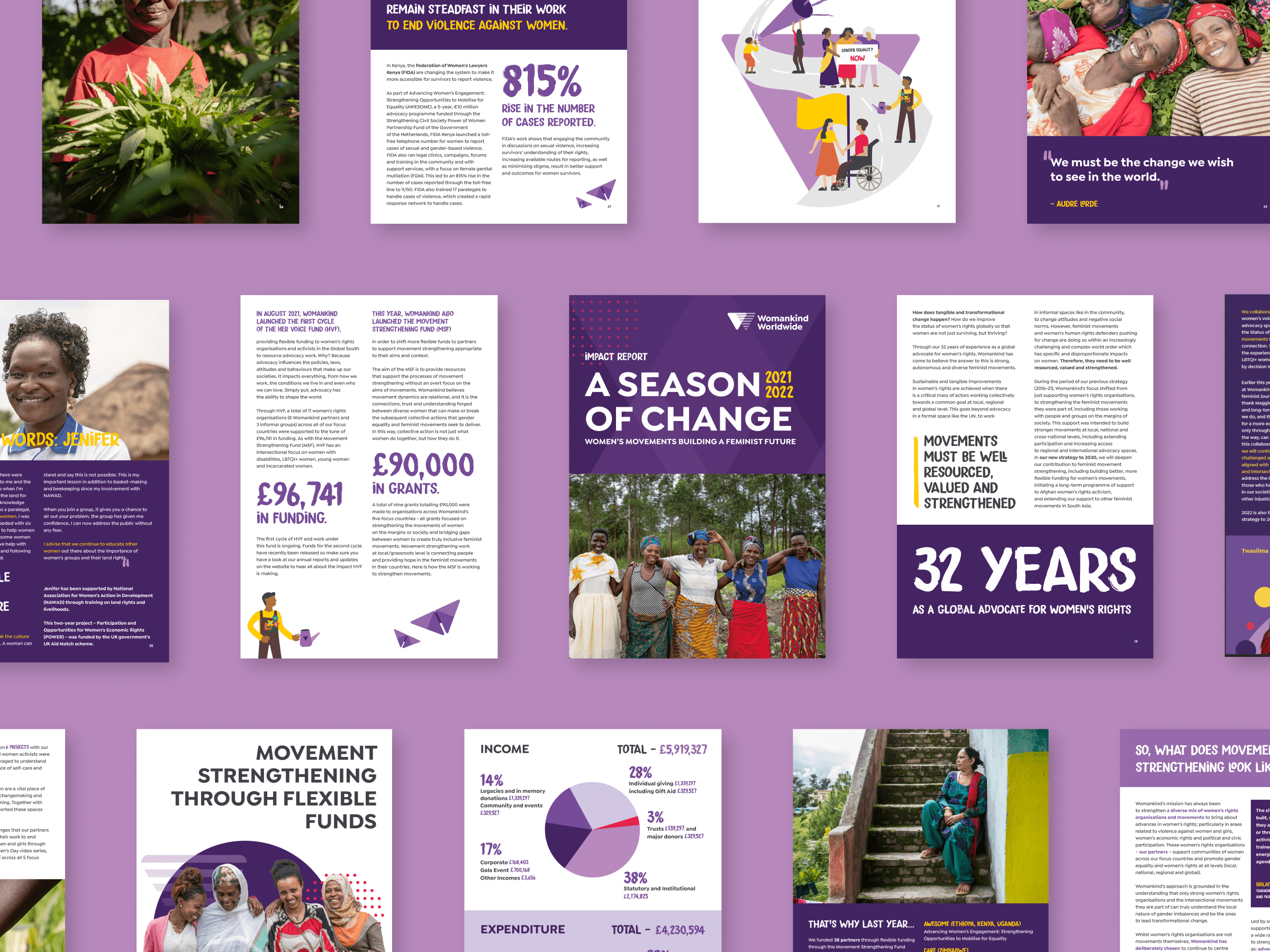
Advancing women's rights globally through impactful advocacy and partnerships.
An organic farm and winery in Sardinia, crafting artisanal wines with sustainable practices.
An interdisciplinary initiative exploring the intersection of walking and air through art, poetry, and music.
Leading UK charity providing housing support and advocacy for LGBTQ+ individuals facing homelessness.
A global network supporting and empowering Pride organisations worldwide through advocacy and resources.
A digital exhibition enlivening historical LGBTQ+ activist posters.
Innovating healthcare access for LGBTQ+ communities with personalised digital solutions.
An advertising agency championing diversity with unique and inclusive campaigns.

A feminist education consultancy inspiring and supporting intersectional gender practices.
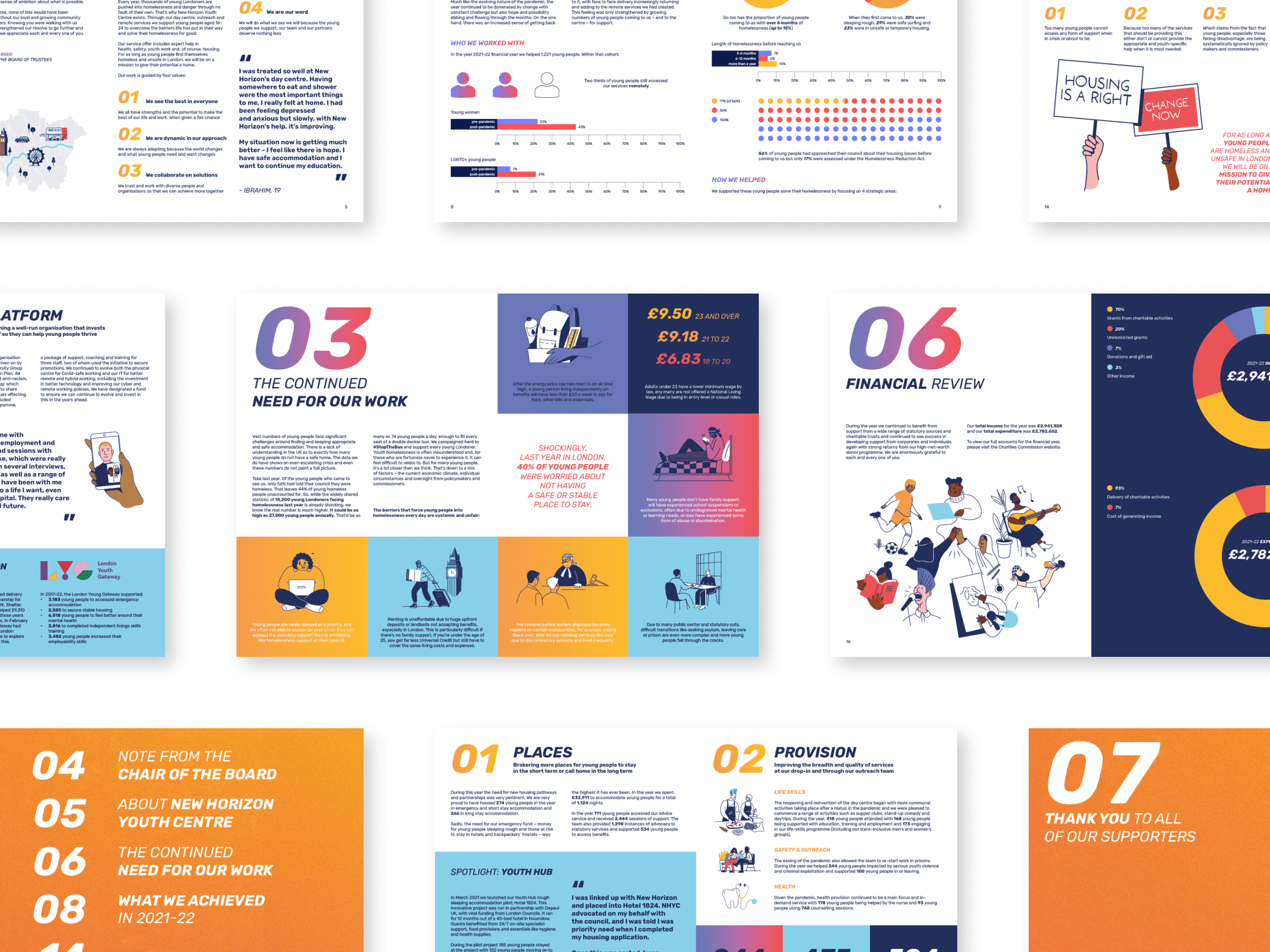
Supporting young people experiencing homelessness in London with essential services and opportunities.
Sharing LGBTQ+ stories to foster understanding and connect diverse communities.
Certifying LGBTQ+ owned organisations in the UK to foster collaboration and community in business.
Host of "Ghost of a Podcast," offering guidance as a humanistic astrologer and psychic medium.
Empowering mission-driven businesses with strategic content, messaging and courageous communications.

Crafting vibrant, hand-dyed yarns to inspire creativity in knitting and crochet projects.

Multidisciplinary artist exploring language, music, and performance to deepen creative connections.
Providing comprehensive support and housing solutions for young people in London.
Empowering young LGBTQ+ individuals through community support and advocacy.
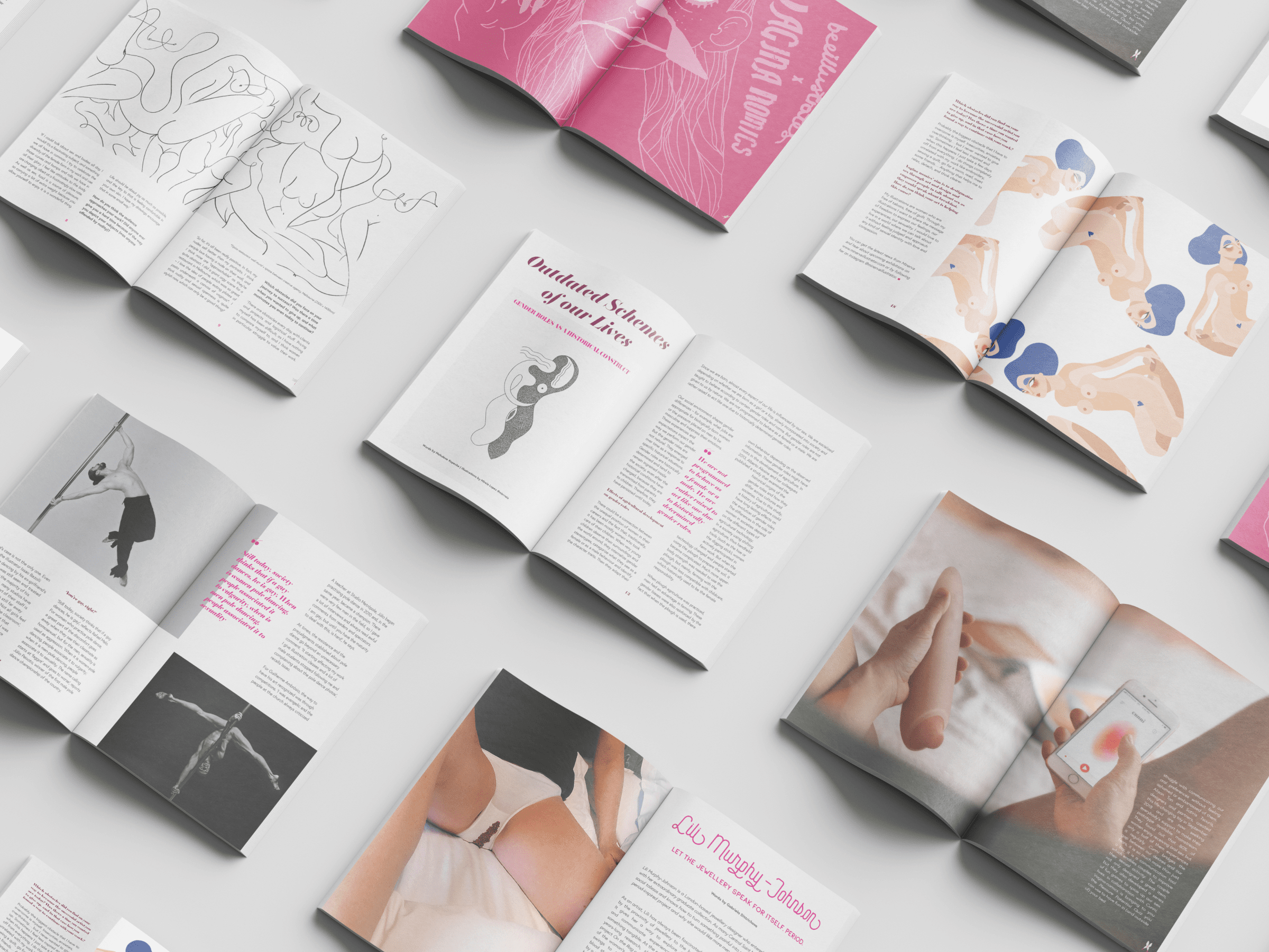
A feminist platform de-stigmatising pleasure and normalising conversations on taboo subjects through art and design.
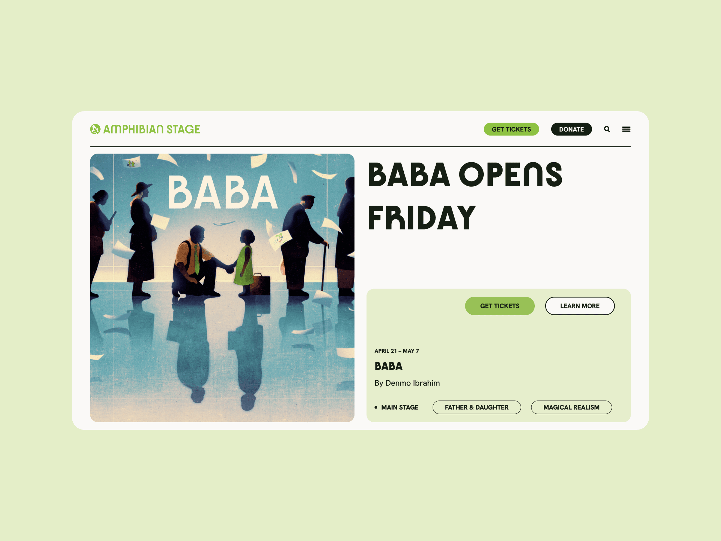
Fostering creativity and innovation in theatre with dynamic performances and community engagement.
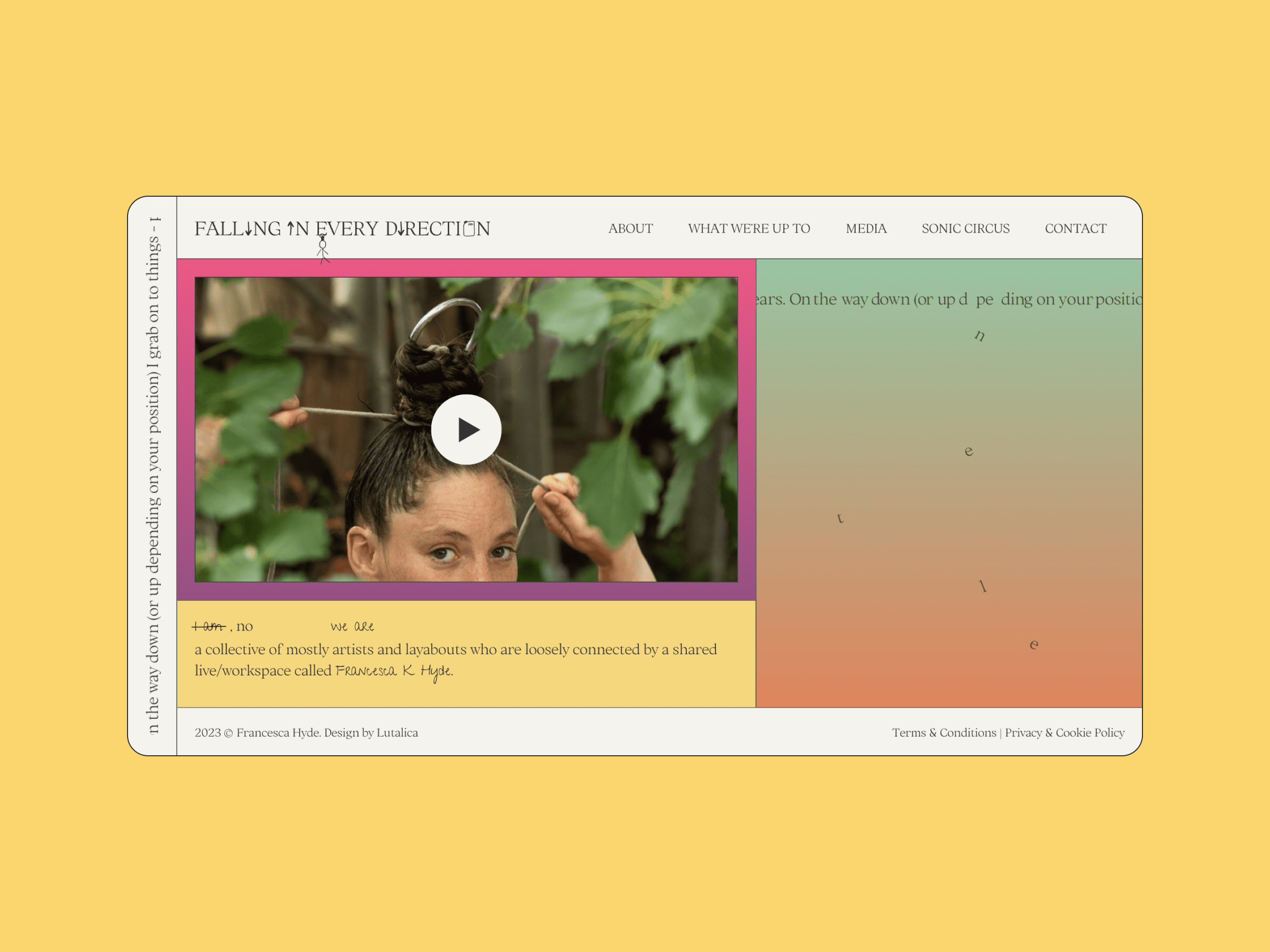
Circus artistry by Francesca Hyde, blending performance with feminist academic themes.
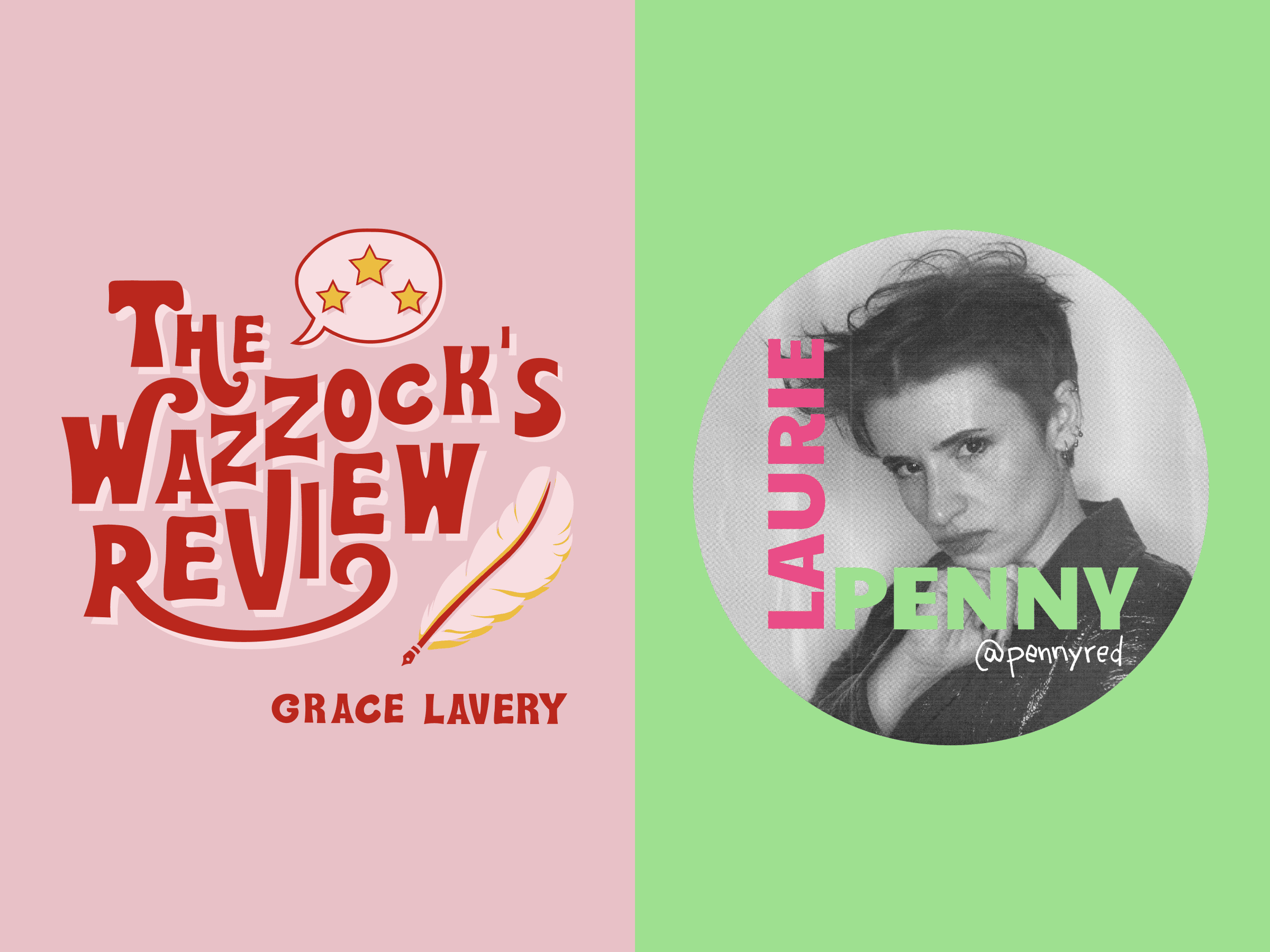
Creative assets for feminist and LGBTQ+ writers on the leading writing newsletter platform.
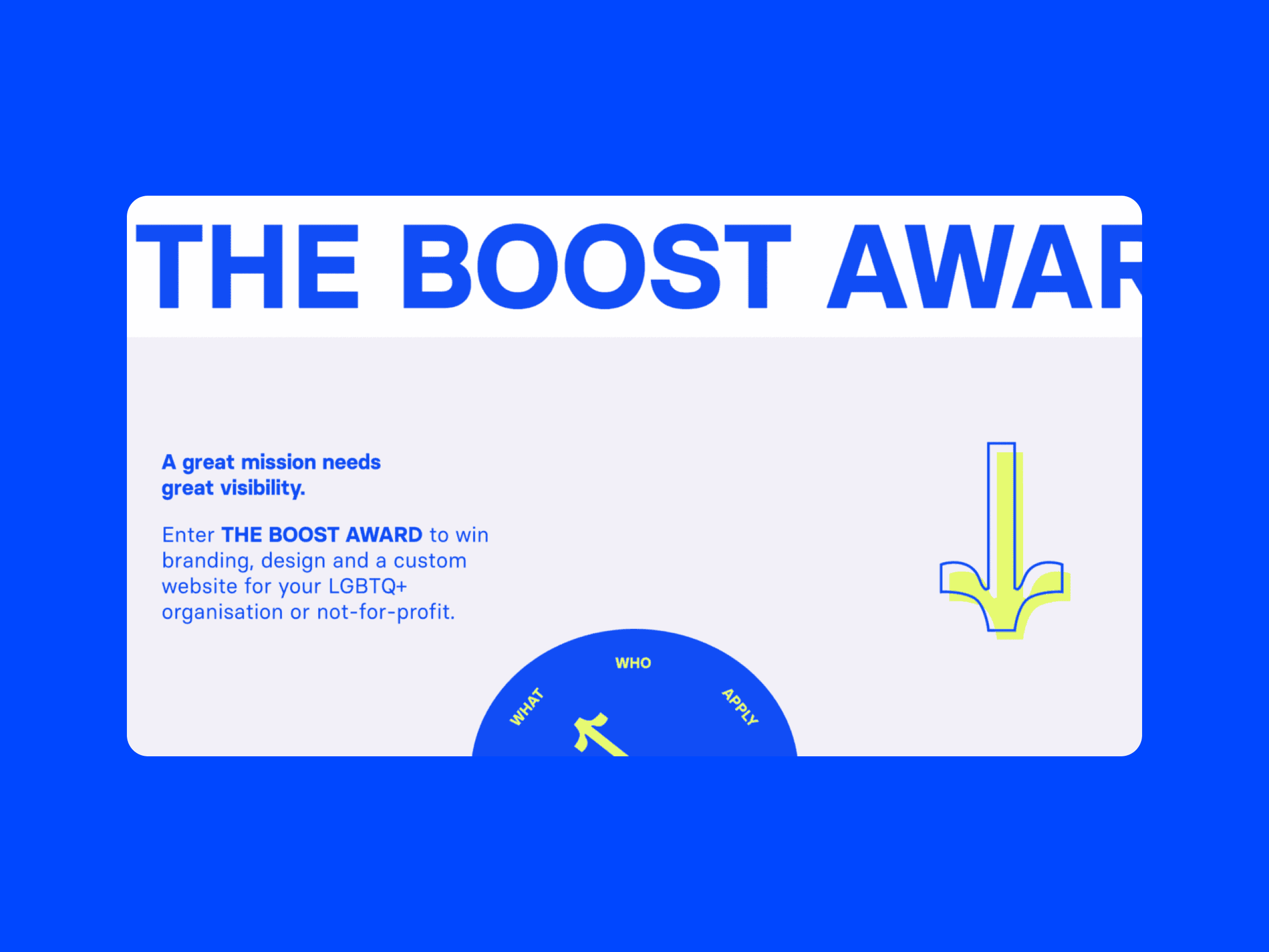
Supporting impactful LGBTQ+ projects with pro bono branding and website design.
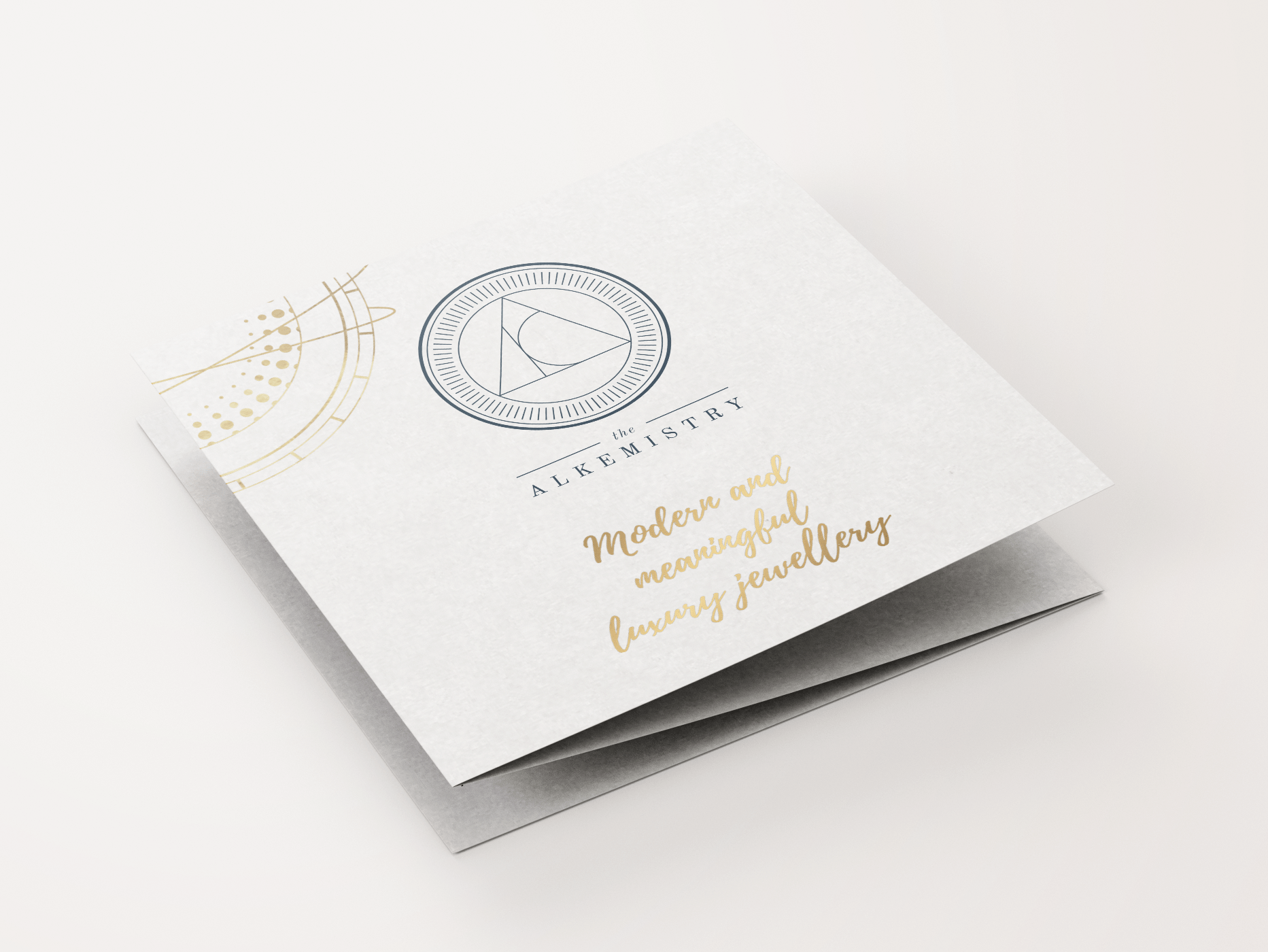
Empowering women through modern and meaningful luxury jewellery.

WHO WE are