/lu:talika/
Share
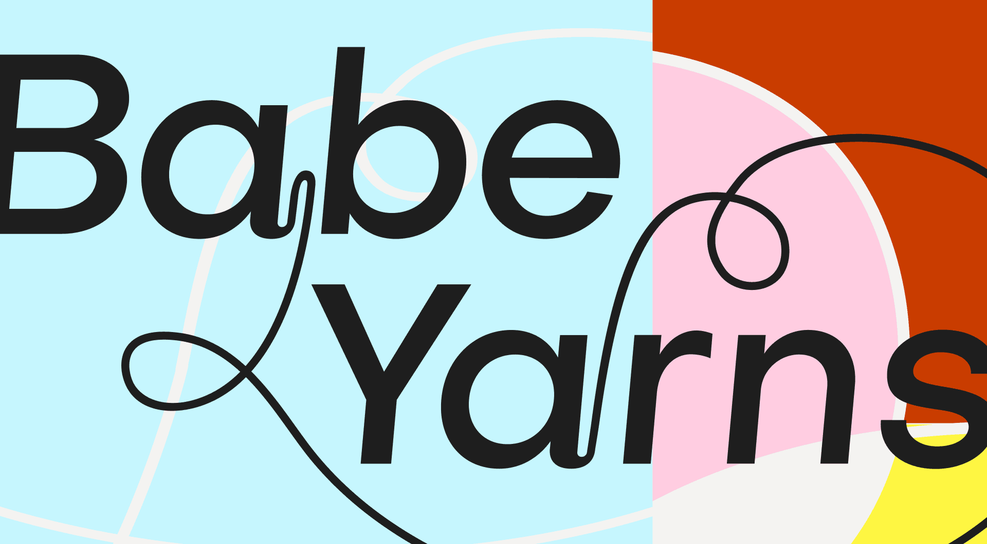
Babe Yarns is the side project of artist Molly JF Caldwell, who hand dyes and spins the yarn in her studio in Calgary, AB. She uses an antique machine carder and a secondhand Lendrum spinning wheel to make her original textiles. We helped Molly create a vibrant, fresh visual identity for her yarn business.
Credits
Branding: Alaïs de Saint Louvent
Logo
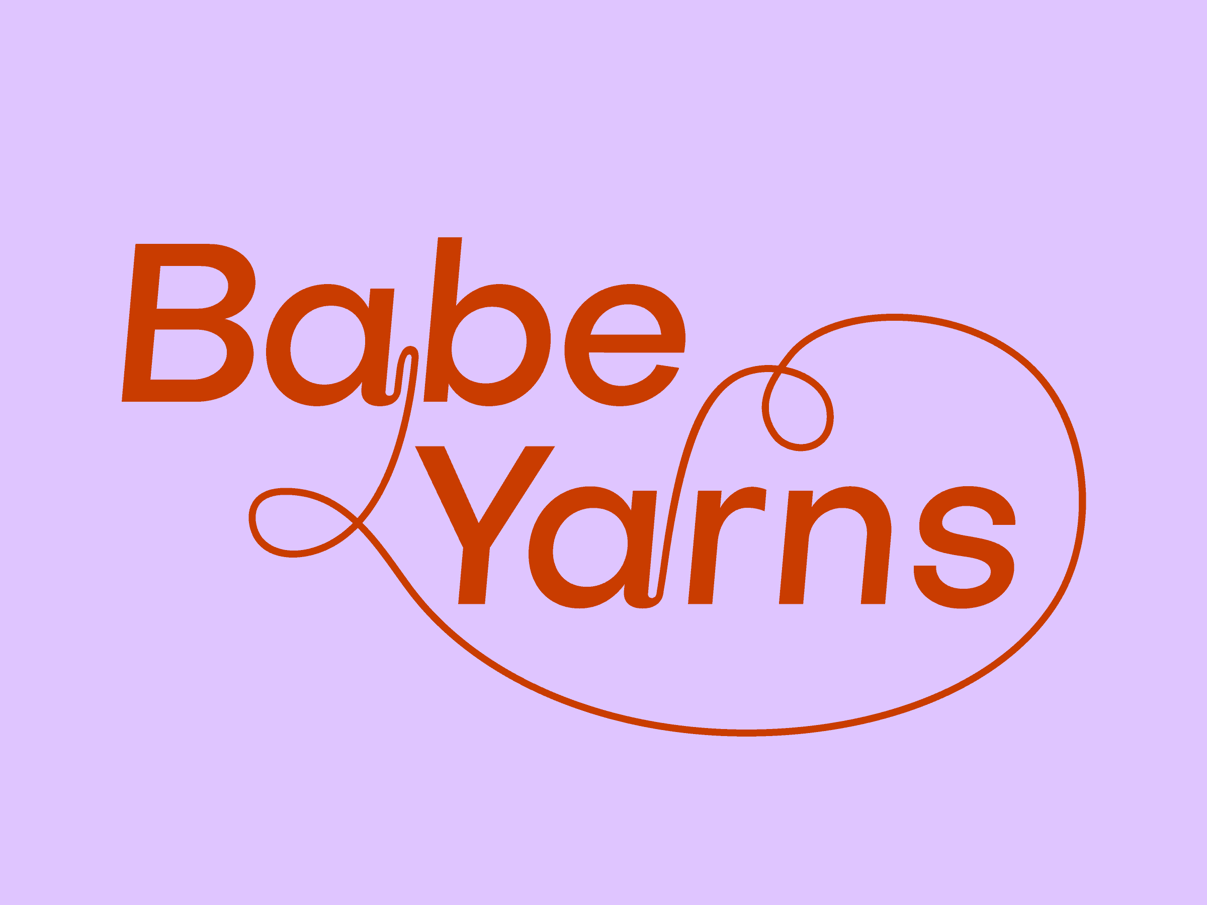
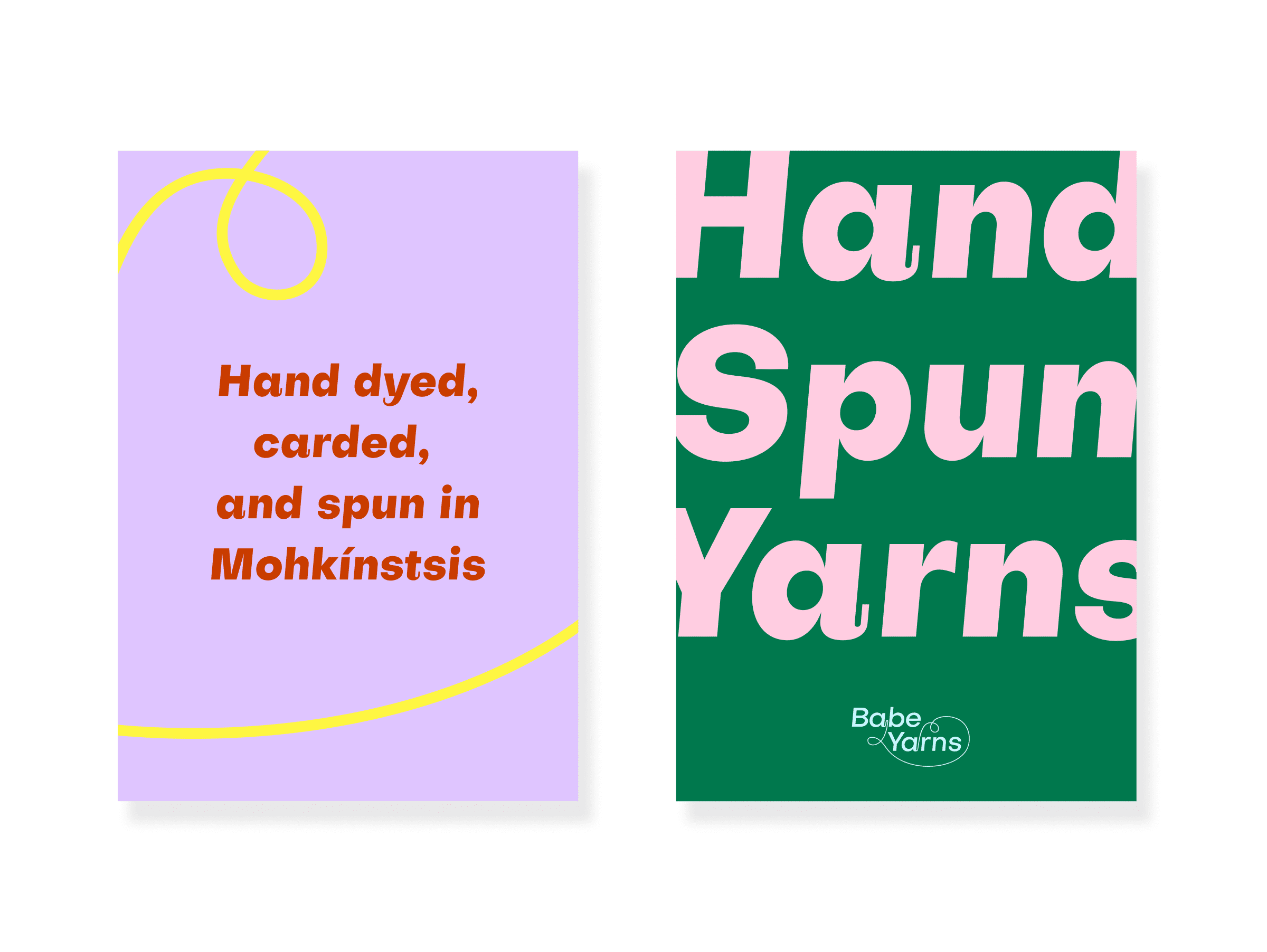
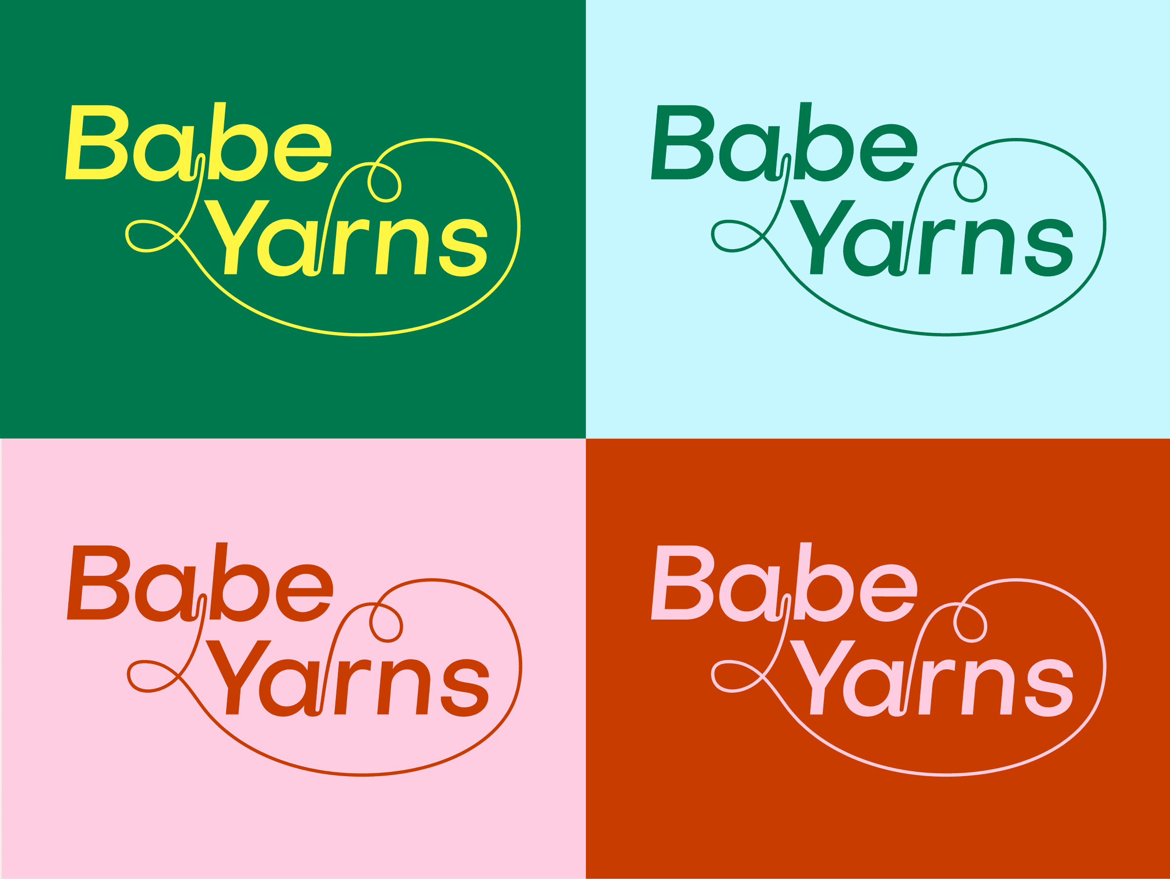
We experimented with various concepts that would encapsulate the materiality of yarn and the contemporary boldness of Molly’s project. The final logo is a happy marriage between edge and softness. We chose the font Subjectivity, in large part, for its quirky flicks on particular letters, which we extended in order to link the titular words with a strong, thin, yarn-like line.
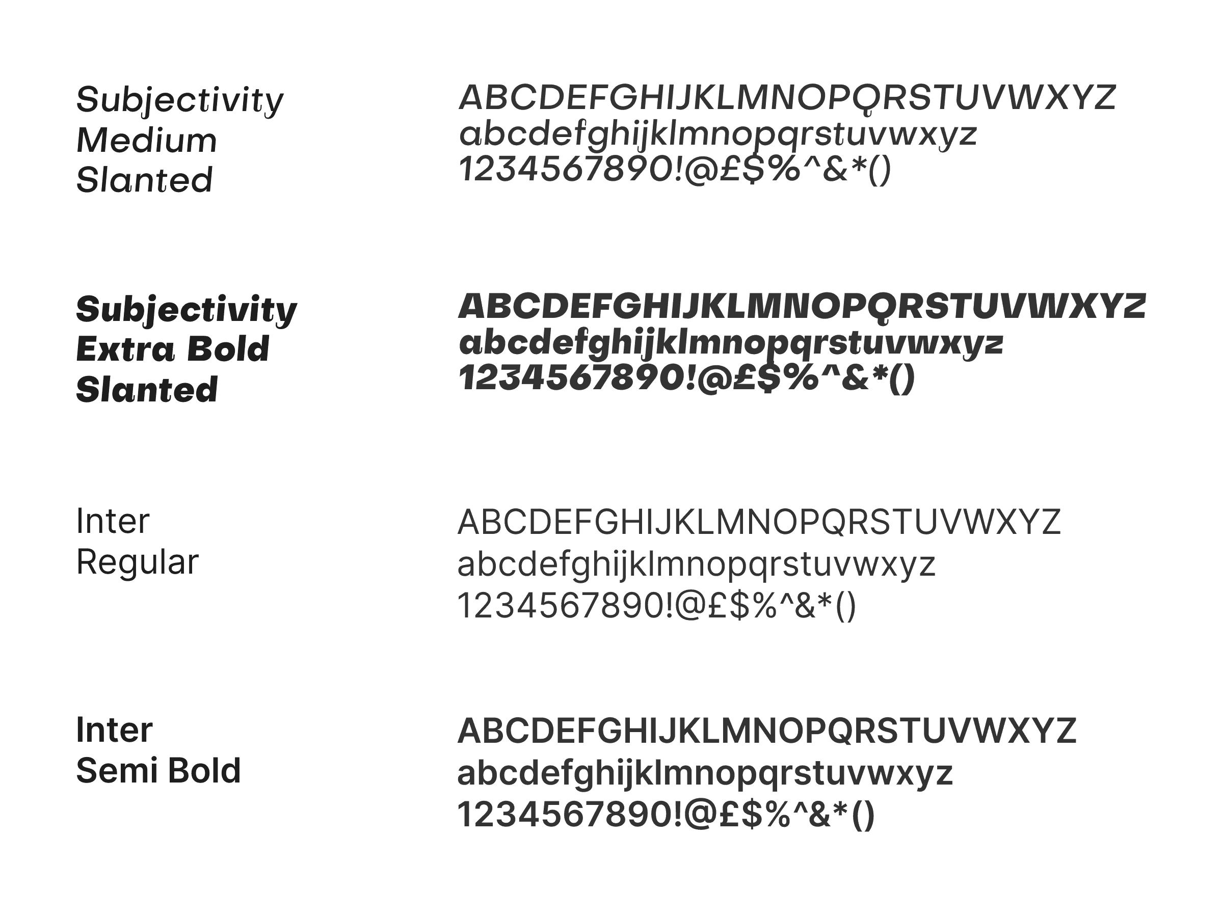
We selected the widely accessible sans-serif font Subjectivity for Molly, which is bold, clear and contemporary but, if you look carefully, has subtle accents and flicks that nod to craft. Central to Babe Yarns identity is the ultra bold primary colour palette and the soft pastel secondary colour pallette – more on this below.
Applications
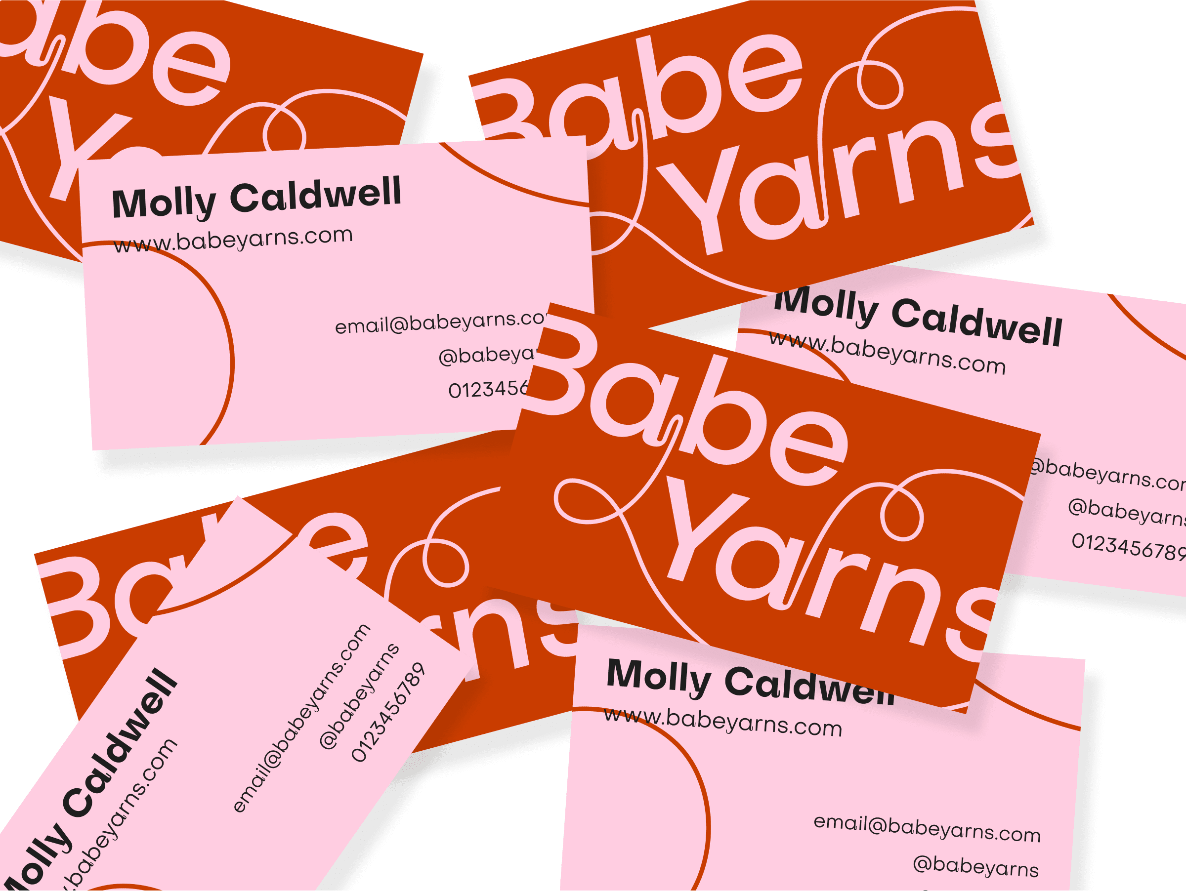
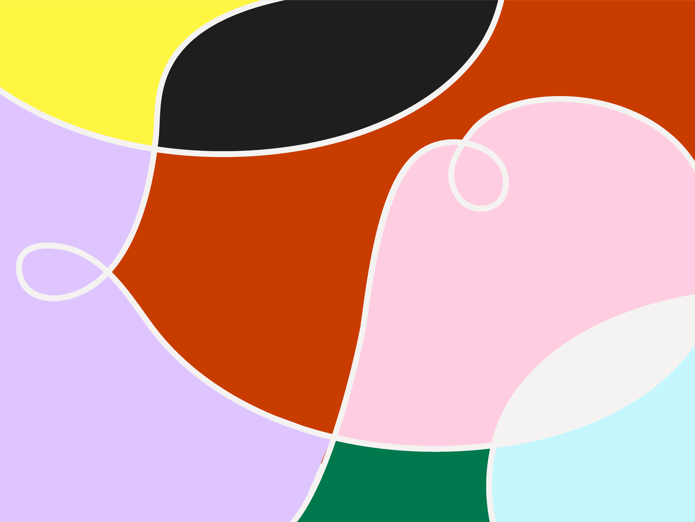
We worked with Molly to apply her updated visual identity to business cards, her website, and printed inserts. This gave us a chance to get creative with the pop-inspired colour palette, and create our own abstract designs for Molly’s website, and iterate the concepts developed for the logo into typographic print designs.