/lu:talika/
Share
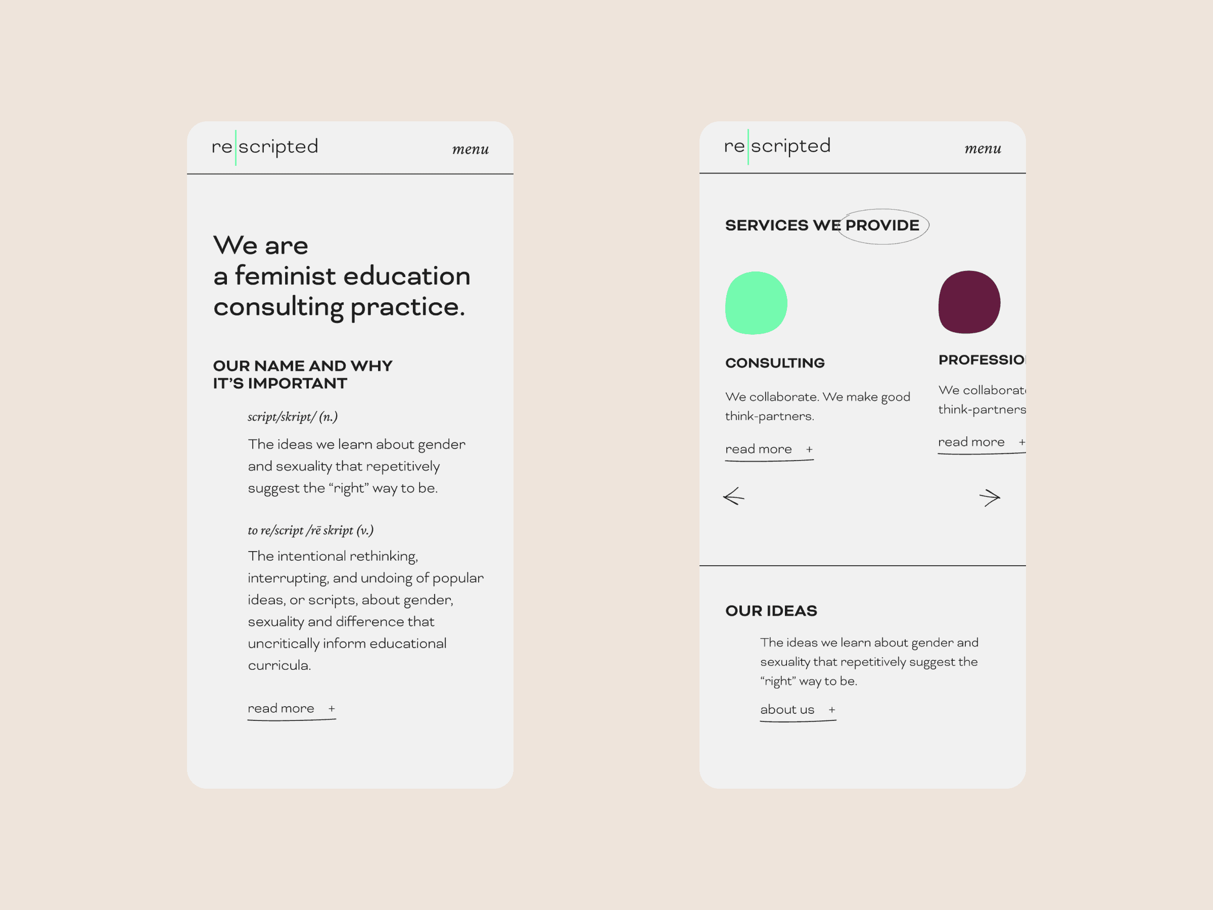
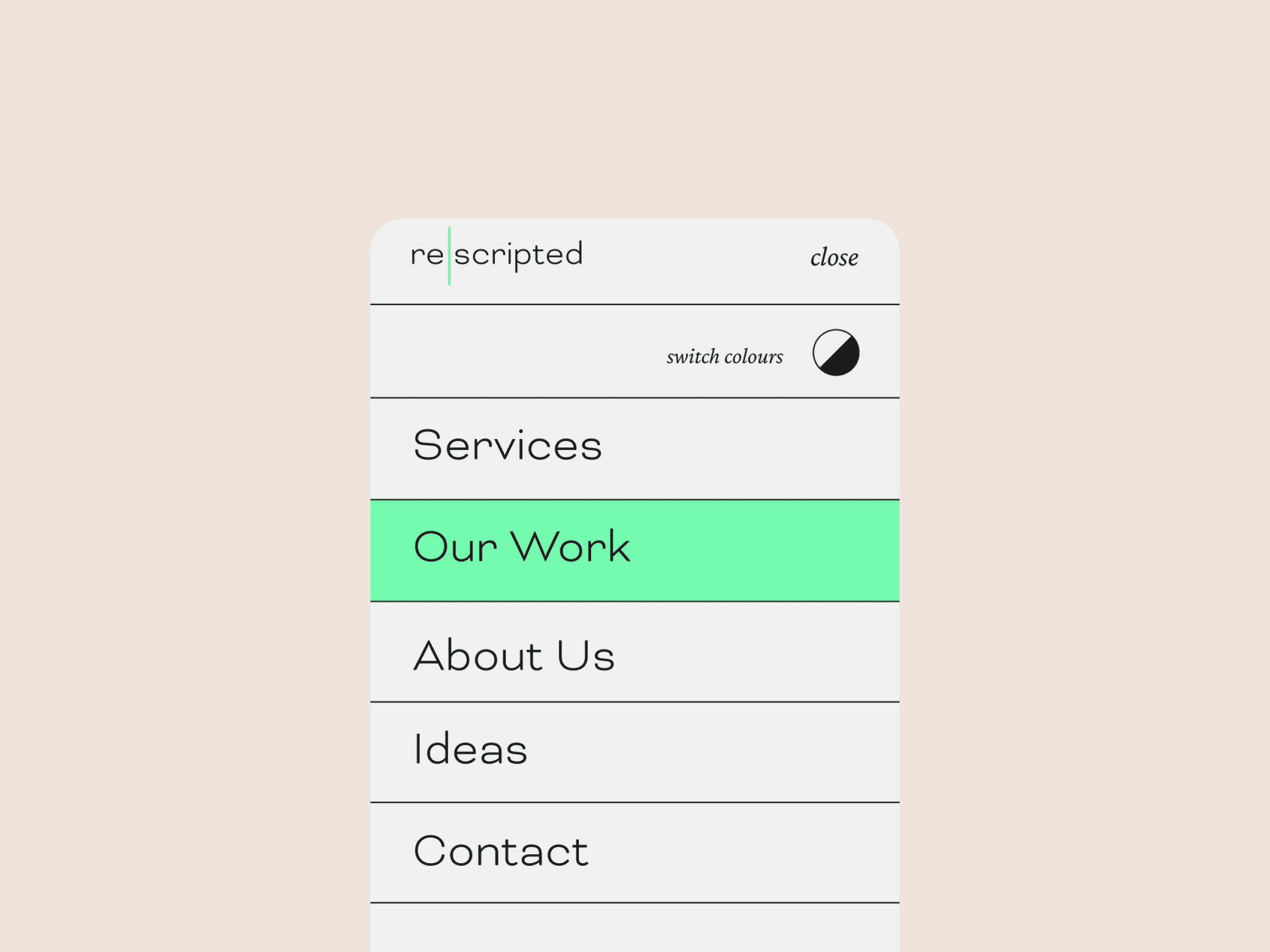
re|scripted is a collective of feminist education specialists, scholars and researchers, offering consultancy services to schools and organisations. They exist to ‘inspire, complicate, support and lead practices of intersectional theories of gender and difference.’ We had the pleasure of re-branding the feminist education consultancy and designing and developing their new website.
Credits
UX Design: Katie Gee
Branding and UI Design: Alaïs de Saint Louvent
Development: Nata Sheketa
Awards
Awwwards: Honorable Mention
Branding
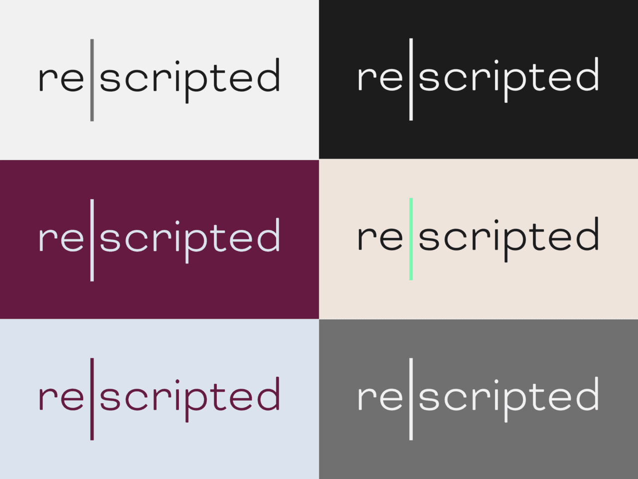
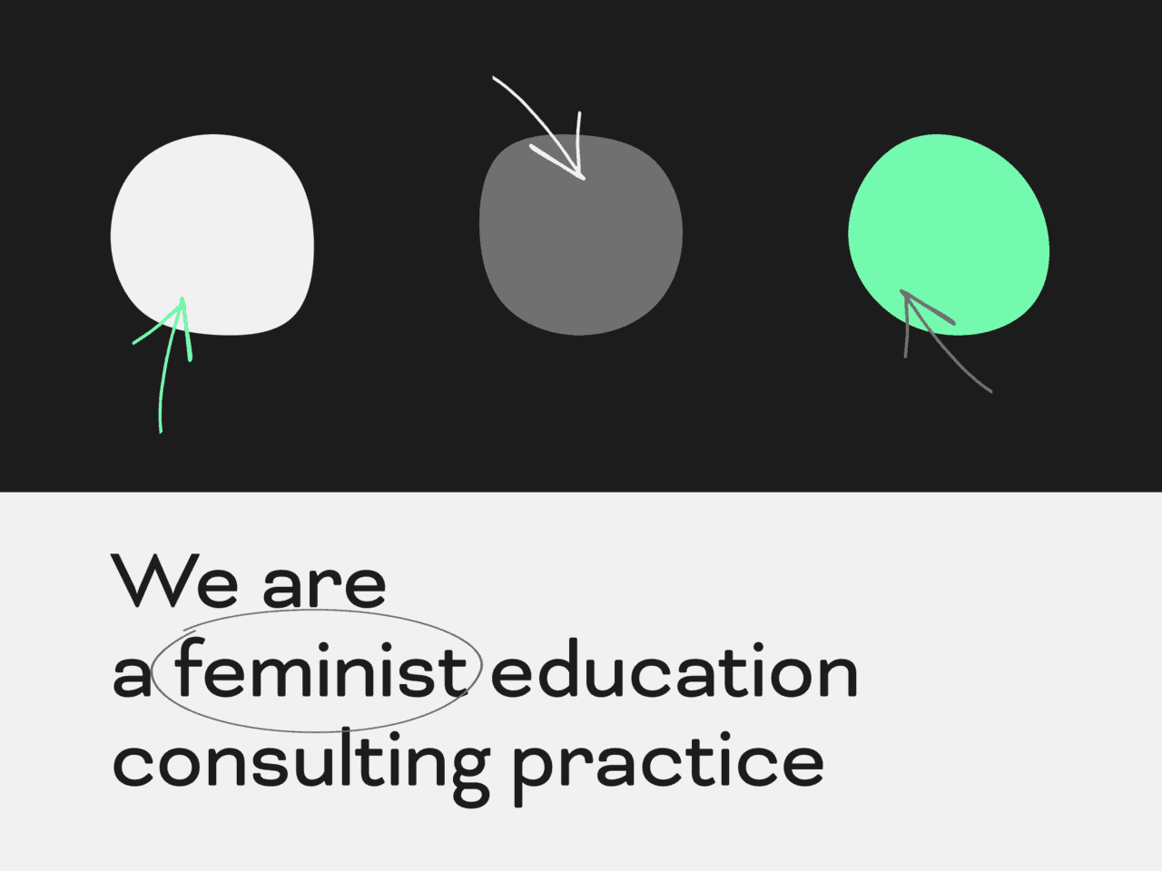
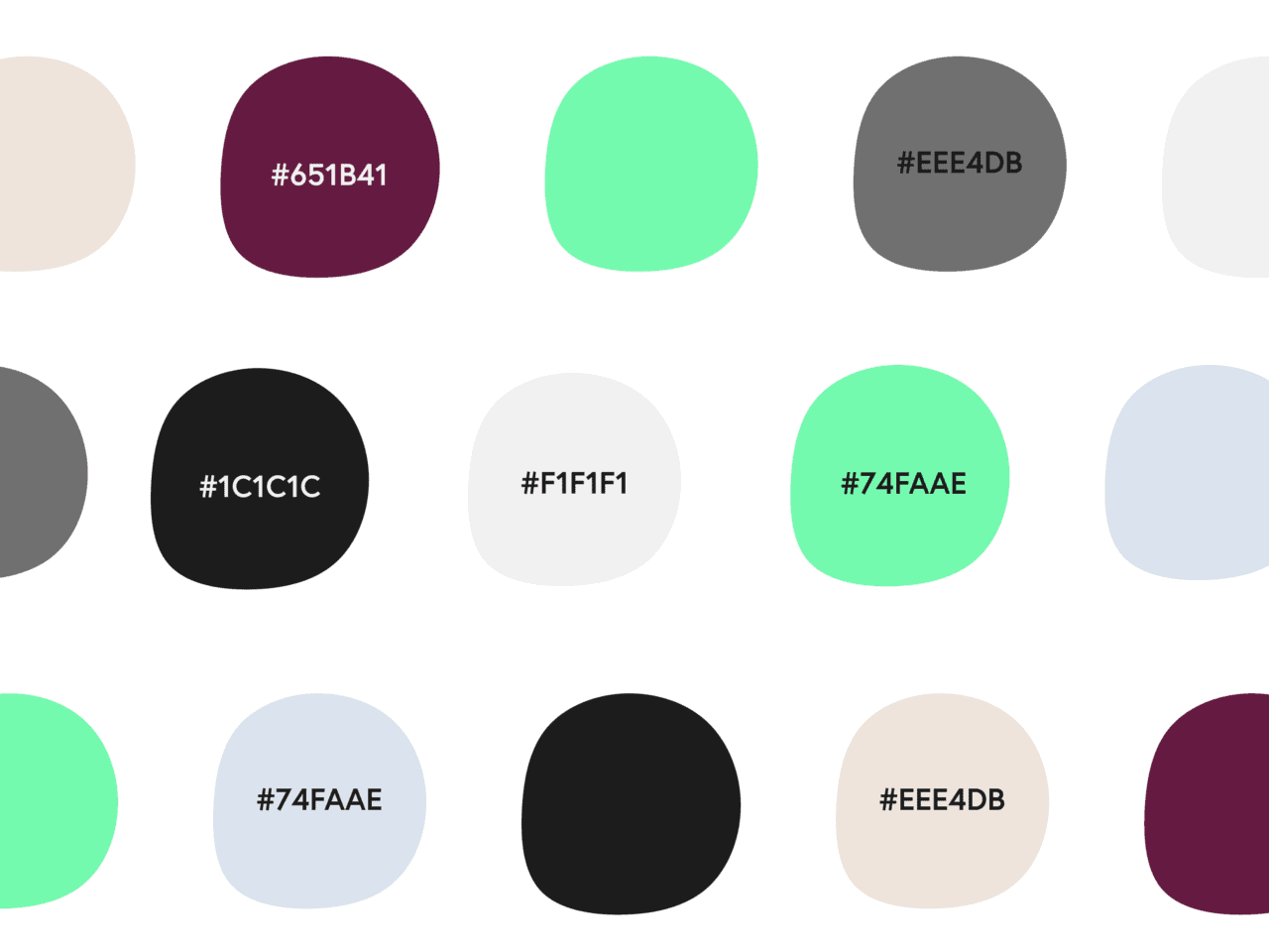
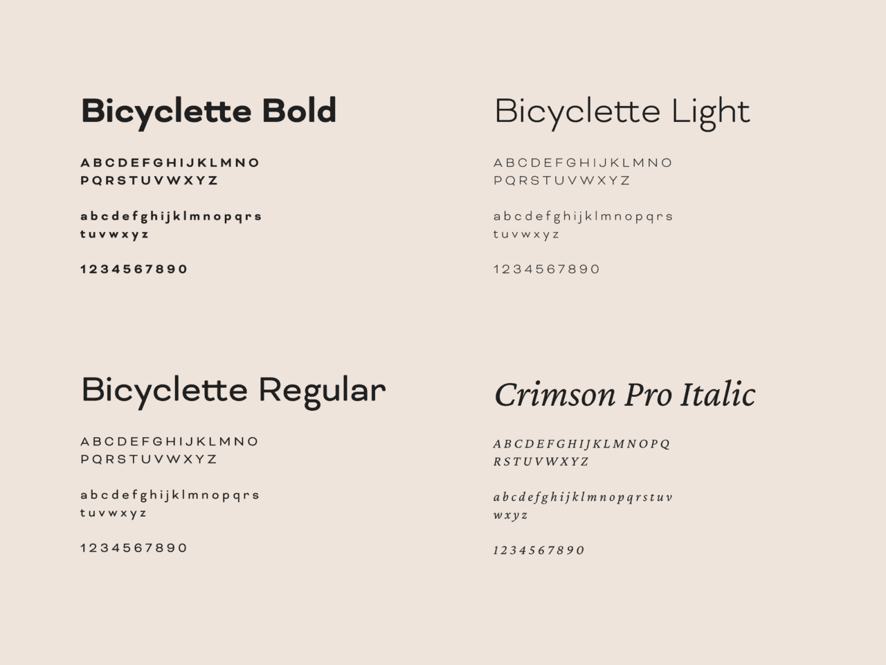
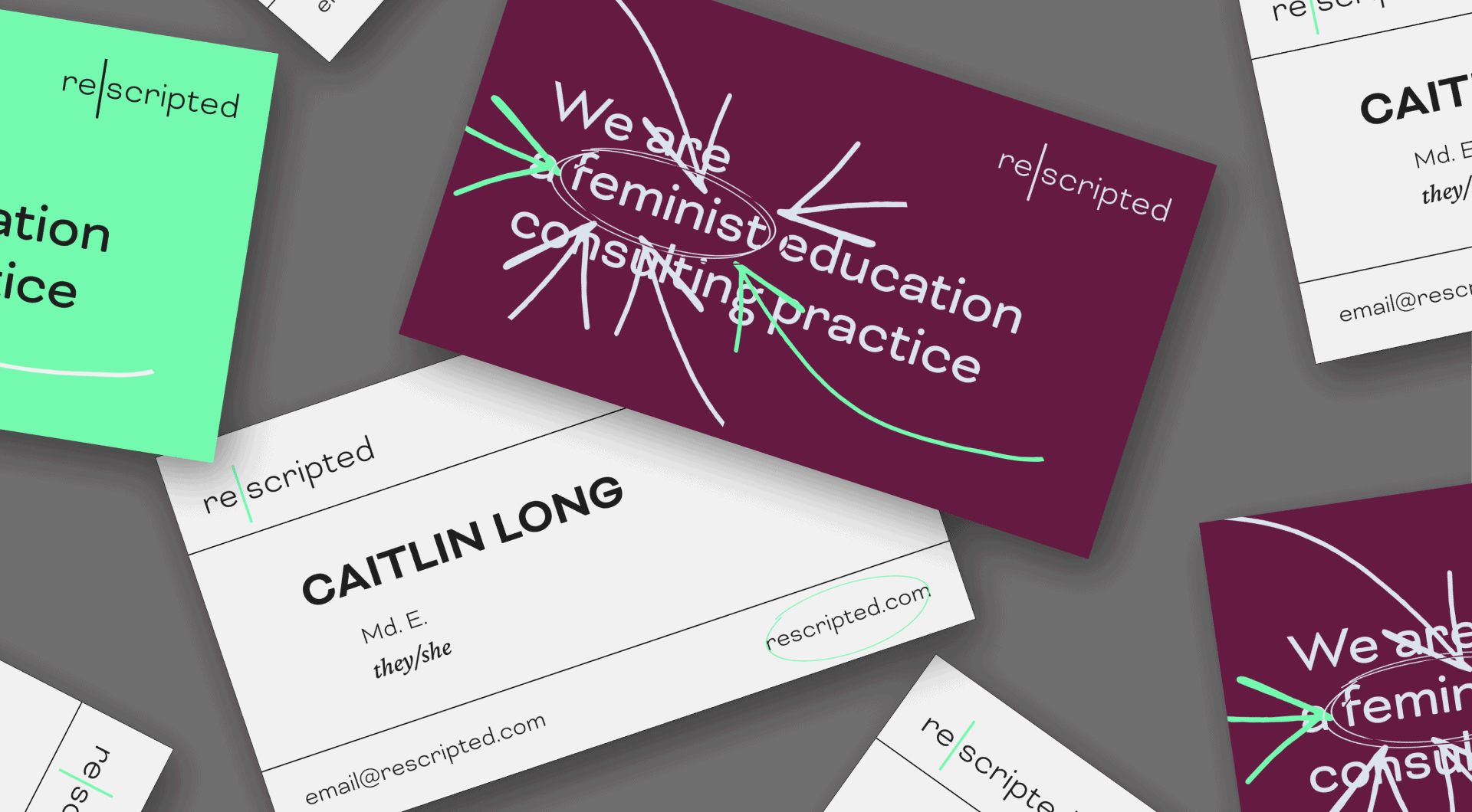
The driving concepts behind the re|scripted branding include clarity, minimalism and dynamism. After several iterations, we landed on a minimalist typographic logo in a single font, with the pipe (previously a slash) highlighted with the brand’s prominent green. As for typography, sans-serif fonts are more prominent but we sourced two contrasting serif fonts for subheadings and accents. We made use of organic, free-form lines and shapes to add a sense of spontaneity, autonomy and personality.
