Grab a cuppa, get comfy and have a nosy around :)

GET Cities

A shared report that helps an ecosystem collaborate—so founders don’t have to fight alone.

GET Cities is a national initiative working across multiple city hubs to radically increase equity and intersectionality in tech. In Chicago, that work takes a particular form: the Tech Equity Working Group (TEWG), a coalition of ecosystem partners (accelerators, incubators, funds, and other supporters) convening to identify what’s missing—and build shared interventions that close the gap for historically excluded founders.

Studio Lutalica partnered with the GET Cities Chicago team to design an editorial report, “Bridging the Gap: Collaborative Networks for Historically Excluded Seed Founders.” The aim was to create a document that’s genuinely readable and useful: something people can move through quickly, return to for specific insights, and share as a credible resource inside their own organisations.

Project Team

Layout and Data Visualisation: Louise Jezequel
The Challenge

The story GET Cities wanted to tell was rich, specific, and inherently structural: a coalition model, two cohorts, and a set of interventions that don’t fit neatly into a simple “before/after” narrative. The content was also text-heavy, with multiple audiences in mind—from ecosystem partners and funders to people designing founder support programmes.

The challenge, then, wasn’t just layout. It was designing an editorial system that could hold nuance while staying accessible: balancing lived experience with clarity, and keeping the reader oriented without reducing people’s experiences into slogans or stats.

What We Did

We approached the report as a piece of community infrastructure in its own right: a shared artefact that helps different parts of the ecosystem coordinate around the same realities and language.

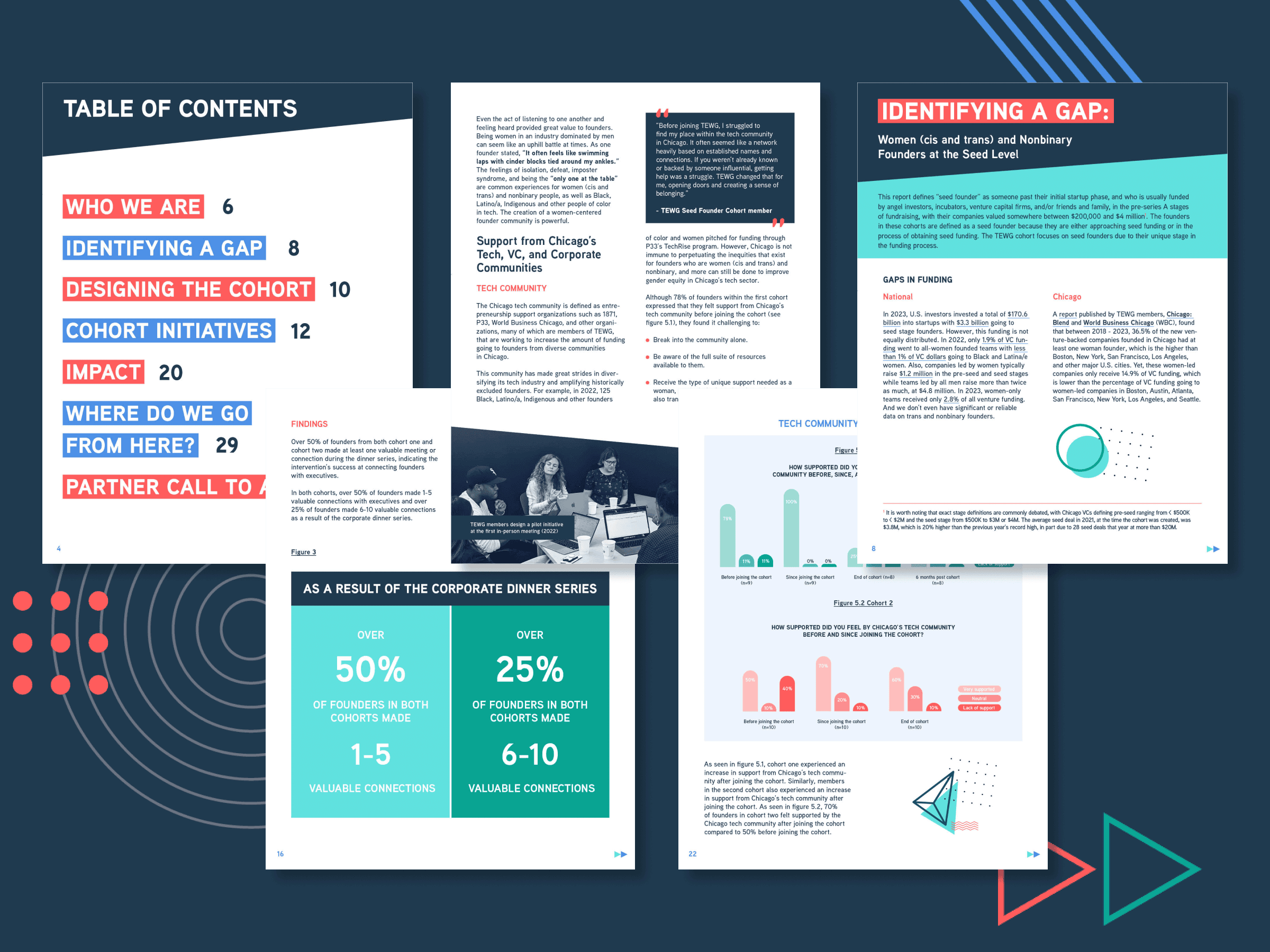
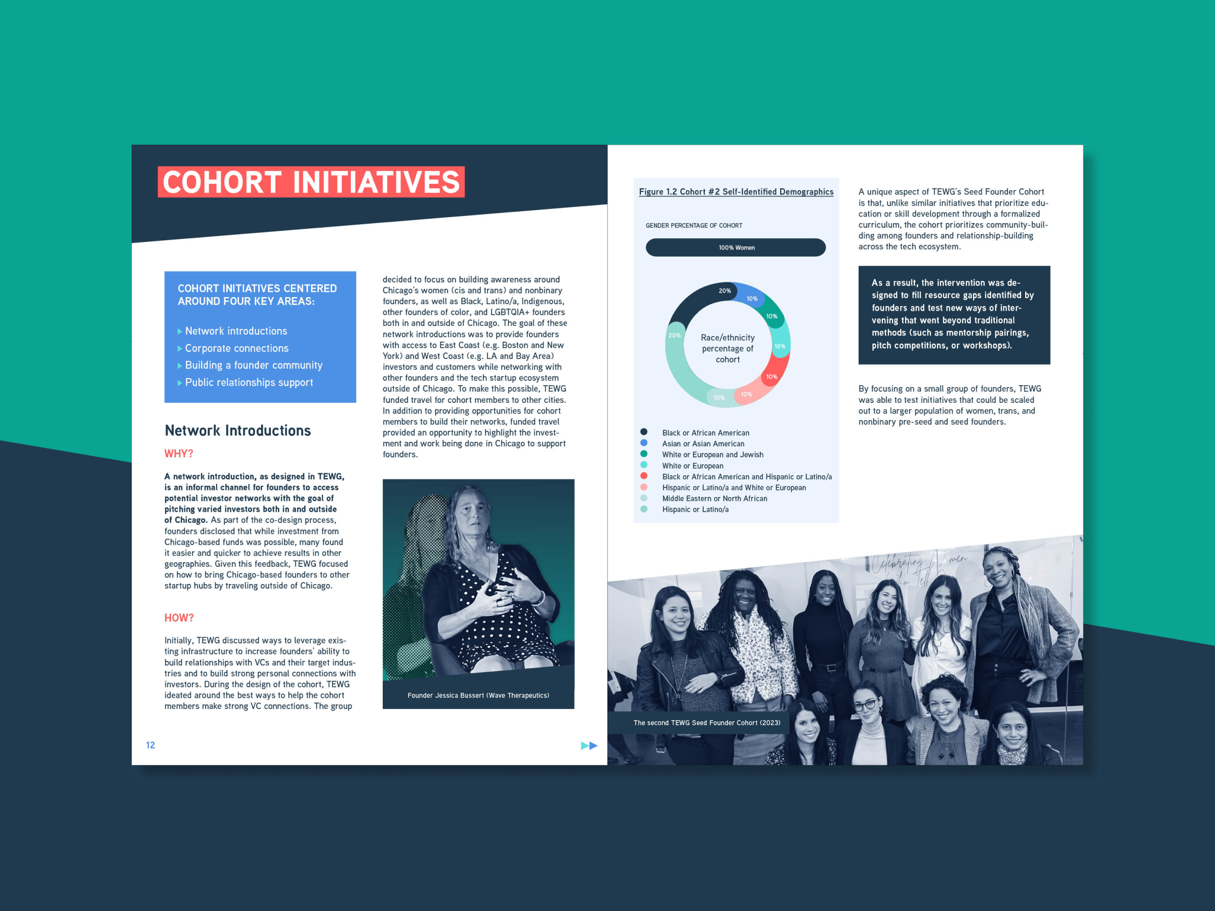
We designed a clear, flexible layout system with consistent application of typographic hierarchy, spacing, and recurring visual elements—creating predictable structure without losing momentum. To support navigation, we focused on strong signposting (section openers, callouts, and repeated design cues) so readers could skim, dive deep, or return later with ease.

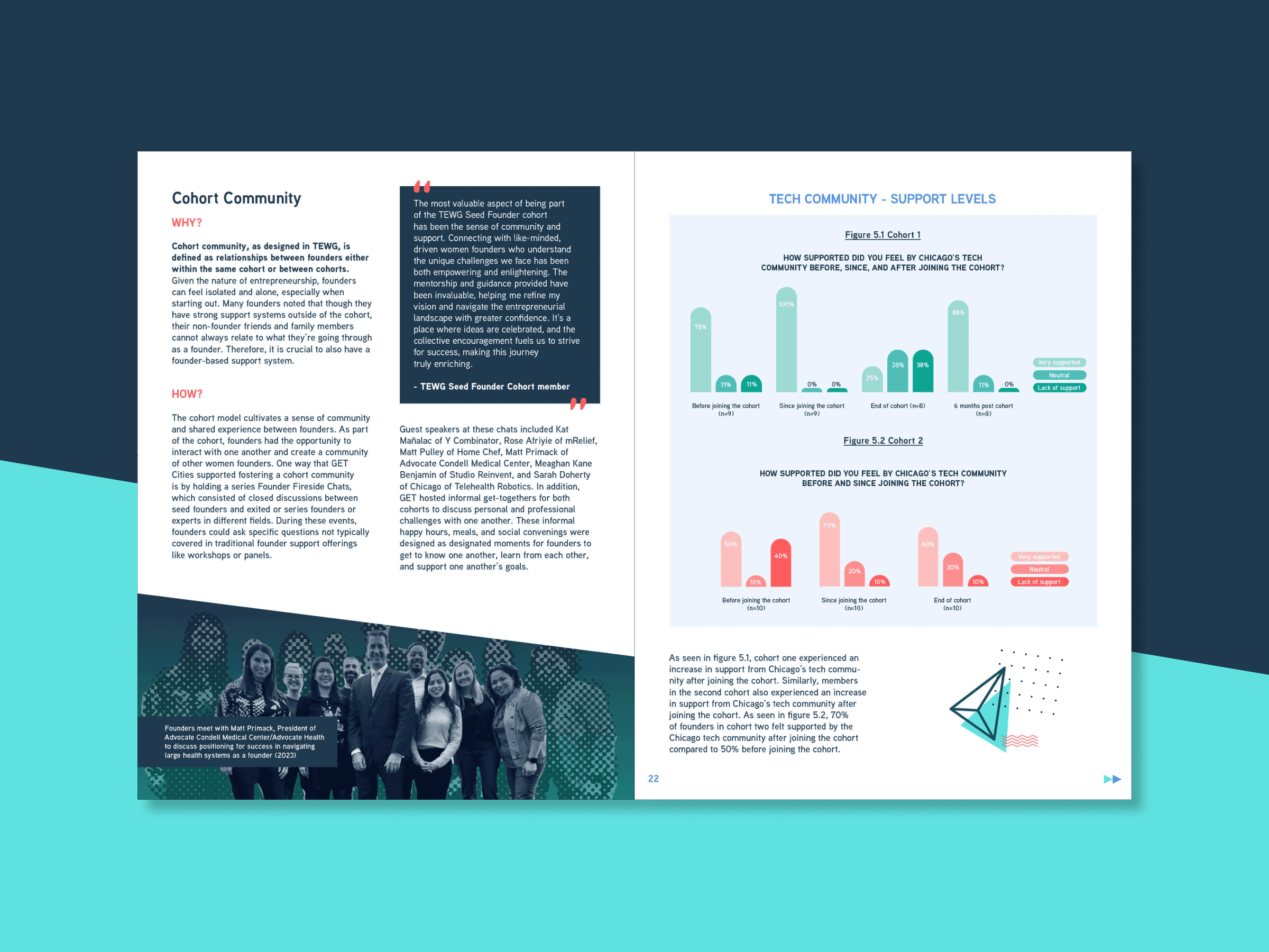
To make key insights land, we created bespoke infographics and data visualisations, designed for clarity first—using contrast, legibility, and thoughtful pacing to break up dense text and reduce cognitive load. Where photography was used, we prioritised real images that reflected the communities at the centre of the work, avoiding generic stock imagery.

Throughout, we ensured the report felt aligned to GET Cities’ existing brand—while refining the design to better support long-form reading, accessibility, and editorial rhythm.

Impact

The final report gave GET Cities Chicago and TEWG a polished, shareable resource that communicates the cohort model as more than a programme: a way of building relationships, community, and pathways into capital and opportunity.

By translating complex, text-heavy content into a structured and visually engaging publication, the report makes it easier for ecosystem partners to understand the intervention, learn from it, and discuss it internally—supporting more consistent, informed action across organisations. Just as importantly, it helps hold space for the lived experiences that shaped the work, making sure the human reality behind the systems is neither softened nor obscured.

Blue-toned dotted illustration of a cityscape featuring skyscrapers. The text GET CITIES is boldly displayed in white in the centre.
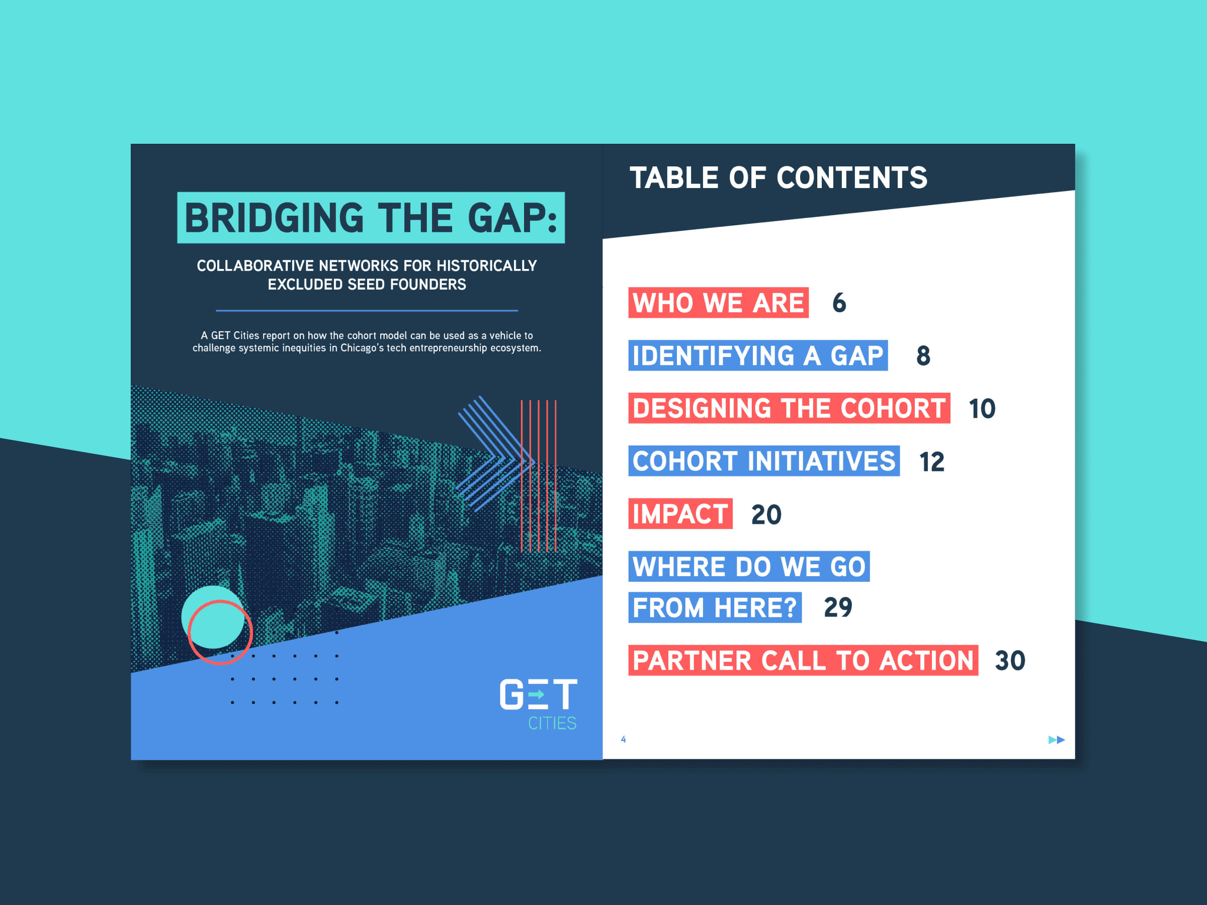
Report cover titled Bridging the Gap: Collaborative Networks for Historically Excluded Seed Founders with sections like Who We Are and Impact in the table of contents. Cityscape background and GET Cities logo.
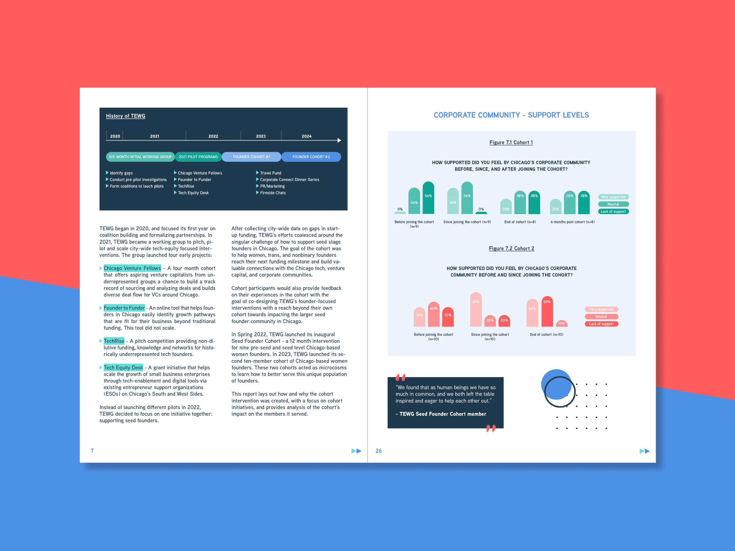
double page spread of report featuring double columns on one page and a 3/4 page image of our original infographics
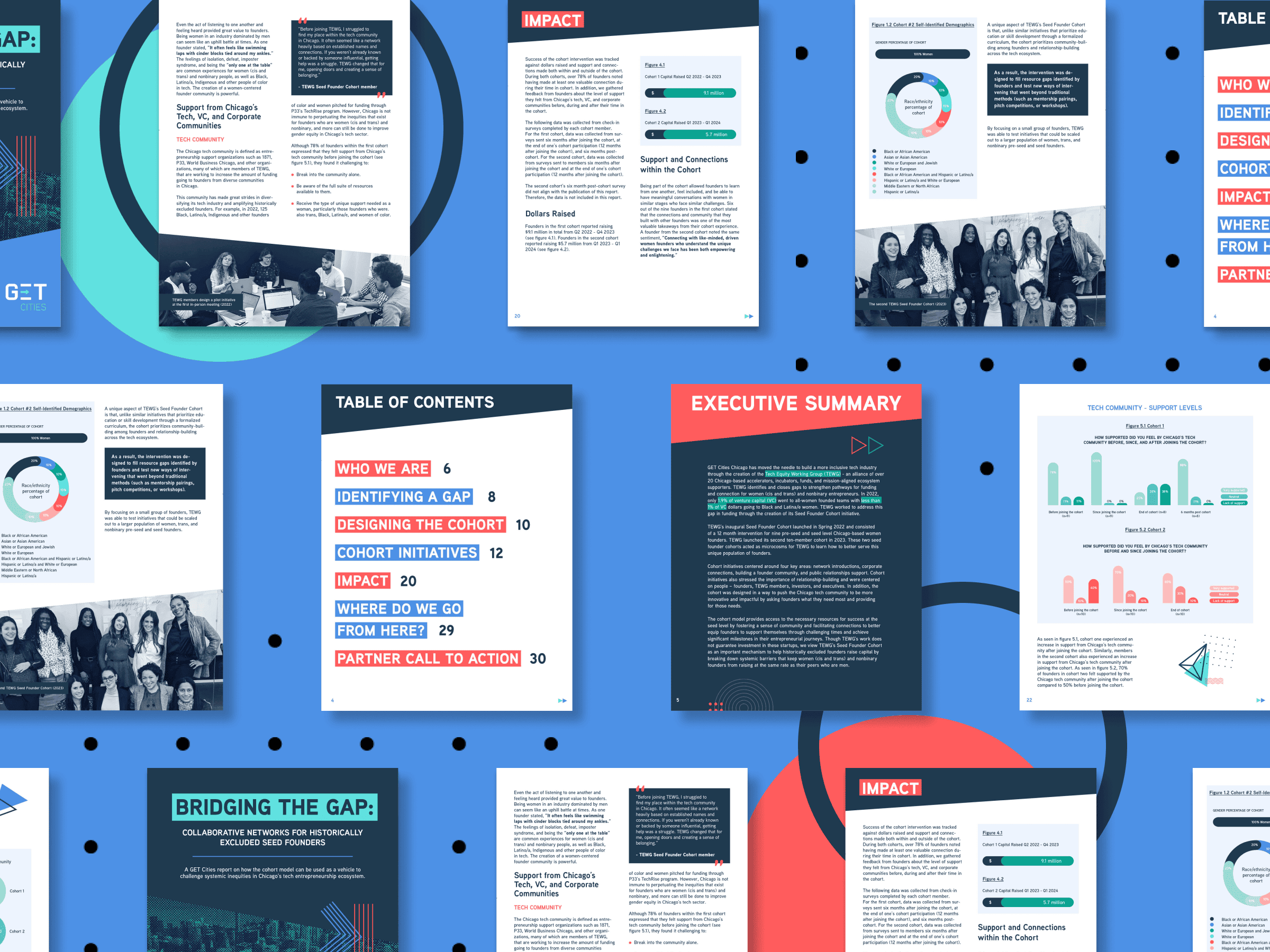
series of images of report pages, showing a diversity of layout, adapted to the content
double page spread featuring double columns, angular graphic elements and colour-drained photography
series of pages showing variety of layouts with consistently applied elements
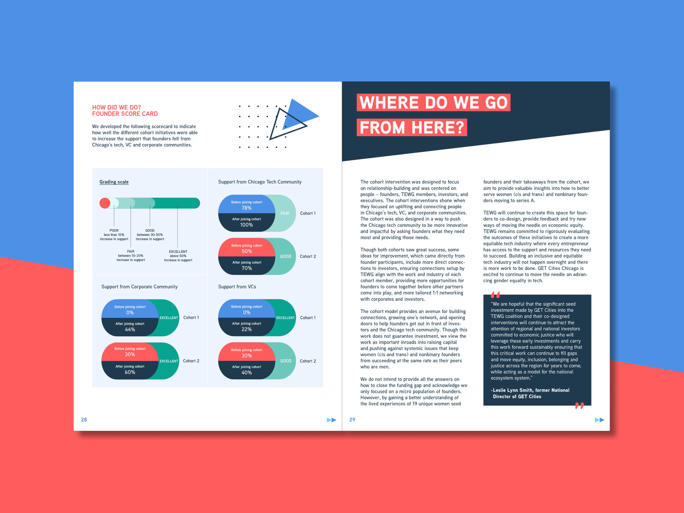
2/3 of page left devoted to infographics; page right is a full page of copy in double columns with pull text and a banner title
report design for get cities

I loved working with the team; I wholeheartedly recommend supporting this organization (or hiring them!) if you are an inclusive organization that wants to center the experience of LGBTQIA+ and gender diverse individuals. Bookmark their link for your future reporting or design needs!

– Allison James, Senior Program Manager, Chicago, GET Cities