Work & Class
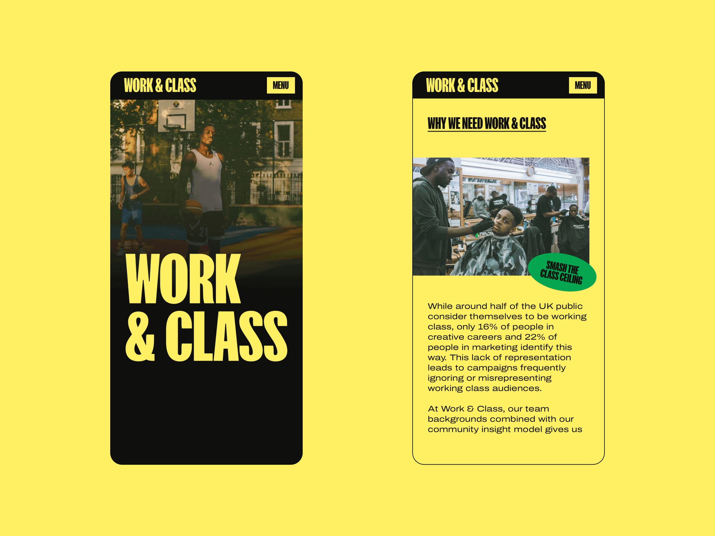
Work & Class is a pioneering agency connecting brands and organisations with working-class communities. Recognising the significant underrepresentation in creative and marketing careers, they aim to bridge the gap between brands and often neglected working-class audiences. They are part of Ready Media Group. We had a great time putting together the branding and web design for Work & Class, which we developed on Webflow.
Credits
Branding + UX/UI: Zoe Tang
Development: Lisa Komoltseva
Branding
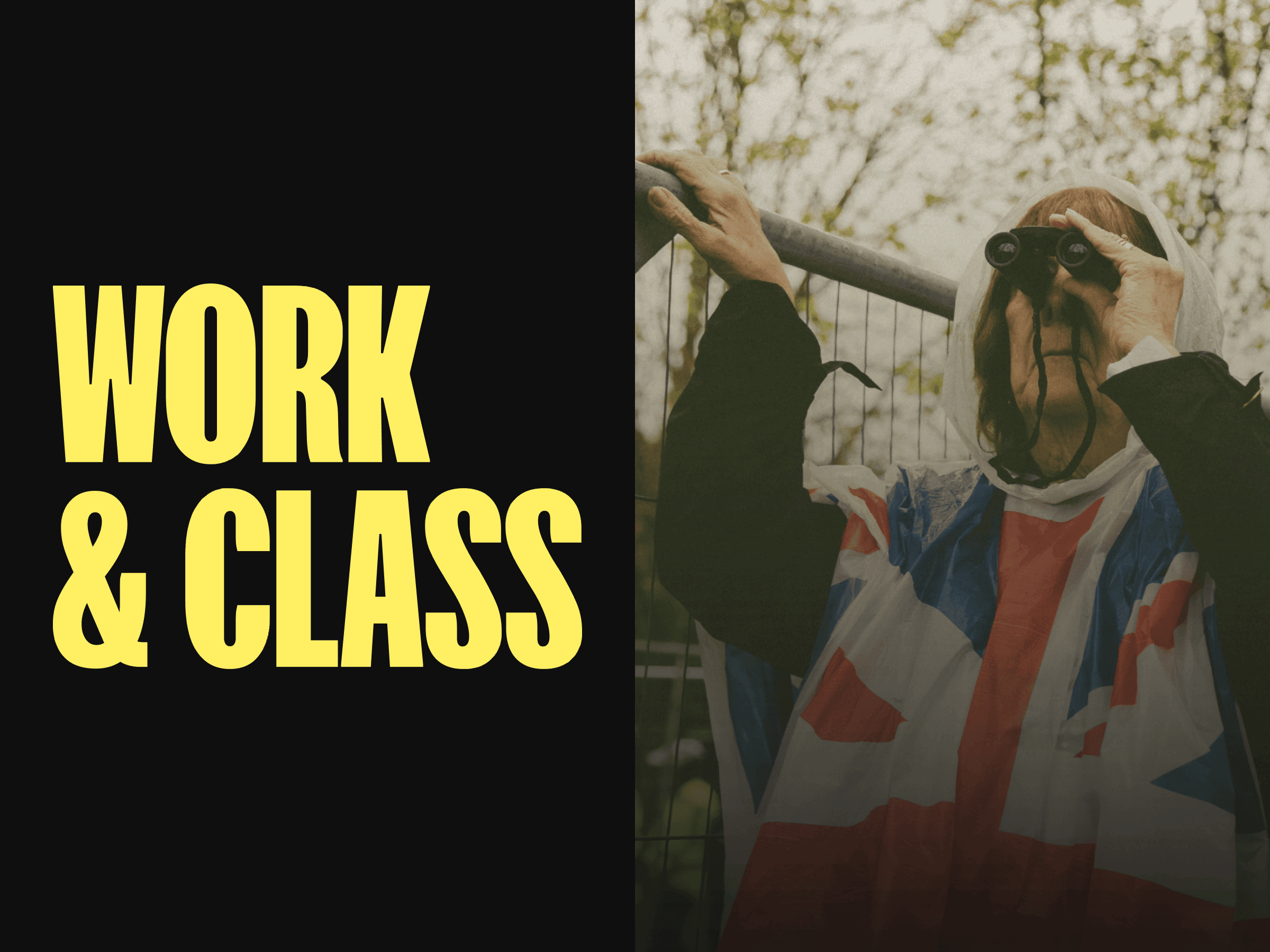
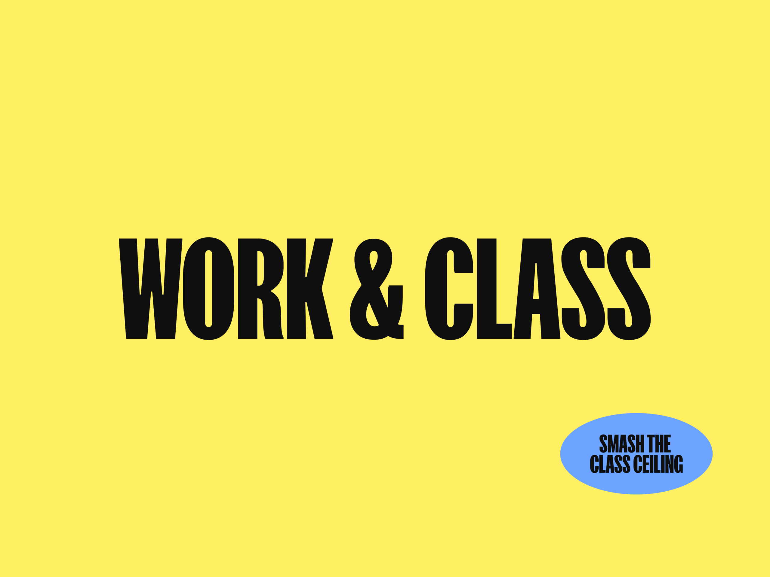
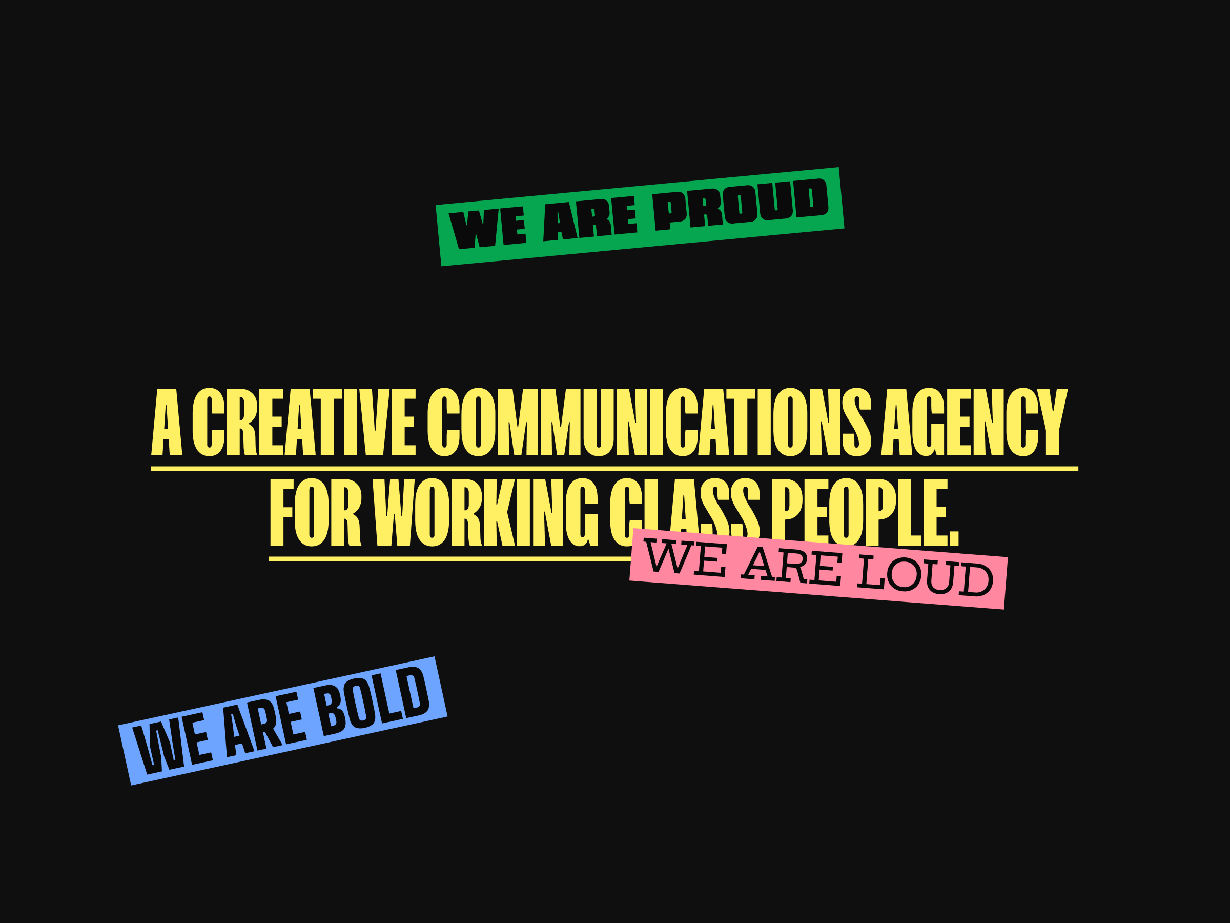
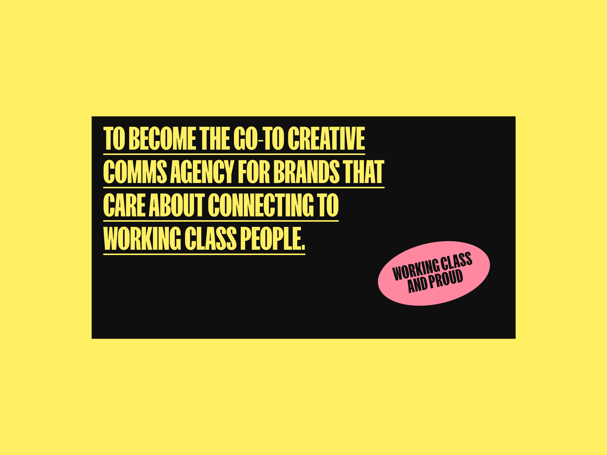
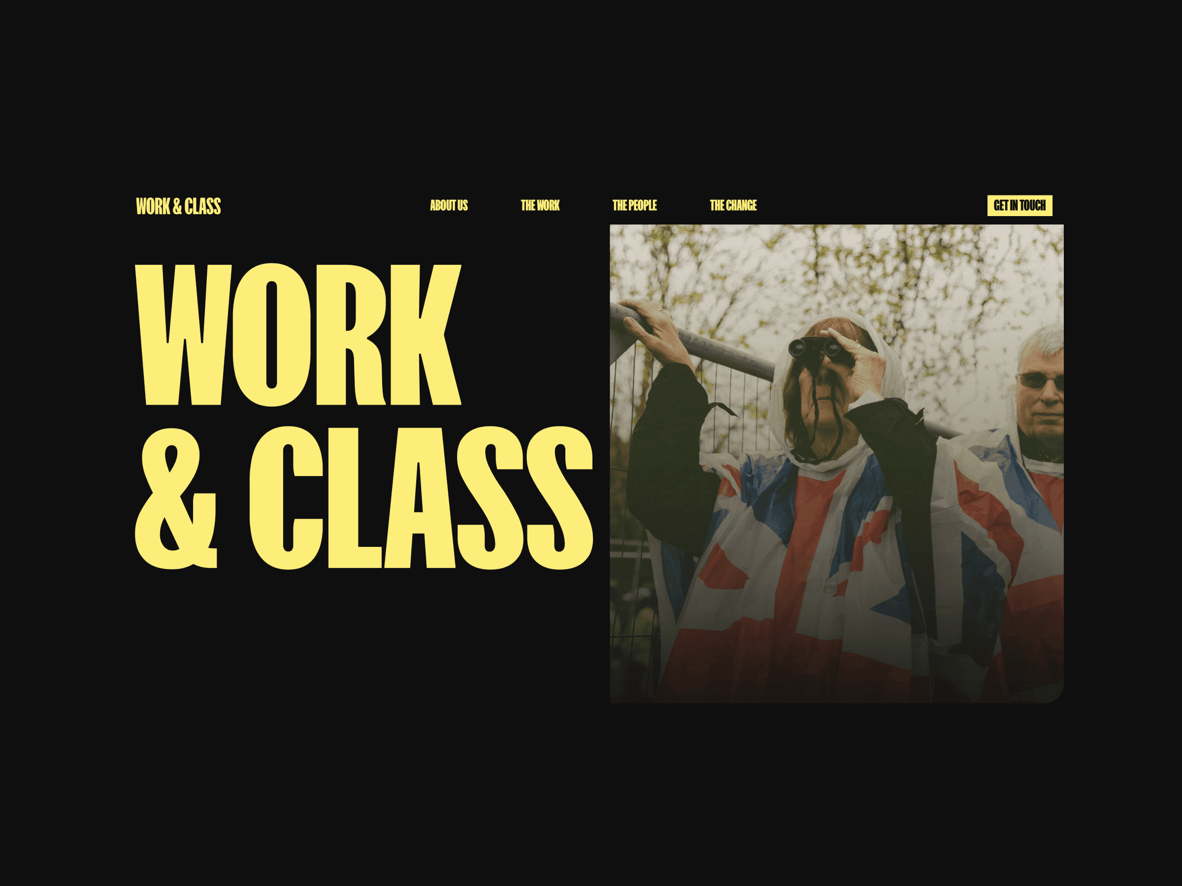
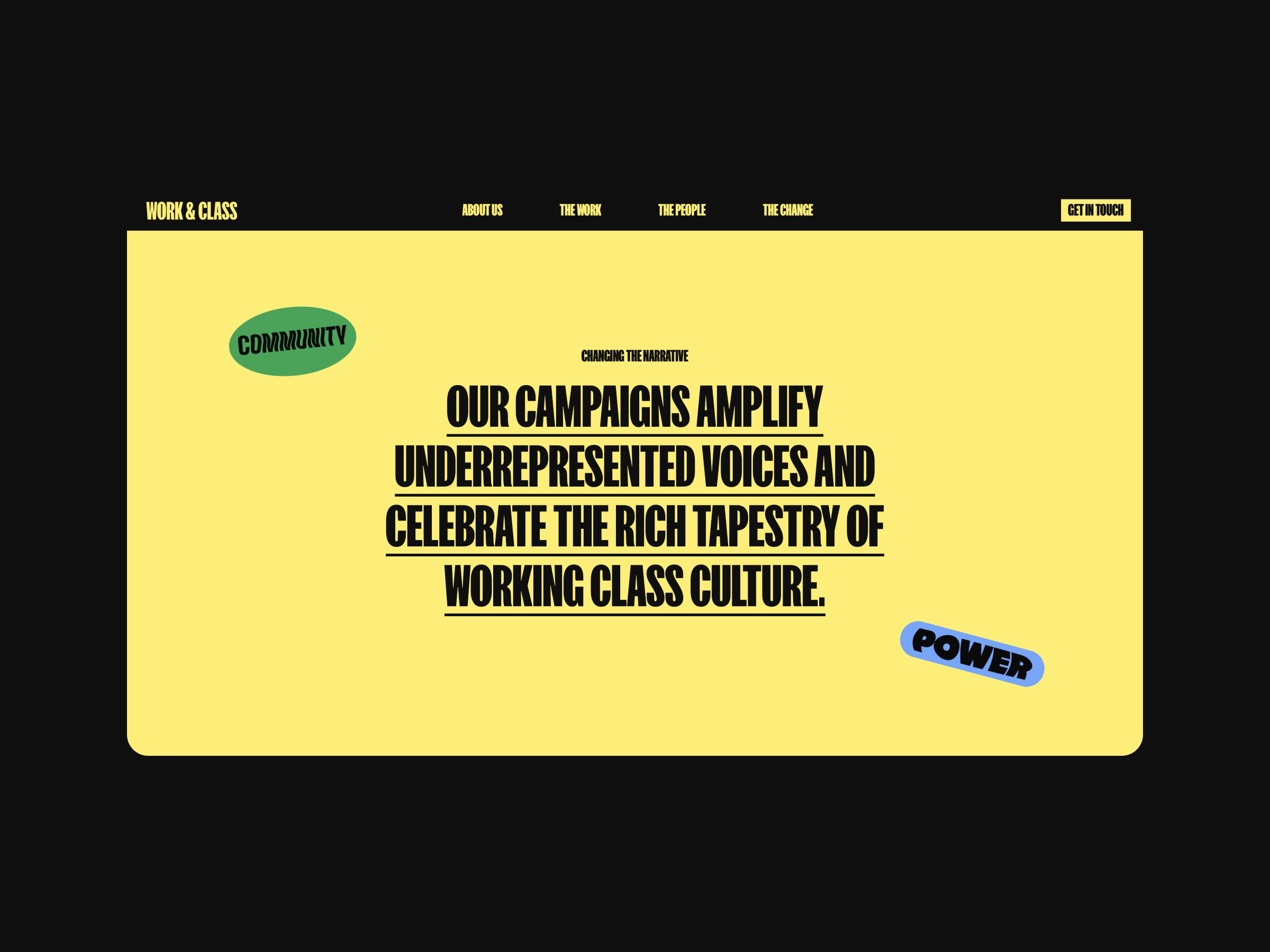
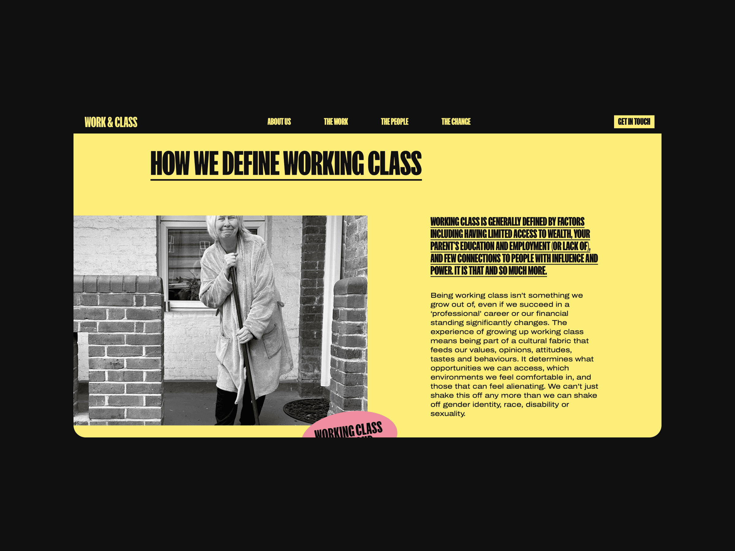
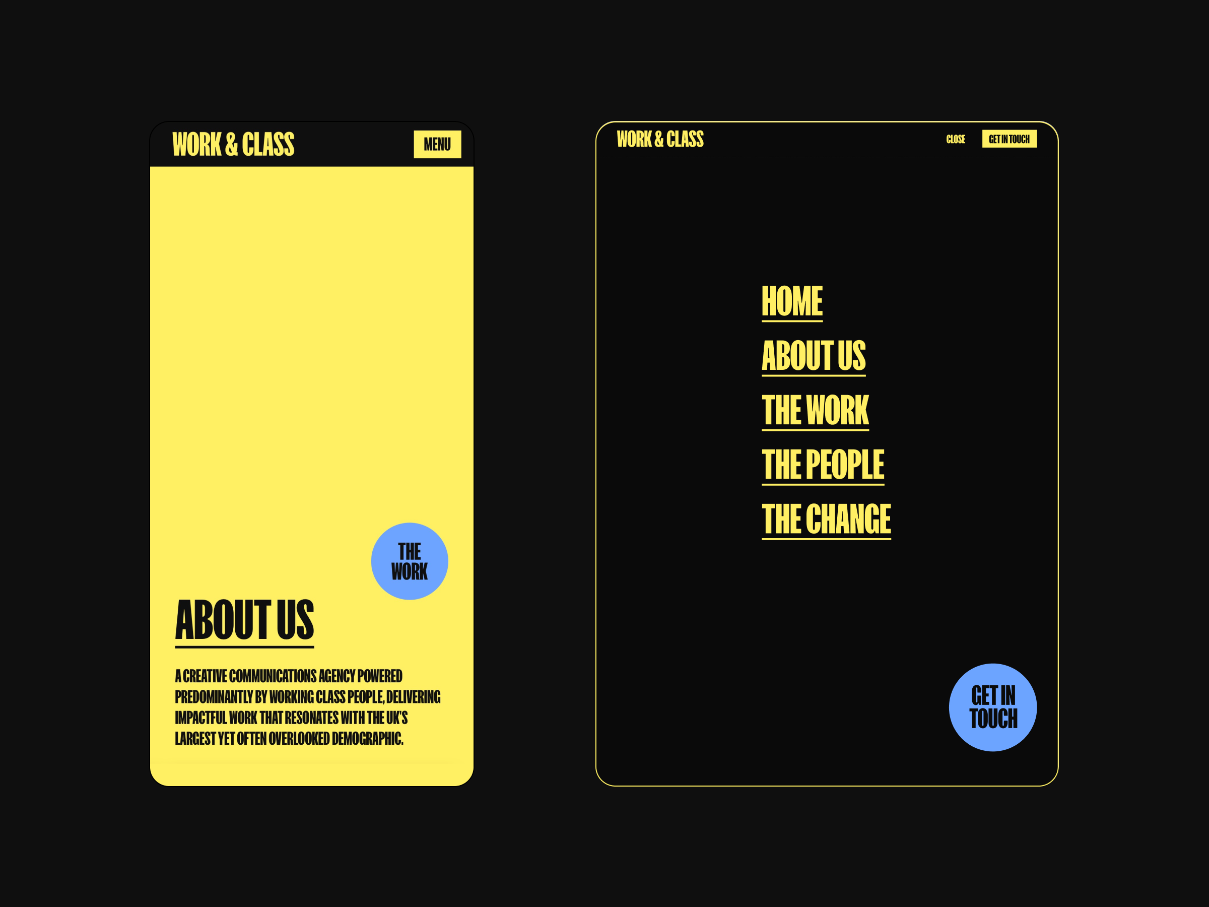
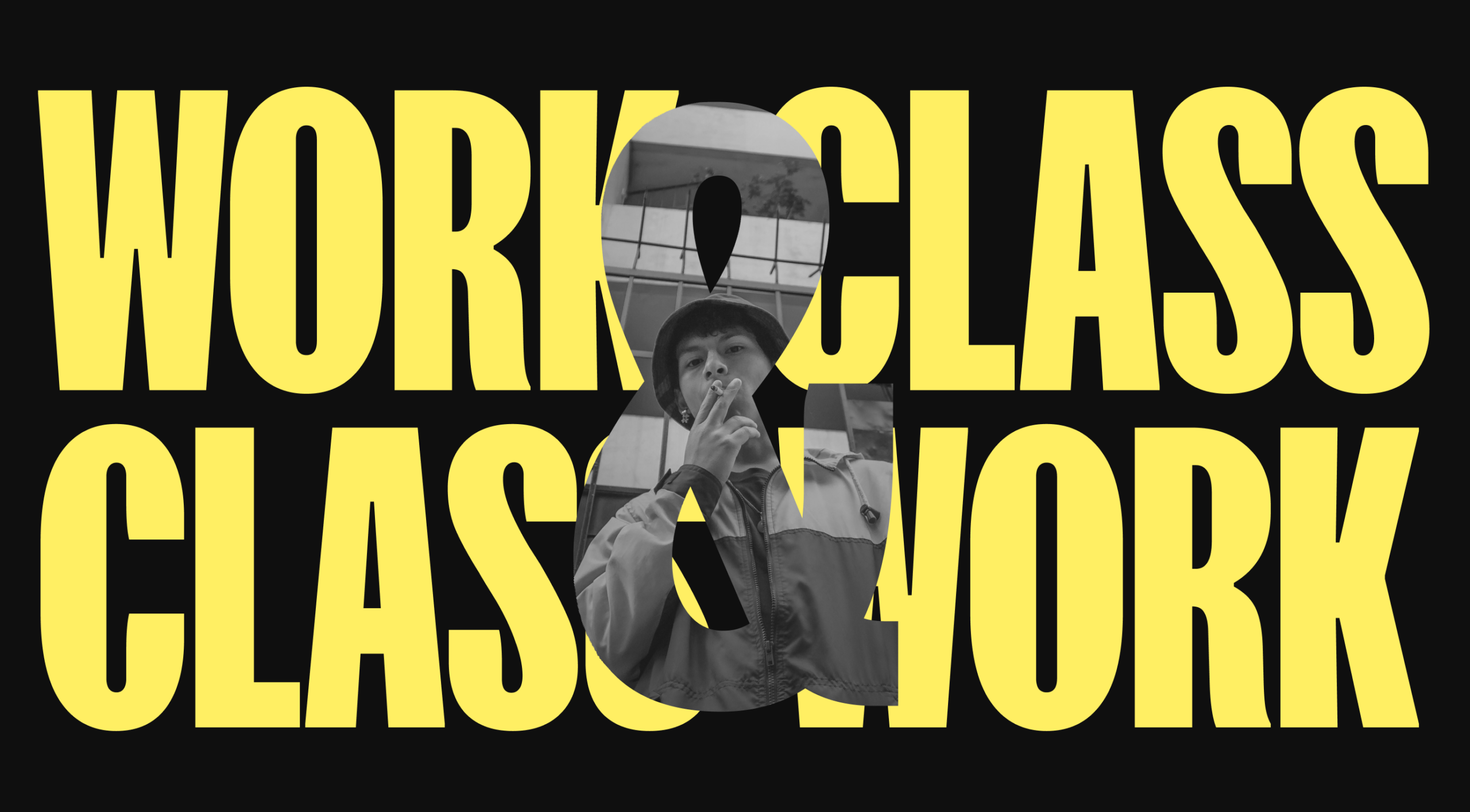
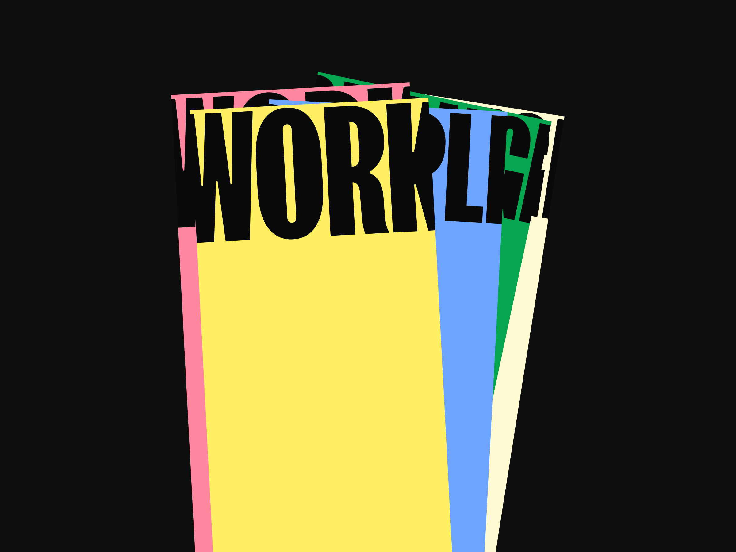
Our branding strategy for Work & Class was inspired by key moments of working class activism, from archival photos of the General Strike of 1926 to present-day campaigns like ‘Enough is Enough’ which addresses the cost of living crisis. We sought to encapsulate the spirit of resilience and unity by using black and white photography, putting a sepia filter on coloured photographs and using bold typography, akin to the visual language of protest signs. Bright, bold colours are employed to ensure the brand stands out loud and proud in any context.
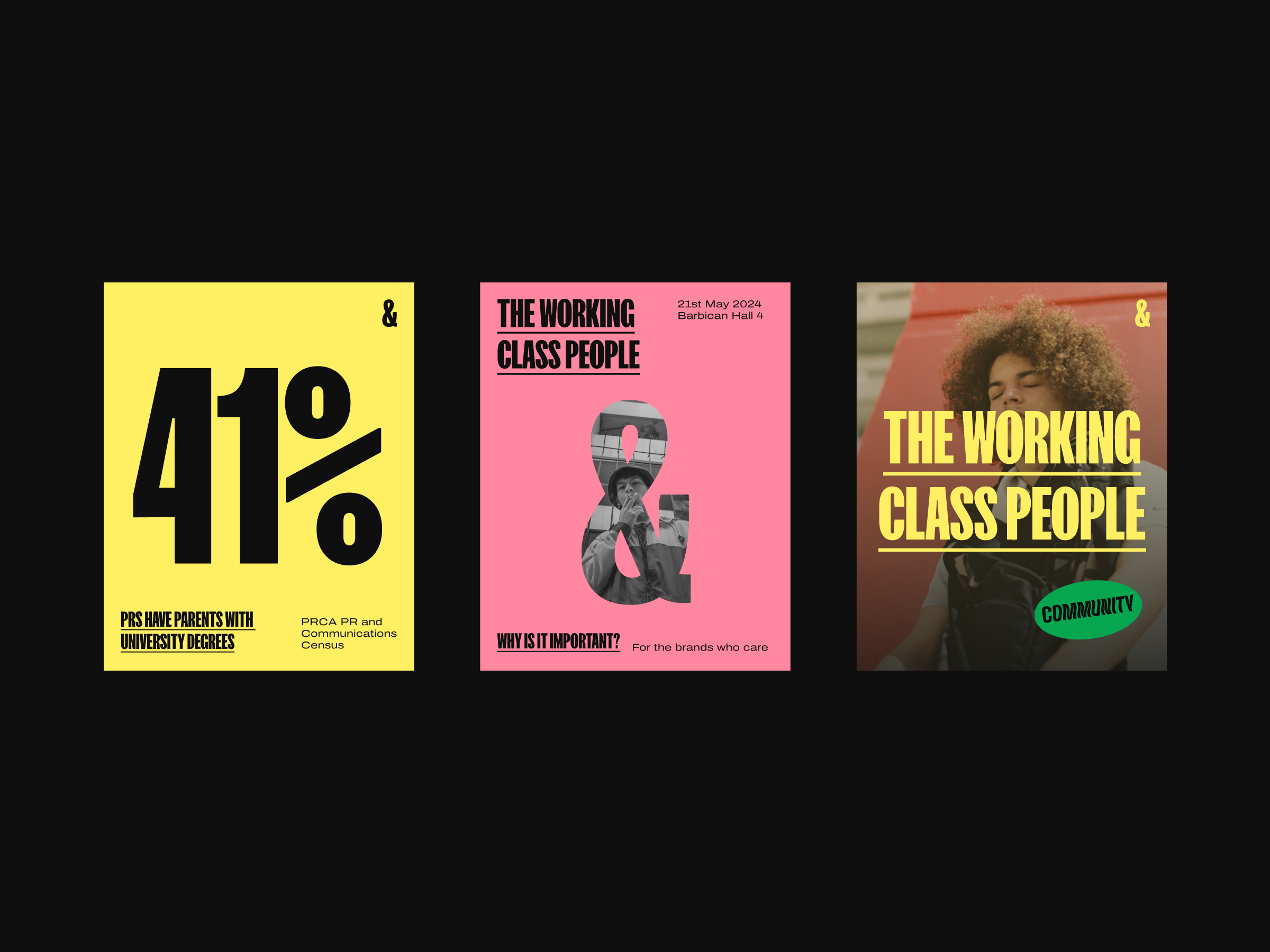
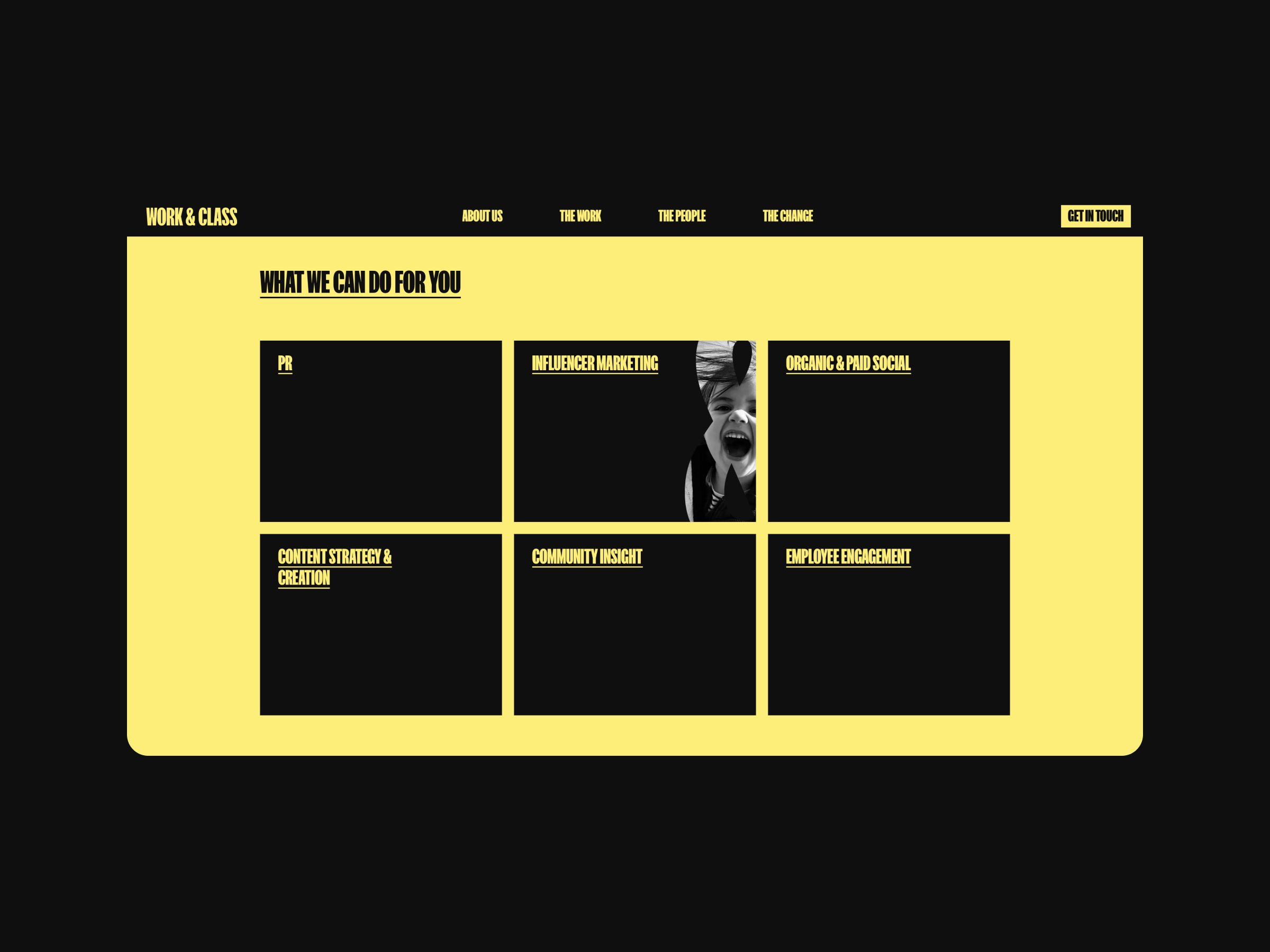
The colour palette also intends to convey optimism, authenticity, and vibrancy. Dominated by yellow, symbolising optimism and energy, it is complemented by bright green and orange tones that add warmth and dynamism. These are balanced with subdued hues to temper the boldness, ensuring the palette remains accessible but nuanced. The combination reflects the diverse and inclusive ethos of Work & Class, resonating with their commitment to genuine and impactful communication.
Stickers play a significant role in the brand’s visual identity, symbolising the diverse voices within the community. The varying fonts used on the stickers represent the multiplicity of perspectives, while traditional protest signs inspire the shapes. These elements are not just decorative but serve to reinforce the brand’s message of inclusivity and representation. A lot of the graphics we created for Work & Class are typographical, and the headline font is FK Screamer, a condensed, robust font, with the strength and clarity to carry bold slogans.