La Casa di Sophia
La Casa di Sophia is an organic farm and winery, located on the Italian island Sant’Antioco. They balance traditional and modern techniques to work the land sustainably and produce high-quality organic wines. Much of the process is done by hand ‘to get the most out of the exquisite Carignano grape.’ We developed a new site for La Casa di Sophia on Shopify, along with new brand guidelines and visual identity.

Credits
Branding and UX/UI Design: Cecilia Righini
Development: Tim Fowler
Illustrations: Catarina Bernardi
Visual Identity


The vineyard where La Casa di Sophia get their grapes is on a Mediterranean island, which we evoked by selecting warm earthy base colours and a ripe magenta for the colour palette. A major factor in our decision was finding colours that would work well with La Casa di Sophia’s product and lifestyle photography.
We used Orpheus Pro, a sophisticated serif font, for main titles and sans serif font Jost, which is a clear and accessible font for product descriptions.
Website
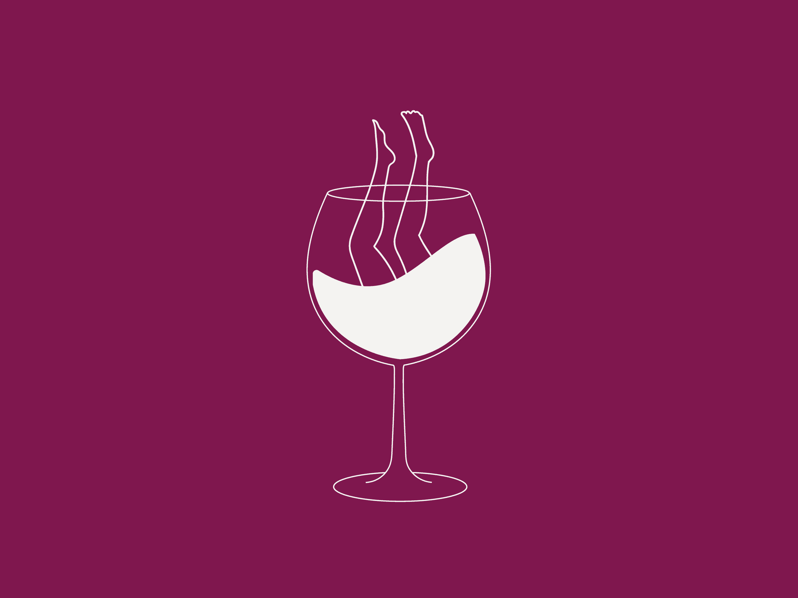
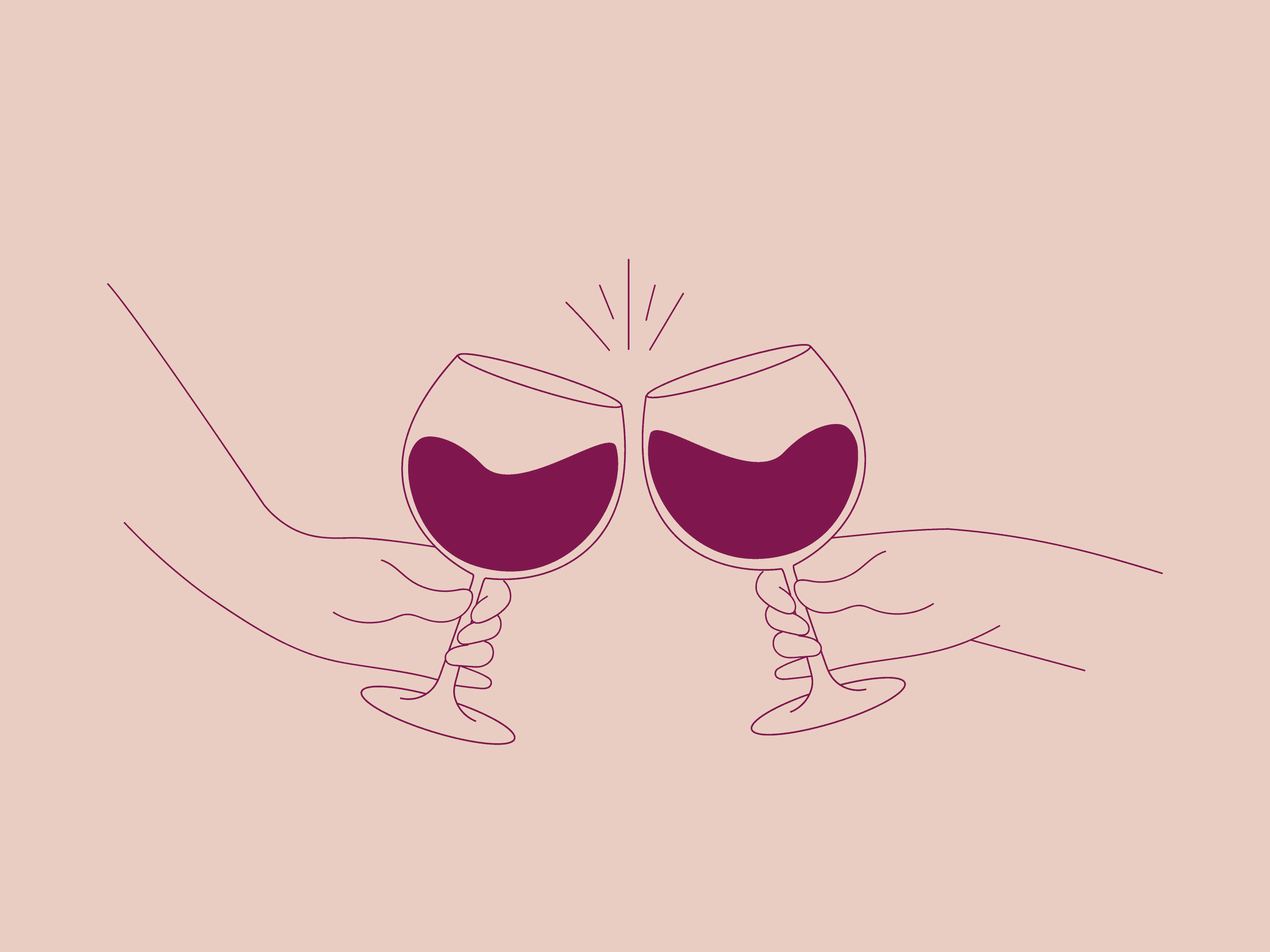
La Casa di Sophia needed an easy-to-manage design for their Shopify store. We developed a clean code, ensuring the website can be scaled and adapted with minimal fuss over time. The brand had a logo already, but we animated some illustrations in a similar style, adding a sense of movement and conviviality on-site – for example, a wine glass clinking pop-up.


Our commitment to a seamless user experience extends to responsive design, ensuring adaptability across various screen sizes for an optimal viewing experience.
Product Images


Recognising the importance of having clear and consistent product shots for an e-commerce site, we supported the brand with orchestrating product shots. The result is a collection of product images that seamlessly integrate with the Shopify interface, enhancing the overall experience for La Casa di Sophia’s customers.
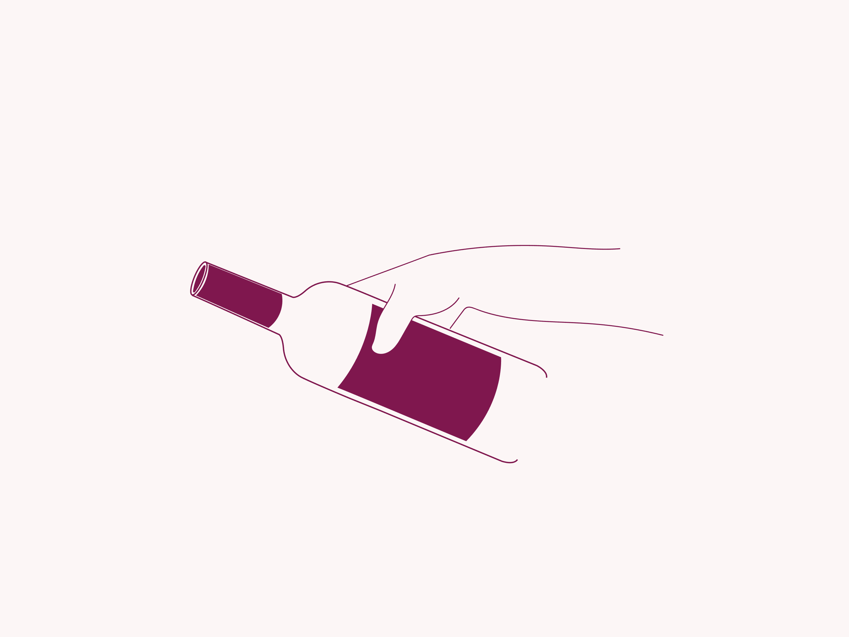
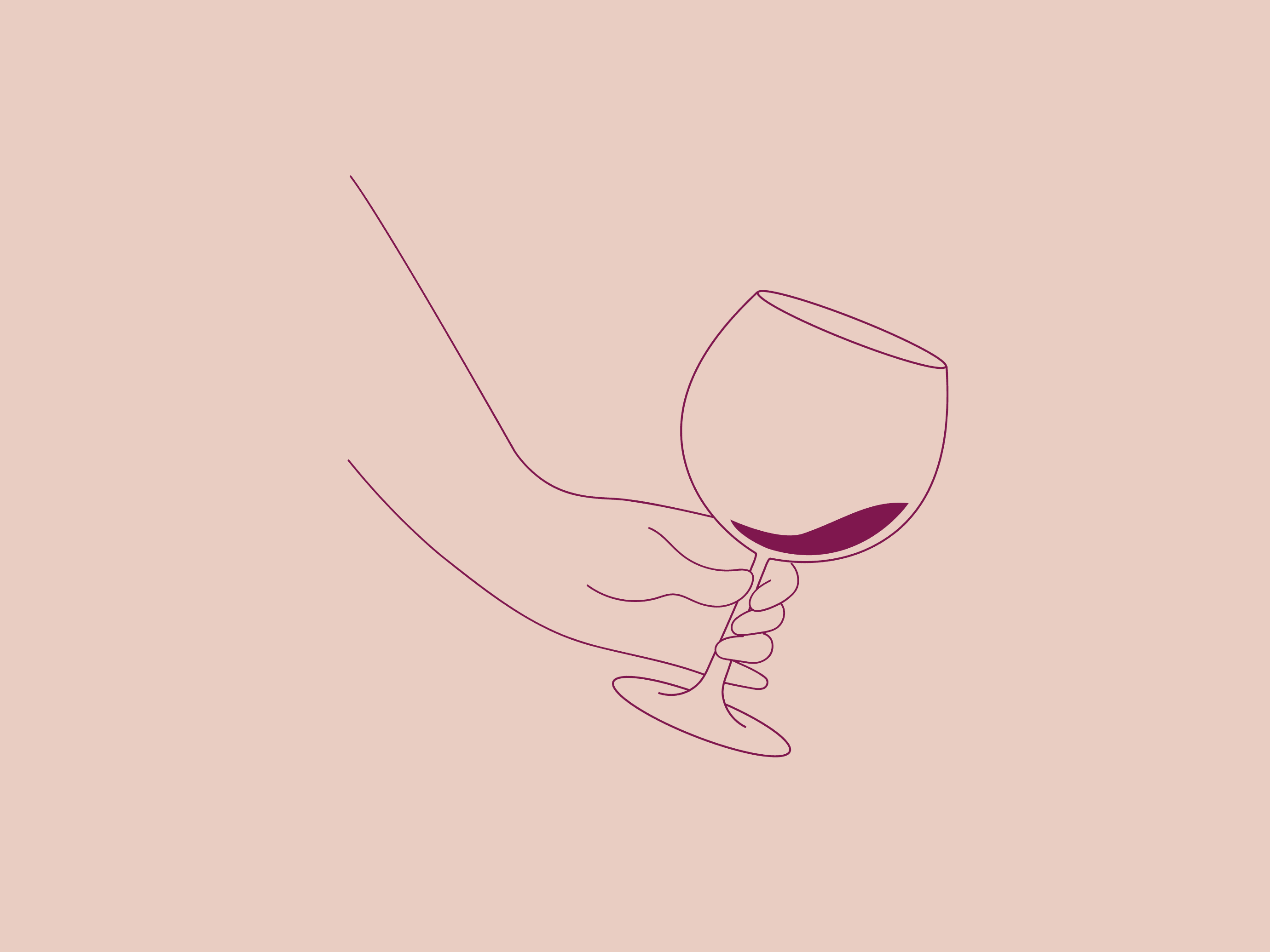
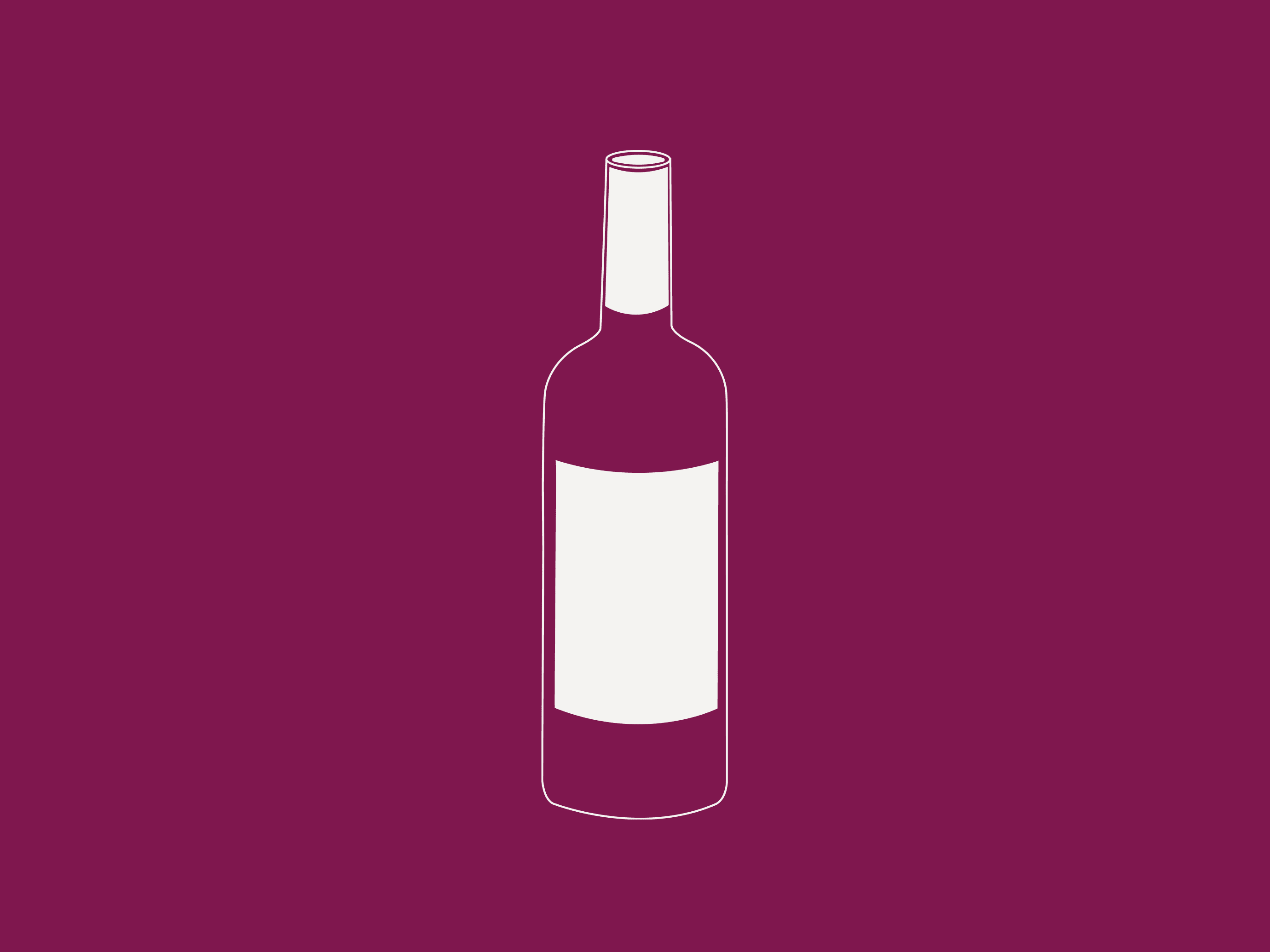
Illustrations
We created minimalist line drawings to elevate and extend La Casa di Sophia’s visual identity. These illustrations, brought to life through animation on the website, not only elevate the user experience but also convey attention to detail. The purple tone line drawings subtly allude to the operation’s female-founded identity, challenging the macho image associated with the wine industry.