Day Stack
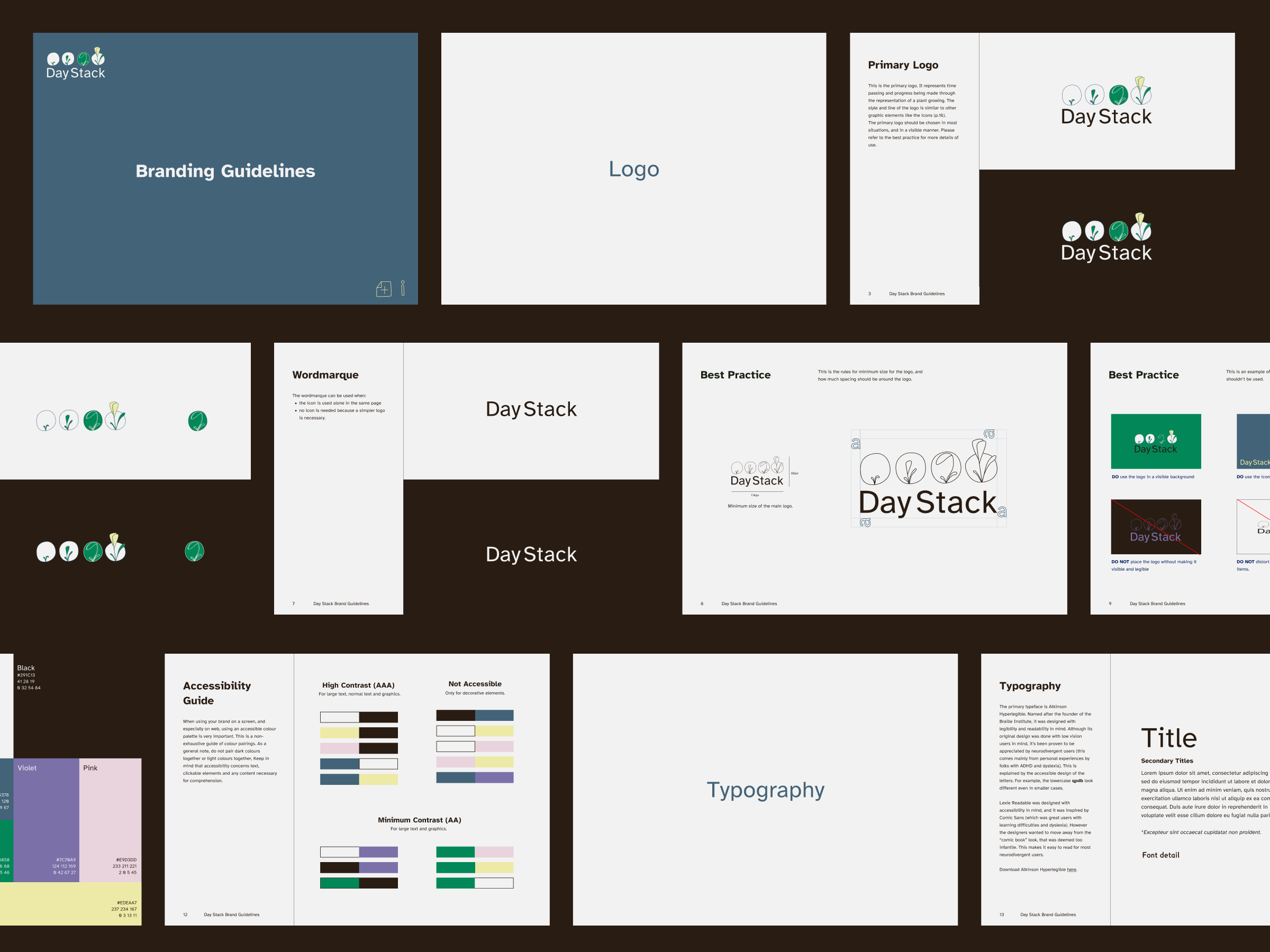
Day Stack is a revolutionary app crafted to simplify list-making for neurodiverse individuals, particularly those with ADHD and autism. The app creators approached us with the need for branding that not only functions effectively but also feels welcoming and accessible to its users.
Credits
Research and Design: Alaïs de Saint Louvent
Brand Identity
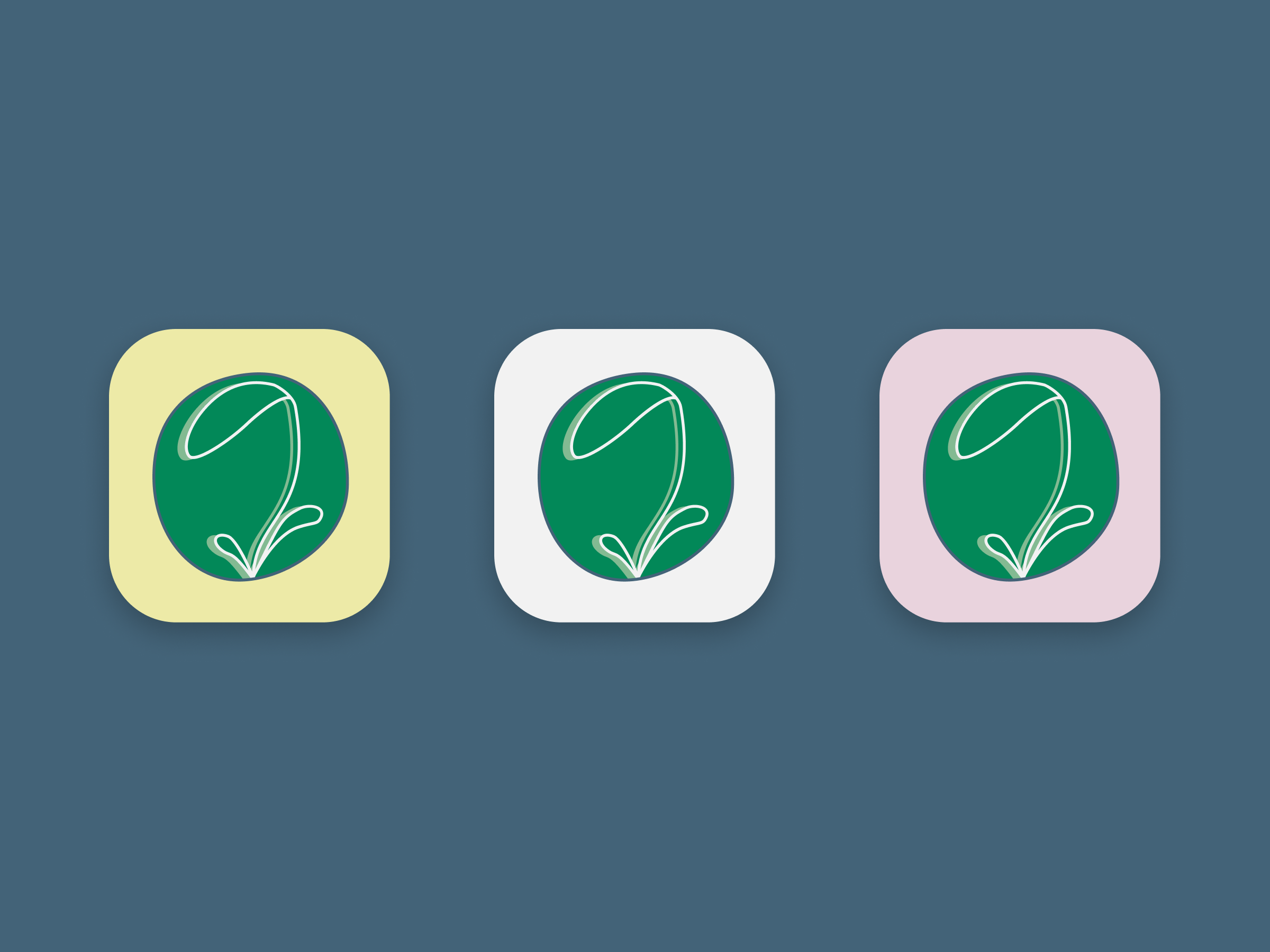
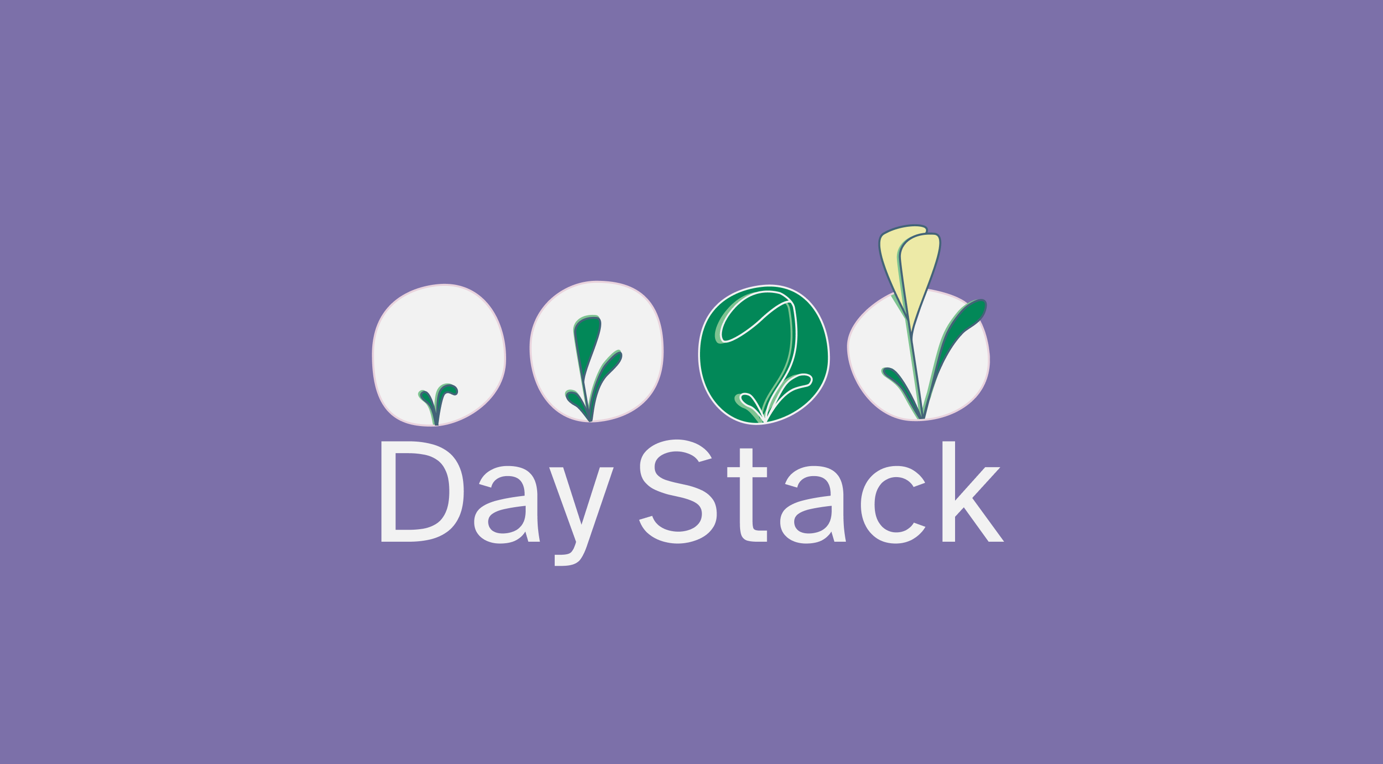
The branding for Day Stack was crafted to evoke a sense of calm and natural harmony, aligning perfectly with the app’s mission to support neurodiverse individuals. The logo, a minimalist and semi-abstract line drawing of a plant, symbolises slow and consistent self-growth through patience and self-care.