Forcibly Displaced People Network
Forcibly Displaced People Network (FDPN) is the first LGBTIQA+ refugee-led organisation in Australia, dedicated to creating a future where every LGBTIQA+ forcibly displaced person thrives, with their rights and dignity protected both in Australia and globally. We were honoured to support them by redesigning their branding and developing their website.

Credits
Brand Refresh: Zoe Tang
UX/UI Design: Federica Minini
Development: Sofiia Bondarenko
Brand Refresh


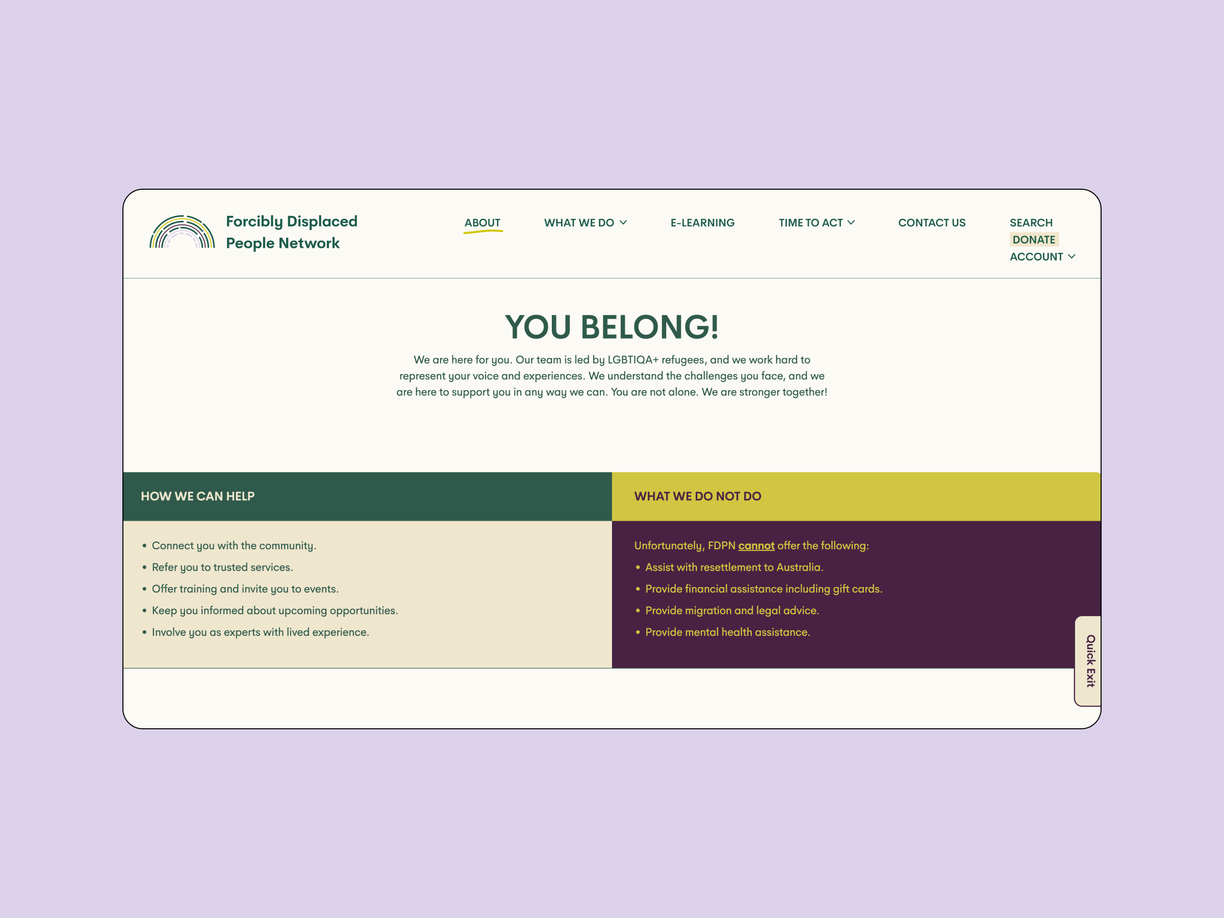
For FDPN’s brand, we embraced warm and approachable colours, using purples, greens, and cream. Shades of violet are traditionally associated with LGBTQ+ identities, providing a subtle nod to this cultural history. The responsive logo features a minimalist line-drawn rainbow in purple and green, offering a more appropriate tone than the full spectrum of rainbow colours. Typography choices include Heywow in bold and regular, ensuring legibility and impact. The secondary font adds a grassroots, human touch with its handwritten aesthetic, used sparingly to reflect the humanity of FDPN.
Website


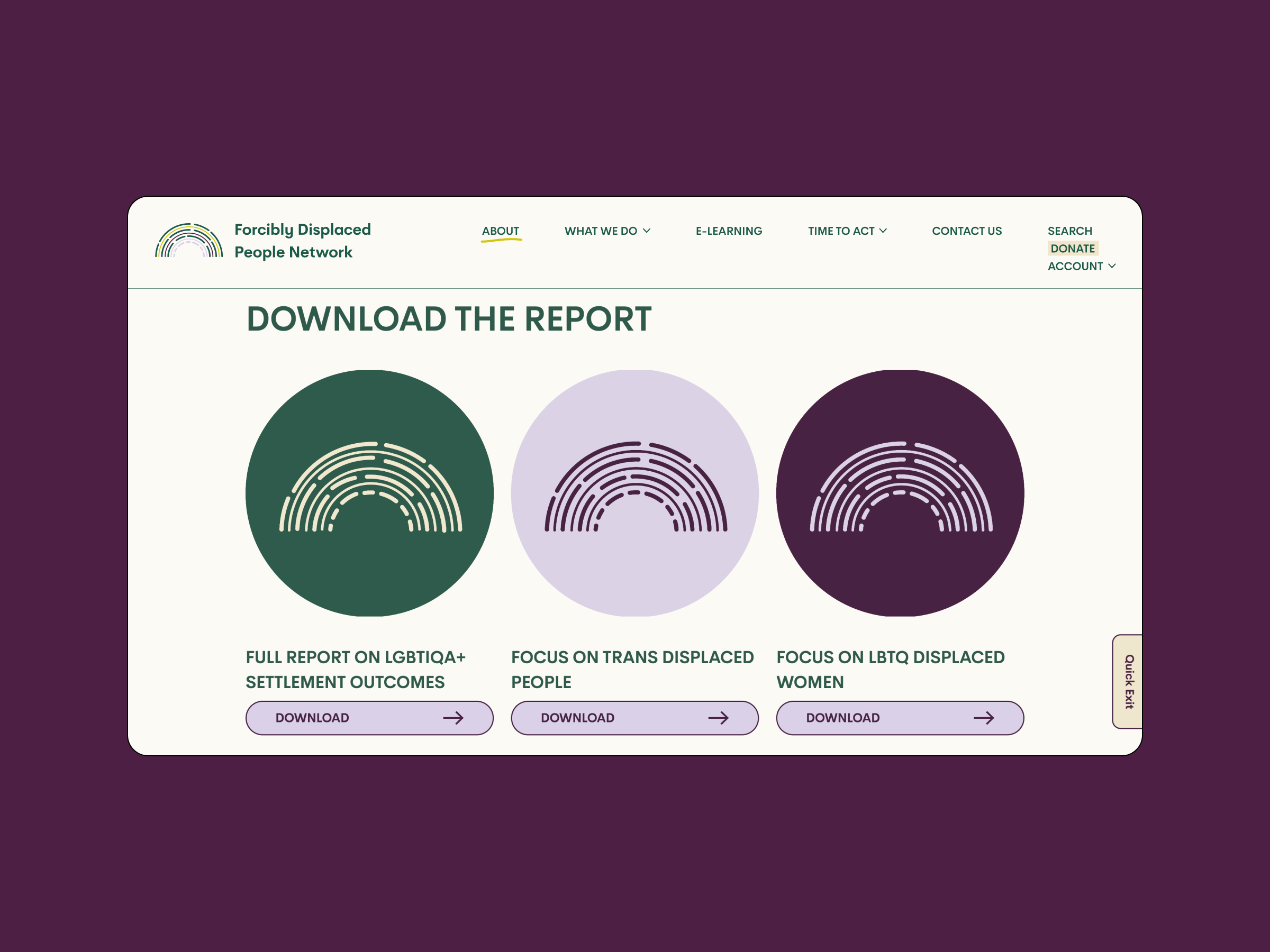
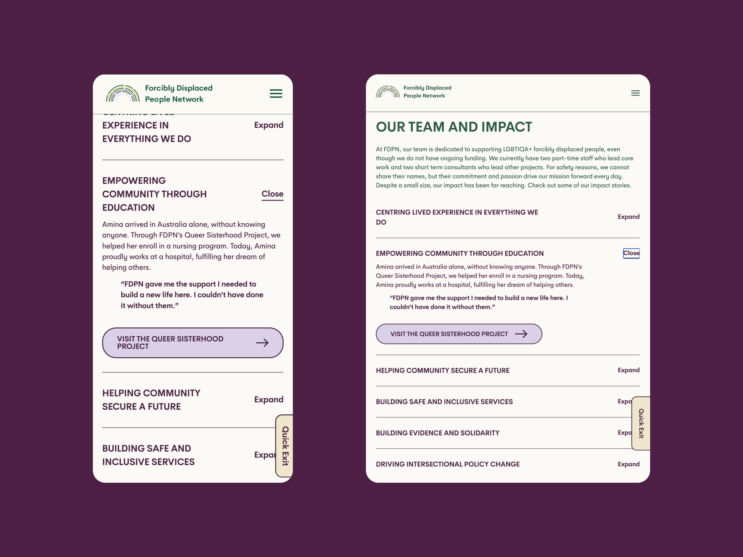
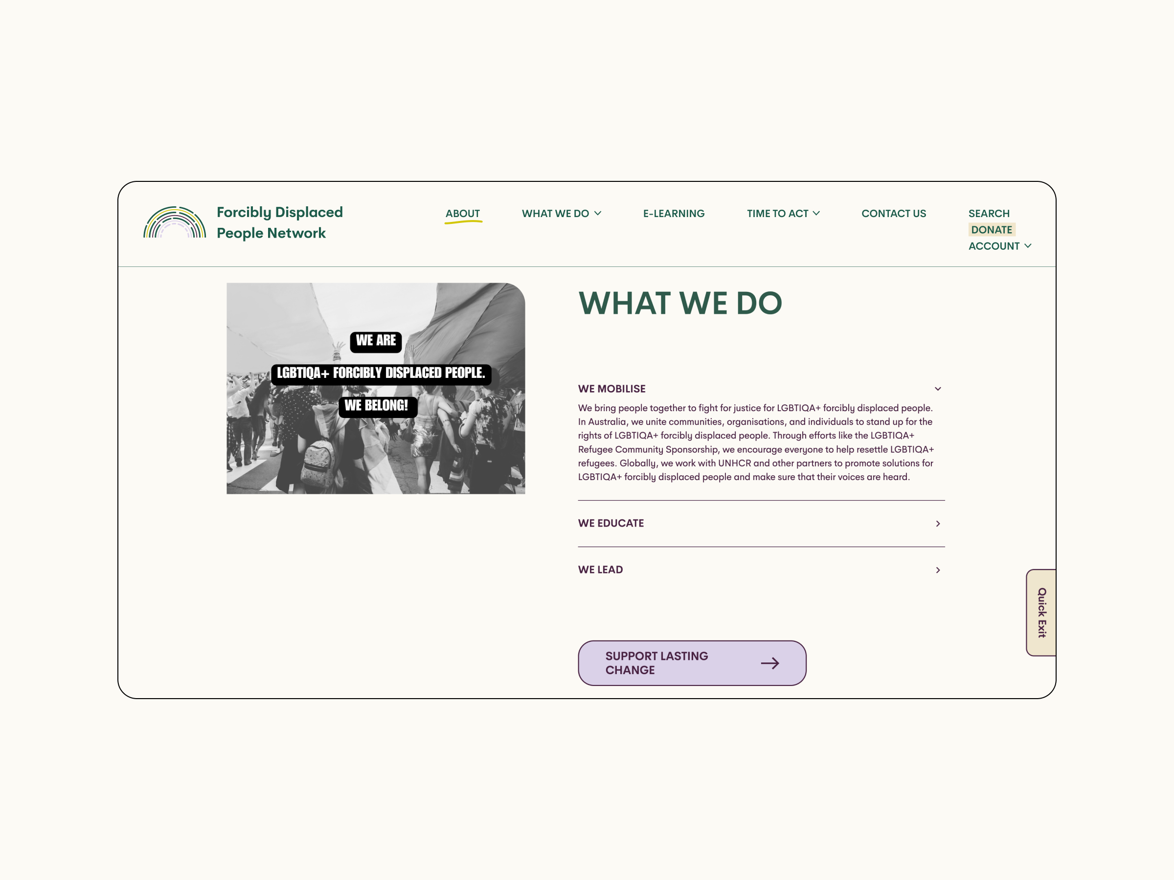
Our design approach focused on creating a cohesive and user-friendly experience. We incorporated block colour geometric shapes over black and white images, ensuring visual cohesion across the site. Interactive elements like buttons and titles include subtle hover effects to guide users seamlessly. To accommodate extensive content without overwhelming users, we developed a mega menu structure, keeping in mind the needs of different personas and creating a structure to serve each of them.
The website’s responsive design ensures all content blocks intelligently resize and adapt, enhancing functionality across devices. Navigation menus condense into icons on smaller screens, maintaining ease of use for mobile visitors and ensuring a consistent and engaging experience.