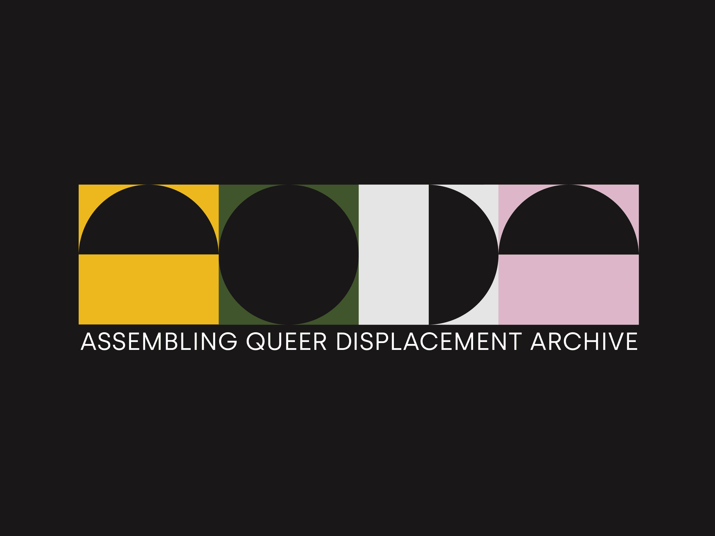
AQDA
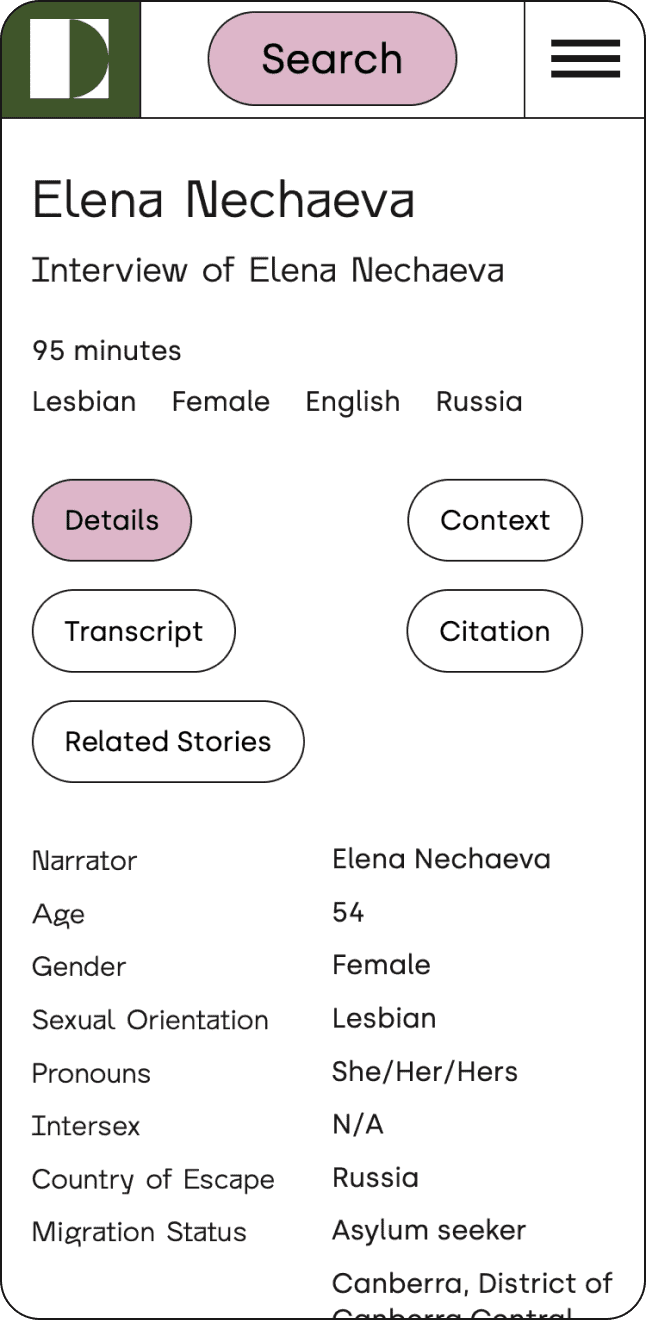
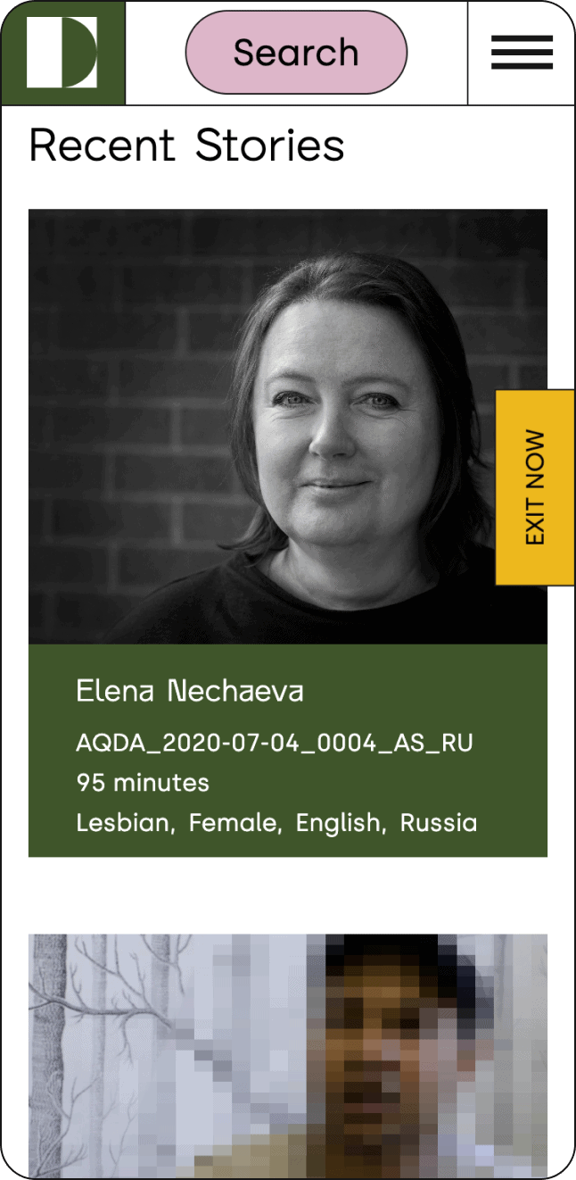
The Assembling Queer Displacement Archive (AQDA) is an innovative digital archive that captures oral histories related to LGBTIQ+ forced displacement. It originated as part of a creative doctoral research project, conducted by Renee Dixson at the Centre for Digital Humanities Research, Australian National University. We collaborated with AQDA to develop a fresh website and brand identity for the project, enhancing the archive’s online presence and accessibility.

Credits
Branding and UI Design: Alaïs de Saint Louvent
UX/UI Design: Katie Gee
Development: Sofiia Bondarenko
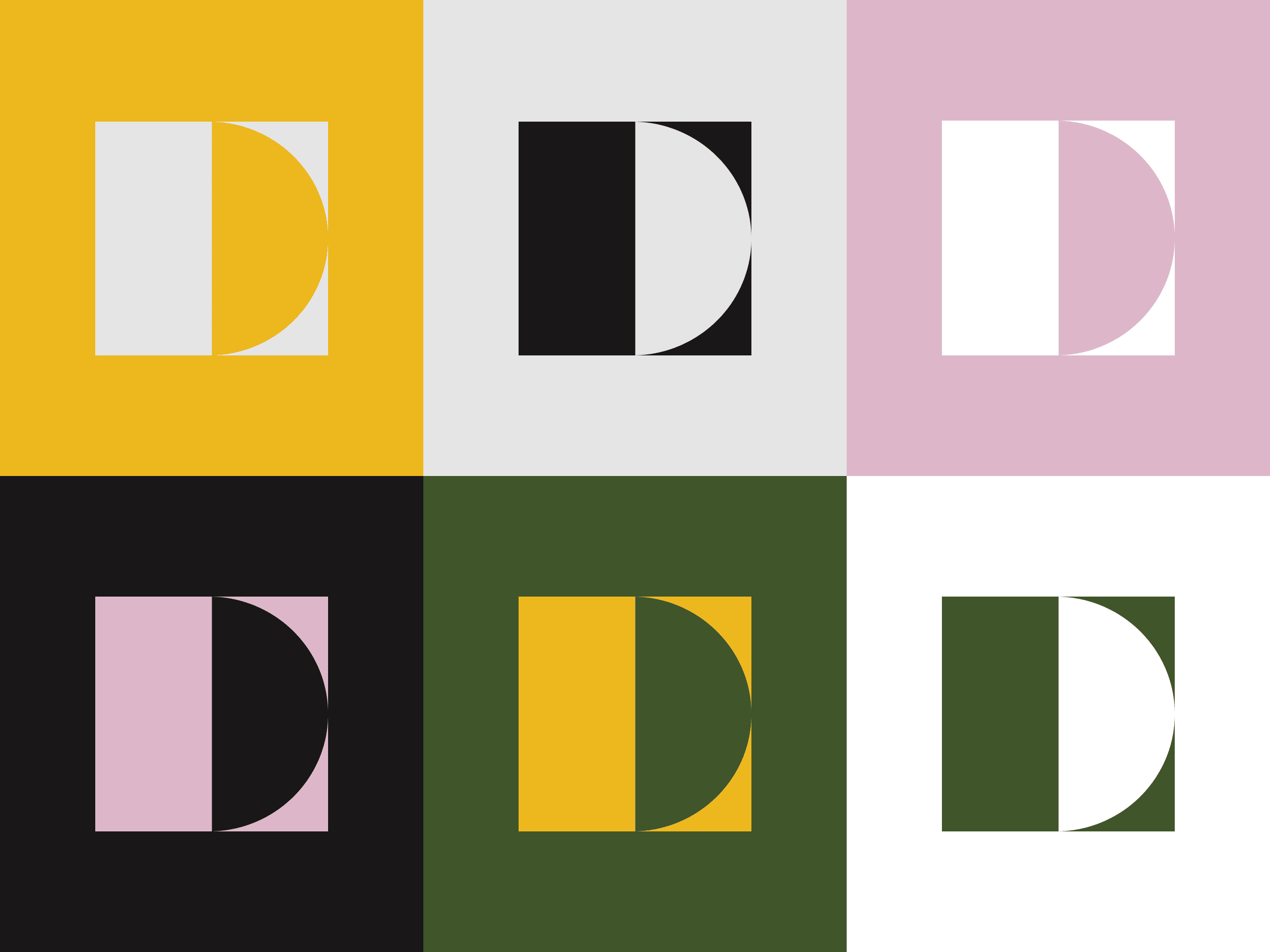
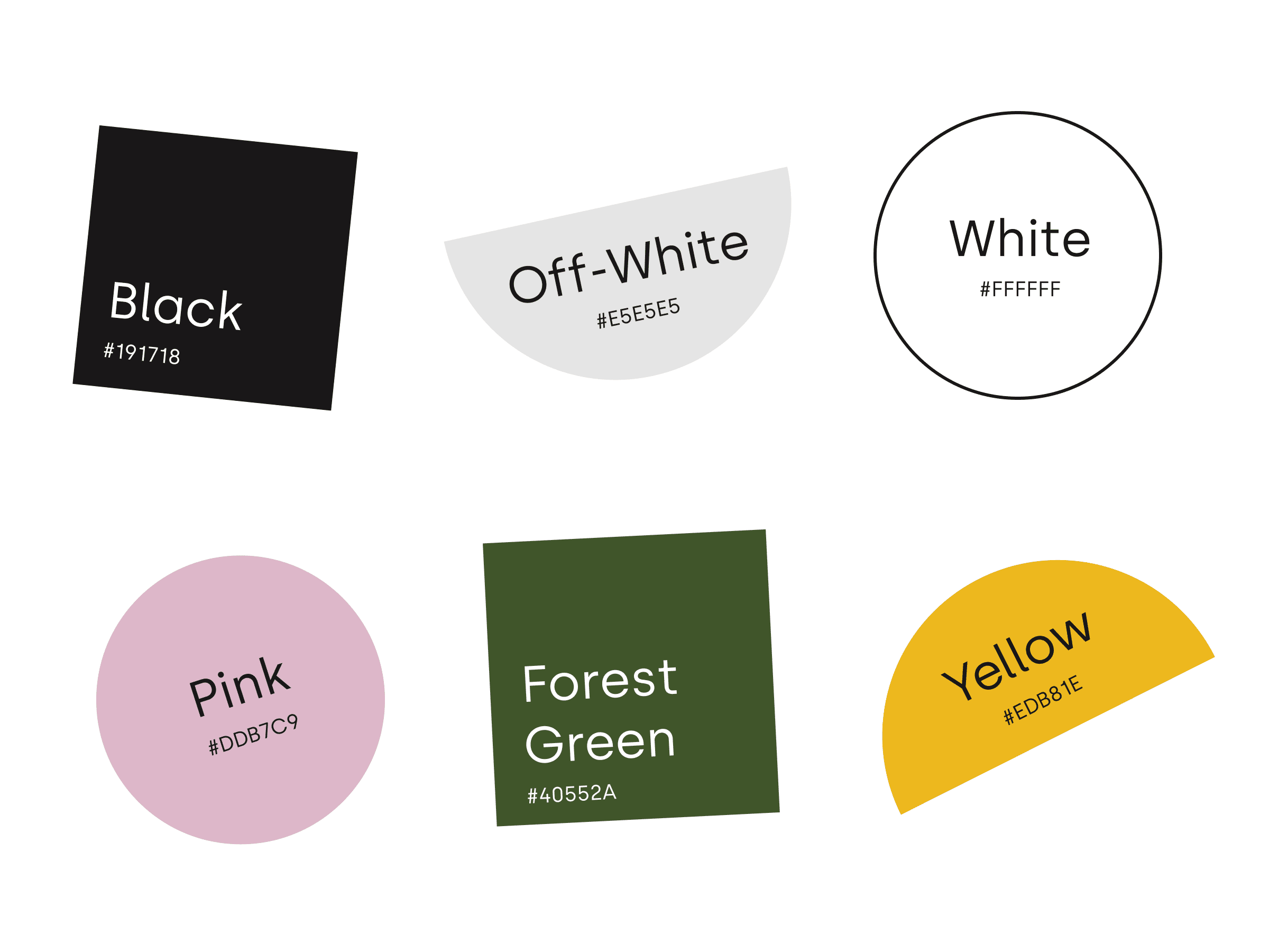
Branding
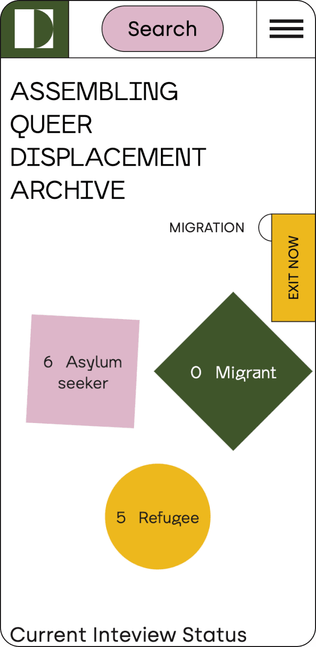
Studio Lutalica worked with AQDA to update their UX journey and provide the organisation with a brand revamp. Drawing on inspiration taken from historical, vintage and archival footage, we provided a new font and logo for AQDA’s website. We decided to experiment with a diverse selection of playful shapes throughout the website’s branding, with the intention of representing a displaced community finding its place.