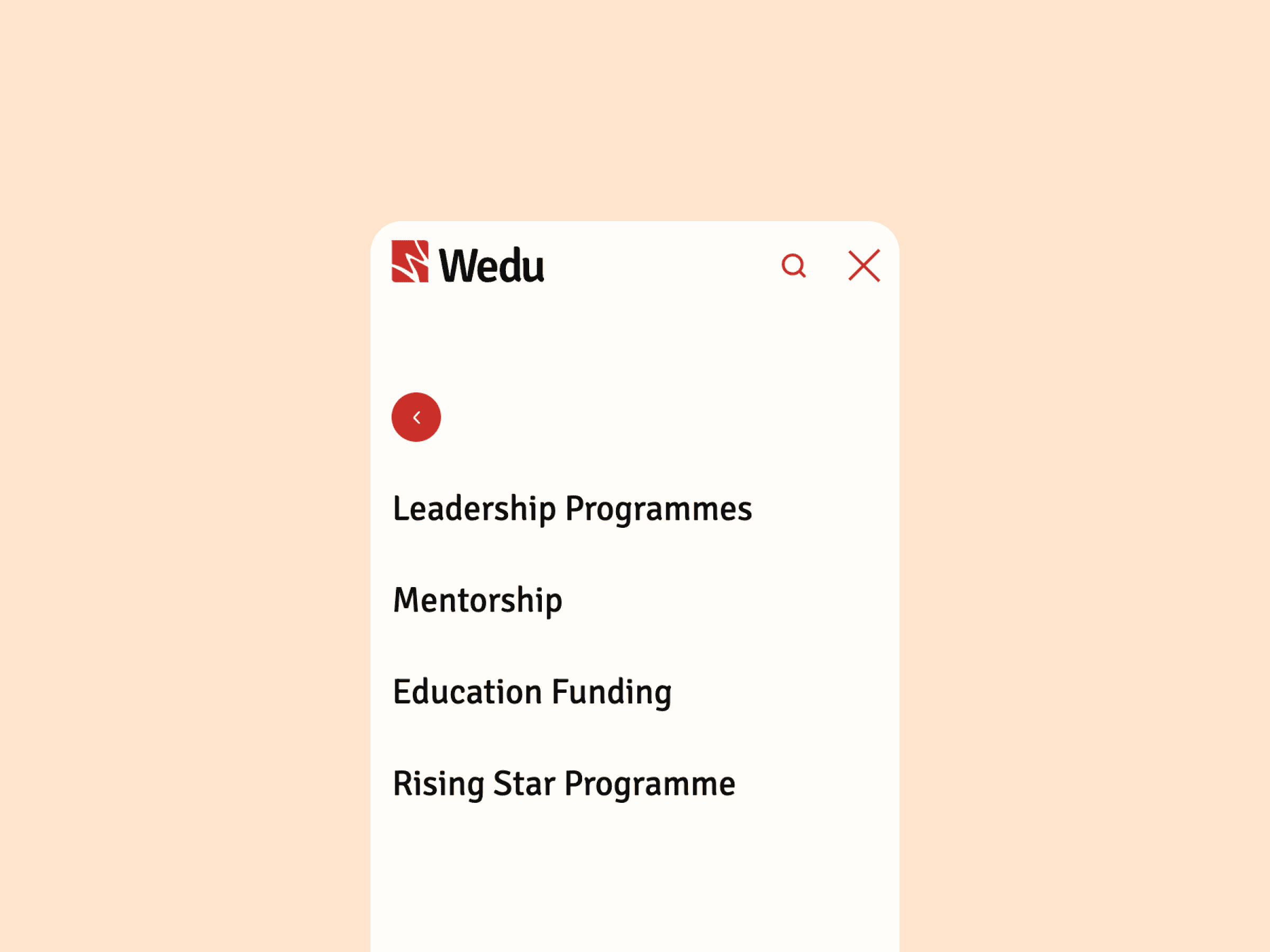
Wedu
Wedu is an initiative devoted to giving women across South and Southeast Asia the tools they need to become empowered leaders. Through leadership development programmes, a supportive community, and educational funding, Wedu provides women with the tools, knowledge, and networks they need to thrive. With a mission to achieve gender equality in leadership, Wedu is breaking down barriers and building a future where women have equal opportunities to lead.

Credits
Brand Refresh + UX/UI: Zoe Tang
Development: Ben Lattimore
Brand Refresh


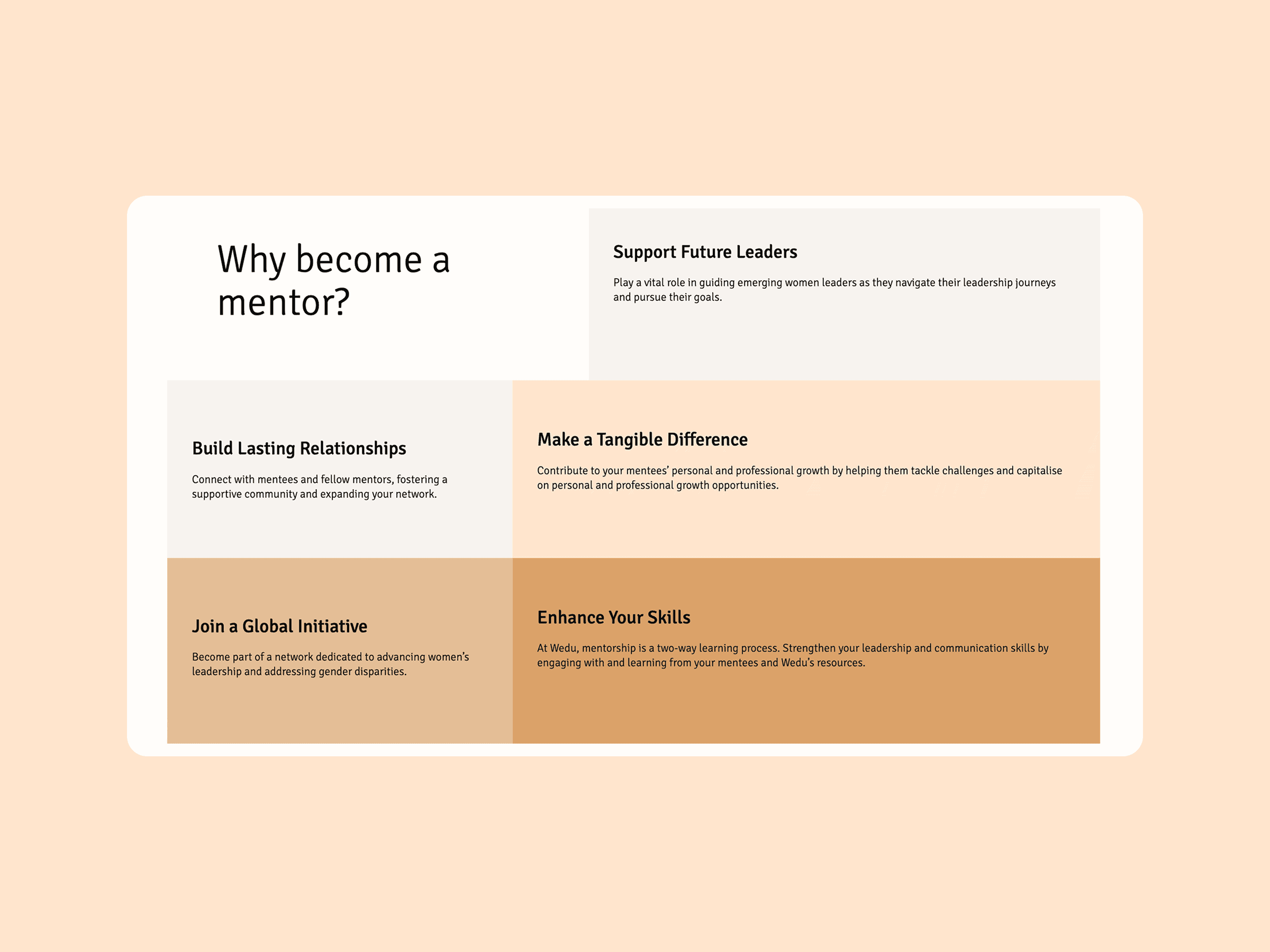
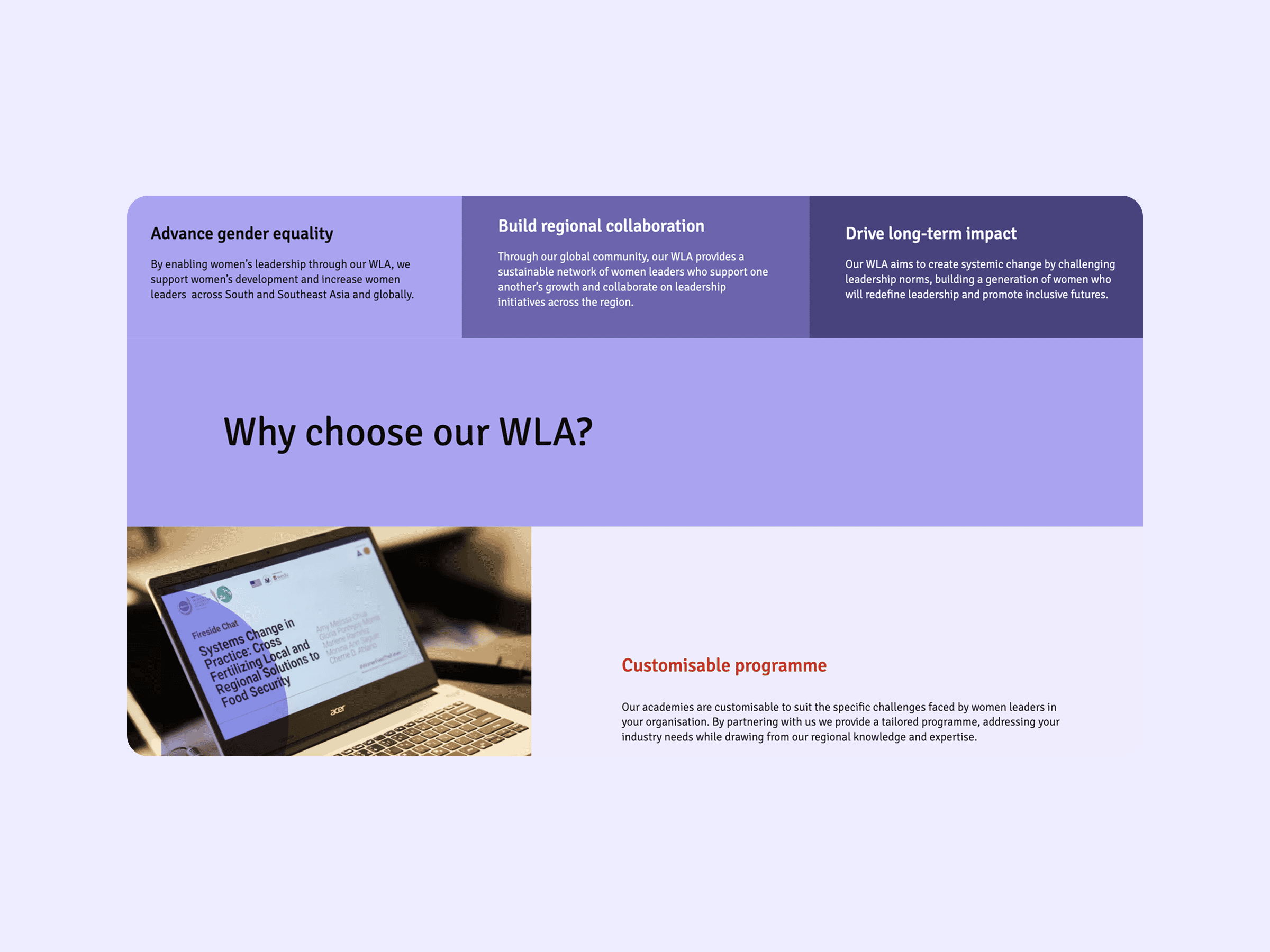
The typography was chosen for its clarity and legibility, ensuring content is easy to read across all devices. This modern sans-serif font conveys openness and confidence, aligning with Wedu’s mission to empower women leaders.
The colour palette is anchored by a bold red, symbolising strength and passion, complemented by ample whitespace to maintain focus and clarity. The minimalistic layout ensures that Wedu’s message remains at the forefront, reflecting their direct approach to leadership and their commitment to supporting women.

Website
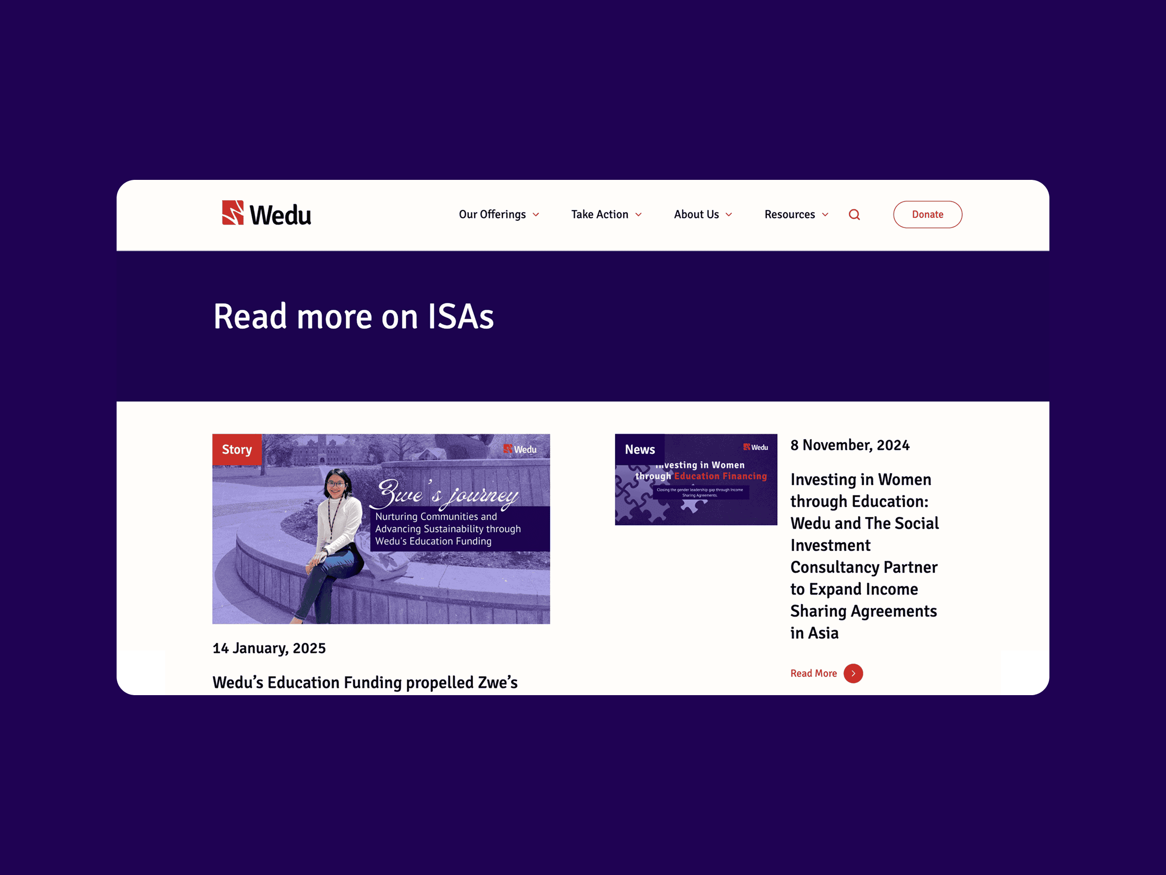
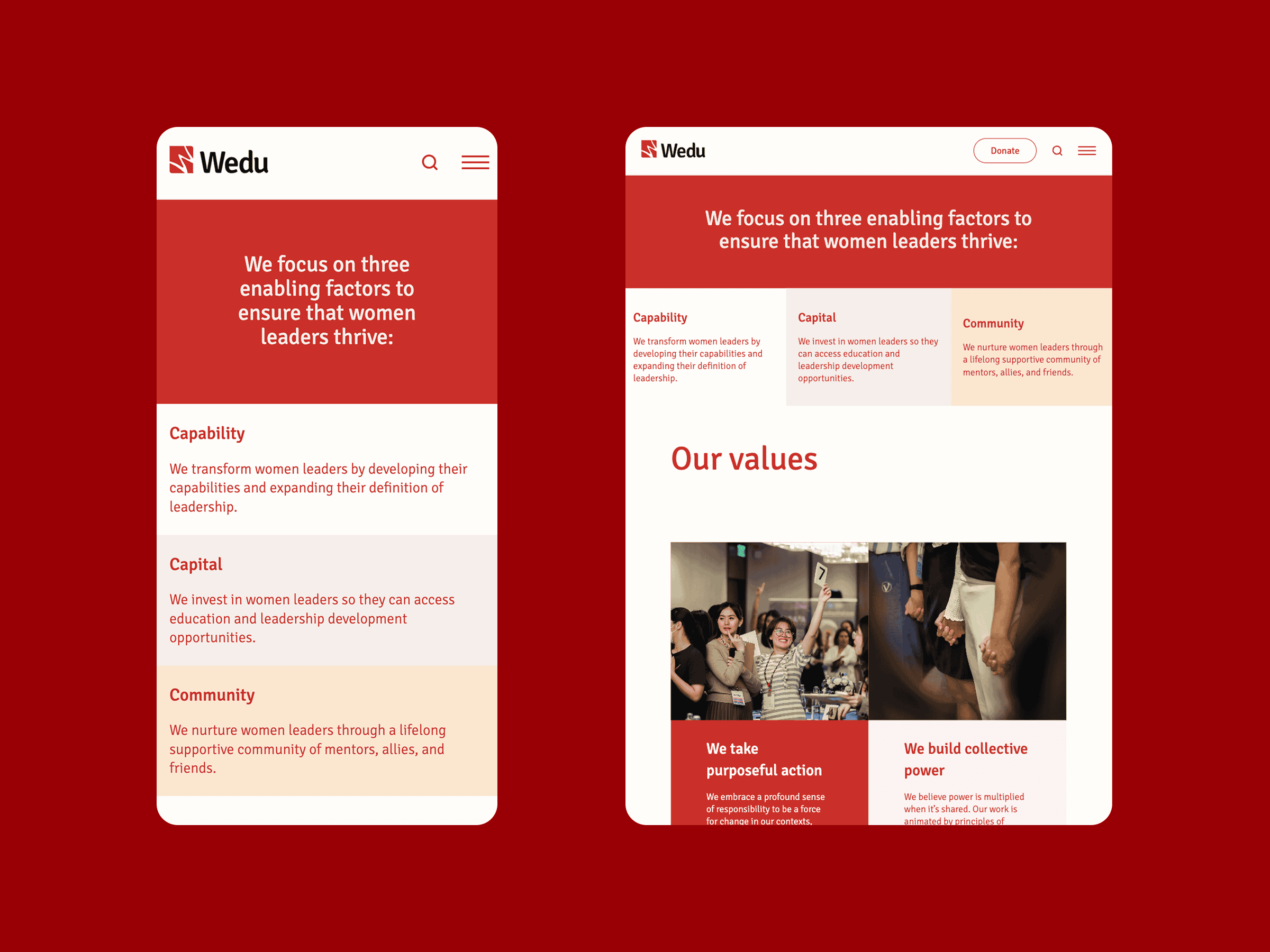
Our approach prioritised accessibility, clarity, and ease of use, ensuring the website is welcoming and functional for users of all abilities and backgrounds. The modular structure of the site allows Wedu’s team to update content independently, empowering them to manage and adapt the site as needed. To support this, we provided a complimentary training session to equip the team with the skills to confidently maintain the platform.
The design incorporates thoughtful accessibility features, including a clean, intuitive interface and structured layouts that make navigation seamless.