/lu:talika/
Share
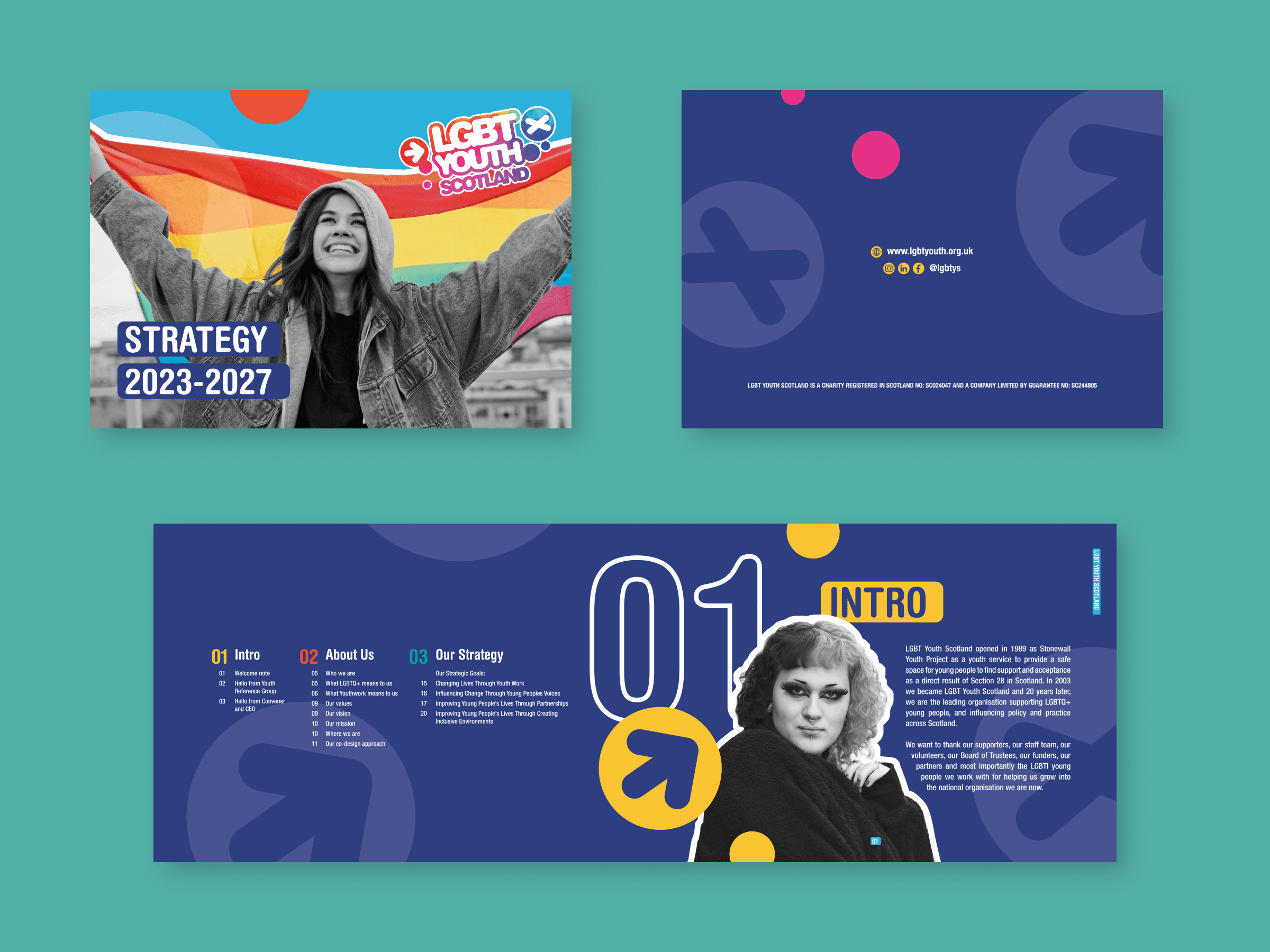
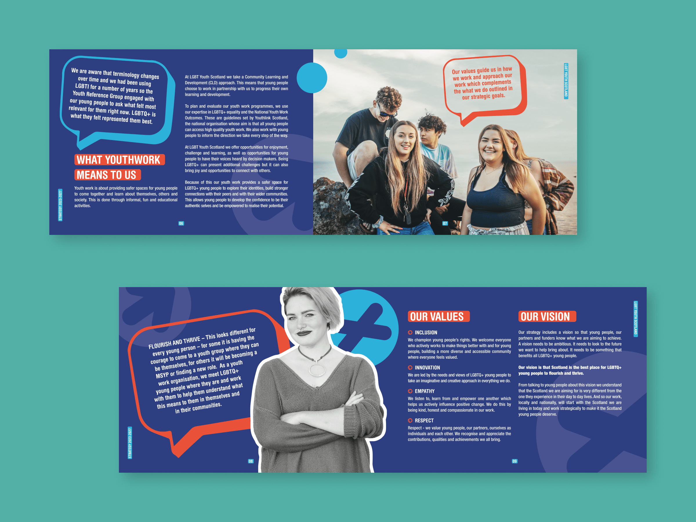
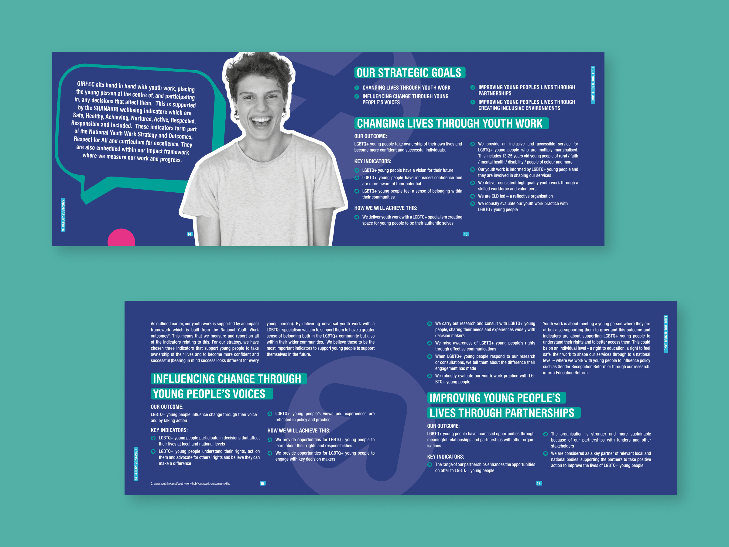
LGBT Youth Scotland is a charitable organisation based in Scotland that aims to support, educate and advocate for LGBTQ+ young people aged 13 to 25. They provide a range of services and resources to empower young people and promote equality and inclusion for all. We had the honour of working with LGBT Youth Scotland on their strategy report and we couldn’t be happier with the final product.
Credits
Graphic Design: Alaïs de Saint Louvent
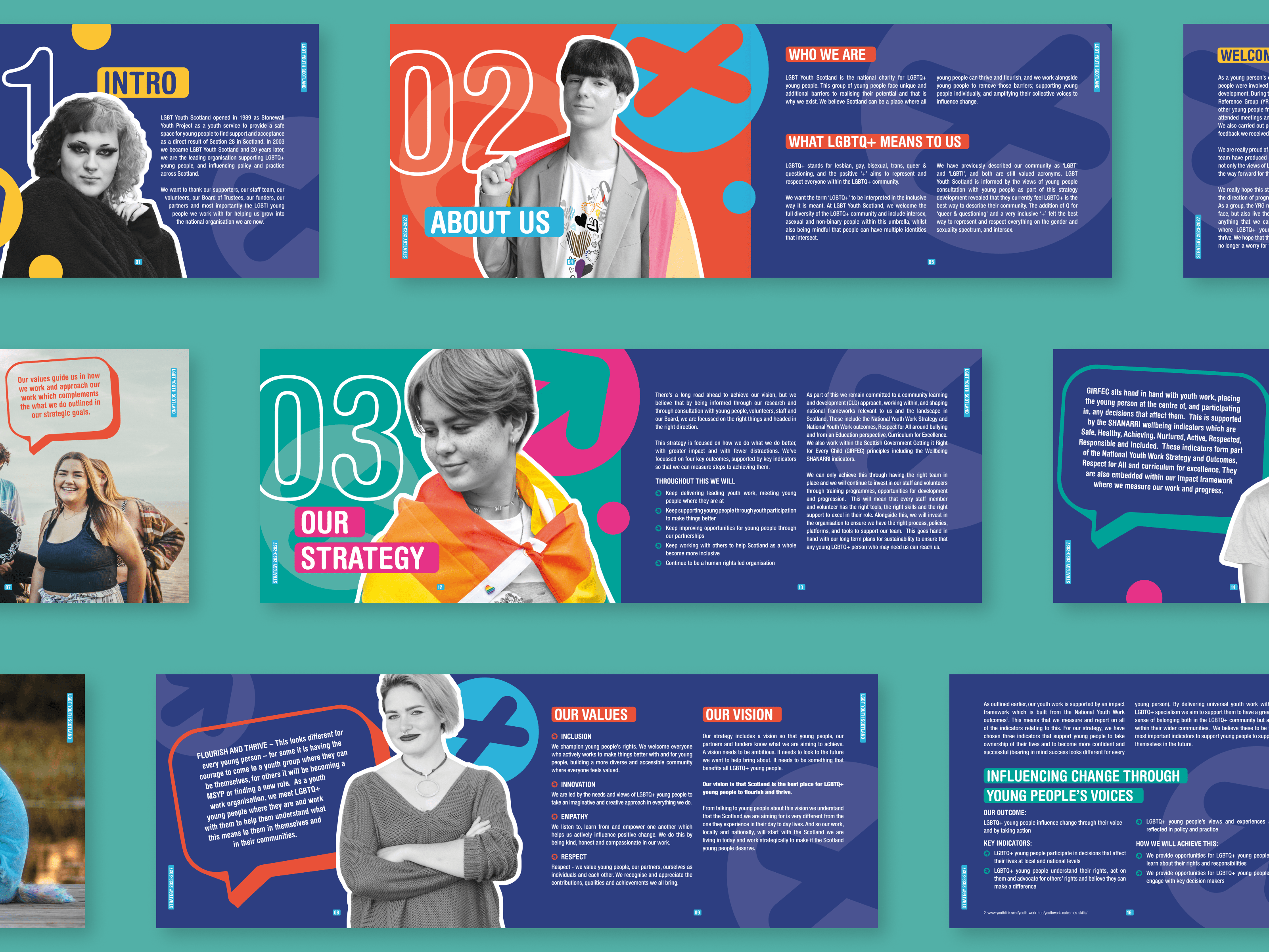
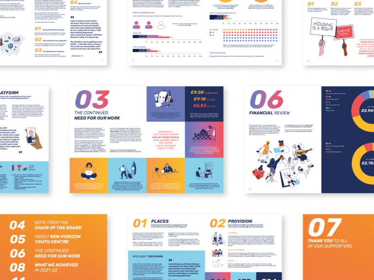
Strategy Report: Kat Urban
LGBT Charter Posters
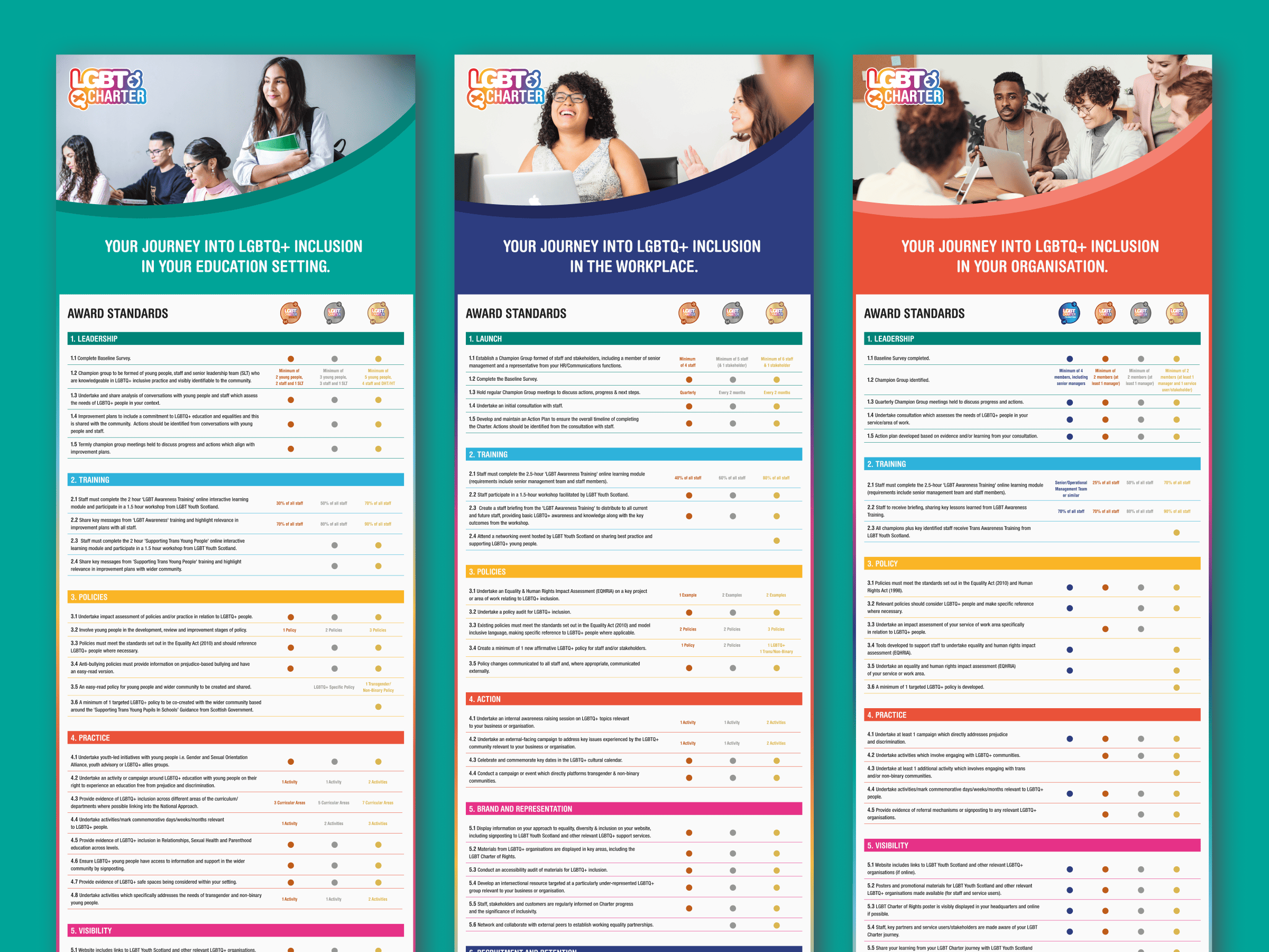
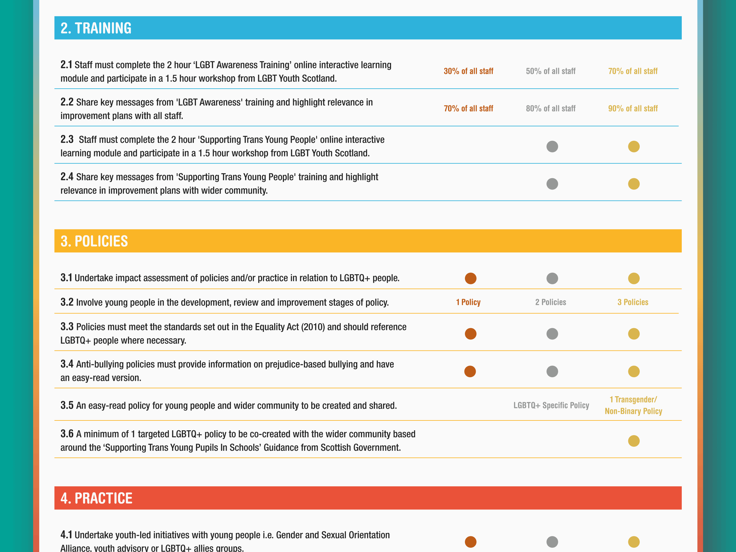
Our design approach for the posters, intended for display in offices and school corridors, incorporates a clear and accessible presentation of information through the use of colour-coded sections and a structured grid. To ensure readability across both digital and print formats, we limited the use of fonts to the main sans-serif brand font. The integration of LGBT Youth Scotland’s branding is subtle but present, according to strategic aims.
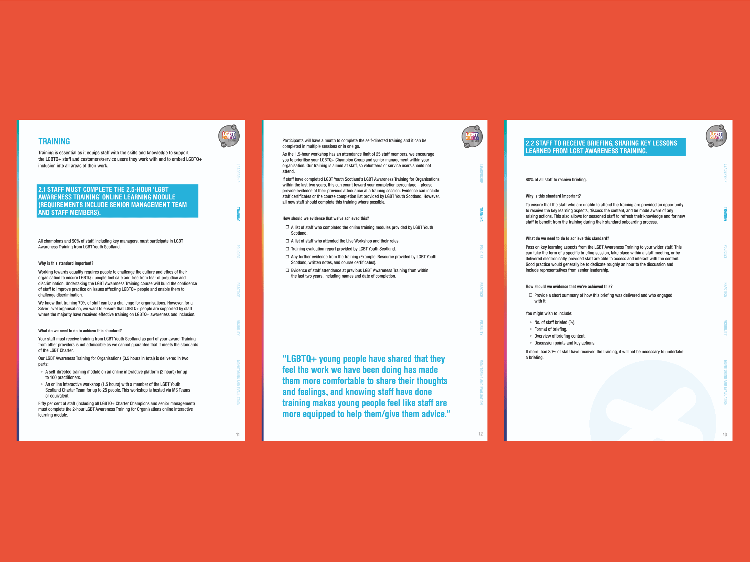
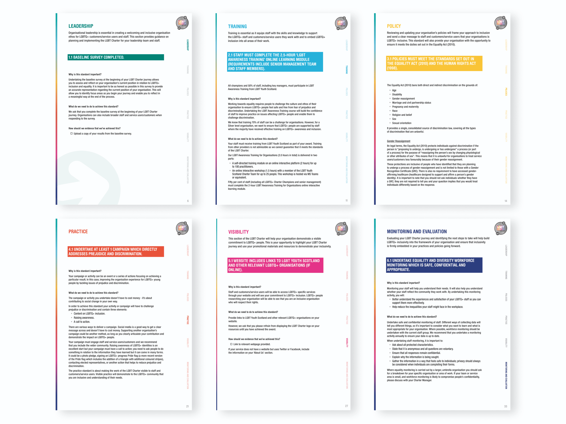
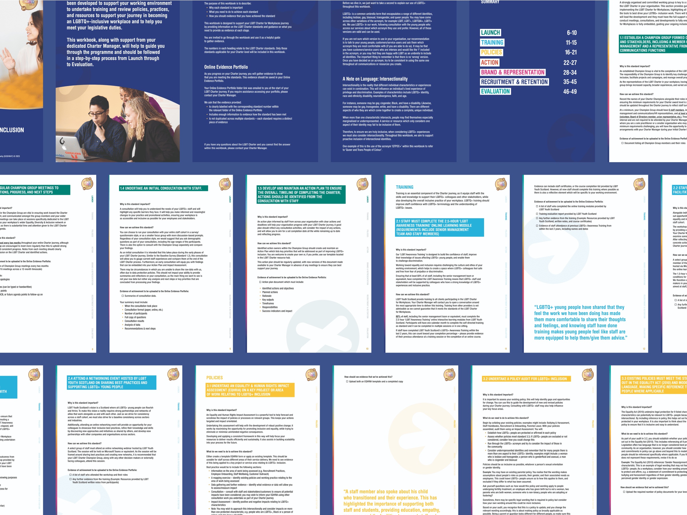
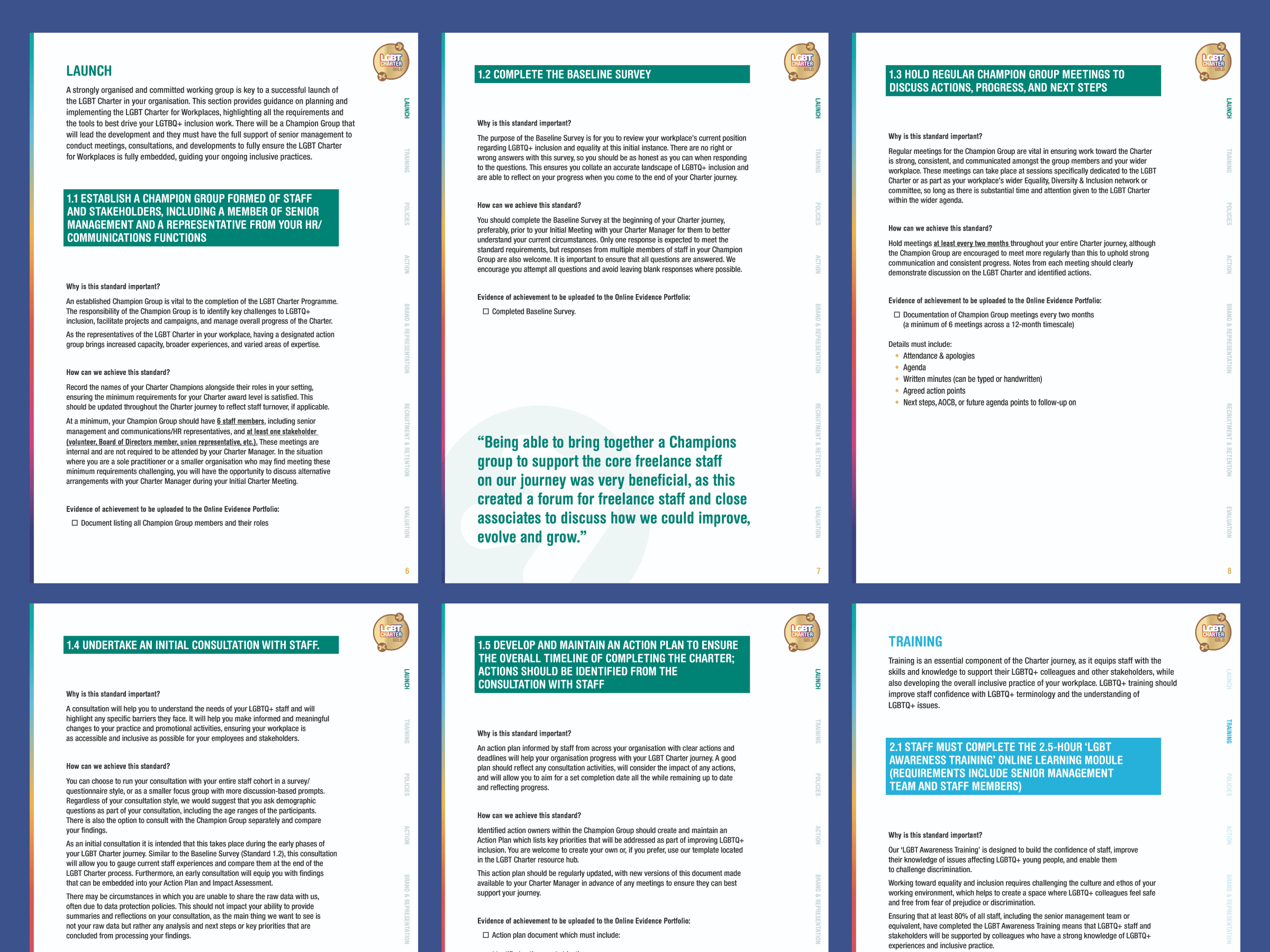
Education Workbooks
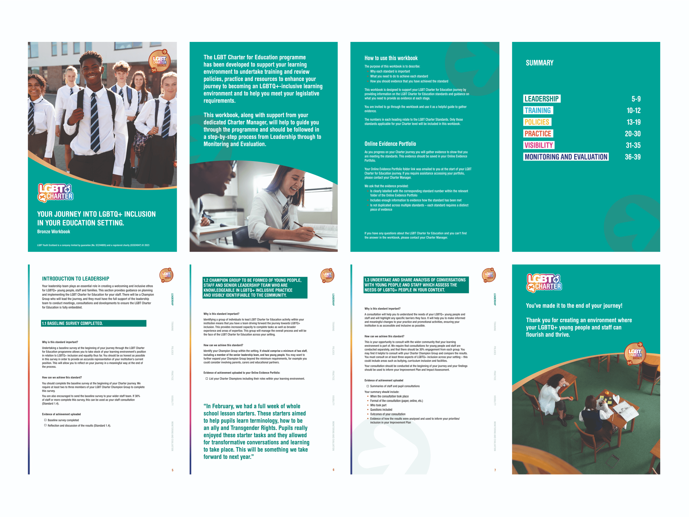
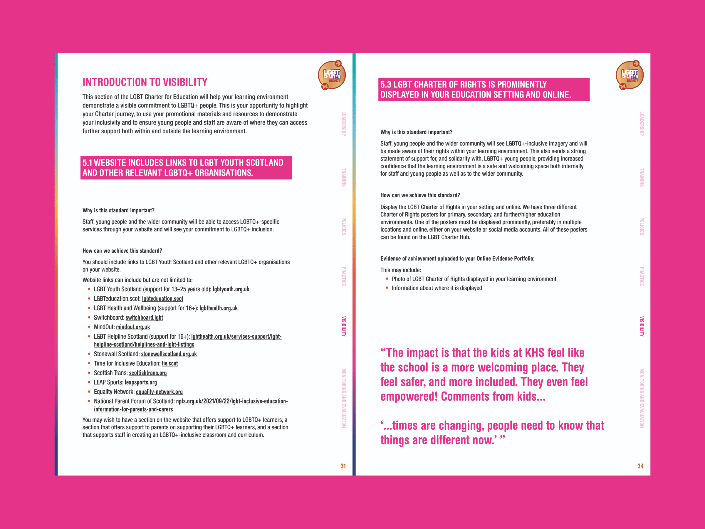
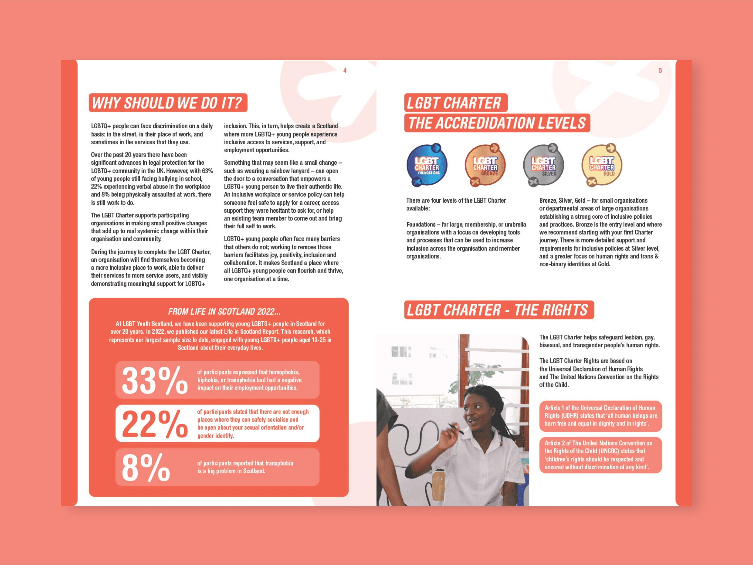
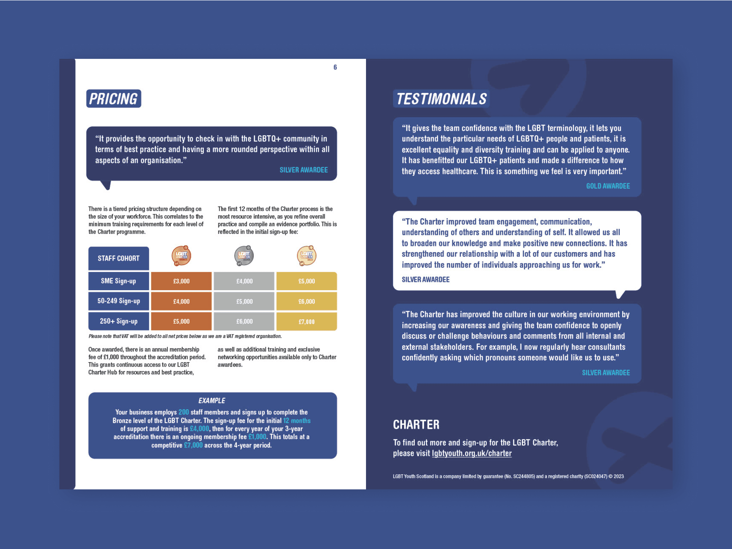
Attention to the hierarchy of information, alongside the strategic use of pull-quotes, ensures that content is presented in an engaging and easily digestible manner. The use of rainbow colours is restrained, avoiding cliché while still proudly representing LGBTQ+ identity, as seen in the delicate rainbow lines accentuating the margins on select pages. Graded-out arrows not only guide the user’s progression through the material but also symbolise forward momentum and progress.
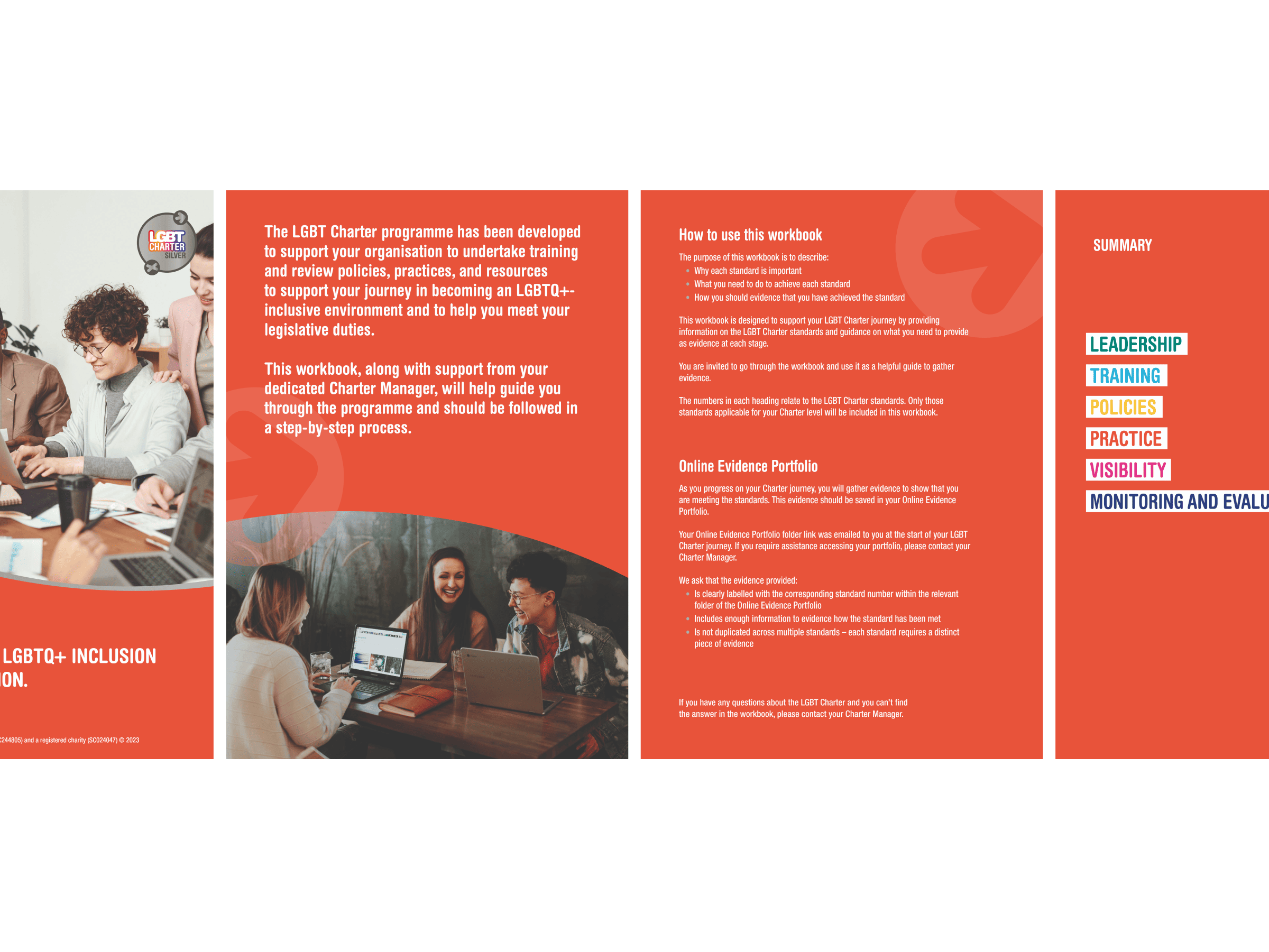
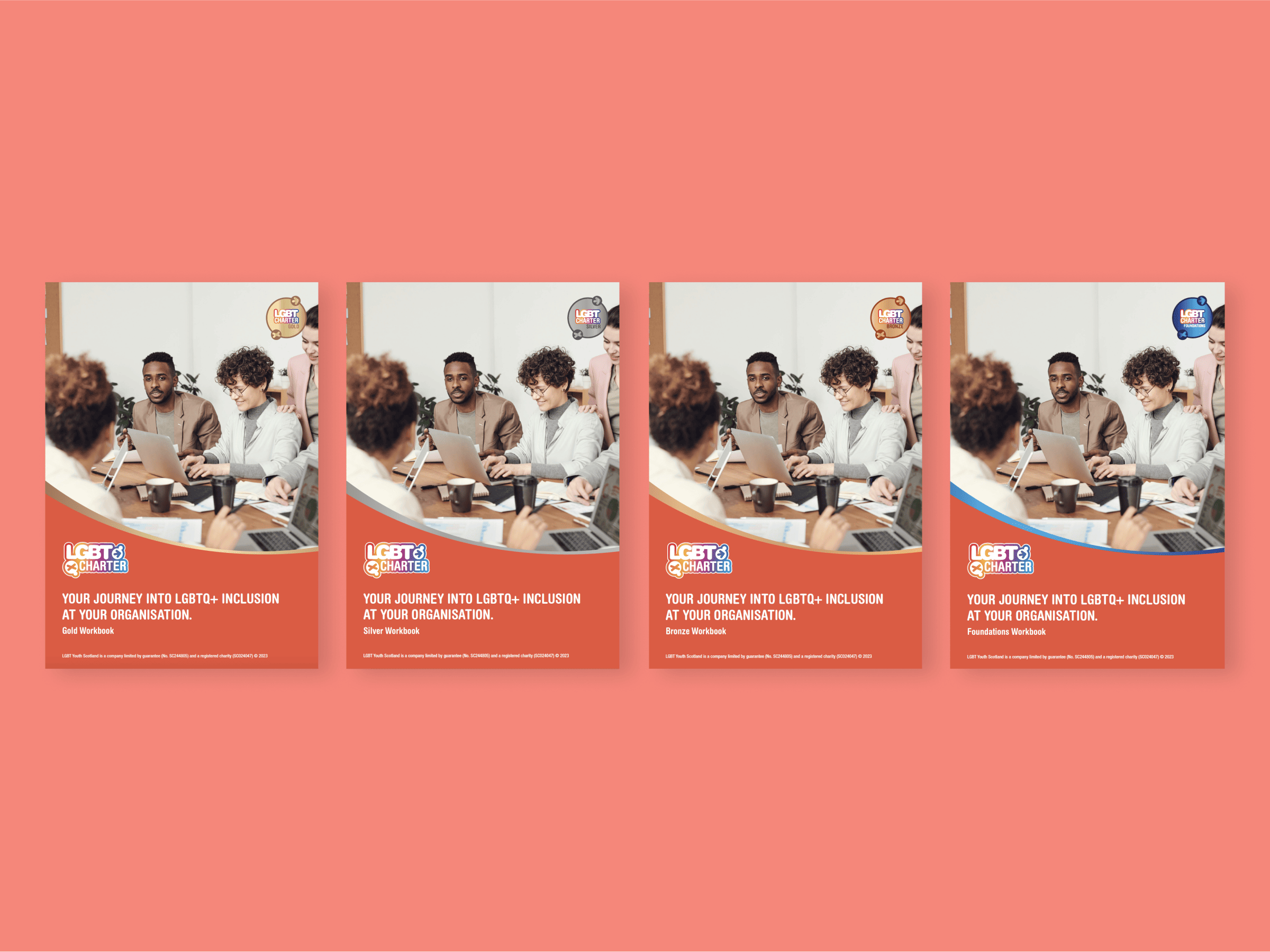
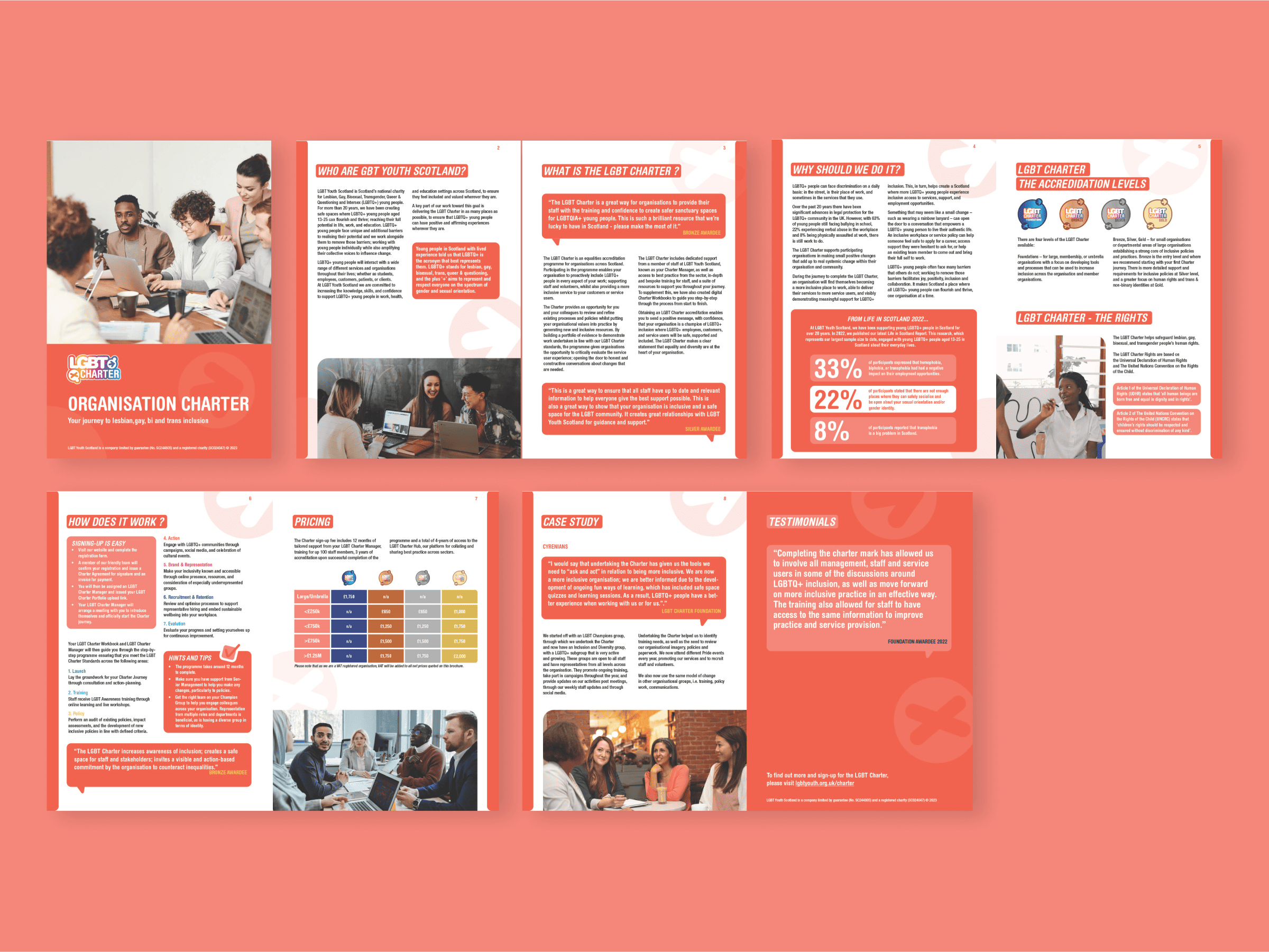
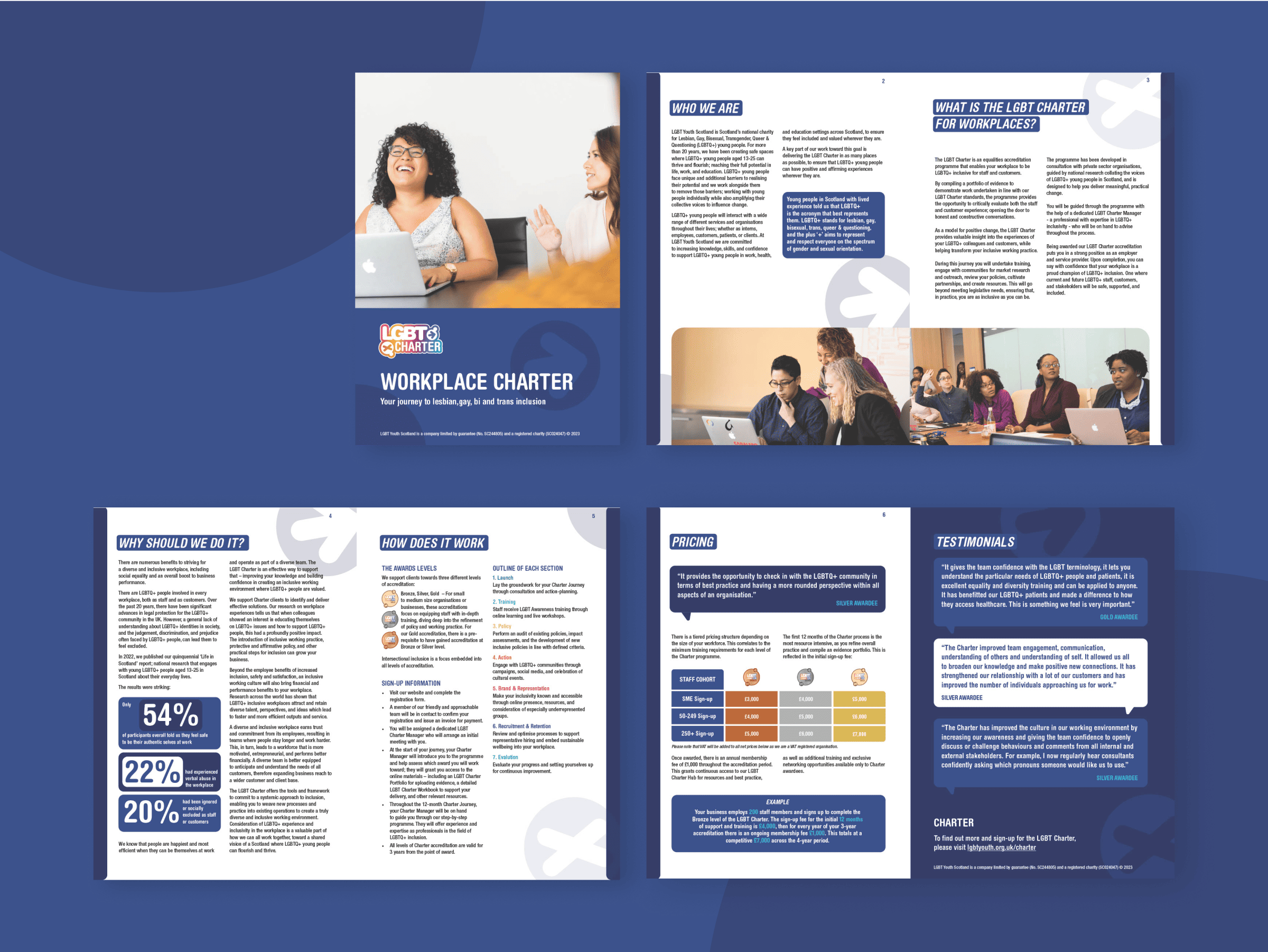
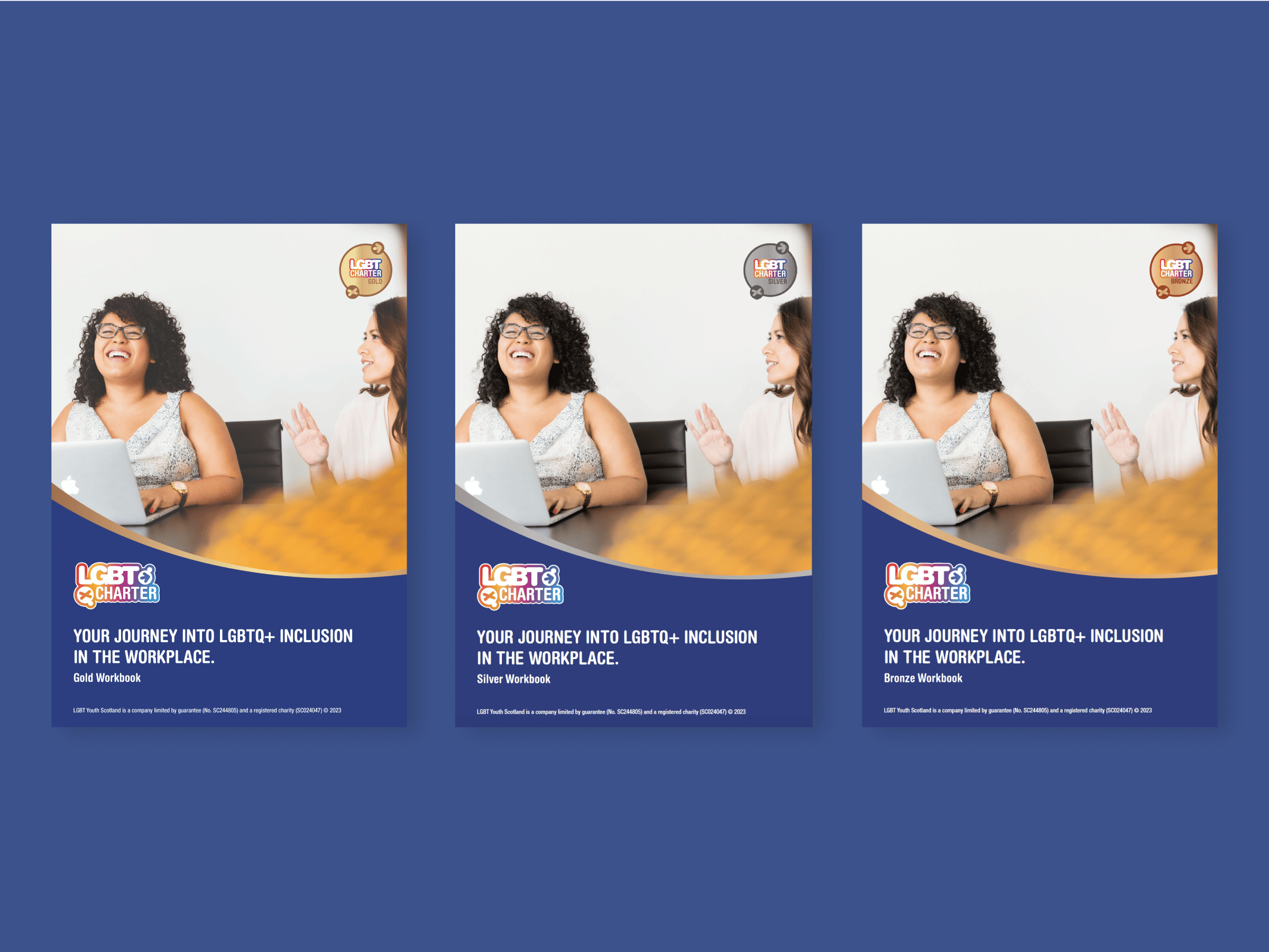
Organisation Brochure and Workbooks
We employed the vibrant block colours from LGBT Youth Scotland’s brand palette to infuse each workbook and brochure with a distinct and lively identity, ensuring they stand out while remaining cohesive. By choosing one bold colour per item, we’ve managed to avoid overwhelming or childlike appearances, giving each piece a confident and clear finish.
Workplace Brochure and Workbooks
The Workplace Brochures and Workbooks are tailored to include more extensive text and space for detailed content, catering to the needs of this specific audience. We’ve emphasised key statistics and information by varying the size of numbers and facts, adding visual interest and highlighting important points. Consistent with our design ethos, we’ve incorporated elements like speech bubbles, directional arrows, and diverse stock photography to enrich the visual narrative and address inclusivity.
Strategy Report
The report makes use of bright, bold colours throughout the report to create a sense of inclusivity and positivity. We included muted versions of the rainbow flag, as they are an immediate LGBTQ+ signifier, but muted them so that the overall effect isn’t overstimulating. To make the report accessible, we used a clear and consistent layout of fonts for headings, subheadings and body copy to make important information stand out.
We also included high-quality images of real people from the LGBTQ+ community, which helped to make the report feel more personal and welcoming. The end result is a strategy report that is not only informative but also gives an impression of LGBT Youth Scotland’s status as an established, trustworthy and in-touch charity. We believe that this report will help LGBT Youth Scotland to reach more young people and continue to make a positive impact in their lives.
It was the first time working with Cecilia and their team and it certainly won’t be the last! Their fast and reliable communication, creative input, care and structured approach is second to none. We loved how they used our existing brand guidelines to produce something that is fresh, engaging and eye-catching – exactly what we needed our new strategy document to look like!
– Doro Weber, Fundraising & Communications Manager at LGBT Youth Scotland