/lu:talika/
Share
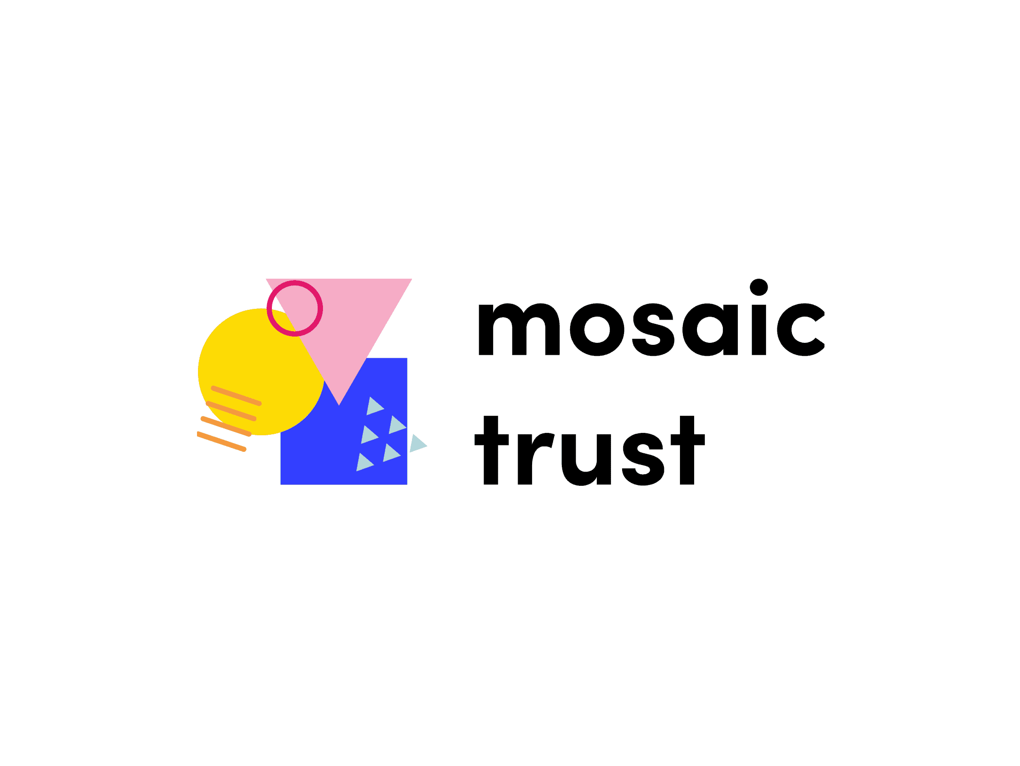
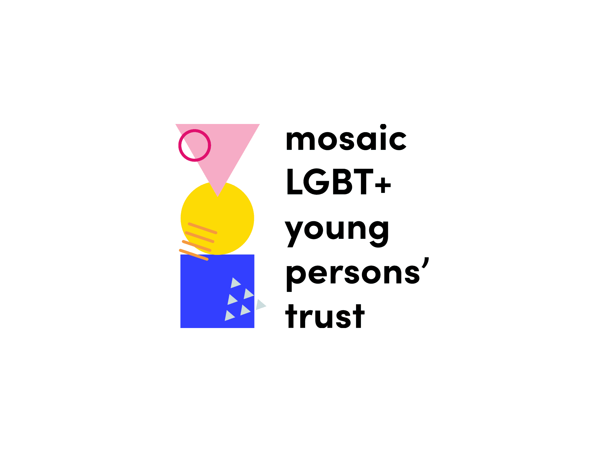
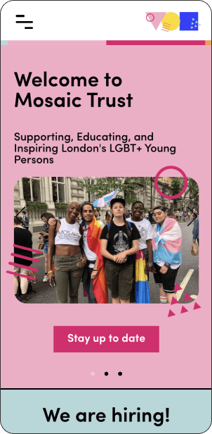
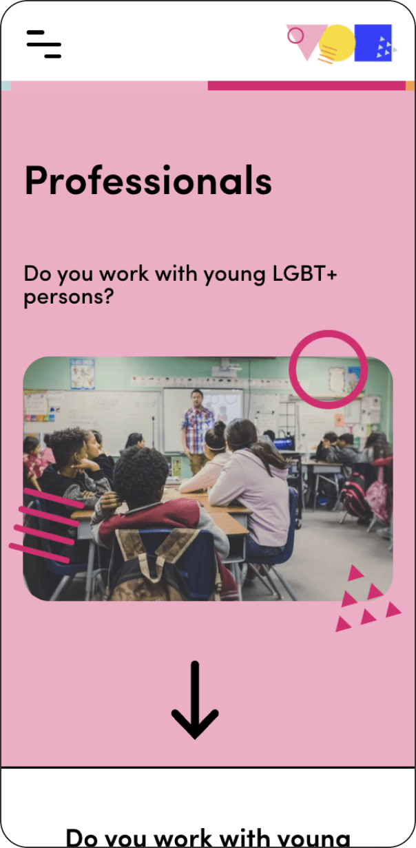
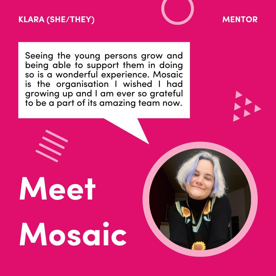
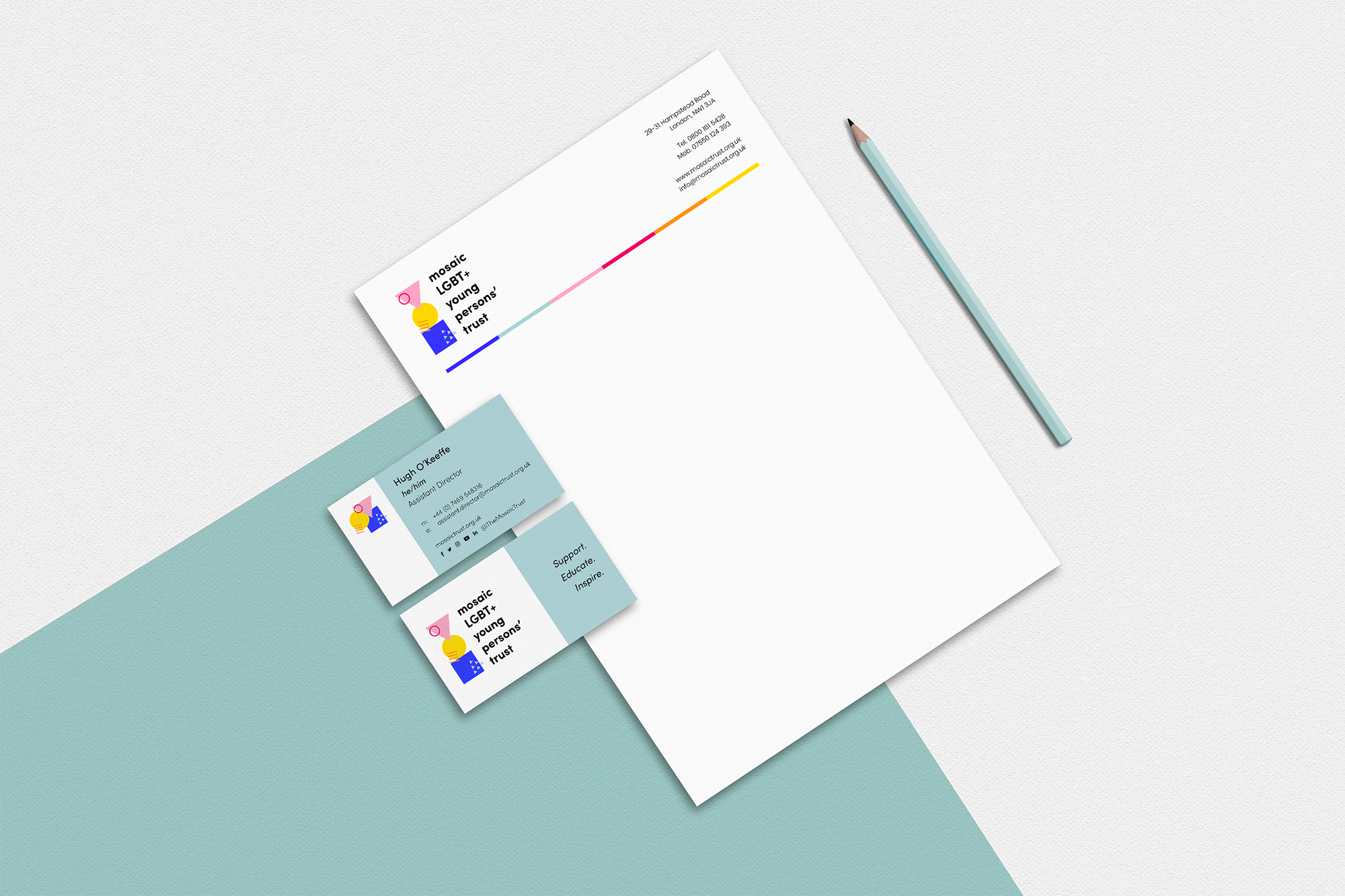
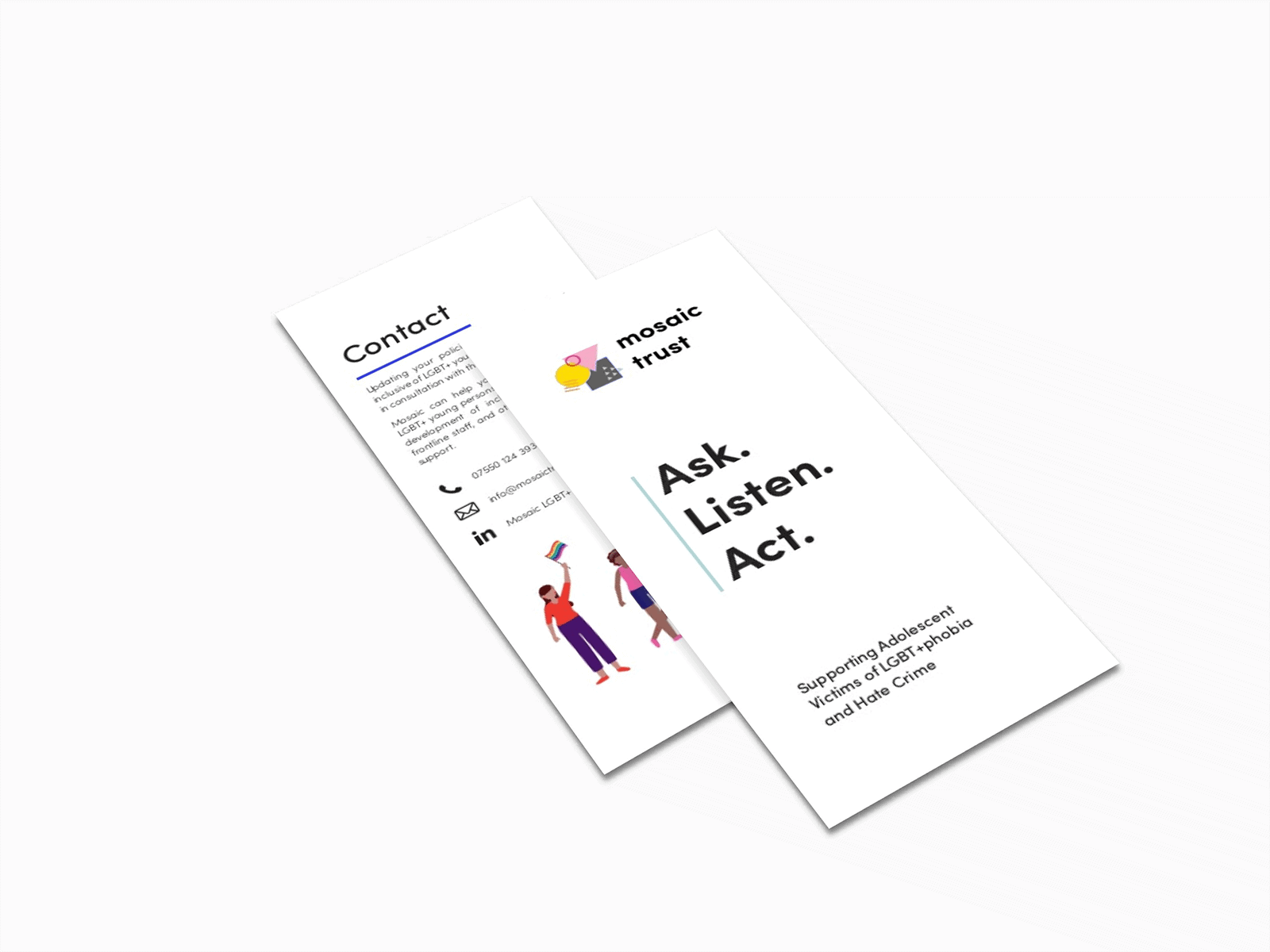
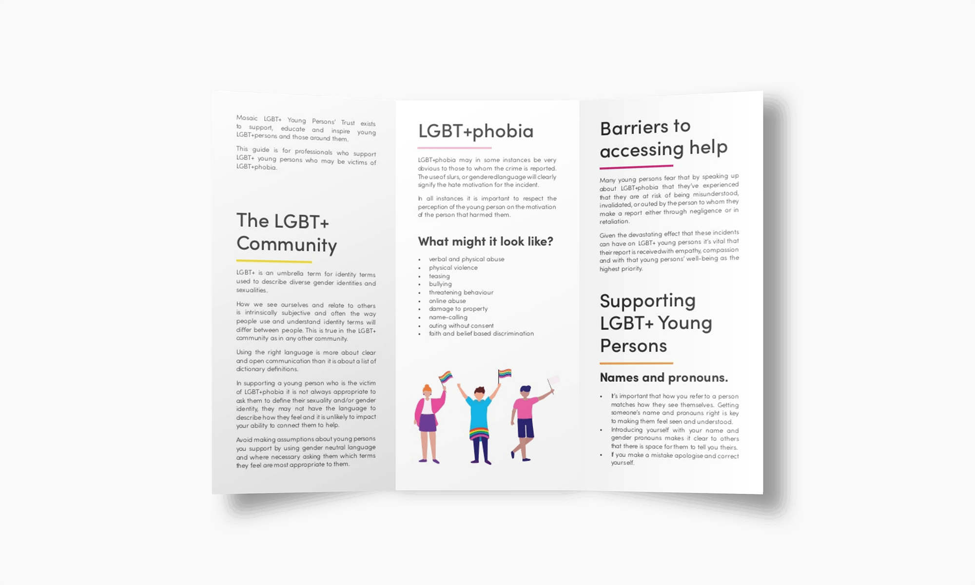
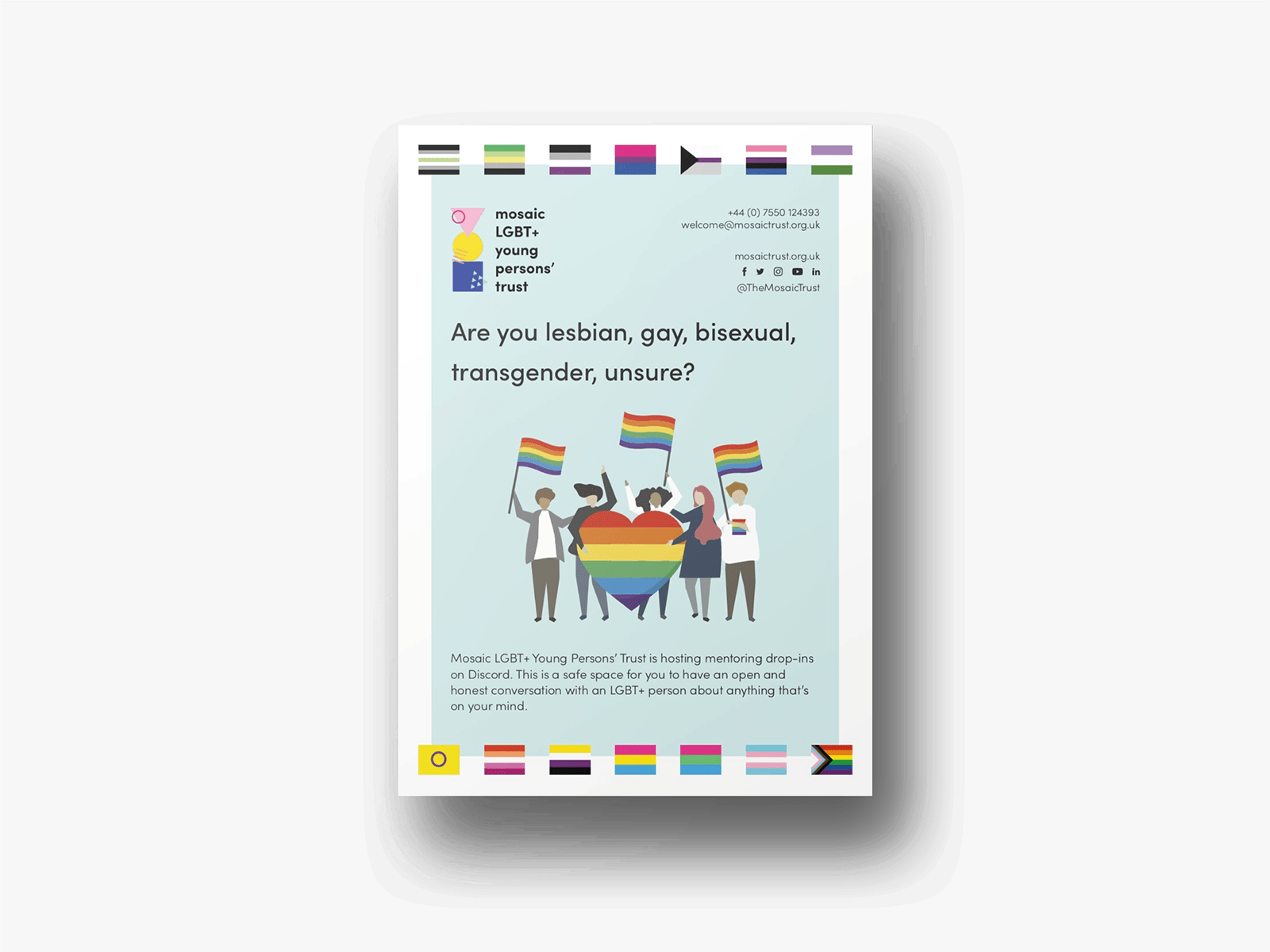
Mosaic Trust, previously known as Mosaic LGBT+ Youth Centre, is a not-for-profit organisation that aims to support, educate and inspire young LGBT+ persons from 13 to 19, and those around them. To help them lead their mission and showcase their engagement, we provide them with both visual and strategic tools to make them grow and raise a larger audience.
Credits
Design and Development: Cecilia Righini
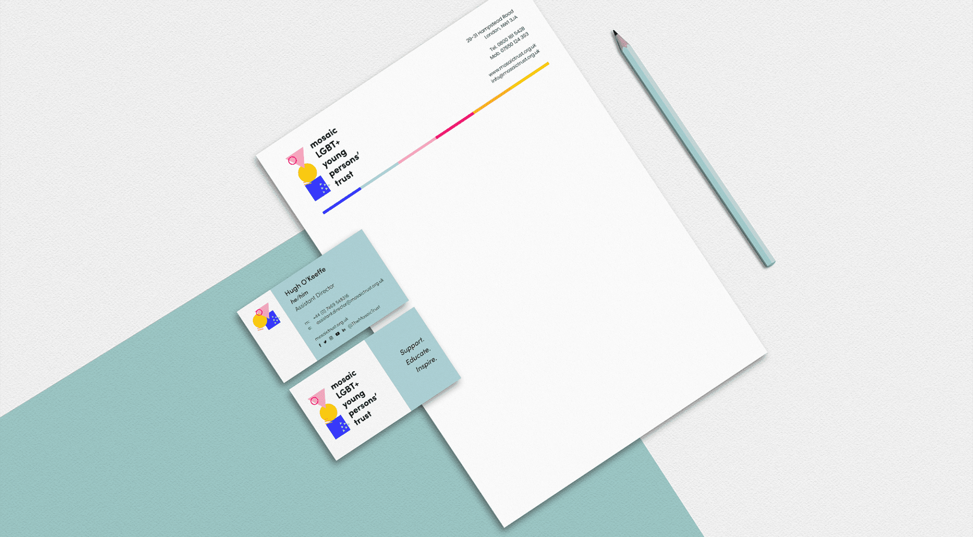
Rebranding
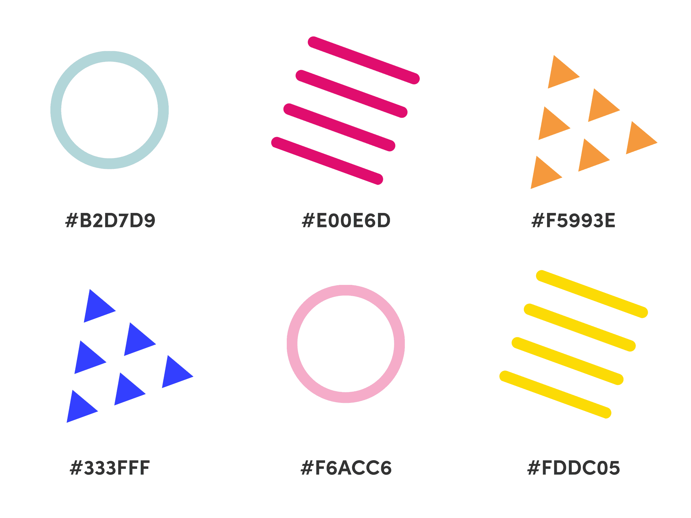
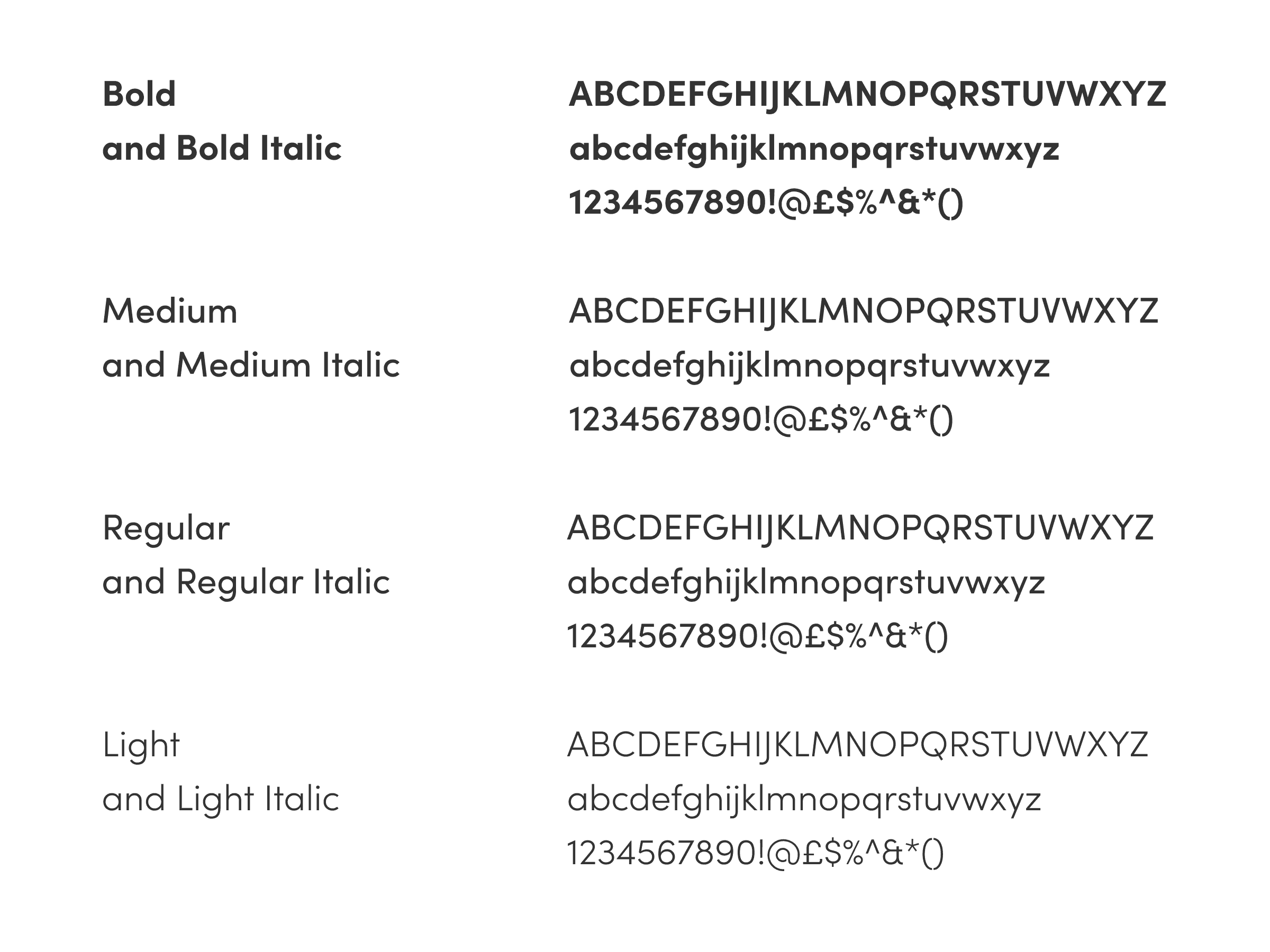
To develop the new branding for Mosaic Trust, we organised surveys, workshops and focus groups with the young persons involved in the organisation. The keywords that stood out were ‘kind’, ‘friendly’, ‘young’, ‘dynamic’, ‘optimistic’, ‘joy’, ‘fun’.
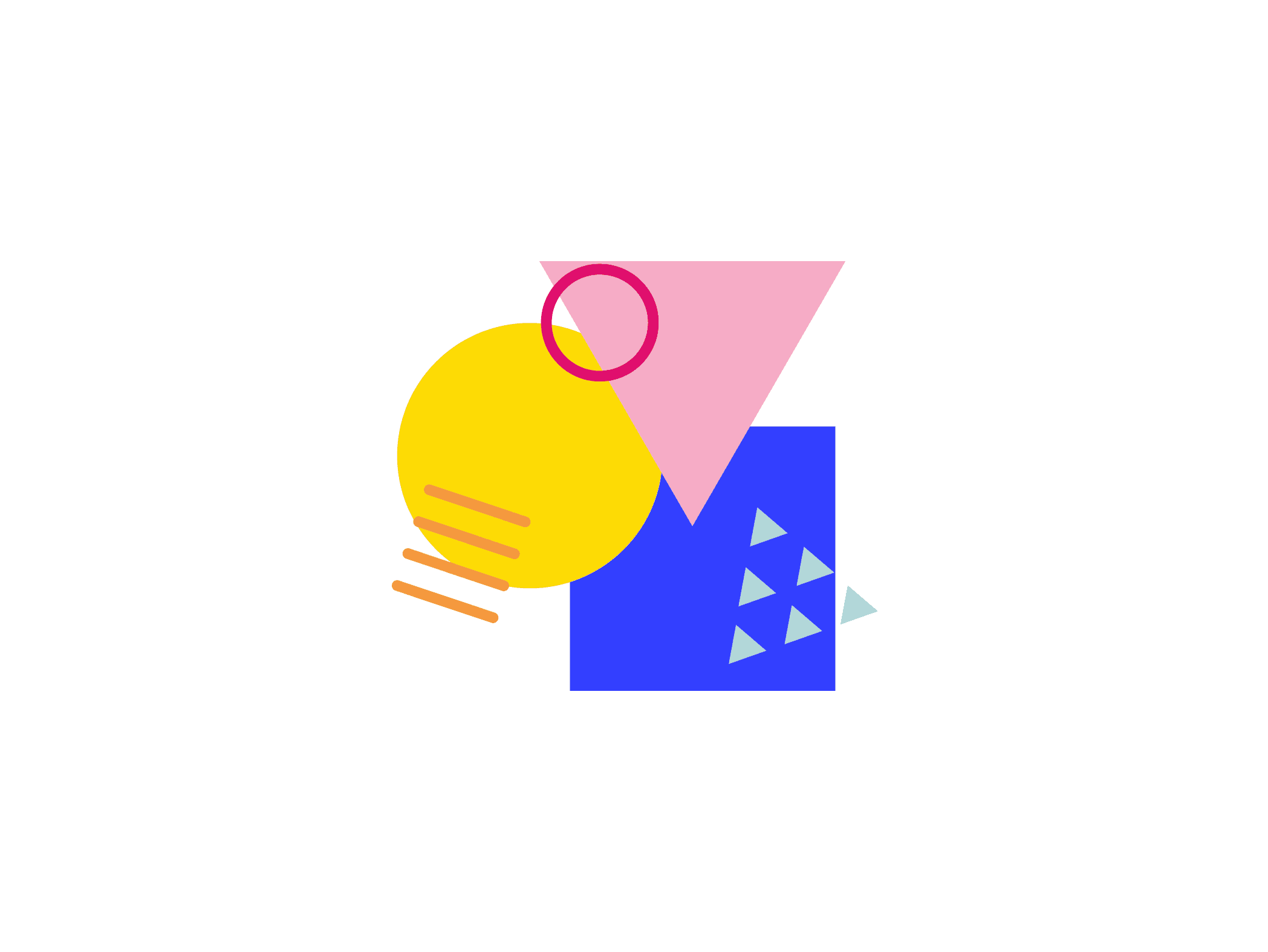
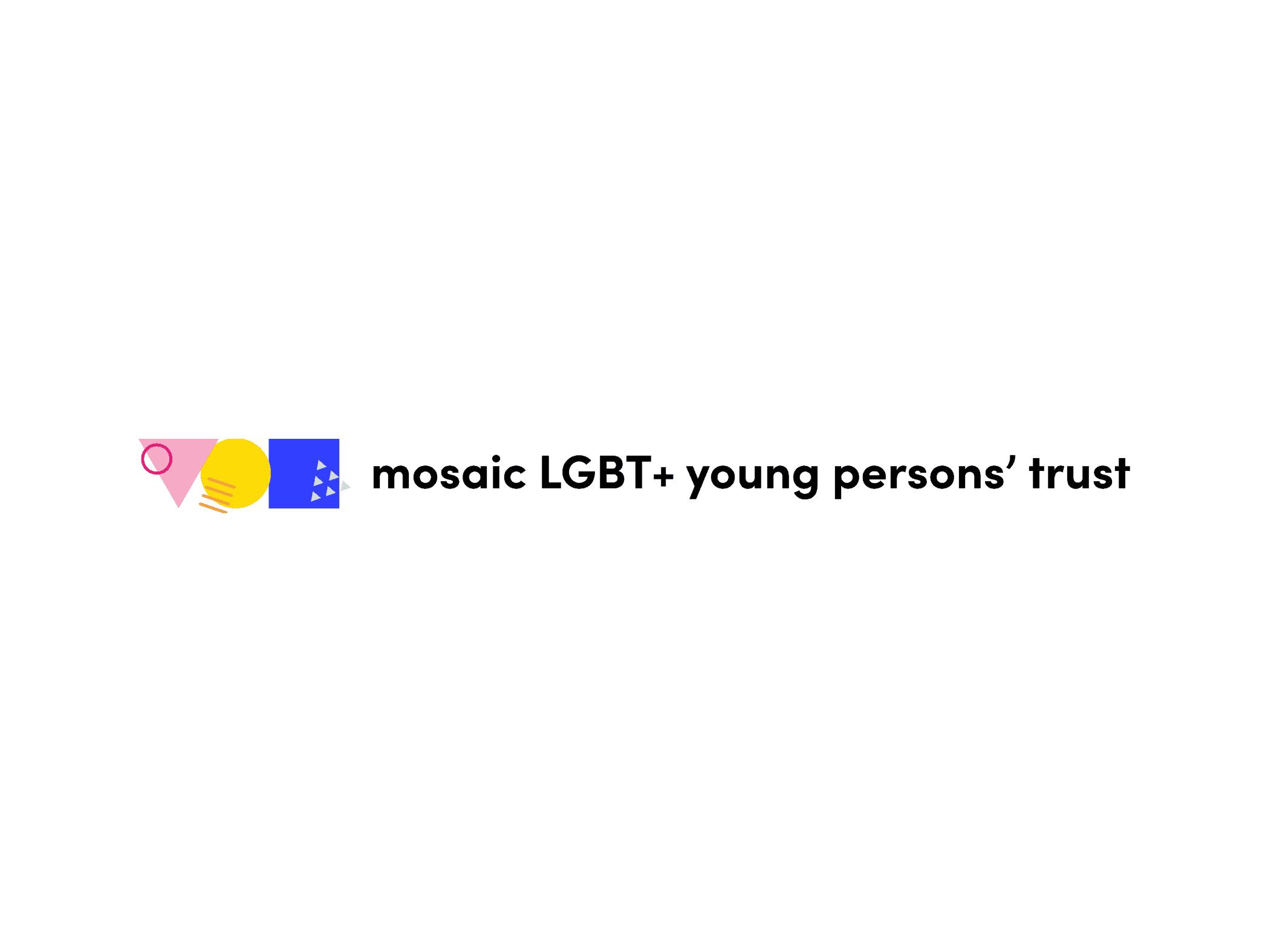
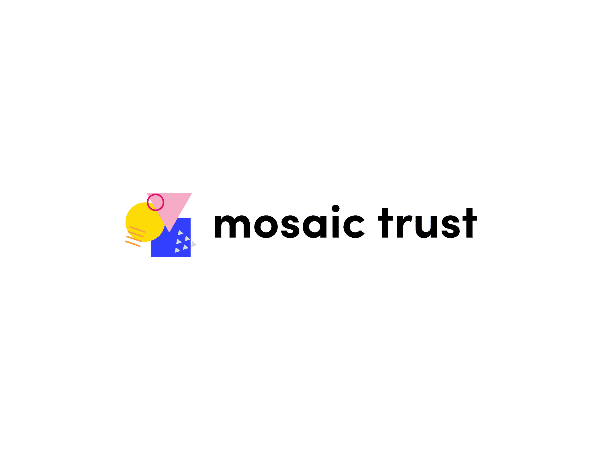
After multiple iterations, the winning concept used three shapes, a square, a triangle and a circle, which respectively reflects Mosaic Trust’s keywords ‘support’, ‘educate’, ‘inspire’. In this responsive logo design, the shapes are always connected to express the interconnection between these concepts.