/lu:talika/
Share
Substack helps writers gain support, readers and time back for … well … writing! Their platform has everything writers need to package and monetise subscription newsletters, so writers can connect with audiences and get paid for their work.

Credits
Branding: Cecilia Righini and Alaïs de Saint Louvent
Grace Lavery

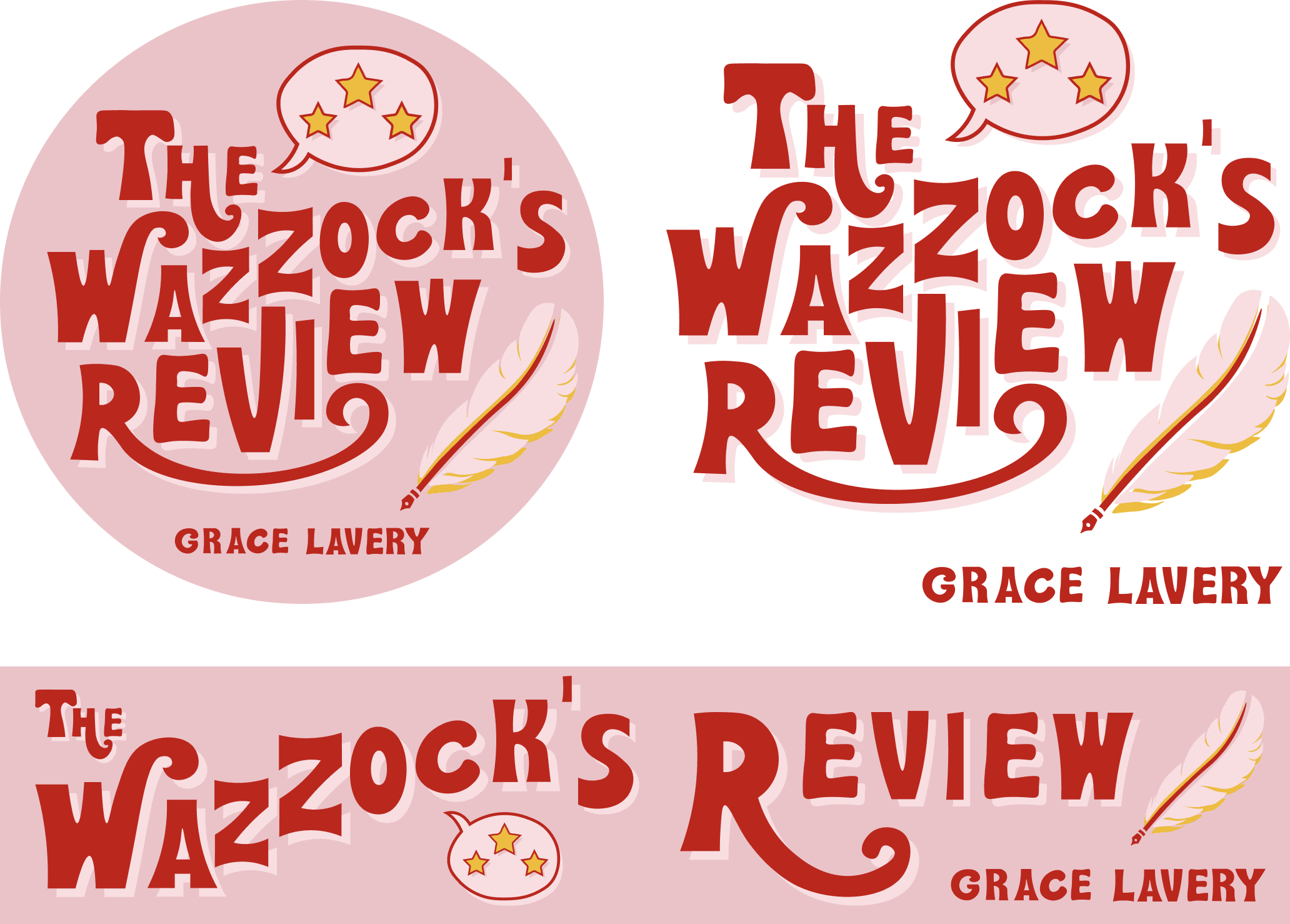
Studio Lutalica developed a logo for the Substack newsletter of the writer, editor and academic Grace Lavery. Based in New York, she is an Associate Professor of English, Critical Theory and Gender & Women’s Studies. She explores psychoanalysis, literary realism, and queer and trans cultures, topics she studies in even more depth in her memoir and essays. Discover Grace’s unique perspective via her Substack page, ‘The Wazzock’s Review’.

Designing the banner for Mister Mulberry was a matter of extending the Vaudevillian; mid-century American vibe we’d created for Wazzock’s Review. We applied the same quirky font and bold multi-tone colouring. Where we’d used quill and star illustrations to capture Grace’s playful and incendiary voice for her Substack newsletter, for Mister Mulberry we went with more literal illustrations, in the same style.


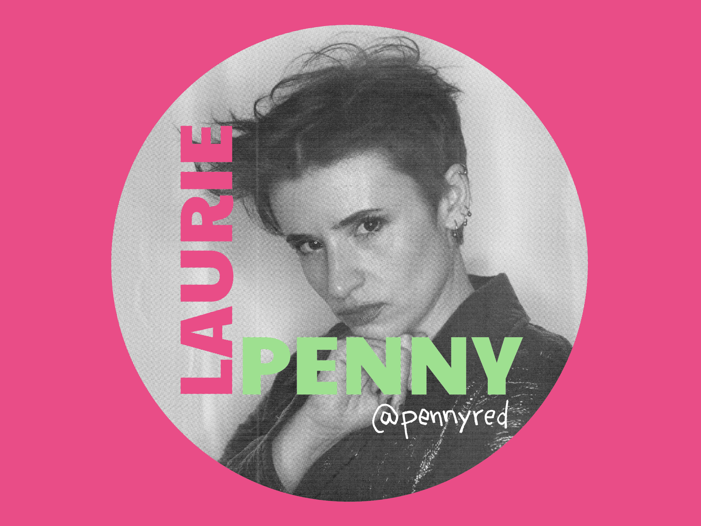
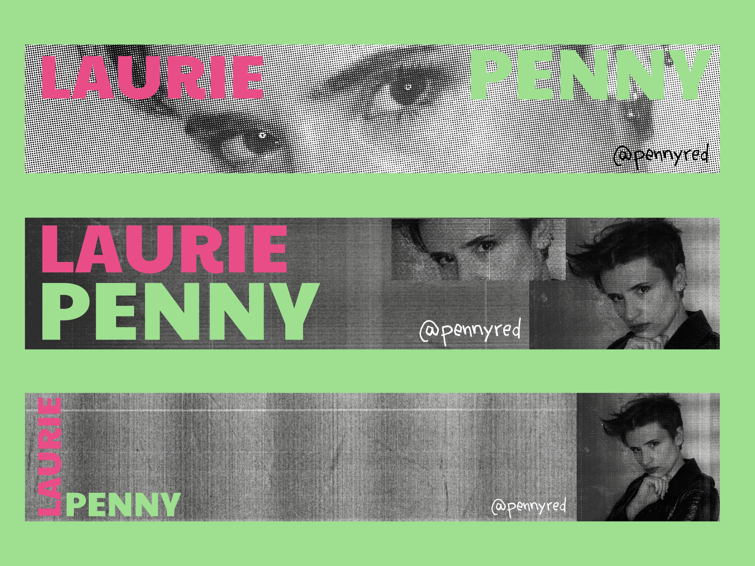
Laurie Penny approached us to create a new logo and banner image that would better represent her and her writing. We looked to 90s DIY counterculture to find an aesthetic that was rebellious and resonant. Our designers took direct influence from archive materials including flyers from nightclubs, posters and magazine covers. The challenge was replicating the textured low-fi feel without it looking contrived. The result is unique but reminiscent of post-punk, and expresses Laurie Penny’s powerful voice and aesthetic.

