Urgent Action Fund
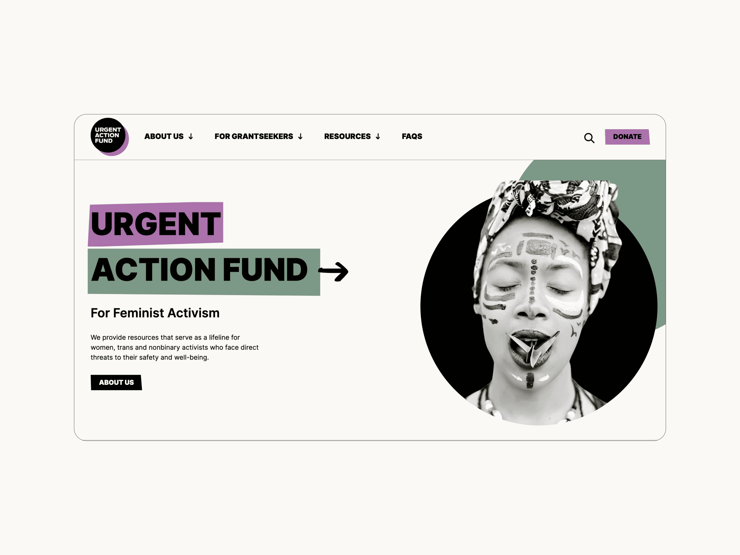
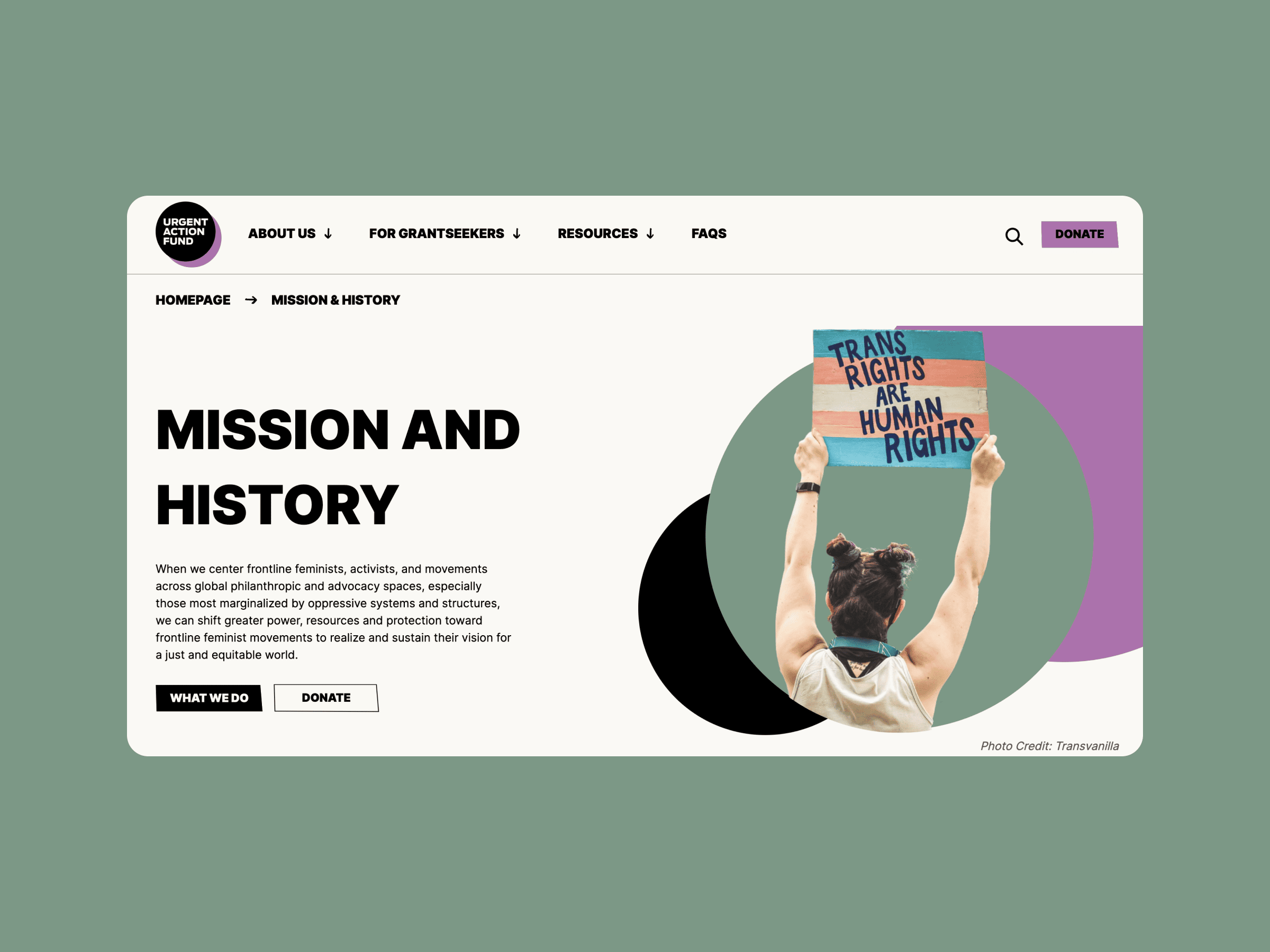
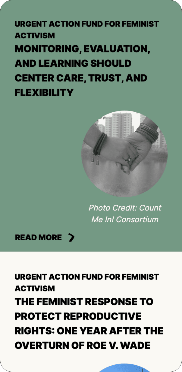
Urgent Action Fund for Feminist Activism has supported feminist activists across the globe for over 25 years. They provide fast, flexible support to women, trans and non-binary activists so that they can respond to unexpected risks and opportunities, and protect and care for themselves and one another. We designed and developed Urgent Action Fund’s new website, focusing on accessibility and impact.

Credits
UX Research and Design: Eva Kamenetski
UI Design: Alaïs de Saint Louvent and Zoe Tang
Development: Sofiia Bondarenko
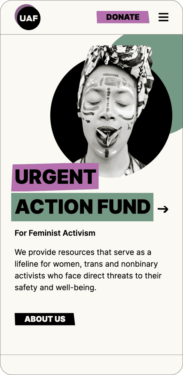
UAF wanted a modern and engaging platform that would integrate with their previous brand identity. We took inspiration from the world of activism, with a focus on power and strength.


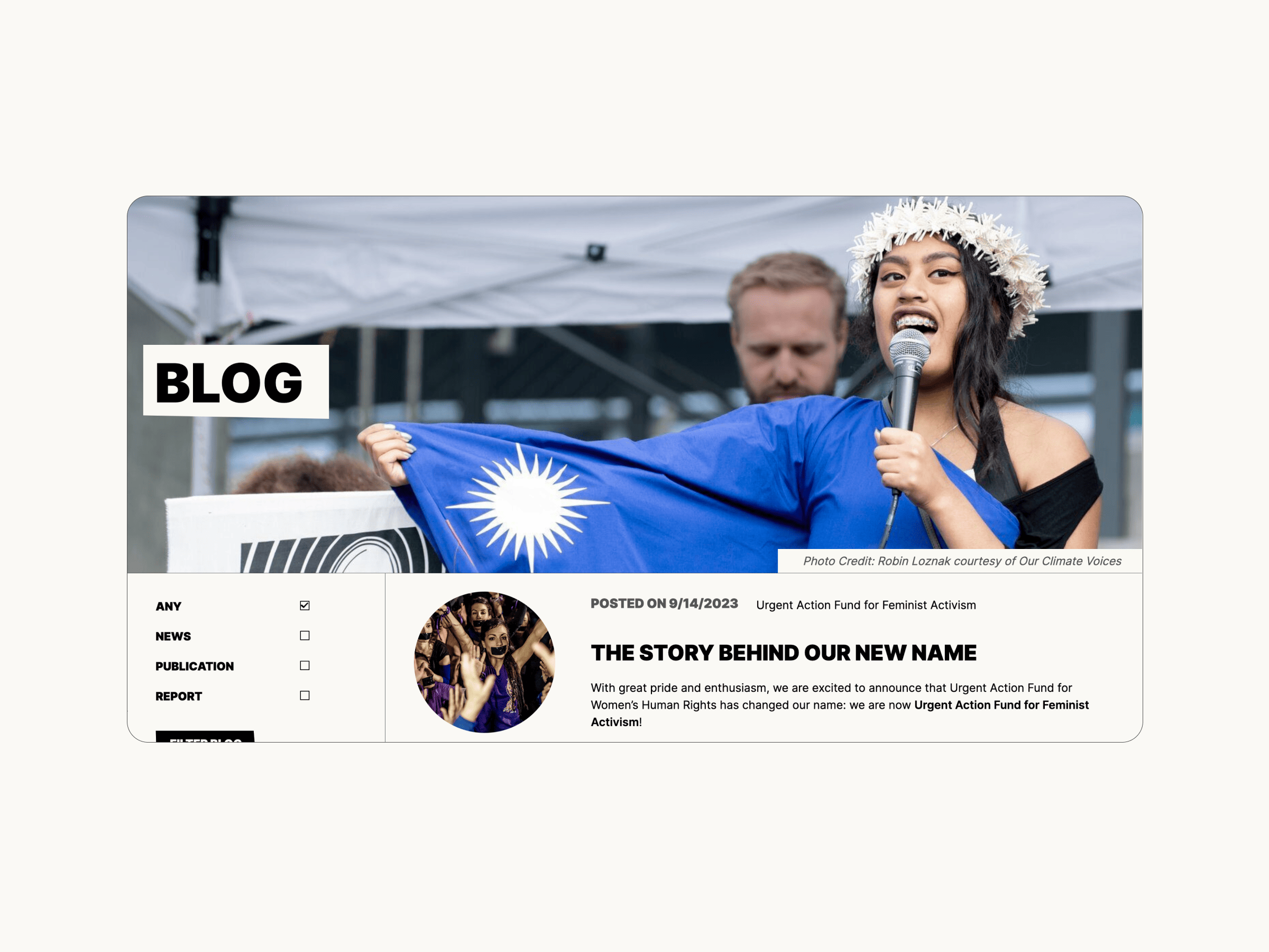
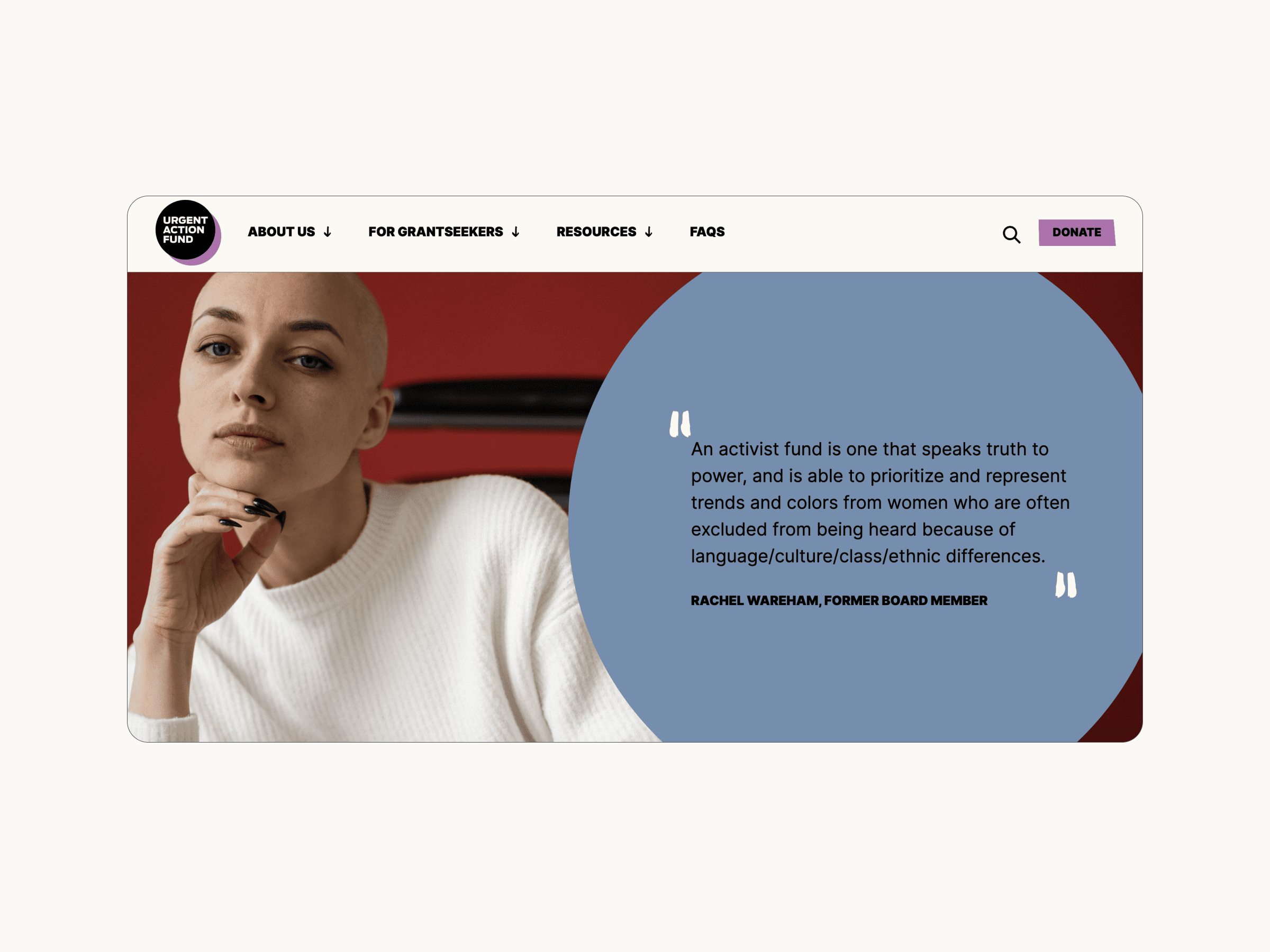
We conveyed UAF’s call for equity, empowerment and community strength through the use of bold typography and editorial cut-outs. It was important for us to balance the client’s hopes for a playful and engaging user experience with accessibility requirements, page loading speeds and energy usage. As a result, limited animated elements and created a motif with bold circular frames, which convey UAF’s bold, down-to-earth ethos in an accessible and sustainable way.
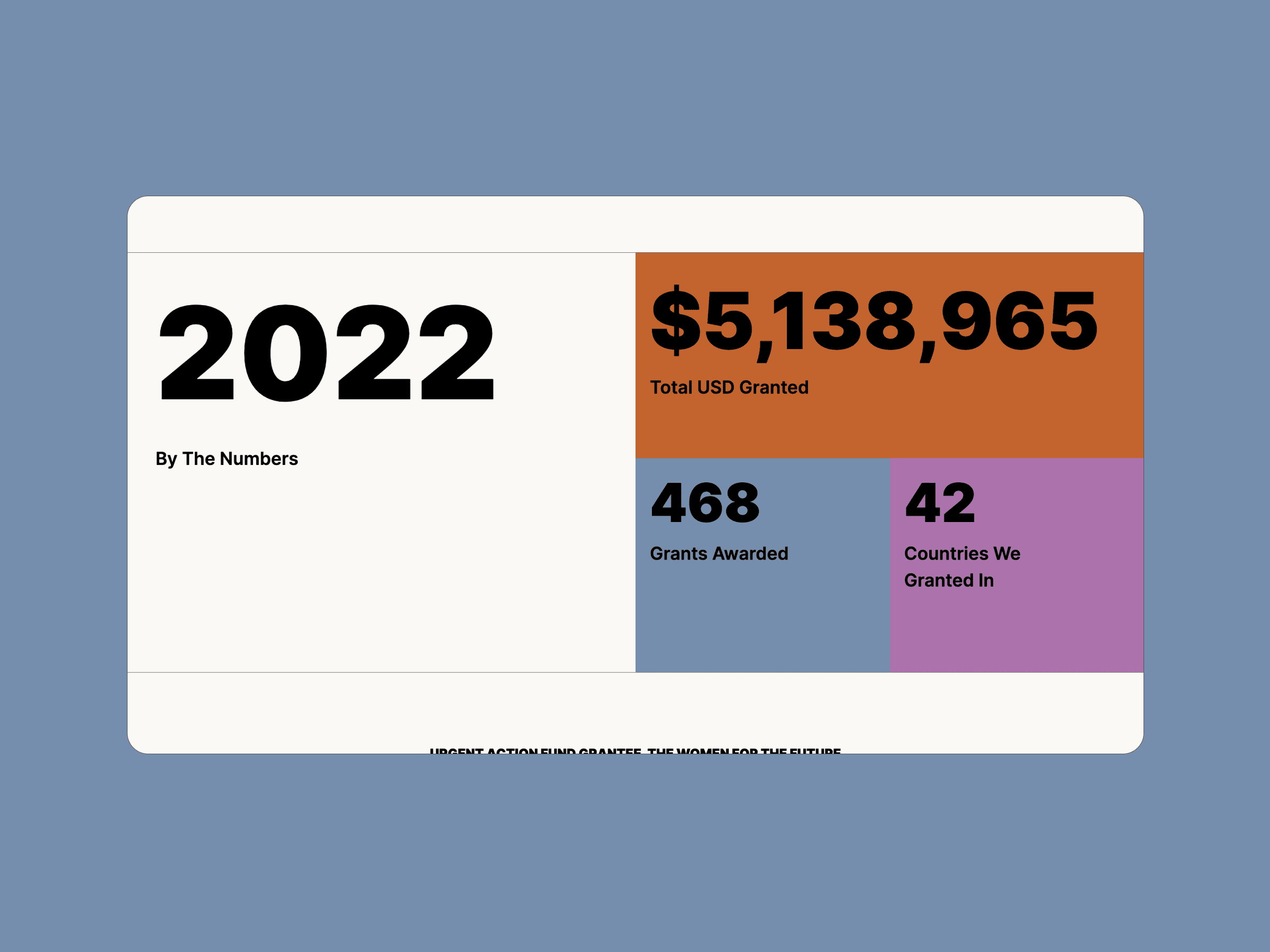
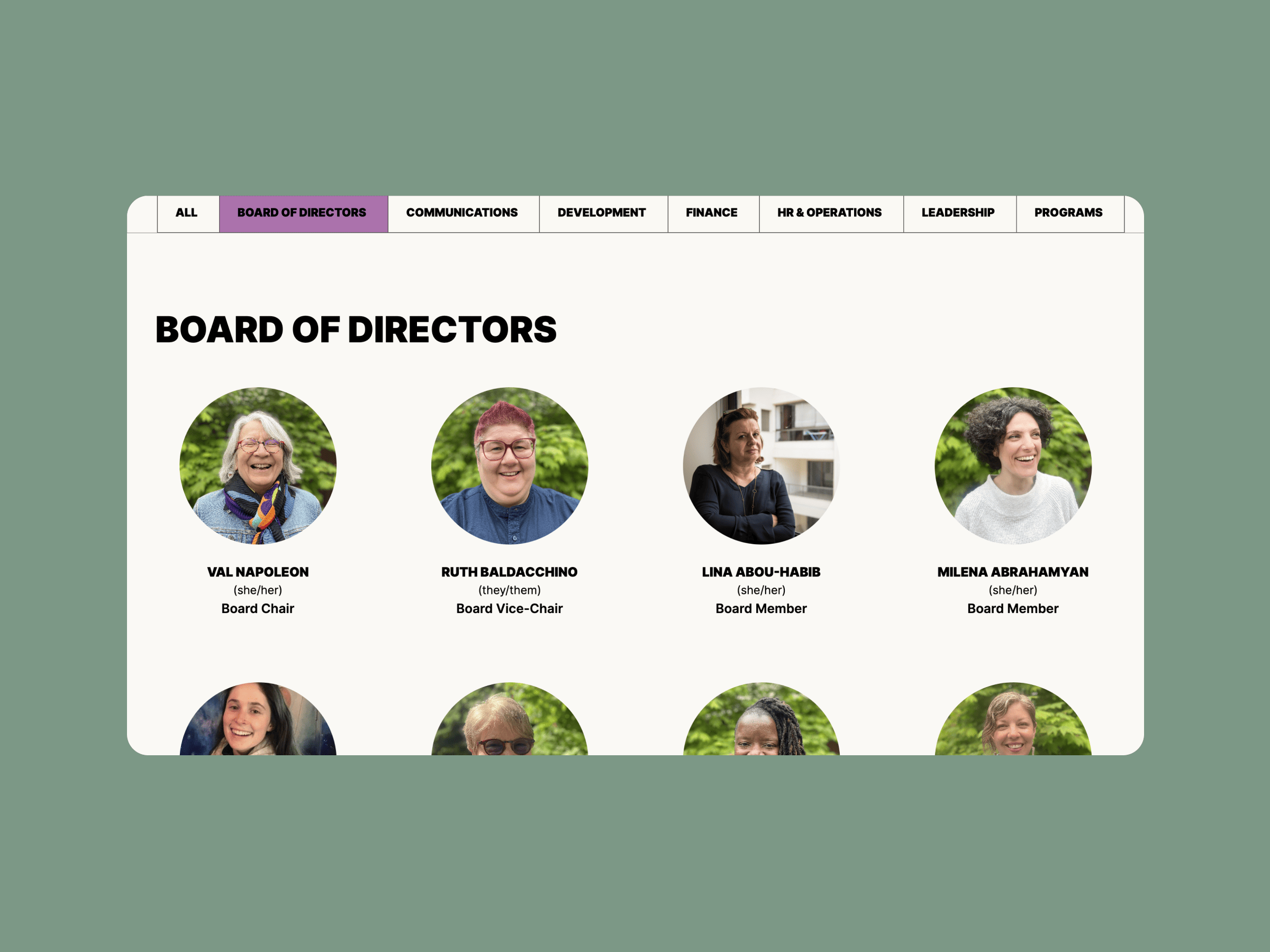
We designed Urgent Action Fund’s website with a modular layout, featuring reusable, flexible blocks. This approach allows clients to update and add content to their site without needing to pull in specialists or web developers.
Throughout the site, we’ve used bold sans-serif titles, chunky blocks and friendly circles, extending and adapting UAF’s legacy branding. Our aspiration here was to create an inclusive but strong atmosphere on the website.