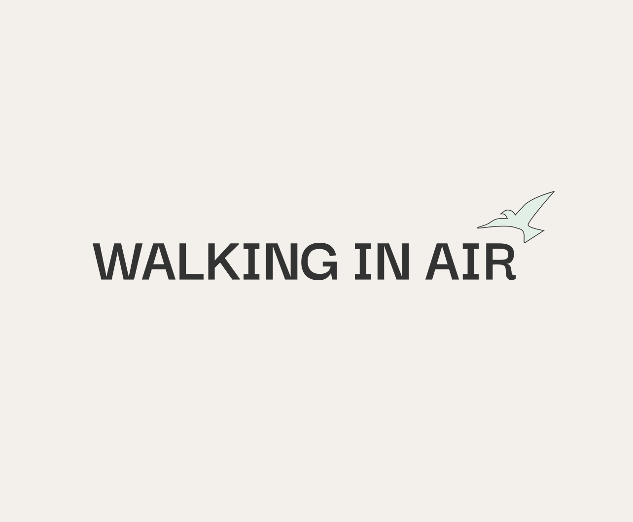
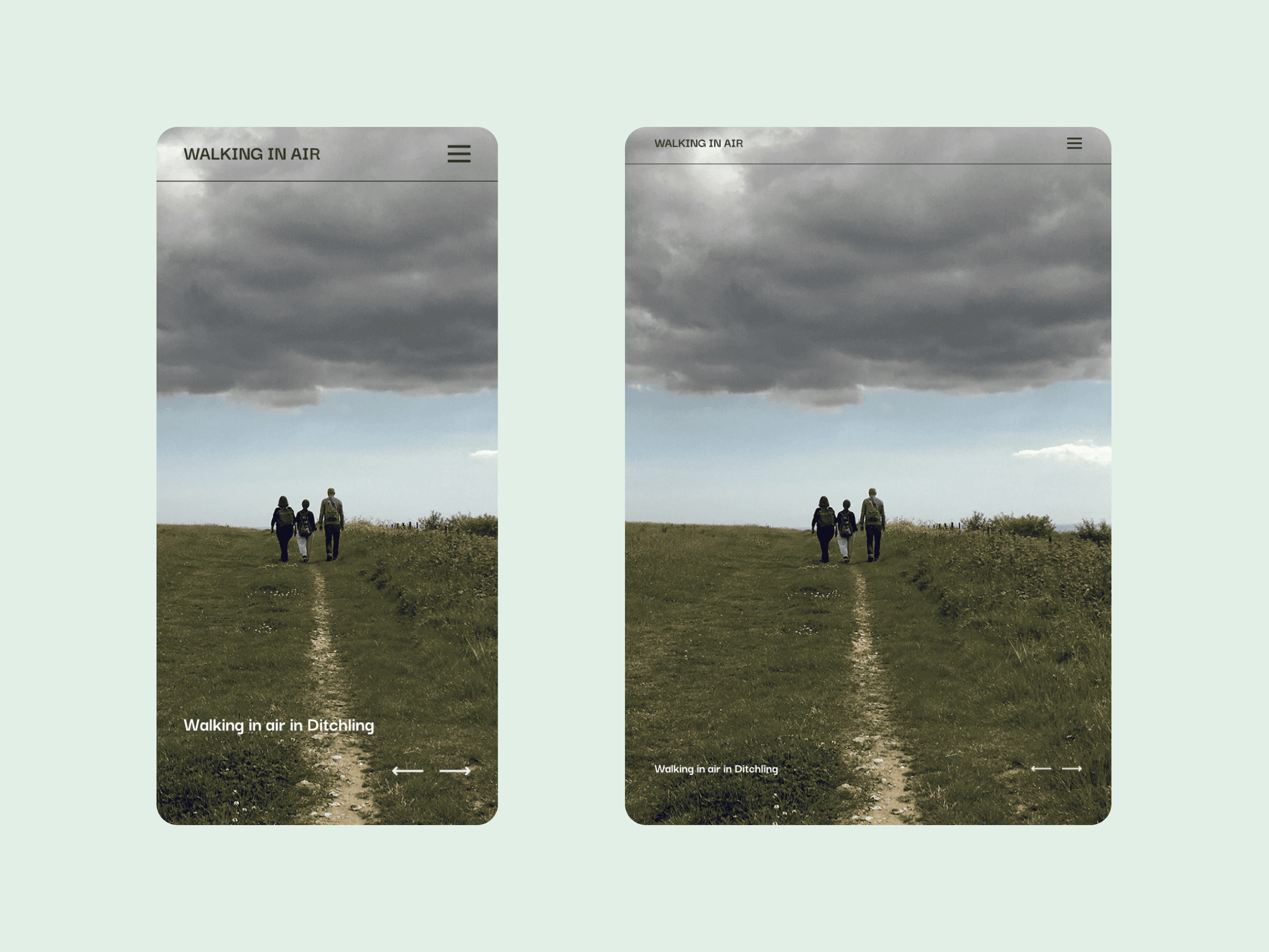
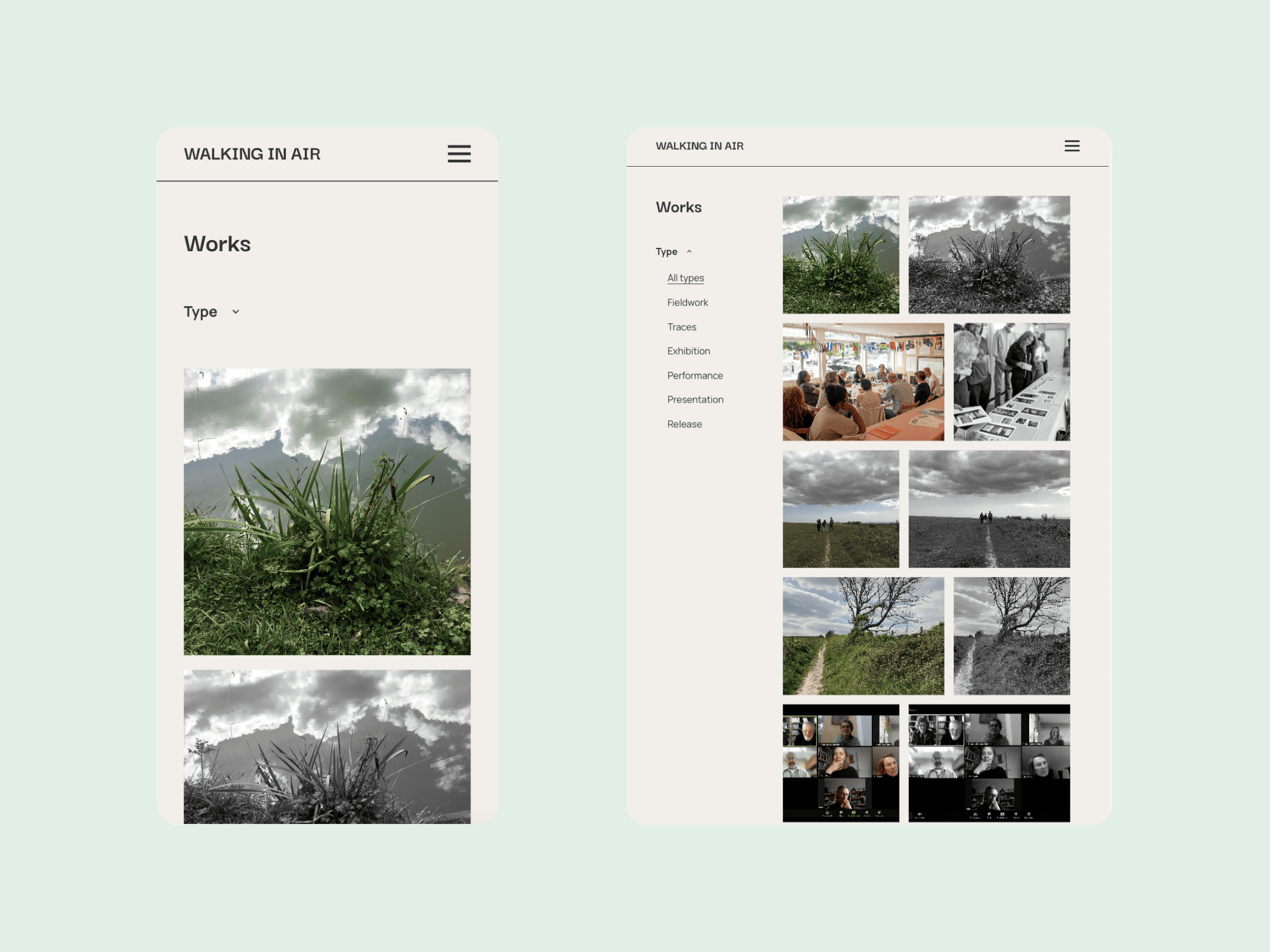
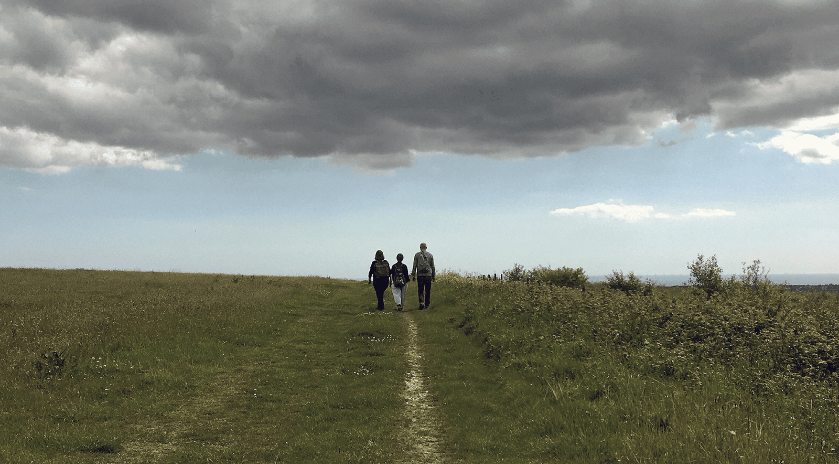
/lu:talika/
Share
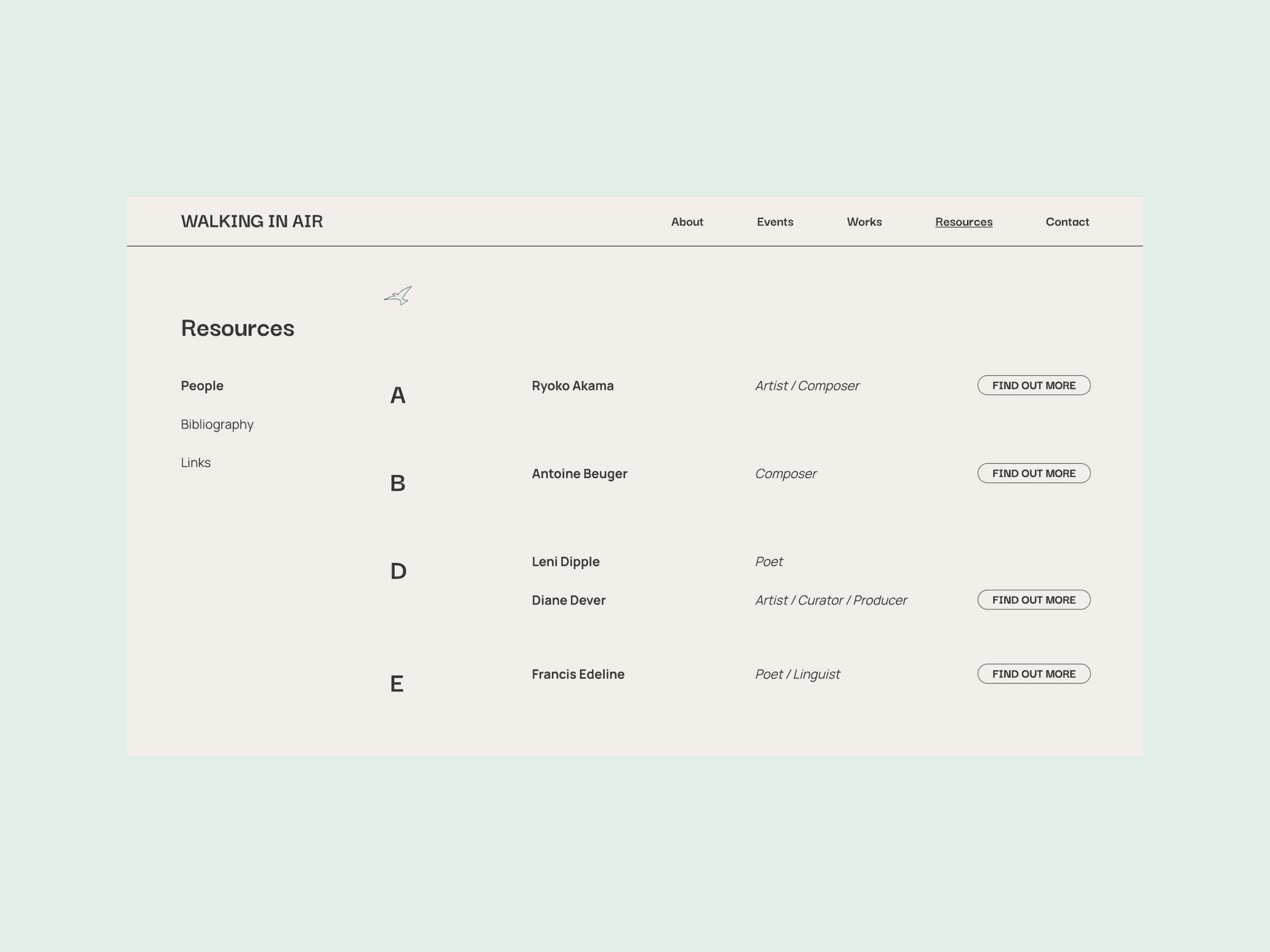
Walking in Air is a visionary project, led by Emmanuelle Waeckerlé (University of the Creative Arts) and Will Montgomery (Royal Holloway, University of London). Working across the disciplines of Poetry, Music and Fine Art, Walking in Air unites the act of walking with the intangible element of air, inviting critical reflection and creative exploration. Having worked with Emmanuelle Waeckerlé previously, we were thrilled to be asked to brand, design and develop the website for this project.

Credits
Brand and UX Design: Katie Gee
UI Design: Katie Gee and Cecilia Righini
Development: Nata Sheketa
Branding
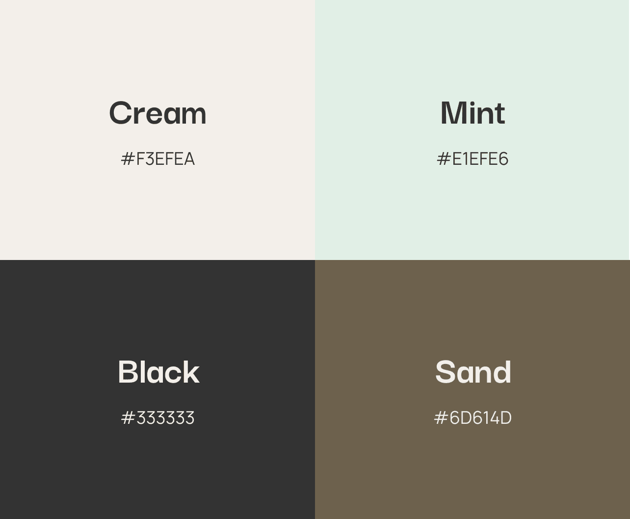
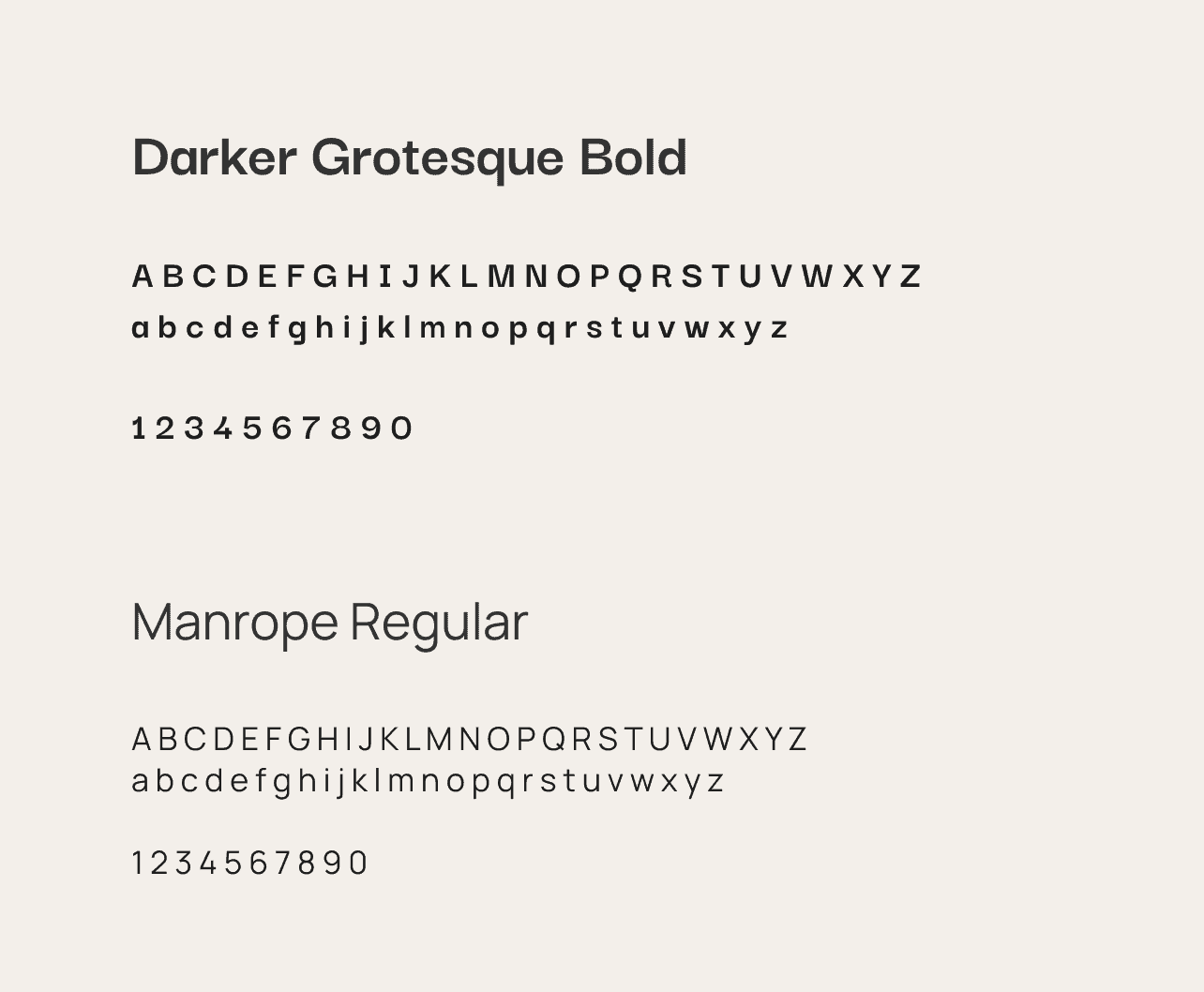
We wanted Walking in Air to feel breathable and natural to align with the project. The colour palette consists of cream and mint shades, complemented by accents of deep sand and muted tertiary colours for the background, which has the additional advantage of allowing images to stand out effectively. The selected fonts include Manrope for the main typography, providing a clean and modern look, and Darker Grotesque for titles. These design elements work together to evoke a sense of tranquillity and connection with the project’s core themes.
Website
The website design embraces spaciousness, using ample white space to create a sense of breathability, and subtly referencing the white space of an art gallery. This intentional use of whitespace allows the artworks and content to take centre stage. The overall style of the website aligns with Emmanuelle Waeckerlé’s personal site, which we also had the pleasure of designing, ensuring a visual continuity between the two projects.


As you navigate the site, you’ll notice the bird illustration we animated for the cursor. When the visitor moves (or flies) around the site, the bird is in flight, and when you land on a link, the illustration changes to a bird perching. In terms of functionality, we implemented a user-friendly filtering system to help visitors navigate the site and find specific works, events and resources.
Responsive Design
The Walking in Air website has been designed to be fully responsive, adapting to various devices. The layout dynamically adjusts depending on the screen size of the visitor’s device. For example, on mobile devices, the menu is optimised to occupy the entire screen, and the gallery of images stack singularly. This approach guarantees a clean and uncluttered interface, prioritising ease of use.