QABD
Queer Archives of the Bengal Delta (QABD) is a community-based archive dedicated to preserving queer Bangladeshi history and culture. Launched in 2020 by queer activists, QABD aims to safeguard the narratives of the queer community in Bangladesh and its diaspora. We worked with QABD to refresh their branding and update their website, to better support their mission.

Credits
Branding and UI Design: Zoe Tang
UX Design: Eva Kamenetski
Development: Sofiia Bondarenko and Nata Sheketa
Brand Refresh


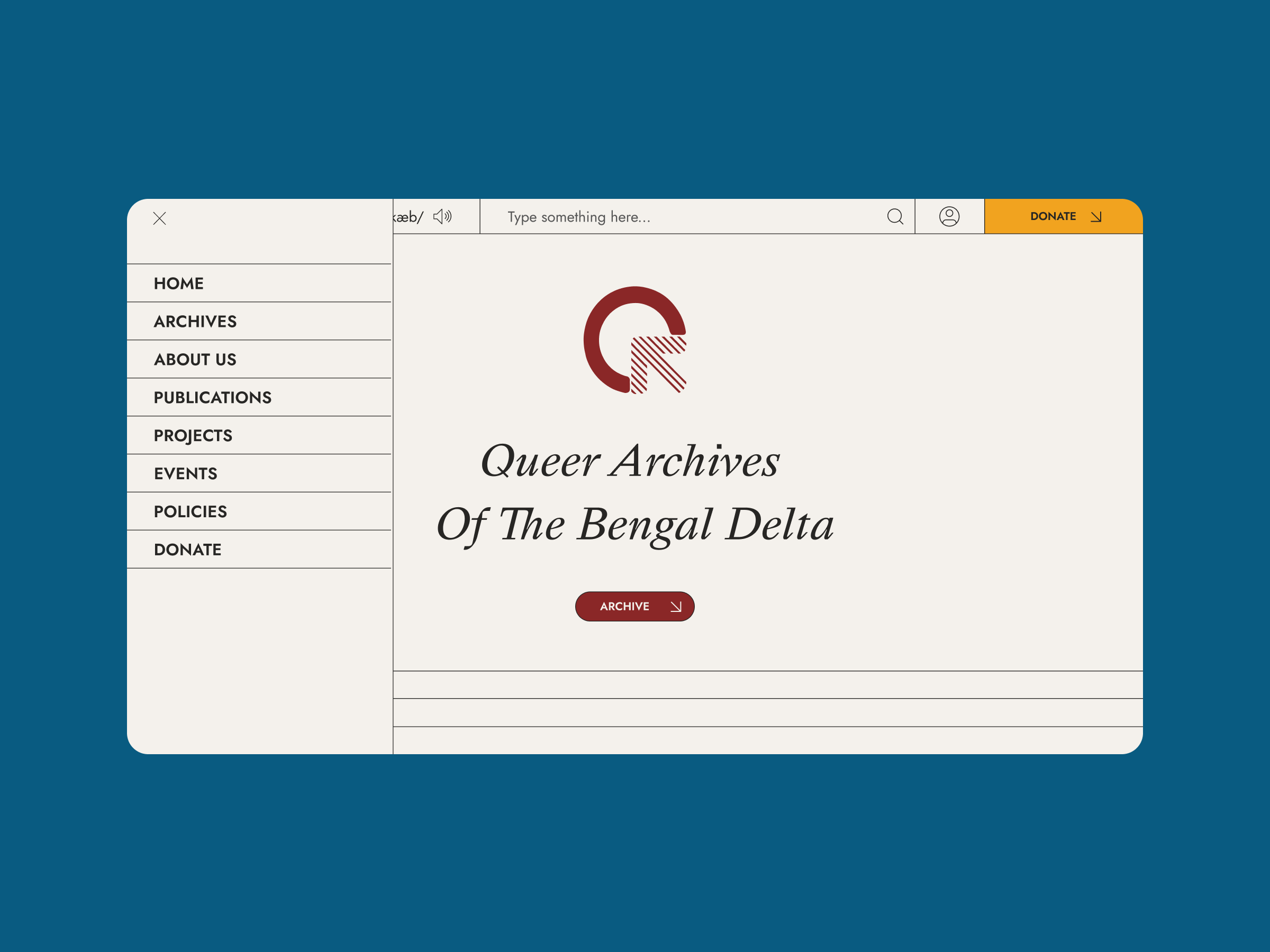
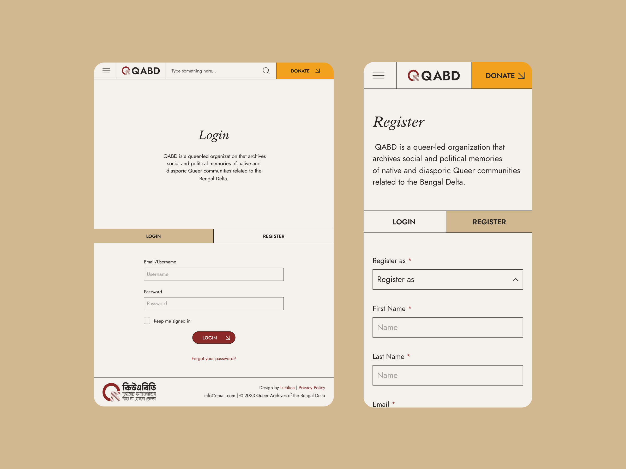
Our brand refresh for QABD was inspired by the look and feel of traditional archives. For the text, we chose a classic serif font for headings, recalling older print materials, and an accessible sans serif font for the body text, which gives a modern feel. We updated the logo, so that the sharp lines of the text contrast nicely with the softer, rounded edges of the logo symbol. Red is the dominant colour in the brand palette, giving a feeling of warmth and energy. This is complemented by rich shades of green, yellow, and blue, while a neutral beige is used to balance these vibrant colours.
Website

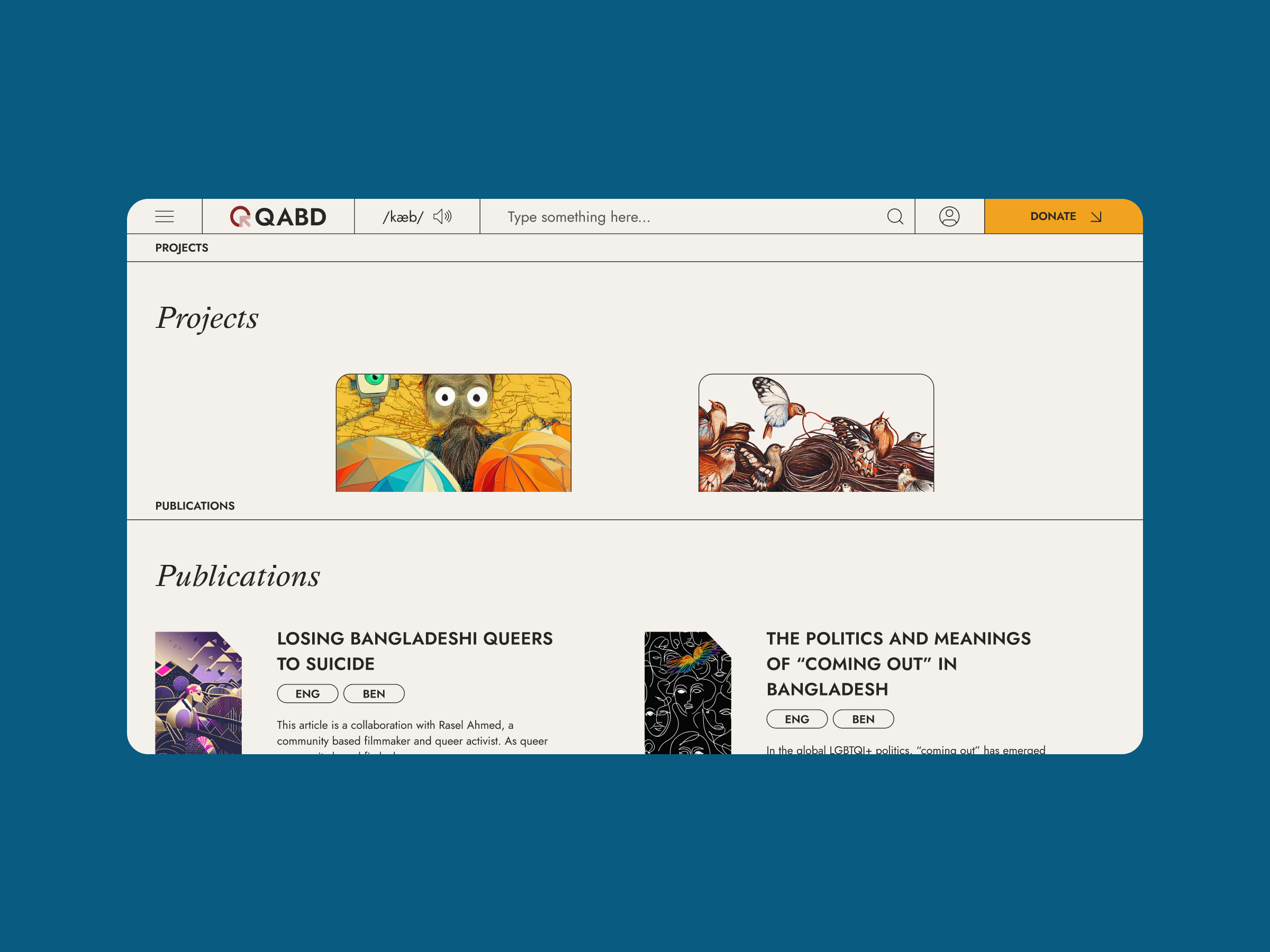
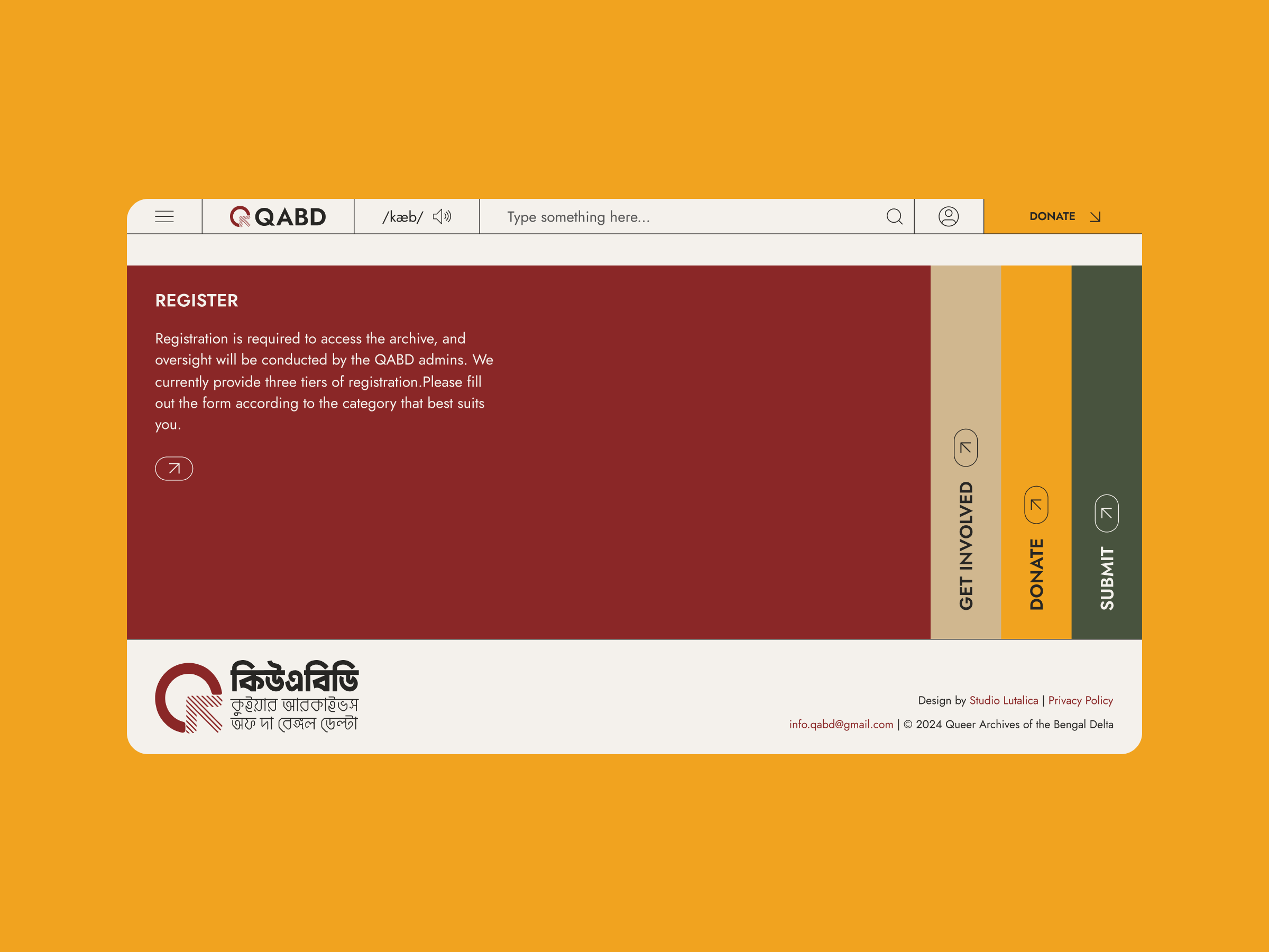
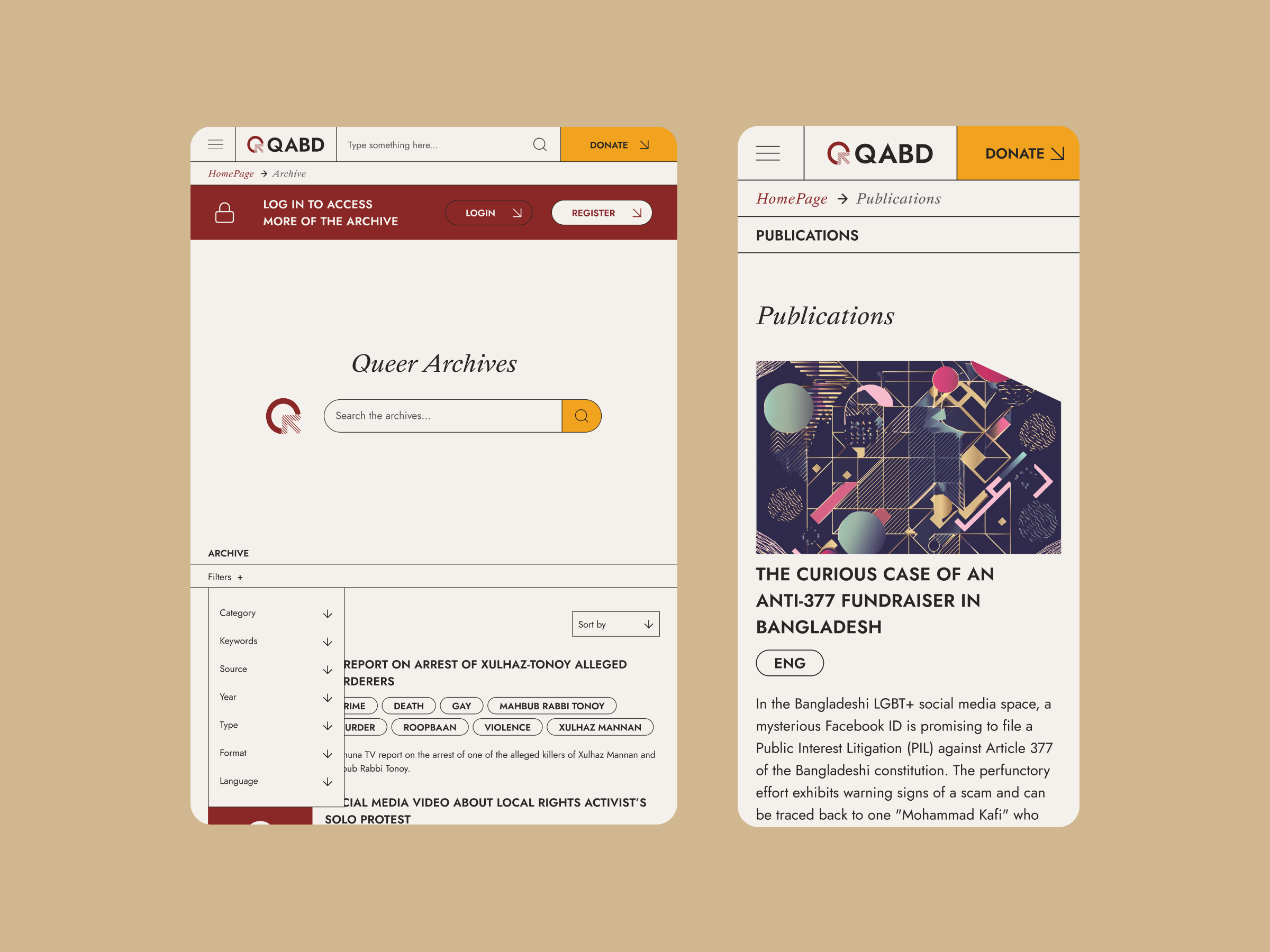
We designed the QABD website with a focus on enhancing user experience, making it easier for visitors to find and discover materials of interest. The responsive design integrates the refreshed branding, with red as the primary colour and other hues used as accents to maintain visual interest without overwhelming users.
We streamlined metadata presentation by using expandable sections and clear headings, ensuring that information is accessible and not overwhelming. Additionally, the modular layout facilitates easy updates and tagging of articles, enabling QABD to efficiently manage and expand their digital archive.