Understanding Accessibility
Understanding Accessibility is a new online resource, created by Alaïs de Saint Louvent, lead designer for Studio Lutalica. Developed by Lattimore + Friends, with Creative Direction from Studio Lutalica, Understanding Accessibility promises to tackle the usability gap in Web Design, by presenting fundamental accessibility guidance in a clear and engaging way.

Credits
Branding, UX + UI Design: Alaïs de Saint Louvent
Development: Lattimore + Friends
Illustrations: Emily Peat
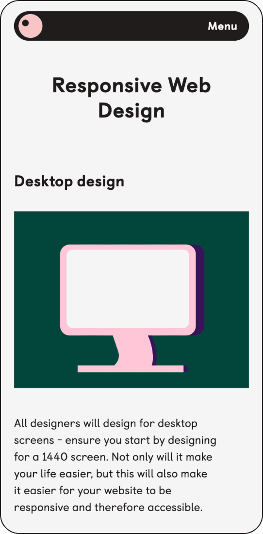
Web Design
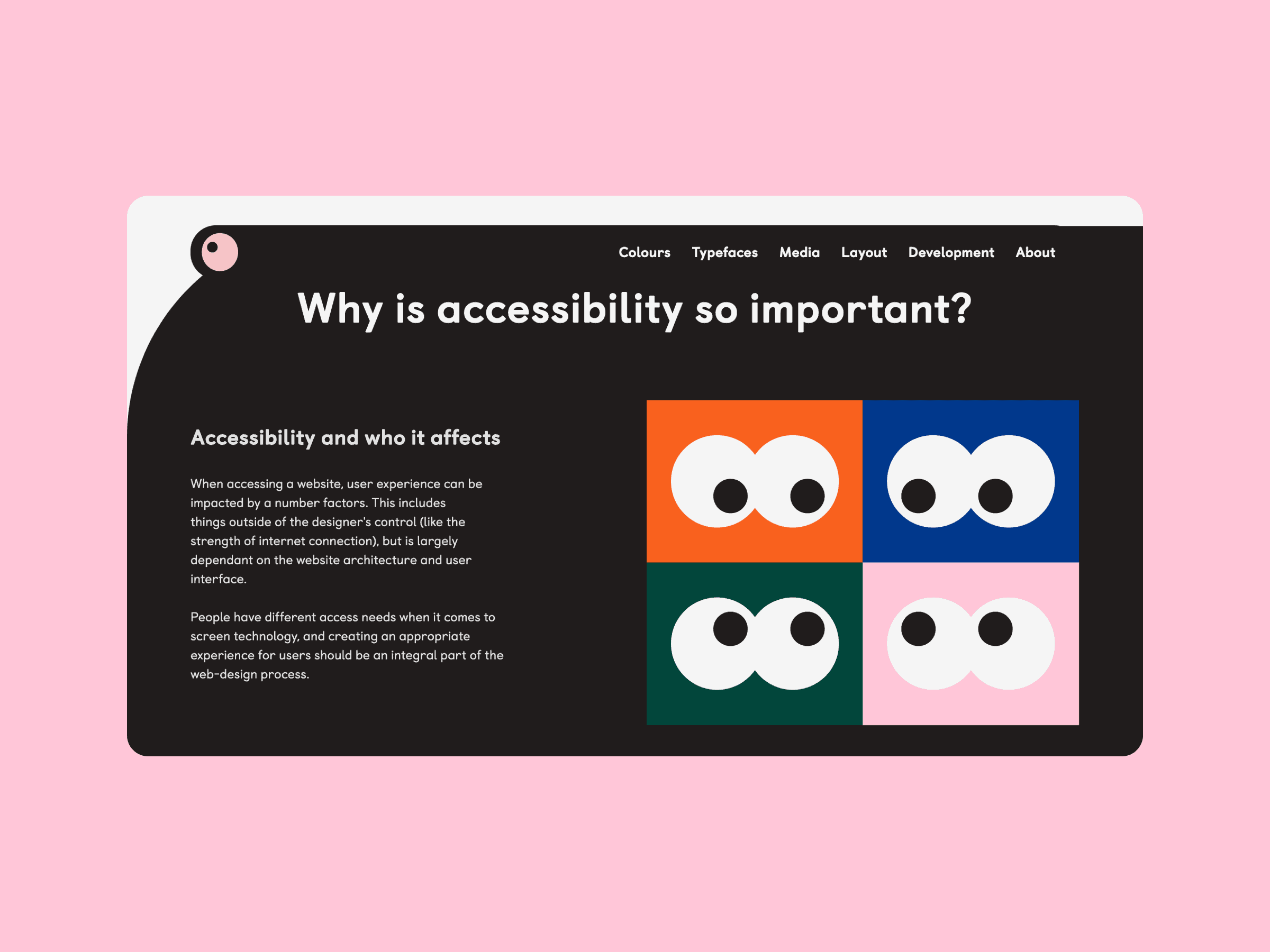
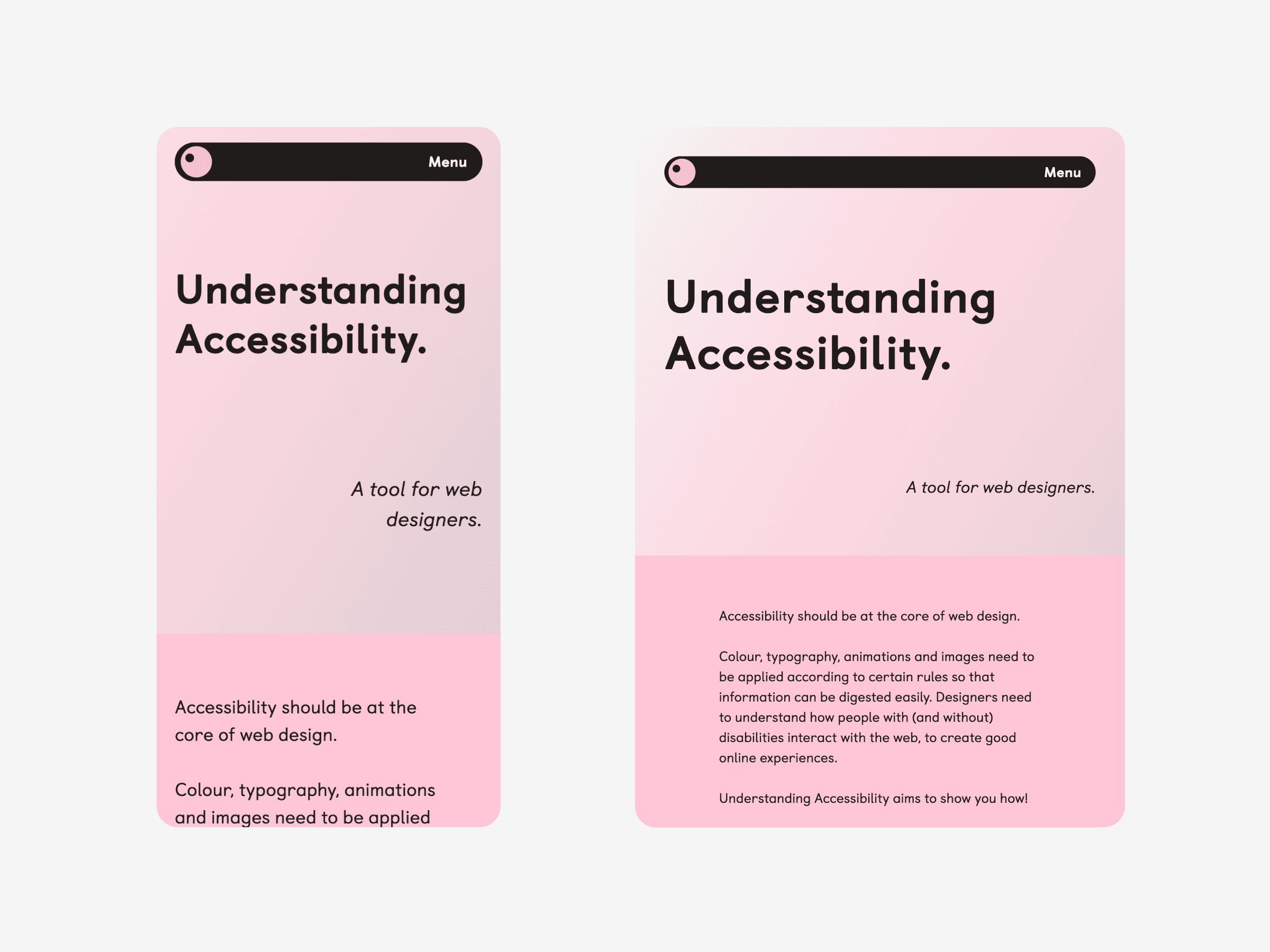
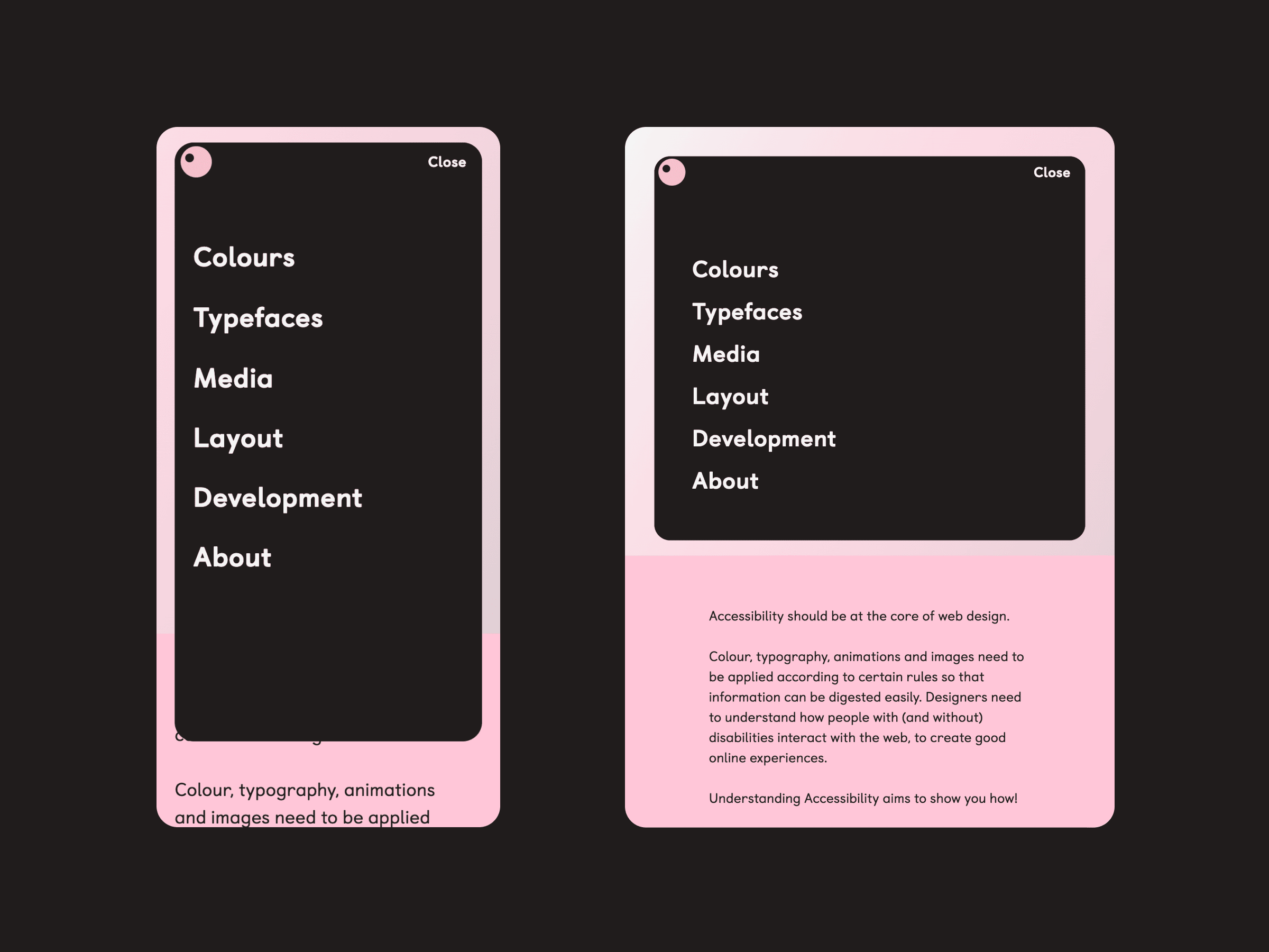
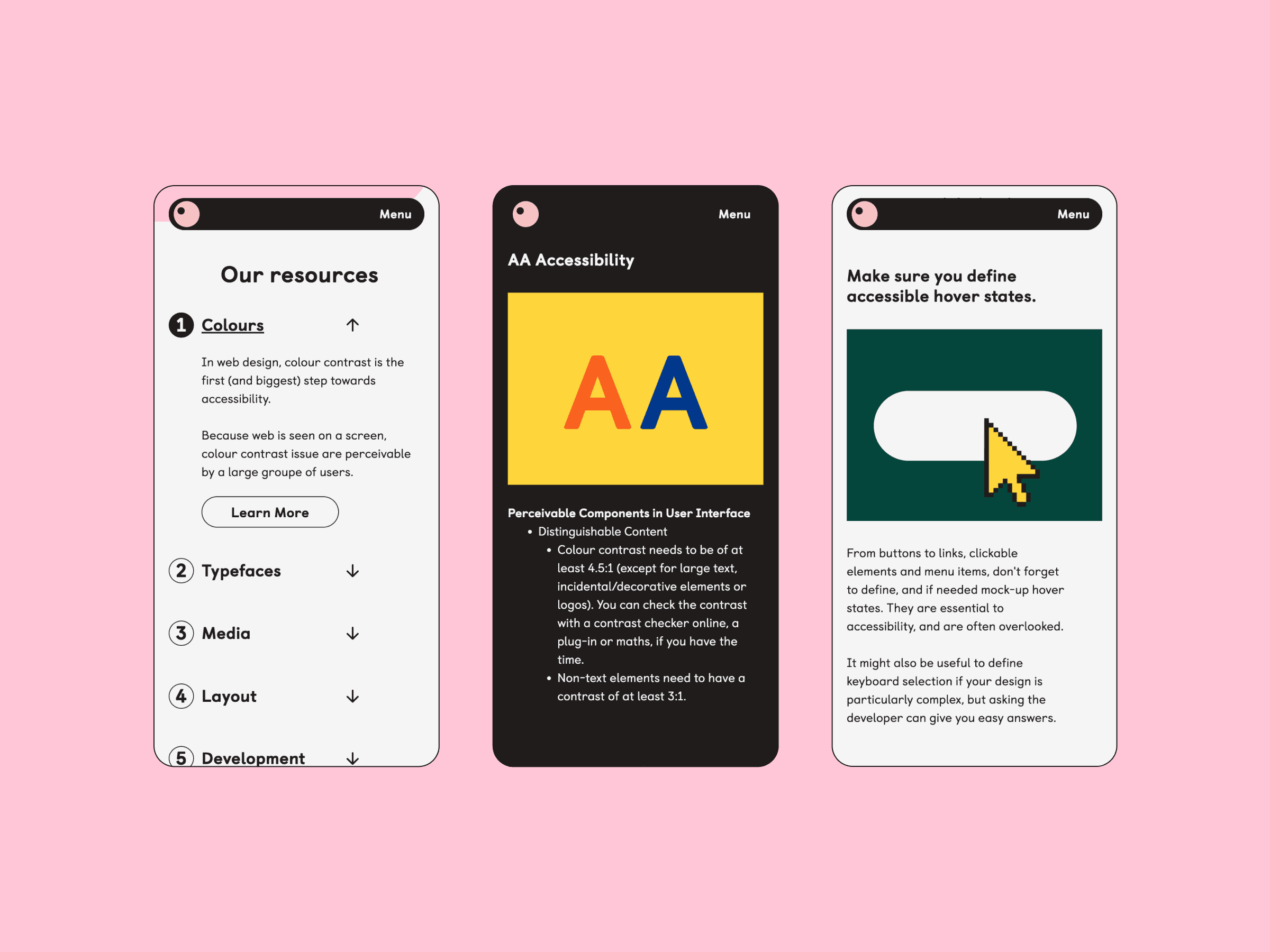
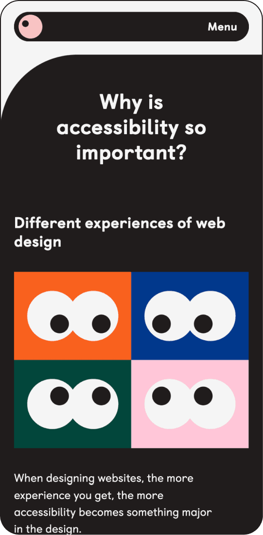
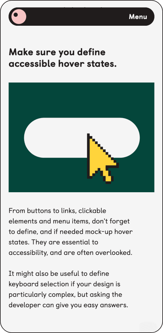
Naturally, we sought to make this website as widely accessible as we could to practice what it preaches. We carefully implemented general accessibility practices, ensuring a user-friendly interface and clear communication.
We put ourselves in the shoes of the people we expect to use this website, and created the layout and navigation, accordingly. The site is divided and subdivided clearly by design area and WCAG focus area.