Grab a cuppa, get comfy and have a nosy around :)

Bi+ Equal

A welcoming, accessible platform for a growing pan-European bi+ organisation.

Bi+ Equal is building a pan-European bi+ umbrella organisation to advance gender equality and sustainable development—ensuring bi+ people are no longer overlooked within wider equality work. They needed a digital presence that felt welcoming and easy to navigate, while still carrying the credibility required to convene partners, funders, and community.

We supported Bi+ Equal with a partial rebrand and a set of accessible Webflow website templates: a modular system they can adapt and grow over time.

Project Team

UX/UI Design: Federica Minini

Development: Lisa Komoltseva

The Challenge

The site had to communicate a lot of information without overwhelming people. It needed calm-but-joyful clarity, straightforward navigation, and accessibility baked into the details—especially for a diverse, international audience with different needs, devices, and levels of familiarity.

Just as importantly, Bi+ Equal needed a structure that could expand (events, research, resources) without a full rebuild or a heavy maintenance burden. This wasn’t just about launching a site; it was about building capacity for the work ahead.

What We Did

We refined key identity elements—including logo details, colour palette, and typography—alongside an accessibility review of logo and colour choices.

We developed a clean, consistent type system (including Figtree) to create an approachable, readable foundation, supported by minimal animation and strong information hierarchy.

We designed and built reusable Webflow templates and content blocks, focusing on scannable layouts, clear navigation patterns, and a structure that can flex as Bi+ Equal’s work evolves.

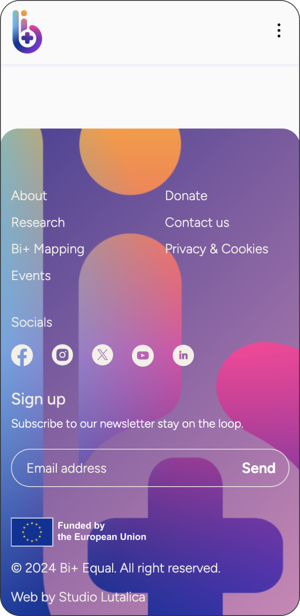
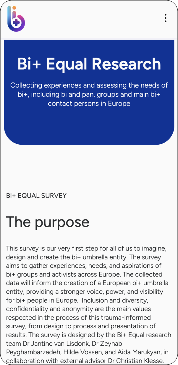
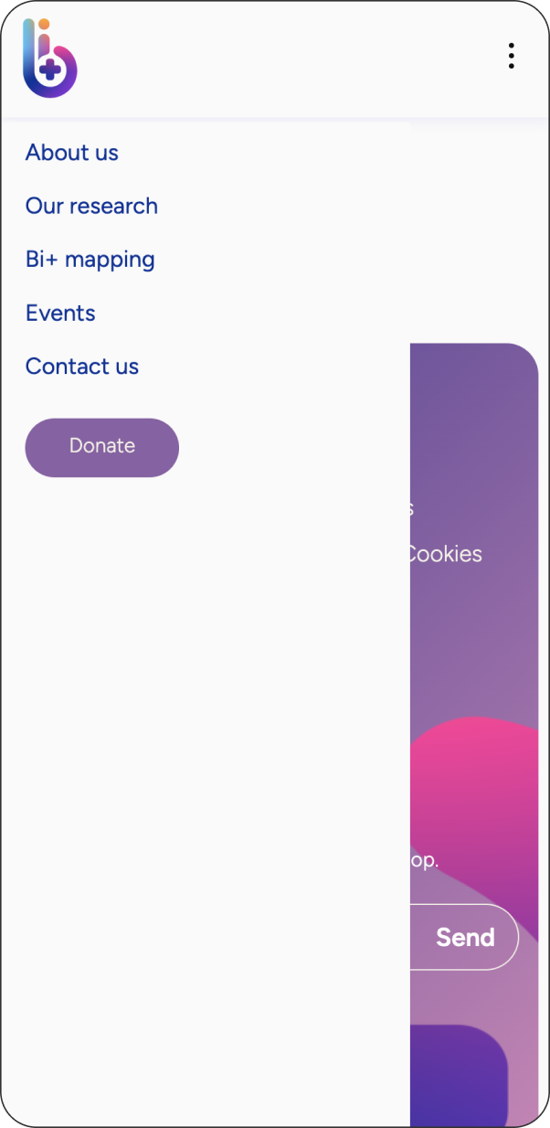
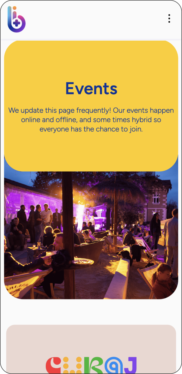
We prioritised responsive behaviour across devices, ensuring key blocks reflow smoothly on tablet and mobile.

Impact

The result is a calmer, clearer experience that makes it easier for people to find information, understand what Bi+ Equal does, and get involved—without the friction that can come from dense content or inconsistent navigation.

Behind the scenes, the modular template and block system gives the team a practical foundation for publishing updates and expanding the site sustainably, protecting capacity as the organisation grows.

The collaboration itself was part of what made this possible. As founder Soudeh Rad shared, “During our collaboration, open and clear communication prompt responses truly made our trajectory easier,” and the resulting website is “representative of the project but also a potential resource and website for the future organisation.”

Soudeh also reflected on the value of working with a lived-experience-led design team: “There is an undeniable power and an inherent treasure in narratives that emerge directly from lived experience… The process was remarkably fluid and intuitive, devoid of the usual complexities.”

Collage of five colourful website screens with diverse people, rainbow, event info, text and icons, in playful purple-pink gradients.
A colourful abstract logo with a lowercase 'b' and plus sign on the left, eight rounded gradient buttons in two columns on the right.
typography examples - the font 'figtree' in light, regular and semibold
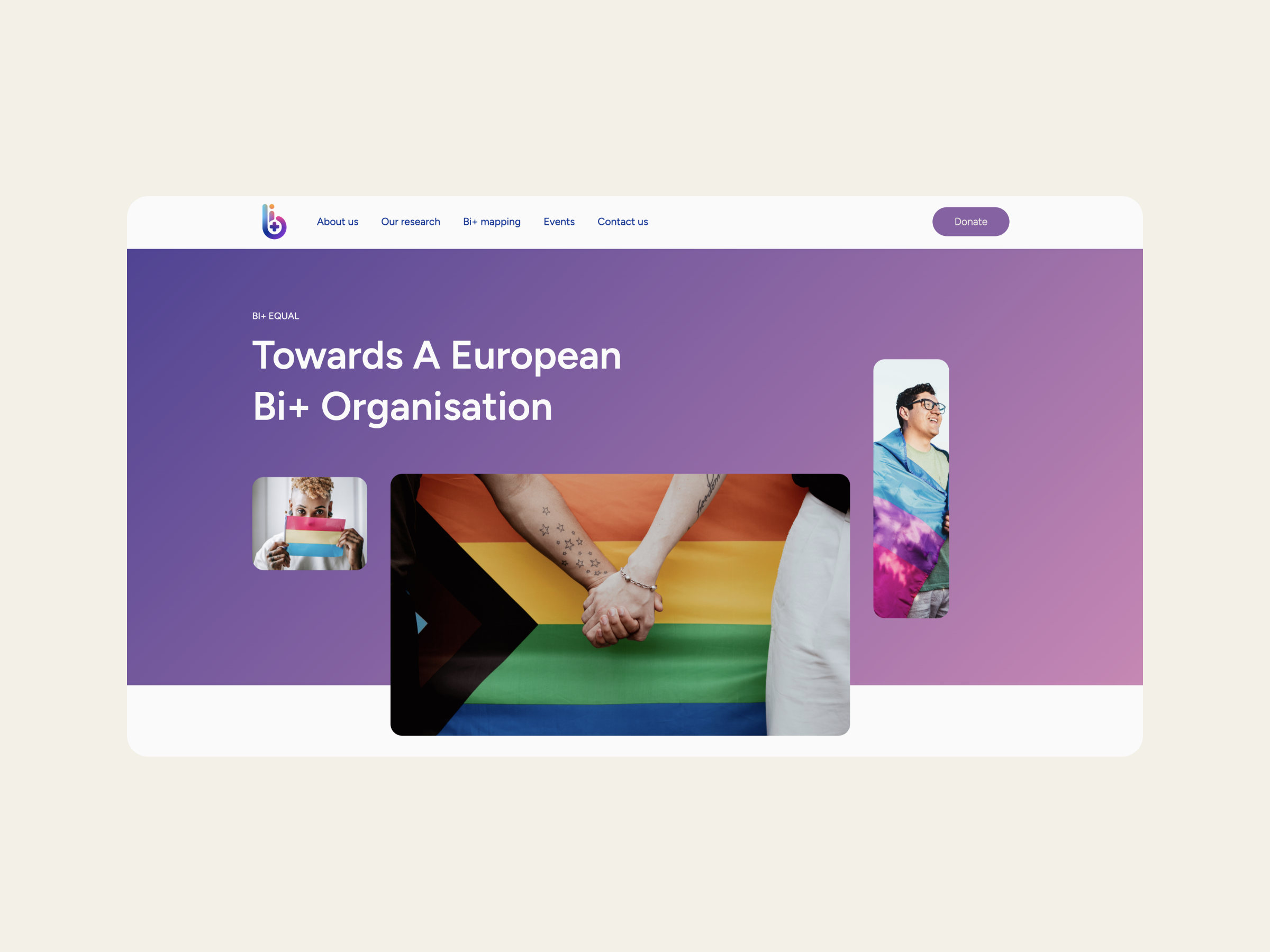
bi+ equal homepage with title reading: Towards a European Bi+ Organisation

“During our collaboration, open and clear communication and prompt responses truly made our trajectory easier. The process was remarkably fluid and intuitive, devoid of the usual complexities that often accompany the initiation of branding and websites.”

– Soudeh Rad, Vice-Director

core team page, with photos and bios of Bi+ equal team
Two mobile screens display a “What We Do” section with pink-yellow gradients, objectives, and “Learn More” buttons in an app interface.
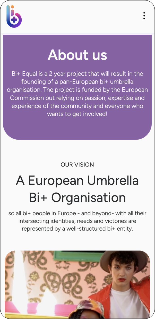
Two phones show a website: left screen with a purple gradient menu, right screen with Bi+ Equal Research info on bi+ needs in Europe.
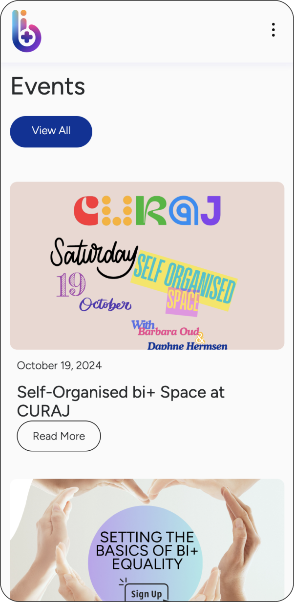
Two mobile screens show an events page on a bold yellow background—one with a lively night crowd, the other listing forthcoming events.
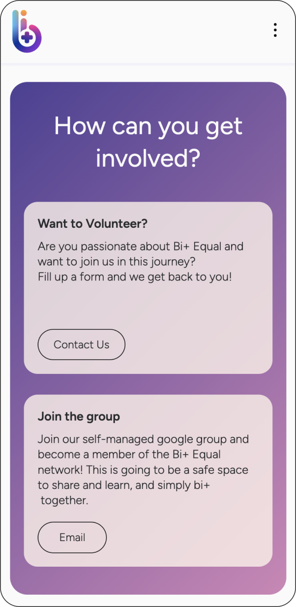
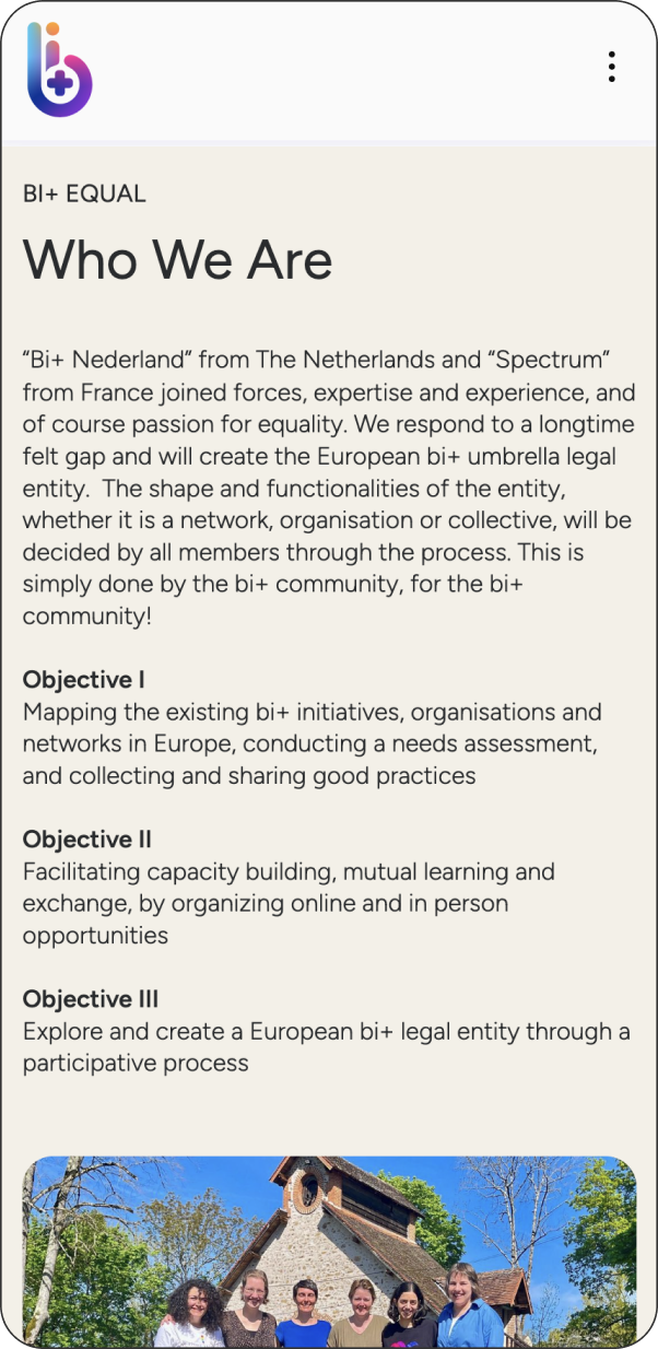
Two mobile phones on a blue background display the Bi+ Equal site: one with get involved options, one showing Who We Are and group photo.