Friends of Bethnal Green Working Men's Club
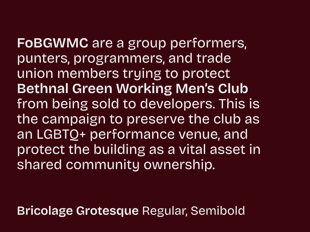
Friends of Bethnal Green Working Men’s Club is a grassroots campaign group made up of performers, punters, programmers, and trade union members. Their mission is to save this iconic East London LGBTQ+ venue from being sold to developers. For over 20 years, BGWMC has been a cornerstone of London’s queer community, providing a vital space for professional cabaret and drag artists, as well as a safe and inclusive home for LGBTQ+ events. Now, it faces the serious threat of being sold off to developers, putting its future at risk.
Credits
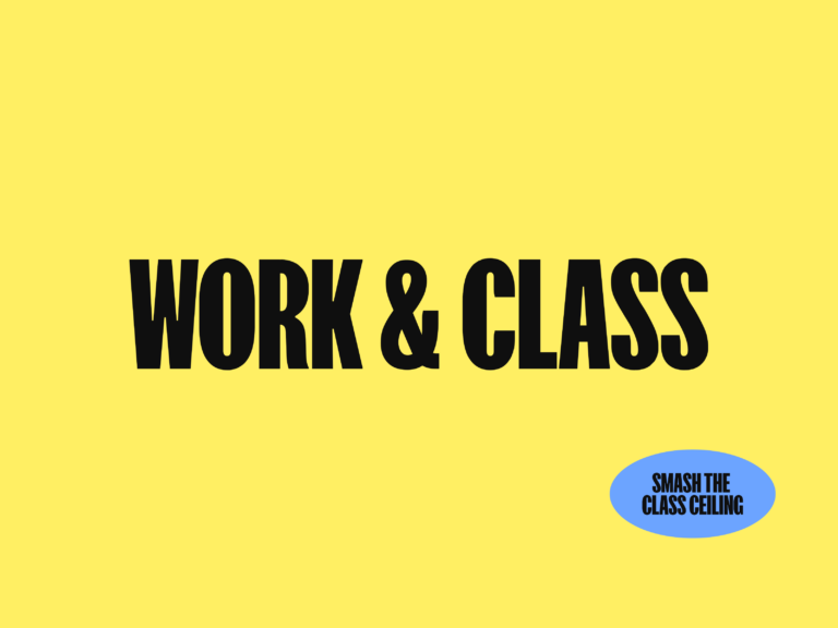
Branding: Georgey Lee

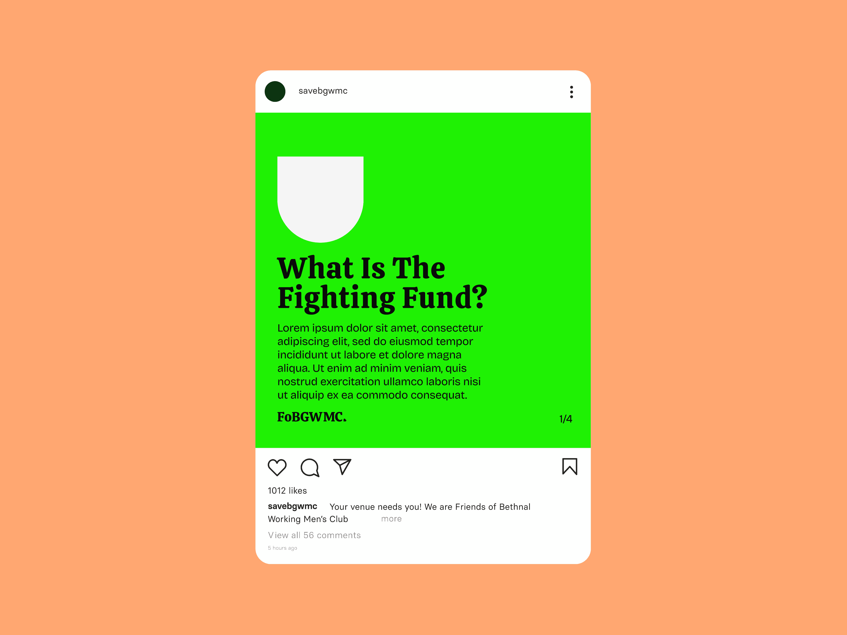
To support BGWMC to raise essential funds for tasks like property surveys and planning applications, Friends of BGWMC approached us to create a brand kit on a quick turnaround basis. They needed a bold and cohesive identity that could rally support, inspire solidarity, and help drive their campaign to protect this vital space. The deliverables included a typographical logo, a comprehensive set of brand guidelines, and suggested applications such as social media icons, poster concepts, and a homepage mock-up.
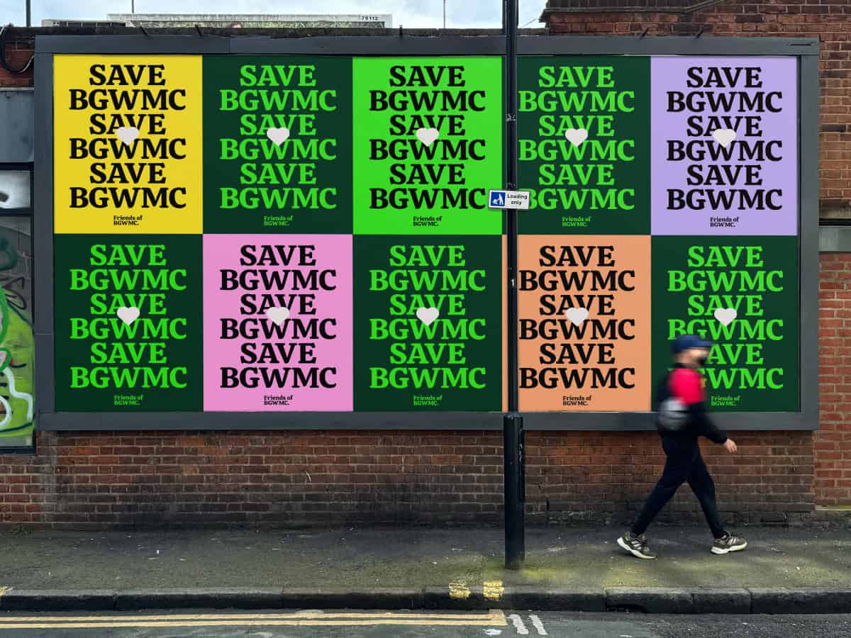
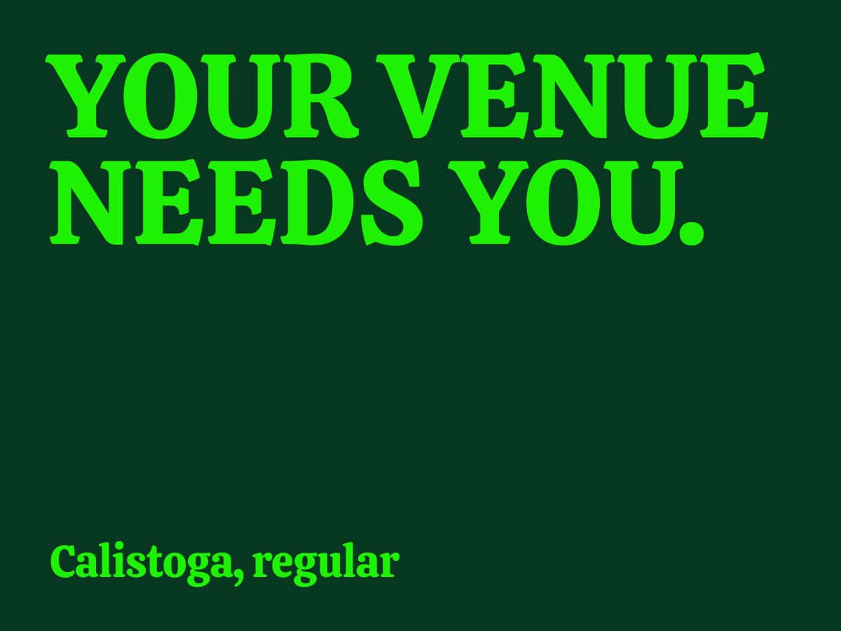
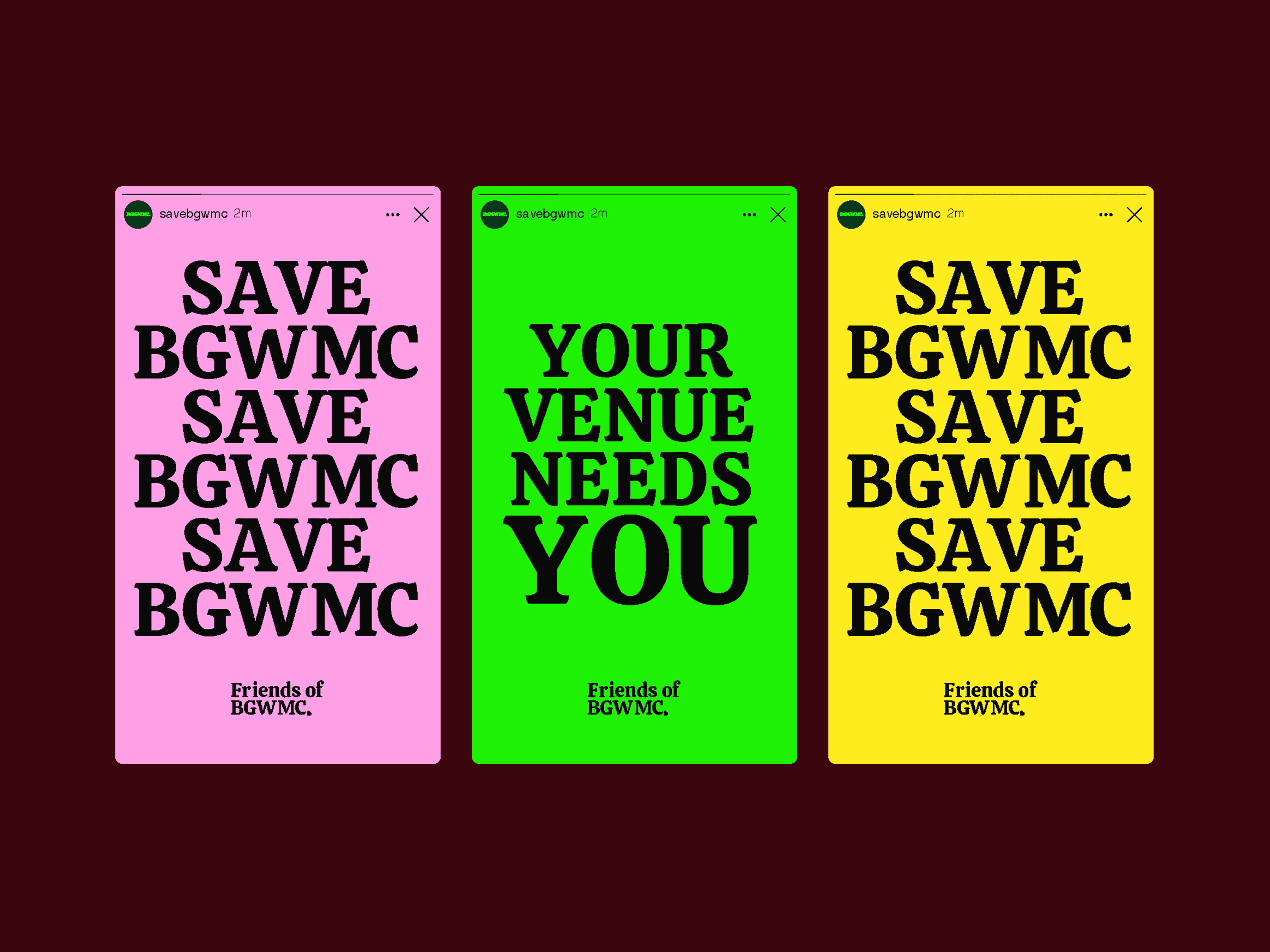
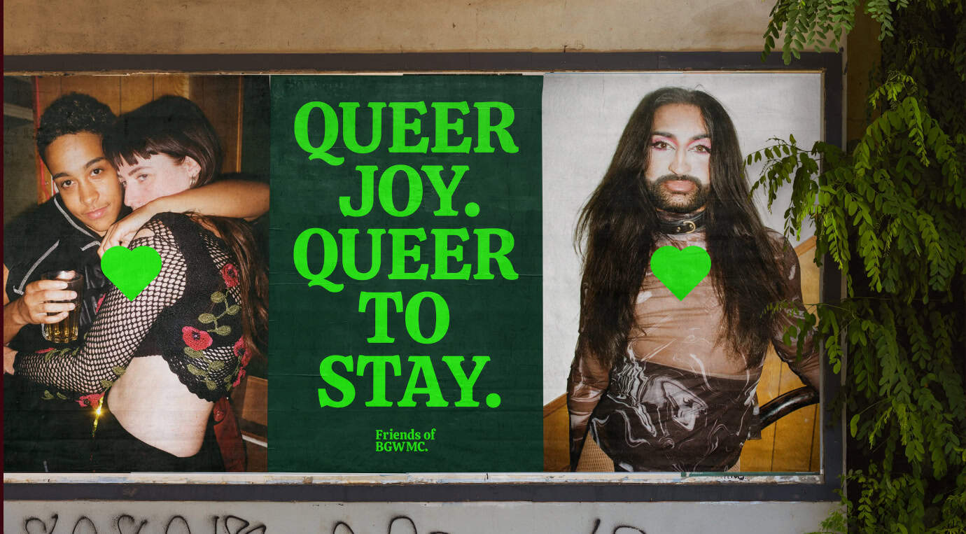
We sought to create a brand identity that captured the spirit and urgency of the Friends of BGWMC campaign while resonating with the vibrant community it serves. The typographical logo was designed using Calistoga, chosen for its upbeat, bold style that makes a strong visual statement. For secondary and longer-form information, we used a modern sans-serif font with three weights to ensure versatility and emphasis where needed.
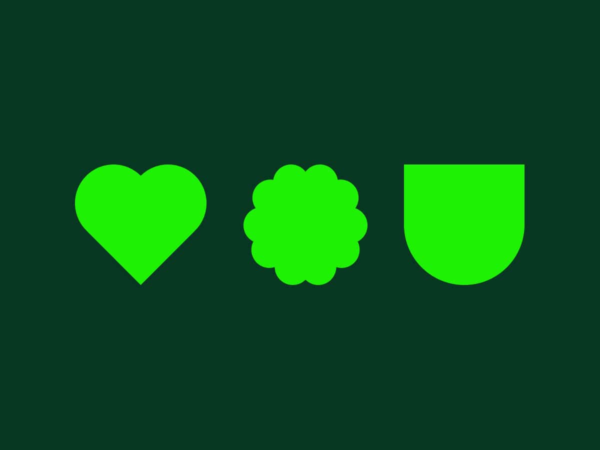
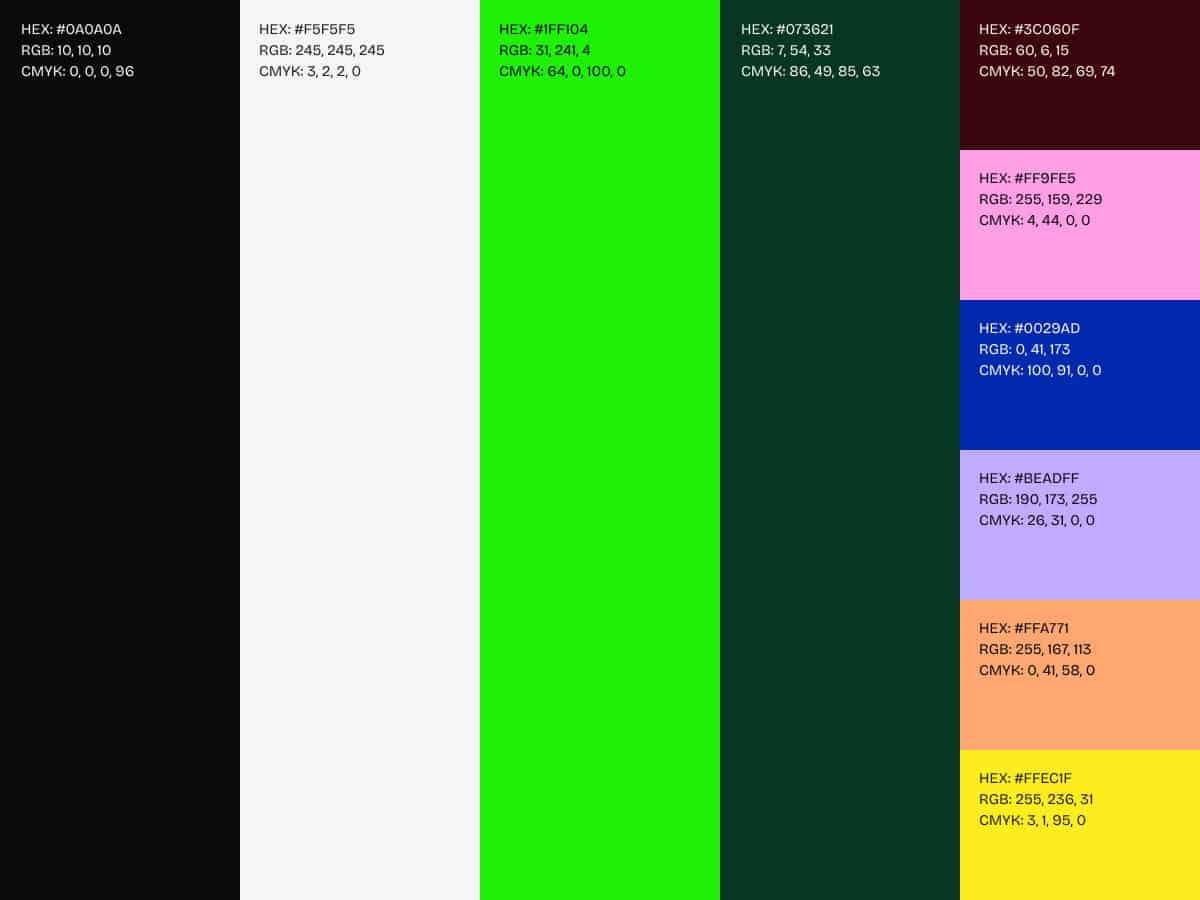
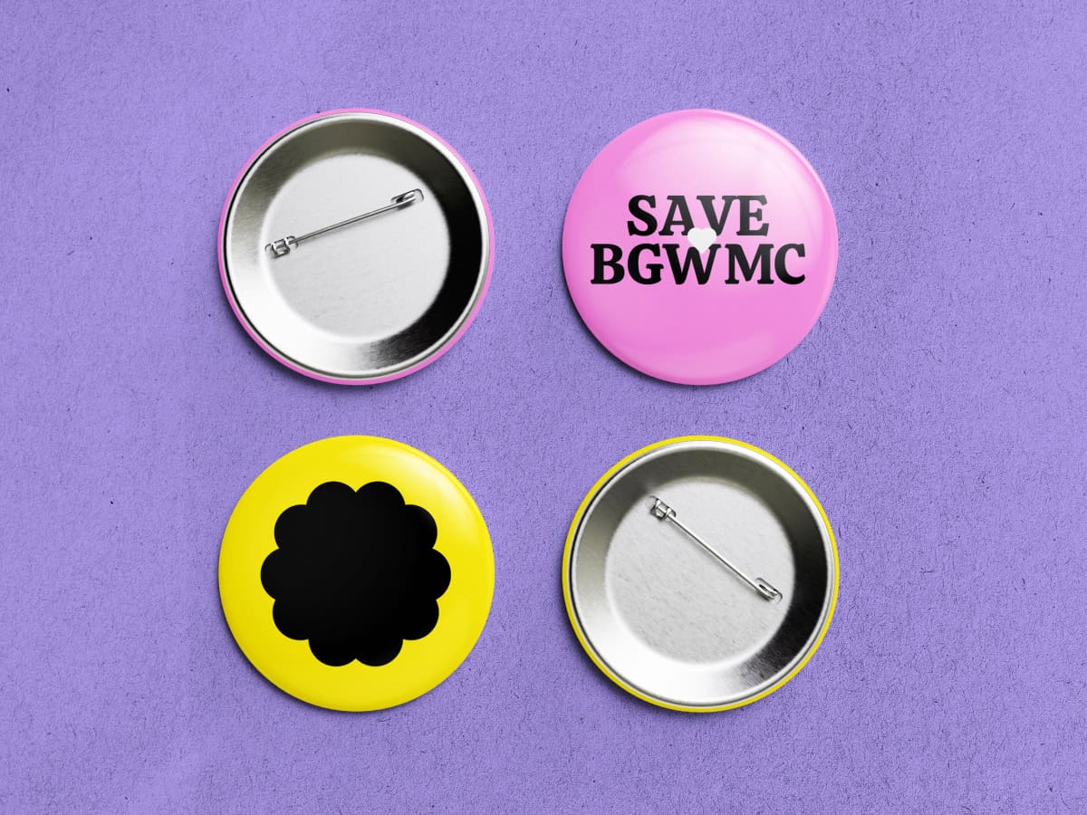
The extended colour palette prominently features green, symbolising growth and solidarity, alongside complementary colours like pink, yellow, and blue to reflect the energy and diversity of the LGBTQ+ community. We also created bespoke icons inspired by the heart shape associated with the venue, including a flower to represent the LGBTQIA+ community and a shield to symbolise solidarity and unity in the fight to save the venue.
To ensure the brand could be applied effectively, we developed detailed guidelines covering placement, size, and colour pairings, ensuring accessibility and aesthetic impact. Practical examples of brand implementation were also provided, including social media icons, poster templates, and a homepage mock-up. These assets were designed to inspire action, convey the campaign’s urgency, and help Friends of BGWMC reach their fundraising goals.